
 By Lina Hope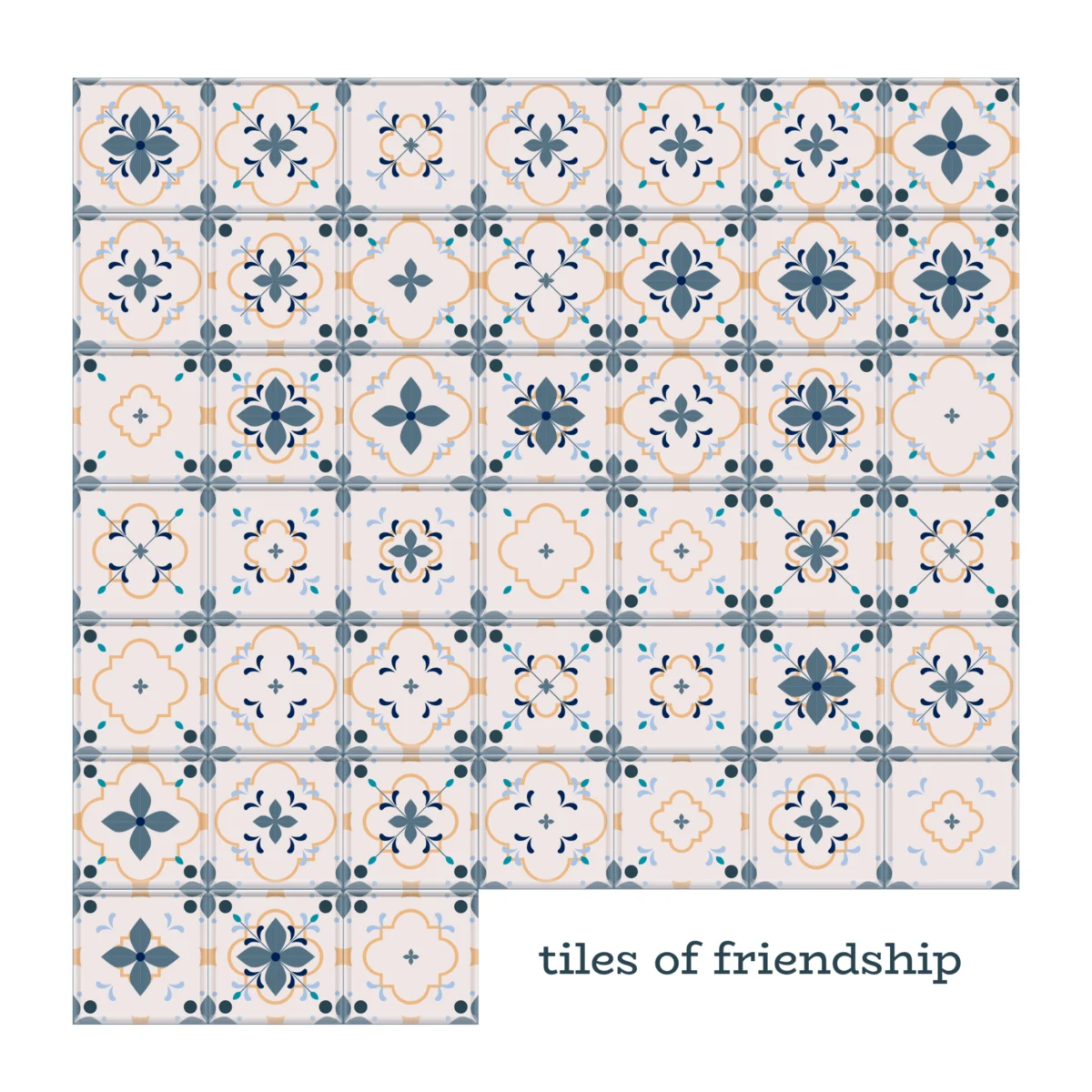
Introduction: Redefining the Invisible
The Oxford Dictionary offers a clinical, functional definition of friendship: a "voluntary, personal relationship characterized by mutual affection, trust, and support." While accurate, this lexicographical distillation fails to capture the visceral reality of human bonding. To the individual, friendship is rarely a static definition; it is the spontaneous warmth of a smile upon greeting a familiar face, the deliberate choice to nurture a relationship with a niece long after the conclusion of a family gathering, or even the heavy, poignant silence shared with a friend who finds themselves unable to align with one’s own life trajectory.
As a data designer, my professional life is dedicated to the categorization of the intangible. We live in an era where data is often viewed as a cold, objective ledger of reality. However, I recently sought to challenge this perception by mapping the very people who have sculpted my existence. I did not want a cold balance sheet of social capital; rather, I sought to identify the patterns—the geometry—of my own life. This project was never intended to be a permanent monument, but rather a snapshot in time, acknowledging that every relationship is an evolving, living organism.
The Taxonomy of Connection: Building the Framework
The process began with an exhaustive inventory of my social ecosystem. I started with memory, then cross-referenced these names with my Facebook network to ensure no one had been omitted through simple oversight. Yet, as I populated my spreadsheet, the existential questions began to cascade.
The primary challenge was one of taxonomy. Where does one draw the line between kinship and friendship? My nieces, for instance, were a part of my life through the "circumstance of birth," yet our relationship has been sustained for years through daily communication and conscious effort. Is that friendship? Conversely, what of the confidants who once stood by my side but have since drifted due to disagreements over personal life choices? If they are omitted from the visualization, have I effectively terminated the friendship?
Finally, there is the issue of semantic fluidity. I use the term "friend" with reckless abandon. If I have shared several cups of tea with a new neighbor, does that bridge the gap from "stranger" to "friend"? To resolve these ambiguities, I distilled the essence of friendship into three core metrics, each scored on a scale of one to three:
- Trust: The degree to which I feel secure in their confidence.
- Affection: The level of emotional warmth and mutual care.
- Support: The presence of a reliable safety net during times of crisis.
To ensure the integrity of the data, I imposed a "temporal boundary." I limited the scope of my study to individuals with whom I had maintained contact within the last 24 months—a period marking the birth of my daughter. This window provided a poignant, albeit unintended, revelation: during a time when I often felt the isolating weight of new motherhood, the data proved that I was, in fact, deeply and profoundly loved.

Chronology of a Creative Pivot
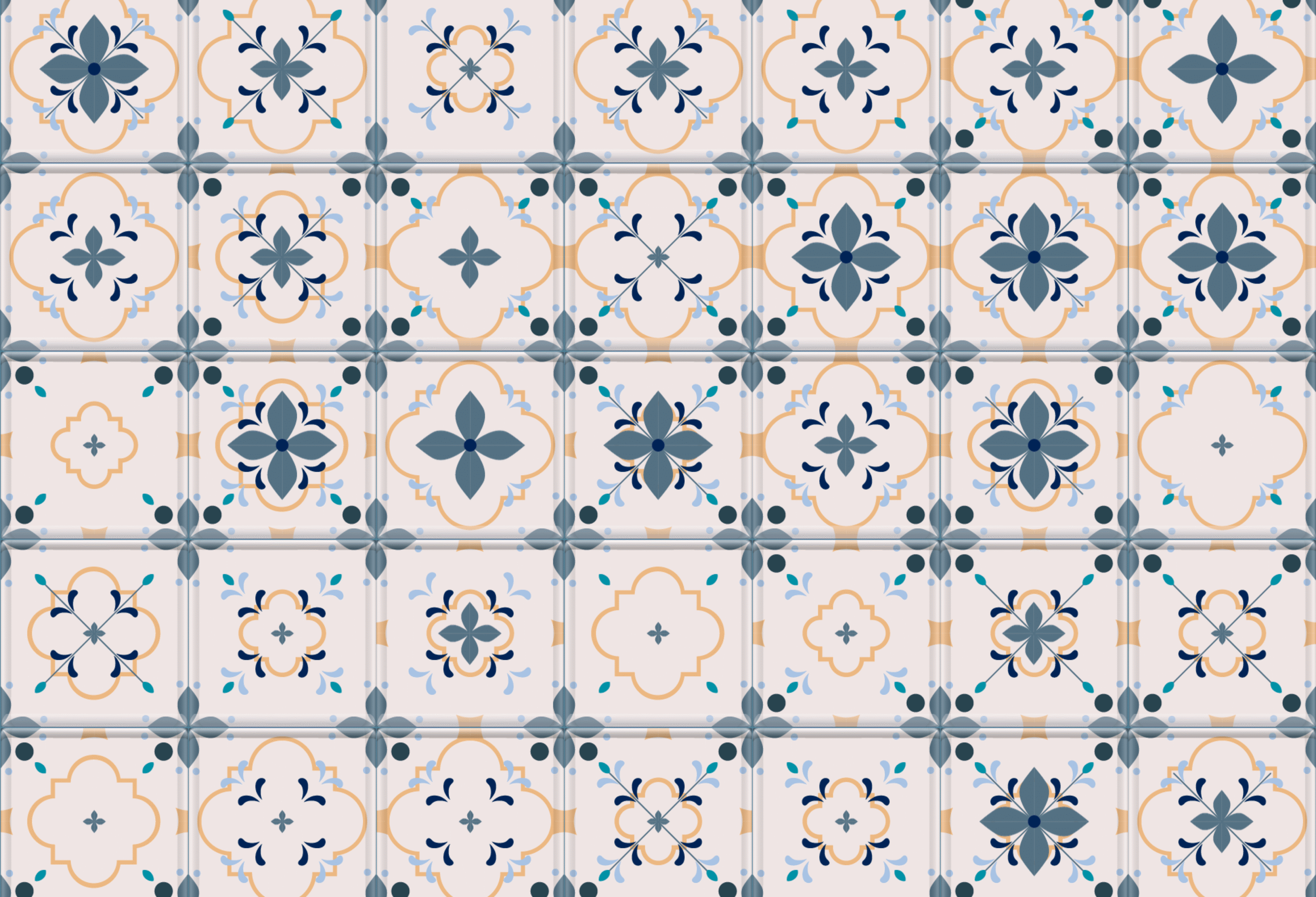
The project’s visual evolution began in the tactile world of a physical sketchbook. I conceptualized a series of "tiles," a modular design that could easily represent the complexity of the data. Level one served as the base, while level three incorporated the nuanced, intricate details of deeper connections.
Initially, I attempted to utilize background colors to denote the duration of these relationships. However, the resulting palette was jarring; it shifted the focus from the qualitative nature of the bonds to a quantitative brag about "how good I am at making friends." The design failed to convey the message of how these specific individuals had built me.
This realization prompted a radical pivot. Traditionally, my design process is manual—a meditative, hours-long ritual of clicking, dragging, copying, and aligning layers in Illustrator and Figma. Seeking to embrace the "vision-to-execution" movement, I turned to generative AI, specifically Gemini and Claude.

The transition was jarring. I asked Gemini to assist in drafting a prompt for Claude, which resulted in a Python script capable of processing my Excel data and generating stacked layers as PNG files. Claude acted as a technical tutor, guiding me through the installation of Python on my Mac—a process that felt eerily nostalgic, reminiscent of 1990s terminal commands. With a single command, the tiles were rendered. The work that usually consumed half a day was completed in moments.
The Cost of Efficiency: An Existential Data Crisis
When I looked upon the final folder of generated tiles, a profound, unsettling feeling washed over me: I did not recognize the data.
In automating the execution, I had inadvertently bypassed the most crucial phase of the data design process: the "data familiarization stage." This is the meditative hour where one handles each data point with intent, recalling the specific person behind the number, the memories associated with their name, and the emotional weight of the relationship.

The resulting visualizations were aesthetically superior to my manual sketches, yet they felt fundamentally hollow. This discovery raises a critical question for our field: when AI handles the heavy lifting of production, are we truly designers, or are we merely the curators of our own archives? Does the loss of manual friction result in a loss of the designer’s soul within the work?
Implications for Modern Design
The "cost of efficiency" highlights a growing divide in the digital age. As we integrate LLMs and automated scripting into our workflows, we must guard against the desensitization of our creative processes. The act of "handling" data is, for the practitioner, an act of empathy. When we automate the labor, we risk treating our own lives as cold, external outputs rather than personal, lived experiences.
However, the utility cannot be ignored. The project ultimately succeeded as a "token of gratitude." The final grid is a comprehensive testament to a life lived in community. These tiles represent the friends who remained steadfast through the awkwardness of puberty, the companions who signed my wedding book, and the new friends found in the mundane rituals of parenthood, such as preschool drop-offs.

Conclusion: A Snapshot of the Soul
This visualization is more than a technical exercise; it is a snapshot of my soul as it existed in 2026. It is a synthesis of human experience, shaped by the individuals I cherish, rendered through the efficiency of machine intelligence, and held together by the voluntary, personal relationships that make life worth mapping.
As we move forward into a future where the lines between creator and curator continue to blur, the lesson is clear: we must not allow the ease of production to diminish the intimacy of the subject matter. Data, at its core, is a human story. Whether we sketch it by hand or script it in a terminal, the value lies not in the precision of the grid, but in the humanity of the connections it seeks to represent.
About the Author
Or Misgav is a critical thinker and an enthusiastic data-visualization designer who finds patterns in the everyday and transforms them into clear, meaningful visual narratives. Previously the lead for UX and Data Visualization within the Business Intelligence department at IEC, she is currently pursuing a practice-based PhD. Her research explores how data visualization can support more balanced, informed decision-making for individuals navigating chronic conditions like diabetes.
 Lina Irawan
  Nana
Nana  Nila Kartika Wati