
 By Reynand Wu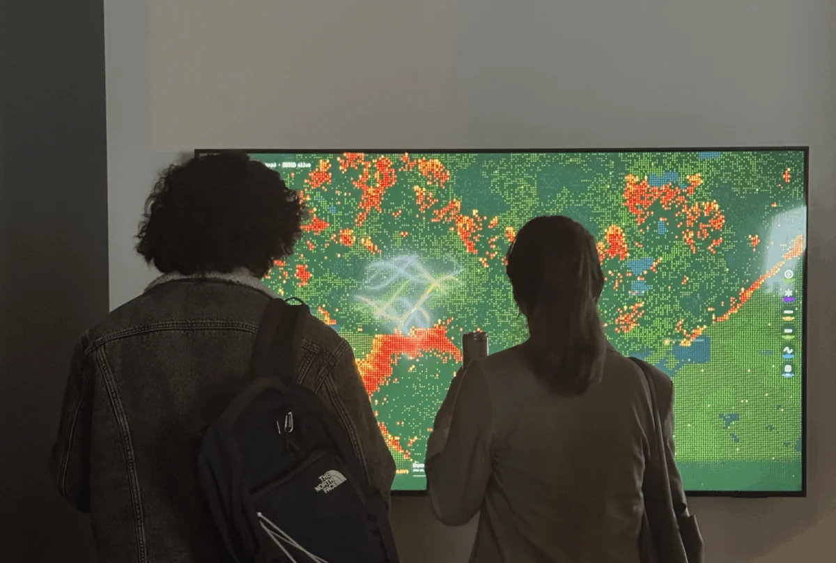
In the high-stakes world of the energy industry, data often serves as a double-edged sword. For professionals like Pranavi Aourpally, a San Francisco-based data designer, the daily routine involves navigating a deluge of alarming metrics: soaring demand forecasts, grid expansion curves, and the compounding pressures of an aging electrical infrastructure. Yet, there is a recurring problem that plagues the industry—the "empathy gap."
Data, in its rawest form, rarely translates into human understanding. A spreadsheet cell detailing grid load is simply a number; a chart in a corporate slide deck is a static object that stakeholders nod at and promptly forget. Aourpally, who specializes in designing data experiences, recognized that the most critical information—the direct correlation between our digital habits and the physical degradation of our environment—was failing to land. She set out to prove that to solve the climate crisis, we must first make its invisible costs feel tangible.
The Invisible Infrastructure: A Feedback Loop of Heat and Demand
The connection between energy infrastructure and wildfire risk is no longer a matter of academic debate; it is a lived reality for those in the American West. As the climate shifts, we are witnessing a lengthening of "burn windows"—the periods of the year when conditions are prime for catastrophic wildfires. Simultaneously, the digital age is exerting an unprecedented physical burden on the planet.
AI data centers, which have become the engine of modern technological progress, are consuming power at a scale that rivals entire nations. As the grid expands to meet this insatiable demand, power lines are increasingly routed through rugged, drought-stricken terrain. This creates a lethal feedback loop: the demand for AI consumes massive amounts of energy, requiring more infrastructure in volatile environments, which in turn increases the risk of ignition during extreme weather events.
For Aourpally, the challenge was not in the science—she could cite the statistics with ease—but in the communication. She needed a way to bridge the gap between a simple AI prompt and the scorched earth that can result from a failing, overloaded grid.
Chronology of a Project: From Theory to Spark
Aourpally’s journey toward solving this communication breakdown began in the halls of Northeastern University, where she studied Information Design and Data Visualization. Her academic training encouraged her to treat data as a material—something with texture, weight, and inherent meaning. However, the true catalyst for her project, Wired to Burn, was the Data Visualization Society (DVS) mentorship program.
The Mentorship Phase
Under the guidance of her mentor, Divya Meghnani, Head of Product at Databricks, Aourpally began to shift her focus. Meghnani pushed her to move beyond the "what" of data visualization and toward the "why." They began to explore how to make the cost of invisible infrastructure feel visceral. This mentorship proved to be the crucible for her ideas, transforming abstract concepts into a functional, interactive design.
The Technical Execution
Inspired by Daniel Shiffman’s Nature of Code and the "Data Humanism" movement championed by Giorgia Lupi, Aourpally moved away from traditional, static charting. She turned to cellular automata—a grid-based system where the state of each cell is determined by its neighbors and specific environmental variables.
Using the creative coding library p5.js, she engineered a system where fire behaves as a living, breathing entity. The simulation accounts for fuel density, wind patterns, and moisture levels—variables that are directly influenced by the climate crisis. The user is not a passive spectator; they are the catalyst. By choosing the terrain—from dry grasslands to dense timber—and clicking to create a spark, the user initiates a chain reaction dictated by real-world environmental physics.
Decoding the Simulation: Wired to Burn
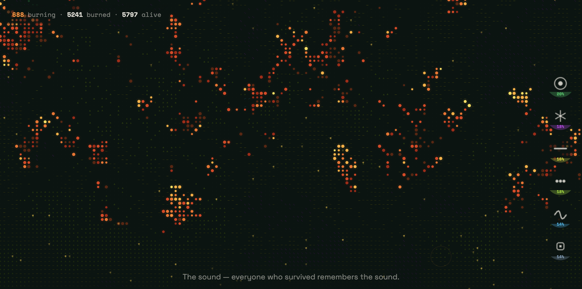
Wired to Burn is not just a tool; it is a narrative experience. When a user opens the simulation, they are presented with a near-black canvas. Six distinct terrain types are represented by vivid, neon-colored symbols:

- Emerald Green: Dense forests.
- Violet Starbursts: Shrubland.
- Acid Yellow Dashes: Agricultural zones.
- Lime Green Dots: Grassland.
- Cyan Sine Waves: Wetlands.
- Slate Blue Squares: Developed land.
As the "amber ember" cursor initiates a fire, the simulation tracks the spread across 9,000+ cells. Crucially, Aourpally incorporated a narrative layer into the aftermath. As the fire consumes the digital landscape, it leaves behind "ash." This ash is not merely a black pixel; it is text. In the wake of the destruction, the simulation displays explanations of the hidden infrastructure costs associated with our digital behaviors. This design choice forces the user to confront the consequences of the "spark" they created, effectively humanizing the data.
The Exhibition: Closing the Empathy Gap
When Aourpally presented Wired to Burn at the TIAT exhibition in San Francisco, the results were profound. Observers were initially drawn in by the aesthetic beauty of the generative fire. However, as they watched the simulation and read the narrative text left in the "ash," the mood shifted from curiosity to reflection.
"I watched strangers walk up to the screen," Aourpally noted. "They weren’t just playing with a simulation; they were looking at a mirror of our current climate reality."
The ability of the project to make people stop, read, and re-read the data is a testament to the power of human-centric design. It validated the core hypothesis of her work: when we provide data with a human pulse, we move the audience from passive consumption to active reflection.
Implications for the Future of Data Design
As Aourpally prepares to participate in this year’s Outlier Conference, her focus has shifted toward the theme of "The Final Draft." In the context of data visualization, the "final draft" is a misnomer. Aourpally argues that no data project is ever truly finished; it is a living entity that must evolve alongside the problems it attempts to map.

Data as a Living System
The implications for the energy industry and beyond are clear. If we are to address systemic risks like climate change, our data strategies must move beyond static reporting. They must adopt the principles of iteration and progress. By treating data as a "living system," designers can create tools that reflect the constant, often unpredictable changes in our environment.
The Responsibility of the Designer
The role of the data designer is evolving. It is no longer enough to be a technician who organizes numbers; one must be a translator of complexity. Aourpally’s work suggests that designers have a moral imperative to remain humble in the face of complex systems. They must ensure that when we talk about the world—and the dangers it faces—we do so in a way that makes the people within it feel the weight of what is at stake.
Conclusion: A New Standard for Advocacy
The transition of Pranavi Aourpally from a student to an exhibitor and innovator in the space of a single mentorship highlights the growing importance of the Data Visualization Society’s mission. By fostering mentorships that bridge the gap between technical skill and creative storytelling, the community is cultivating a new generation of designers who are prepared to tackle the most pressing challenges of our time.
Wired to Burn serves as a benchmark for this new approach. It reminds us that in the world of climate and energy, the terrain is constantly shifting. The fire starts again, the data keeps flowing, and the necessity to make those numbers feel "real" has never been more urgent. As we look toward the future, the goal remains the same: to stop the scroll, spark a conversation, and ensure that our digital progress does not come at the cost of our physical survival.
 Lina Irawan
  Nana
Nana  Nila Kartika Wati