
 By Azzam Bilal Chamdy
Main Facts
In a striking departure from the sleek, minimalist aesthetics that have dominated the creative landscape for decades, a powerful counter-movement known as "anti-design" has been steadily gaining traction across fashion, branding, and graphic design. Over the past ten years, this embrace of imperfection, rawness, and unconventional aesthetics has emerged as a direct response to the perceived sterility and homogeneity of "perfect" design. Brands are increasingly turning to deliberately imperfect elements – asymmetrical layouts, distressed textures, unconventional typography, and unpolished visuals – to forge deeper, more authentic connections with their audiences. This shift reflects a profound cultural yearning for genuineness in an increasingly filtered and synthesized world. To delve into the motivations behind this trend and its lasting implications, we spoke with Ollie Patterson, Managing Director at Mynt, a creative agency at the forefront of contemporary design thought. Patterson offers invaluable insights into the value of embracing imperfection, the critical role of intention, and what the future holds beyond the current anti-design wave.
Chronology
The Roots of Anti-Design: A Legacy of Disruption
While its current iteration feels fresh, the spirit of anti-design is far from new. Its philosophical underpinnings can be traced back to radical design movements of the mid-20th century, particularly Italian Radical Design of the 1960s and 70s. Pioneers like Archigram and Superstudio challenged the functionalist dogma of modernism, critiquing consumerism and the rigid aesthetic norms of their time. They advocated for design that was provocative, experimental, and often deliberately "ugly" or unfinished, aiming to stimulate thought rather than merely provide solutions. In later decades, subcultures like punk and grunge further amplified this rebellious ethos, celebrating raw, DIY aesthetics that rejected mainstream polish and commercial slickness. These historical precedents highlight anti-design’s cyclical nature, consistently re-emerging as a powerful antidote to prevailing design orthodoxies and a vehicle for cultural critique. Each resurgence, while unique in its expression, shares a common thread: a deliberate questioning of what constitutes "good" or "acceptable" design.
The Rise of Minimalism: A Counterpoint to Excess
The vibrant, often chaotic, and maximalist design ethos of the late 1990s and early 2000s, characterized by elaborate gradients, busy layouts, and an abundance of digital ornamentation, eventually paved the way for its antithesis: minimalism. As the digital age matured, there was a growing desire for clarity, efficiency, and sophistication. Minimalism, with its emphasis on clean lines, abundant white space, grid systems, and functional sans-serif typography like Helvetica, offered a refreshing sense of order amidst visual clutter. It quickly became the default aesthetic for technology companies, luxury brands, and contemporary lifestyle products, signifying modernity, precision, and an aspirational sense of calm. The initial appeal of minimalism was undeniable; it promised an uncluttered experience, allowing content to breathe and messages to be delivered with elegant simplicity. For a time, "less was more" became the undisputed mantra, and brands strived for an aesthetic perfection that communicated refinement and control.

The Pendulum Swings Back: The Return of Imperfection
However, as Ollie Patterson points out, the creative world eventually grew "bored of its white space and Helvetica." The very qualities that made minimalism appealing – its uniformity, predictability, and pursuit of an idealized perfection – began to feel sterile and impersonal. This fatigue wasn’t just an aesthetic whim; it was intertwined with broader cultural shifts. In an era saturated with hyper-curated social media feeds and digitally enhanced realities, there emerged a powerful counter-desire for authenticity, vulnerability, and the "real." Consumers grew wary of overtly polished brand messaging that felt inauthentic or unattainable. Over the past decade, this sentiment has fueled the gradual resurgence of anti-design. Brands began to experiment with elements that broke the rules: intentionally off-kilter layouts, hand-drawn typography, raw textures, and visuals that embraced flaws rather than concealing them. This shift signaled a move away from an aesthetic of unattainable perfection towards one that celebrated human touch, genuine expression, and the relatable beauty found in the imperfect.
Supporting Data
The Psychology of Authenticity: Why Imperfection Resonates
The enduring appeal of anti-design lies deep within human psychology. As Patterson aptly states, "Imperfections are the things we can relate to and fall in love with." Humans are inherently drawn to uniqueness and the natural world, which is replete with asymmetry and variation. When everything is too polished and perfect, it feels "out of reach," creating a psychological barrier between the brand and the consumer. This phenomenon can be partly explained by the concept of the "uncanny valley," where extreme realism or perfection can sometimes trigger discomfort or distrust.
In contrast, small flaws and unexpected design elements signal genuine human effort and imbue a design with authenticity and character. This authenticity fosters a sense of connection and builds trust, which are invaluable assets in today’s crowded marketplace. Consumers are not just buying products or services; they are seeking narratives and values that resonate with their own experiences. An imperfect design can subtly communicate vulnerability, honesty, and a departure from mass-produced uniformity, making a brand feel more human and approachable. It taps into a desire for the handmade, the bespoke, and the unique, creating an emotional resonance that sterile perfection often fails to achieve. This is also seen in aesthetics like Wabi-Sabi, a Japanese philosophy that finds beauty in imperfection and impermanence, recognizing the natural cycles of growth and decay.
Market Trends and Consumer Behavior: A Demand for the Undone
The pivot towards anti-design is not merely an artistic trend; it is a reflection of significant shifts in consumer behavior and market demands. Modern consumers, particularly younger generations, prioritize authenticity, transparency, and ethical practices from the brands they engage with. They are increasingly skeptical of slick marketing campaigns that promise an idealized lifestyle, opting instead for brands that reflect real-world values and experiences. The rise of movements advocating for sustainability, conscious consumption, and diversity has further amplified this demand for "realness."
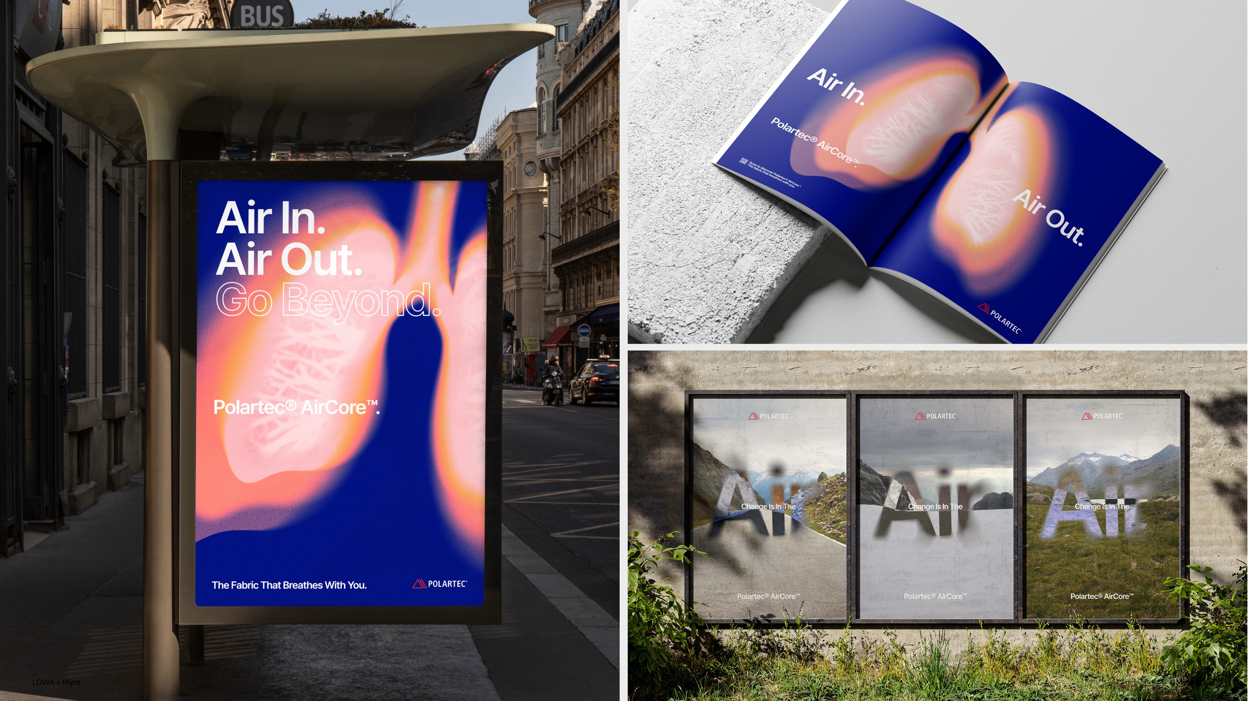
While social media platforms initially championed a culture of aspirational perfection, there is a growing counter-movement. Apps like BeReal encourage unedited, in-the-moment sharing, and influencers who embrace raw, unpolished content often garner more genuine engagement. This societal shift is manifesting in various industries: from fashion’s embrace of deconstructed garments and raw hems to graphic design’s experimentation with glitch art and intentionally crude typography, and even in product packaging that celebrates natural textures and irregular forms. Brands that embrace anti-design are effectively tapping into this collective yearning for a more grounded, honest, and relatable aesthetic, positioning themselves as allies to a generation weary of artifice. They understand that in a world awash with digital polish, the human touch, with all its inherent imperfections, becomes a powerful differentiator.
The AI Conundrum: Differentiating in a Synthesized World
The burgeoning capabilities of Artificial Intelligence (AI) have injected another layer of complexity into the design conversation, further cementing the relevance of anti-design. As Patterson observes, AI can produce "lots of clean, polished visuals" with unprecedented speed and efficiency. This ease of creating "perfection" has a paradoxical effect: the more accessible and ubiquitous flawless design becomes, the less interesting and unique it appears. When every brand has access to tools that can generate immaculate imagery and perfectly structured layouts, the very notion of perfection loses its distinctiveness.
In this rapidly evolving landscape, authenticity emerges as the ultimate differentiator. Brands that simply leverage AI to churn out generic, flawless content risk blending into an increasingly homogenous visual environment. The brands that will truly stand out, as Patterson argues, "won’t be the ones using AI the most, but using it thoughtfully while keeping their personality and point of view, which resonates with their audience." Anti-design offers a powerful antidote to algorithmic uniformity. By deliberately introducing imperfections, irregularities, and a sense of human touch, brands can signal that their aesthetic is intentional, curated, and deeply rooted in their unique identity, rather than merely a product of automated generation. It’s about leveraging AI as a tool, not letting it dictate the soul of the brand.
Official Responses
Ollie Patterson on the Imperfection Imperative
Ollie Patterson, Managing Director at Mynt, articulates the core philosophy driving the anti-design movement with compelling clarity. He posits that the fatigue with perfect design stems from a fundamental human desire "to feel real and authentic." In a world increasingly dominated by curated images and idealized narratives, the unblemished perfection of minimalist design began to feel sterile and disconnected. "Imperfections are the things we can relate to and fall in love with," Patterson explains, highlighting the innate human tendency to connect with vulnerability and genuine expression. He argues that when design becomes "too polished and perfect, it feels out of reach," creating a subtle but significant barrier between a brand and its audience.

For Patterson, the essence of anti-design lies in its ability to reveal the human hand. "It’s the small flaws and unexpected design elements which demonstrate genuine human effort and give a design its authenticity and character." This authenticity is not merely an aesthetic choice; it’s a strategic imperative. In a landscape saturated with marketing messages, "that authenticity creates connection and builds trust." His observation that "in an increasingly filtered and curated world, it’s genuine, honest design which stands out" encapsulates the movement’s power. Brands embracing anti-design understand that to connect with people, they must reflect the inherent imperfections of people themselves. "Perhaps perfection catches the eye, but imperfection catches the heart," he eloquently states, summarizing the emotional resonance that unpolished aesthetics can achieve.
Distinguishing Intentional Flaws from Design Faux Pas
A critical distinction within the anti-design paradigm, and one that Patterson emphasizes, is the difference between "crafted imperfection" and simply "poor design." This nuance is crucial, as a casual observer might mistakenly conflate the two. "The intent behind it" is the defining factor, according to Patterson. Crafted imperfection is a deliberate, strategic choice; it is a meticulously planned deviation from conventional aesthetic norms, executed with a clear purpose and an understanding of its communicative impact. A well-executed anti-design piece, despite its apparent flaws, still functions brilliantly, conveys its message effectively, and achieves its objectives. The "imperfections" are not accidental errors but rather carefully considered elements that contribute to the overall character and message.
Conversely, "poor design is accidental." It lacks intention, fails to communicate effectively, and often compromises functionality or usability. For instance, a deliberately distorted typeface that remains legible and adds a unique brand personality would be crafted imperfection. An illegible, poorly chosen font, however, would simply be poor design. The distinction lies in the designer’s mastery and control: anti-design requires an even deeper understanding of design principles precisely so they can be strategically broken or subverted to achieve a desired effect. It’s about knowing the rules perfectly before you decide to artfully bend them.
Case Study: Polaroid’s Analog Revolution
When asked for a brand that has successfully embraced imperfect design, Patterson points to Polaroid’s impactful campaign launched last year for their "Flip" camera. This campaign was a masterclass in leveraging anti-design principles to make a powerful statement in a digitally saturated market. "Polaroid’s campaign took AI head-on by celebrating realness," Patterson recounts. In an era dominated by ephemeral digital images and AI-generated visuals, Polaroid strategically positioned its analog print photography as a lifestyle choice – a tangible, authentic experience that stood in stark contrast to "endless scrolling and digital images saved in the cloud."
The campaign’s success lay in its comprehensive application of anti-design principles across all touchpoints. "Everything from the OOH layouts and typography (and of course the Polaroid images used) really brought that celebration of authenticity and not being afraid to capture the imperfections of life," Patterson explains. The inherently imperfect nature of a physical Polaroid print – its soft focus, unpredictable color shifts, and unique borders – became a metaphor for embracing the raw, unedited moments of life. The strategic brilliance was further amplified by the campaign’s placement, with billboards appearing "right next to Apple stores and Google offices, which made that contrast impossible to ignore." This bold, intentional juxtaposition highlighted the core message: in a world striving for digital perfection, the real, tangible, and imperfect experience offered by Polaroid was a more valuable and authentic choice. It wasn’t just selling a camera; it was selling an ethos.

Implications
The Future of Design: A Balanced Aesthetic
Looking ahead, Ollie Patterson predicts that the design world won’t simply revert to an era of "ultra-perfect design." Instead, the enduring impact of the anti-design movement will likely manifest in a more nuanced and balanced aesthetic. "I think we’ll see a balance," he states, suggesting a future where designers and brands become more discerning in their application of both polished and imperfect elements. This balance implies a strategic approach where brands "will continue to embrace authenticity, but they’ll become more selective about where they introduce imperfections." The goal will no longer be to blindly adhere to minimalist perfection nor to haphazardly embrace chaos.
The "winners" in this evolving landscape, Patterson argues, will be "those who know when to be beautifully crafted and when to let their personality shine through." This requires a sophisticated understanding of brand identity, target audience, and communicative goals. It means recognizing that some contexts demand precision and clarity, while others thrive on the raw, human touch. The future aesthetic will likely be a hybrid, a dynamic interplay between refined elegance and deliberate disruption, allowing brands to tell richer, more complex stories that resonate on multiple levels.
Challenges and Opportunities for Brands
The embrace of anti-design presents both unique challenges and significant opportunities for brands. The primary challenge lies in the execution: distinguishing "crafted imperfection" from genuinely "poor design." Brands risk alienating audiences or being perceived as unprofessional if their attempt at anti-design lacks intention, clarity, or a fundamental understanding of design principles. Maintaining a cohesive brand identity while incorporating fluid, imperfect elements also requires careful strategic planning. It’s a delicate dance between consistency and creative freedom.
However, the opportunities are substantial. By embracing anti-design, brands can achieve deeper consumer connection, fostering loyalty built on authenticity and relatability. It offers a potent avenue for enhanced differentiation in a crowded market, allowing brands to carve out a unique visual voice that stands apart from competitors adhering to more conventional aesthetics. This approach can humanize a brand, making it feel more approachable and trustworthy, particularly for generations that value honesty and transparency above all else. Furthermore, anti-design encourages creative experimentation, pushing the boundaries of traditional aesthetics and allowing for innovative expressions that can capture attention and spark conversation.
Broader Cultural Impact
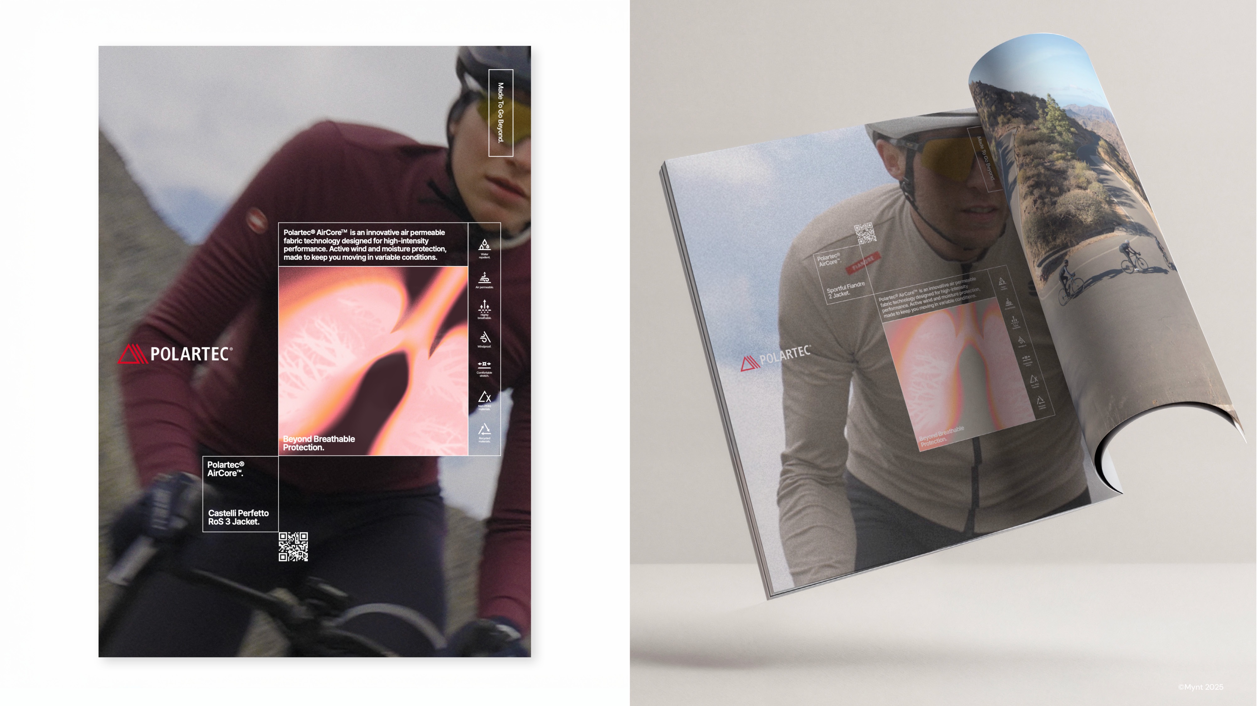
Beyond the immediate realm of design and branding, the rise of anti-design reflects and reinforces a broader cultural shift. It signifies a collective yearning for authenticity and a gentle pushback against the pervasive hyper-curation of modern life, particularly evident in digital spaces. In an age where digital filters and AI-driven perfection can easily obscure reality, anti-design champions the beauty of the real, the unedited, and the genuinely human experience. This movement also contributes to the democratization of design, suggesting that "good design" isn’t exclusively about flawless execution but also about resonant storytelling and emotional impact. As aesthetic values continue to evolve, anti-design stands as a testament to the enduring power of imperfection to captivate, connect, and communicate in a world increasingly hungry for truth and character. It reminds us that sometimes, the most compelling narratives are found not in the pursuit of an impossible ideal, but in the embrace of our beautiful, messy, and perfectly imperfect reality.
Discover more about Mynt and their creative philosophy at mynt.co.uk.
 Evan Lee Salim
  Nana
Nana  Ammar Sabilarrohman