
 By Pevita Pearce
In the high-stakes world of corporate analytics, there is a recurring, almost universal phenomenon that every Tableau developer eventually encounters. You spend weeks building a masterpiece: a responsive, multi-layered, highly interactive dashboard that allows stakeholders to drill down into the granular details of sales pipelines, inventory fluctuations, or financial forecasts. You publish it to the server, confident in its utility.
Then, at 8:55 a.m. on Monday, your Vice President logs in. They don’t filter. They don’t hover for tooltips. They don’t drill down. Instead, they hit the "Download" button, capture an image, and paste it onto slide 17 of a PowerPoint presentation.
After six years in the trenches of reporting and analytics, I have come to realize an uncomfortable truth: Your beautiful interactive dashboard is destined to become a static PowerPoint slide. For professionals in sales operations, finance, and executive-facing teams, this isn’t just a possibility—it is the default workflow. Once you accept this reality, you can shift your perspective from frustration to strategy. This is not a failure of technology; it is a design problem.
The Reality of Executive Consumption
The C-suite operates on a different clock. Executives are rarely looking for the "discovery" phase of data analysis; they are looking for the "decision" phase. They have board meetings, external client presentations, and tight deadlines. They do not have time to navigate a complex interface that requires multiple clicks to reveal key performance indicators (KPIs).

When you build with the assumption that your audience will interact with the data, you are designing for a user who rarely exists in the executive suite. If an insight requires a user to click a filter or hover over a chart to see a value, you should assume that insight will never be seen. To succeed in this environment, we must pivot our design philosophy toward "print-ready" digital intelligence.
1. Design for PowerPoint from Day One
The most common mistake analysts make is building for the default "Desktop Browser" view in Tableau. When this is exported, the aspect ratio is often forced into a distorted, illegible mess that ruins the professional aesthetic of a deck.
The 16:9 Mandate
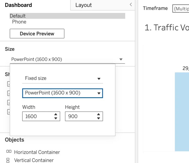
Device preview is not just a feature; it is the most critical constraint in your development process. From the moment you open a new workbook, you should be designing within the 16:9 aspect ratio. This matches the standard dimensions of Google Slides and PowerPoint. By constraining your canvas to these proportions, you ensure that when your stakeholder hits that "Export to PowerPoint" button, the resulting image is crisp, clear, and perfectly aligned.
Pro-Tip: Never wait until the end of the project to test your export. Go to Dashboard > Export as PowerPoint early and often. If the text is too small, if the charts are cramped, or if the layout is disjointed, you need to know before the board meeting, not during it.
2. The Illusion of Interactivity
In the realm of executive reporting, you must build under the assumption of zero interactivity. When a dashboard is exported to a static format, the interactivity dies. Parameters, tooltips, and highlight actions are stripped away, leaving behind only the "default" view.
The Strategy of Multiple Versions
If your stakeholders need to see data across different dimensions—such as sales regions, business units, or product lines—do not rely on a single dashboard with a filter dropdown. Instead, create separate, dedicated views for each. While this might feel redundant to the developer, it is essential for the stakeholder.
Every critical insight must be visible the moment the slide is displayed. If the user has to guess what the data is showing because they cannot interact with it, your report has failed. You are essentially moving from creating an "application" to creating a "narrative document."
3. Mastering Layout Control with Containers
Floating objects are the enemy of consistent exports. When you export a dashboard that relies on floating elements, they will often shift, overlap, or drift when converted to an image. This leads to unprofessional, cluttered slides that reflect poorly on the analytics team.

The Container Workflow
Containers are the structural backbone of a professional dashboard. They keep your charts, legends, and KPI cards locked in place regardless of the export format.
- Minimalism is dangerous: While a dashboard with lots of white space might look modern on a web page, it looks "unfinished" on a slide. Executives prefer information-dense slides.
- Locking the structure: Using horizontal and vertical containers ensures that even when the image is resized, the relative positioning of your elements remains consistent.
Best Practice Workflow:
- Sketch your dashboard layout on paper first.
- Build the primary structure using vertical/horizontal containers.
- Drop your worksheets into these containers.
- Set fixed widths and heights for your containers to ensure they don’t shift during export.
4. Governance: The Secret to Sanity
If you are managing a portfolio of dashboards, you need a system. A disorganized, poorly labeled workbook is a liability.
Visual and Naming Conventions
- Color Coding: Use Tableau’s built-in tab coloring to signify the status of your dashboards (e.g., Green for "Live/Production," Yellow for "Draft," Red for "Archived").
- The Naming Standard: Stop using "Sheet 1," "Bookings (1)," or "Copy of Copy." Adopt a rigid naming convention that includes the version and the content type (e.g.,
Q4_Revenue_Final_v3orRegional_Performance_BarChart). This ensures that when you or a colleague need to update the report, you aren’t playing a guessing game with your own files.
5. The Power of Professional Branding
Your dashboard is a product. Even if it is internal today, it will likely be external tomorrow. When a VP takes a screenshot of your work and shares it with a client or an investor, that image becomes the "face" of your data team.

Logo Placement and Alignment
Align your work with your organization’s standard slide deck template. Placing a company logo consistently in the top-right or bottom-left corner gives your work an air of authority. It signals that this report is a vetted, official document from the organization’s source of truth.
Implications for the Modern Analyst
The transition from "Interactivity-First" to "Print-First" design is not a step backward. It is a step toward maturity. By accepting that your work will be consumed as a static image, you stop obsessing over the features that your users don’t use and start focusing on the elements that drive business decisions: clarity, accuracy, and professional presentation.
Sometimes, being a great analyst isn’t about how many bells and whistles you can pack into a dashboard. It’s about understanding the environment in which your work lives. If that environment is a PowerPoint deck, then you are a slide designer as much as you are a data analyst.
The next time you open Tableau, don’t ask yourself, "What cool interaction can I add?" Ask yourself, "What does this look like on slide 23?" Your stakeholders, your VPs, and your own sanity will thank you for it.
 Lina Irawan
  Nana
Nana  Nila Kartika Wati