
 By Nana Muazin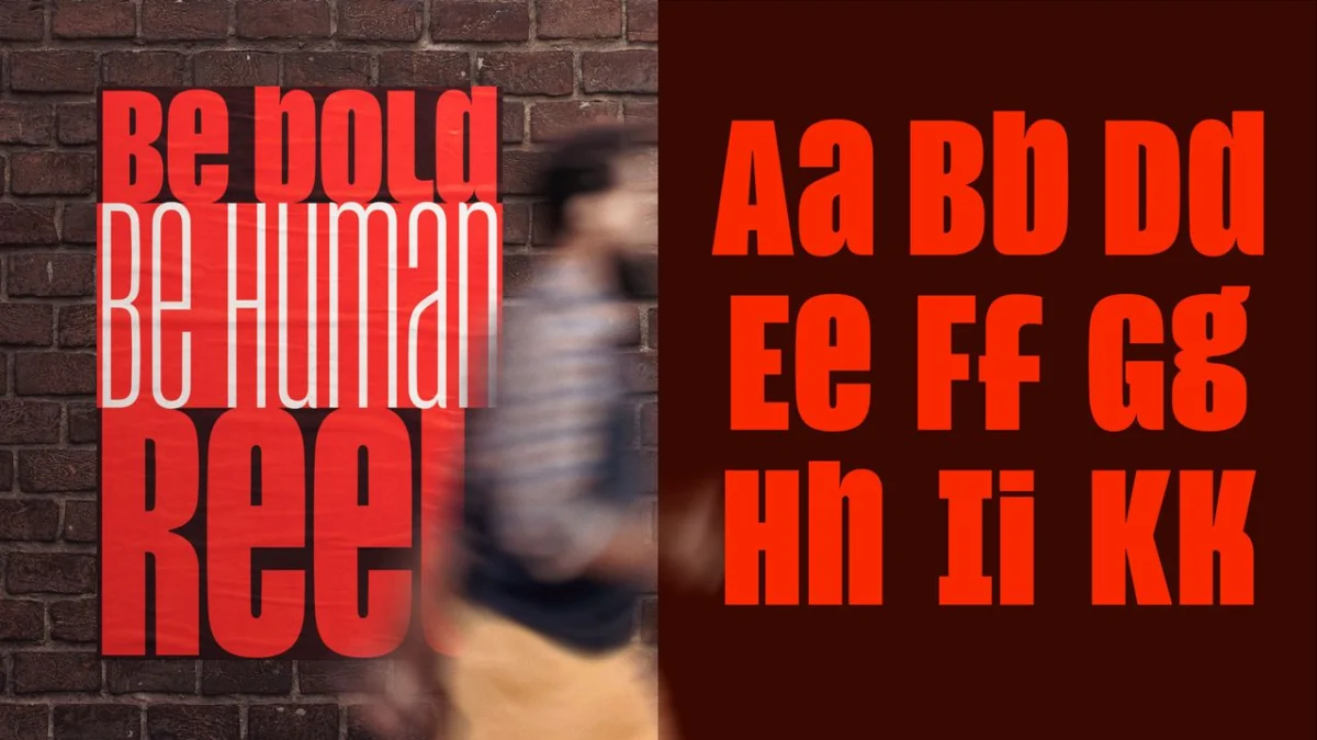
London, UK – For decades, the uppercase letterform has been the undisputed monarch of impact, a typographic shout demanding attention across headlines, political manifestos, and digital declarations. Its ubiquity, however, has come at a cost: in a world where everything screams, nothing truly resonates, and the once authoritative tone has frequently devolved into an echo of aggression. Now, a groundbreaking innovation from type designer Jamie Clarke seeks to redefine the very purpose of capital letters, offering a nuanced alternative that promises both power and personality.
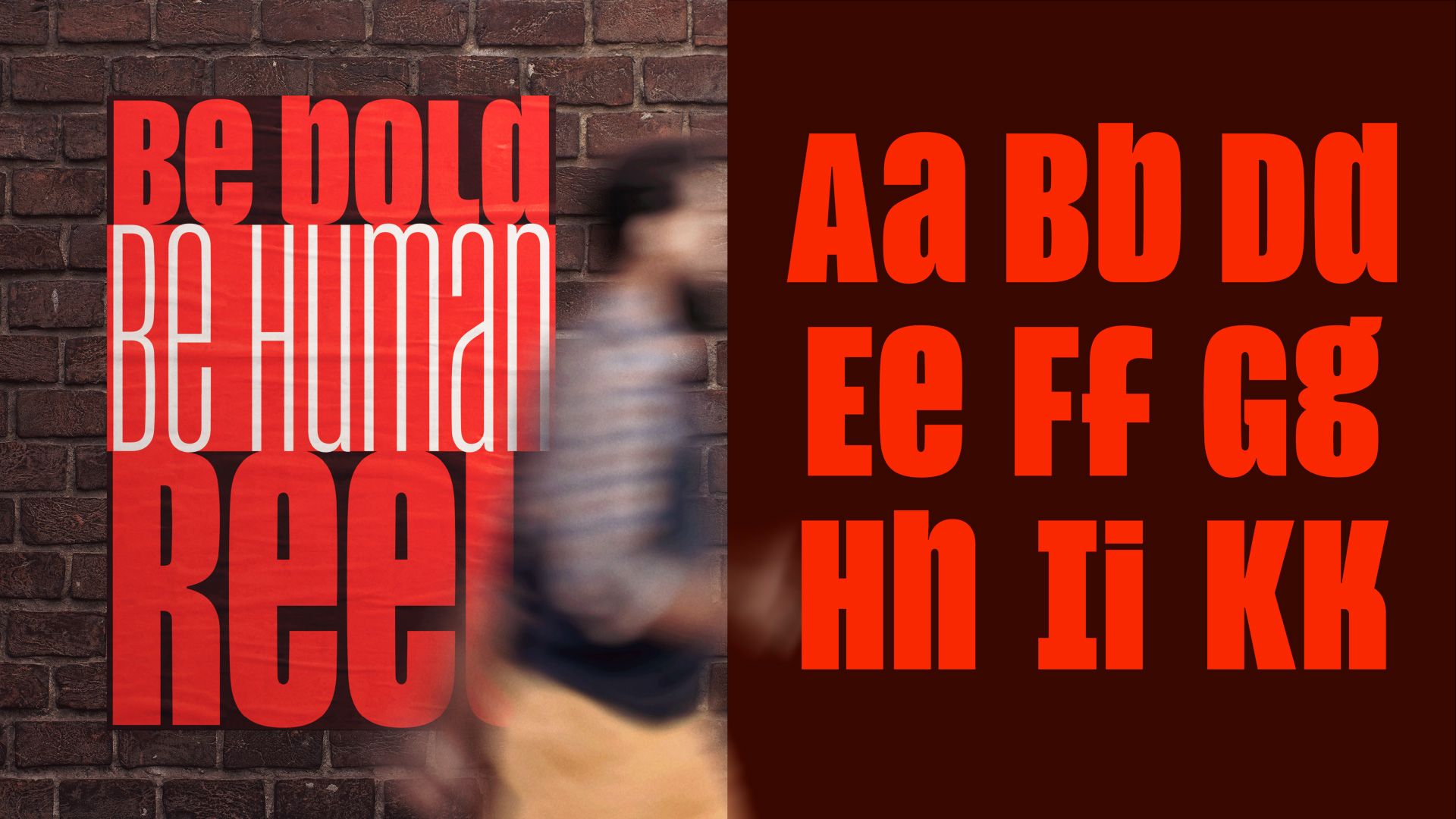
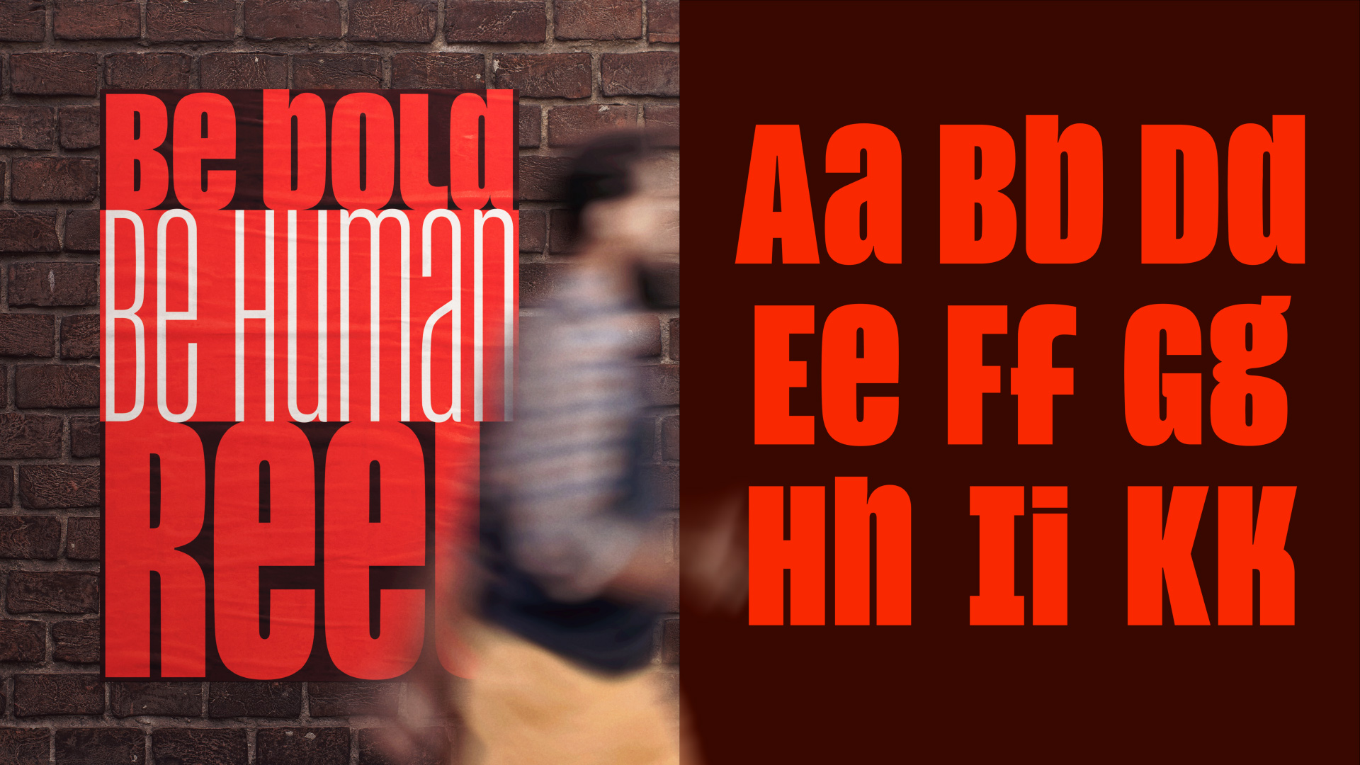
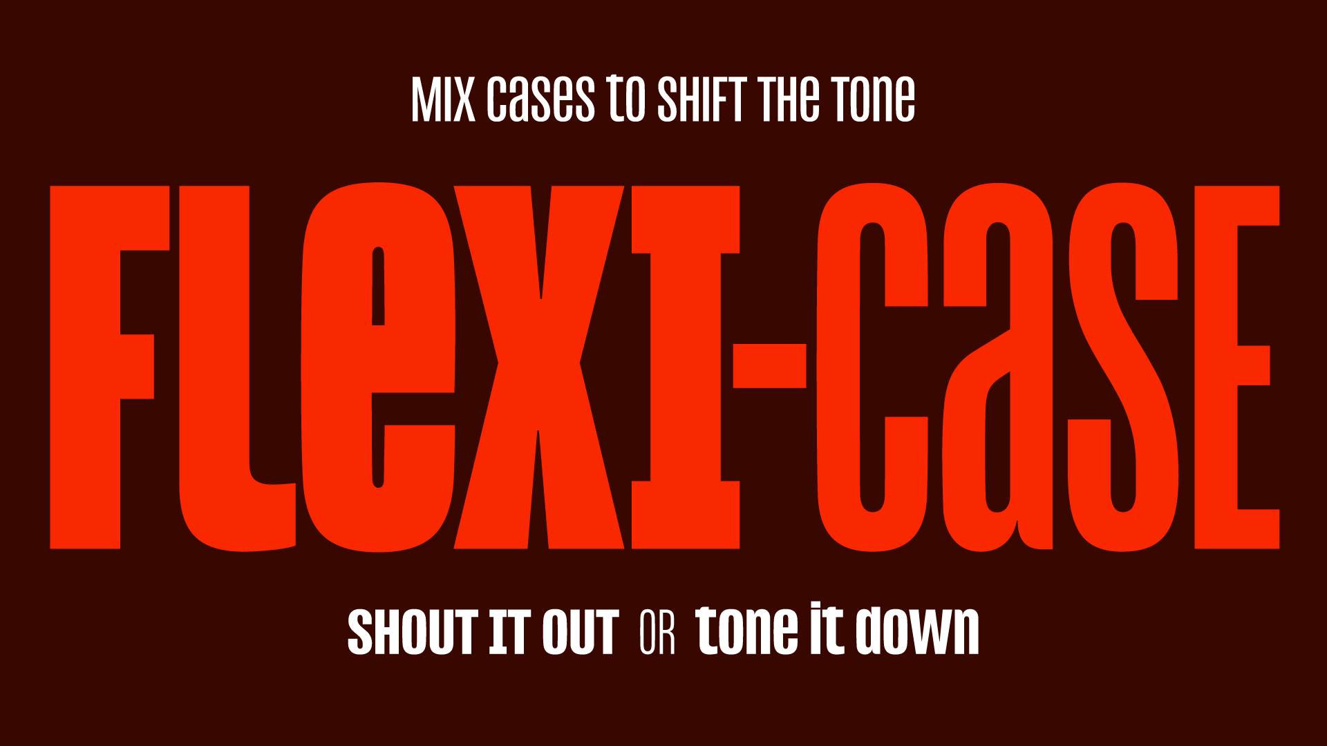
His latest creation, "Reel," introduces a revolutionary "Flexi-case system" that allows designers unprecedented control over typographic tone. By seamlessly blending capitals and lowercase letters within a single word or headline, Reel maintains the distinctive, condensed structure crucial for high-impact display type, yet sheds the confrontational edge that has come to define all-caps communication. The result is a typeface capable of commanding attention without resorting to intimidation, ushering in an era of more sophisticated and empathetic visual communication.
Main Facts: A New Paradigm for Typographic Impact
Jamie Clarke Type’s "Reel" is poised to disrupt established norms in headline typography, responding directly to a palpable fatigue with the aggressive, all-caps default that has dominated visual culture. The core innovation lies in its "Flexi-case system," a sophisticated mechanism that empowers designers to intermix uppercase and lowercase characters within the same word, while ensuring these mixed-case forms retain the consistent height and tight spacing characteristic of condensed typefaces. This unique approach allows for a dynamic shift in tone without sacrificing visual coherence or the bold presence expected of headline fonts.
The problem Reel addresses is multifaceted. Historically, ALL CAPS was adopted for its legibility and forceful presence in print advertising and signage. However, its proliferation in the digital age, from social media posts to website banners, has diluted its impact and often imbued it with connotations of shouting, anger, or urgency that may not align with a brand’s desired message. Reel offers a practical and aesthetically pleasing solution to this dilemma, providing a tool that can articulate both gravitas and warmth within the same typographic expression.
Jamie Clarke, a designer with a notable portfolio including work for Aardman and Disney+, brings a deep understanding of high-impact lettering to Reel. His expertise is evident in the typeface’s ability to maintain structural integrity and a uniform "colour" (visual density) across a line, even with the introduction of varied letter cases. This is no small feat, as conventional mixing of cases in condensed fonts often leads to an uneven, visually fragmented appearance. Reel’s design philosophy is rooted in the idea that strength does not equate to oppression, and impact can be achieved through clever modulation rather than brute force. It offers a single, versatile typeface family that can fluidly adapt its emotional register, making it an invaluable asset for branding, editorial design, and any creative field where typographic tone is paramount.
The Evolution of Typographic Expression: A Chronology
The journey of typographic expression, particularly concerning the use of uppercase and lowercase letters, is a fascinating reflection of cultural shifts and technological advancements. Reel’s emergence is not an isolated design choice but a thoughtful response to a long-evolving dialogue between form, function, and societal perception.
The Rise of ALL CAPS: From Industrial Authority to Ubiquitous Shout
The fixation on capital letters for impact, as uncovered by Jamie Clarke and researcher Doug Wilson, dates back surprisingly far – at least to 1856. This era marked the burgeoning of industrial design, mass advertising, and newspaper headlines, where legibility and immediate attention were paramount. Uppercase letters, with their uniform height and robust forms, naturally conveyed authority and urgency. They cut through the visual clutter of the time, making them ideal for announcing important news, advertising new products, or declaring political stances. The sheer visual weight of ALL CAPS lent itself perfectly to a world increasingly driven by bold statements and clear directives.
Throughout the 20th century, ALL CAPS continued its reign in various domains. Propaganda posters of both world wars utilized it for its unambiguous, forceful delivery. Corporate branding often favored it to project strength, stability, and seriousness. In the golden age of cinema, movie posters frequently deployed all-caps titles to amplify drama and grandeur. The advent of desktop publishing and digital design further democratized its use, making it easier than ever to deploy for designers across all sectors. It became the default setting for any message intended to be "bold" or "loud," firmly embedding itself in the collective consciousness as the go-to for impact.
The Digital Deluge and Its Consequences: When Everything Shouts
The digital age, particularly the rise of the internet and social media, supercharged the use of ALL CAPS, but also began to expose its inherent limitations. In online communication, where visual cues are often limited, typing in all capitals quickly became synonymous with shouting. What was once a mark of authority in print transformed into a sign of aggression or overwhelming emotion in digital discourse. Instagram captions, tweet storms, and forum discussions frequently saw an overuse of caps, leading to a phenomenon where the intended impact was lost in a sea of visual noise. When every brand, every influencer, and every user is shouting, the individual voice becomes indistinguishable.
This ubiquity had a profound psychological effect. ALL CAPS started to feel less like confidence and more like an abrasive demand. It lost its nuance, becoming a blunt instrument in a communication landscape that craved authenticity and connection. Brands found themselves in a dilemma: how to create impactful headlines without alienating an audience increasingly sensitive to aggressive tones? The digital deluge, while making ALL CAPS more accessible, inadvertently highlighted its communicative shortcomings.
The Counter-Movement and The Dawn of Flexi-Case
In response to this, a subtle but significant counter-movement began to gain traction, particularly among artists, musicians, and culturally aware brands. Figures like Taylor Swift, Charli XCX, and Bad Bunny consciously opted for lowercase in album titles, social media posts, and branding. This wasn’t merely a stylistic quirk; it was a deliberate statement. Lowercase began to signal authenticity, vulnerability, approachability, and a rejection of the bombastic, often combative tone prevalent in public communication. It was a visual whisper in a world of shouts, designed to foster intimacy and relatability. This shift highlighted a growing desire for a more human and less confrontational typographic voice.
It is against this rich historical and cultural backdrop that Jamie Clarke’s "Reel" and its Flexi-case system emerge as a timely and ingenious solution. Reel doesn’t abandon the power of capitals but recontextualizes it. It acknowledges the historical efficacy of condensed, impactful type while providing the tools to infuse it with the nuance and warmth that modern communication demands. By allowing a seamless blend of cases within a word, Reel bridges the gap between the historical need for impact and the contemporary desire for authenticity, marking a significant evolution in how designers can sculpt typographic tone. It represents a new dawn for expressive typography, offering a pathway to powerful communication that is both assertive and approachable.
Supporting Data and Design Philosophy: Crafting Nuance from Impact
The development of Reel is not merely a stylistic exercise but a deeply researched and technically sophisticated endeavor. It stems from a profound understanding of typographic history, cultural trends, and the intricate mechanics of letterform design.
Jamie Clarke’s Vision and Expertise: A Designer for the Age
Jamie Clarke’s track record speaks volumes about his suitability to tackle such a nuanced challenge. His portfolio, featuring commissions for industry giants like Aardman and Disney+, alongside a retail catalogue distributed through Adobe Fonts, demonstrates a consistent ability to craft expressive, high-impact lettering that resonates with diverse audiences. This experience has given him invaluable insight into how headline type performs under intense scrutiny and within constrained spaces. He understands that every letterform in a condensed display font must earn its place, contributing to a cohesive visual rhythm and an unmistakable message.
With Reel, Clarke set out to create a typeface specifically for this demanding "condensed, high-impact space," but with a crucial difference: it had to offer flexibility in tone. His vision was to empower designers to navigate the complex emotional landscape of modern communication without compromising the visual punch of condensed type. This required a meticulous approach to character design, ensuring that both uppercase and lowercase forms, when intermixed, would maintain a harmonious visual balance and a consistent overall height, a challenge that typically compromises the effectiveness of mixed-case condensed fonts.
The Collaboration with Doug Wilson: Tracing Typographic Roots
The intellectual backbone of Reel is significantly strengthened by Clarke’s collaboration with writer and researcher Doug Wilson, renowned for directing the Linotype documentary. This partnership allowed for a deep dive into the historical origins of the all-caps phenomenon, tracing its dominance back to the mid-19th century. Understanding this long lineage was critical. It revealed that the widespread use of capitals for emphasis was not an arbitrary trend but a functional response to the demands of early industrial printing and advertising.
This historical context informed Clarke’s design choices, preventing Reel from being a superficial reaction to a contemporary trend. Instead, it became a considered evolution, acknowledging the inherent power of caps while addressing their modern-day communicative limitations. The research highlighted that while the need for impact remains, the means of achieving it must adapt to cultural shifts and evolving perceptions of tone. Wilson’s expertise provided the historical anchor, ensuring Reel was not just innovative but also historically aware and contextually relevant.
The Mechanics of Flexi-Case: A Balancing Act of Form and Function
The true genius of Reel lies in the technical execution of its Flexi-case system. Designing a condensed headline face that allows for the fluid intermingling of uppercase and lowercase letters without disrupting its inherent discipline is a complex feat. Typically, lowercase letters, with their ascenders and descenders, create a jagged baseline and cap-height, breaking the tight rectangular structure that makes condensed type so effective.
Clarke’s solution in Reel is multifaceted. It involves:
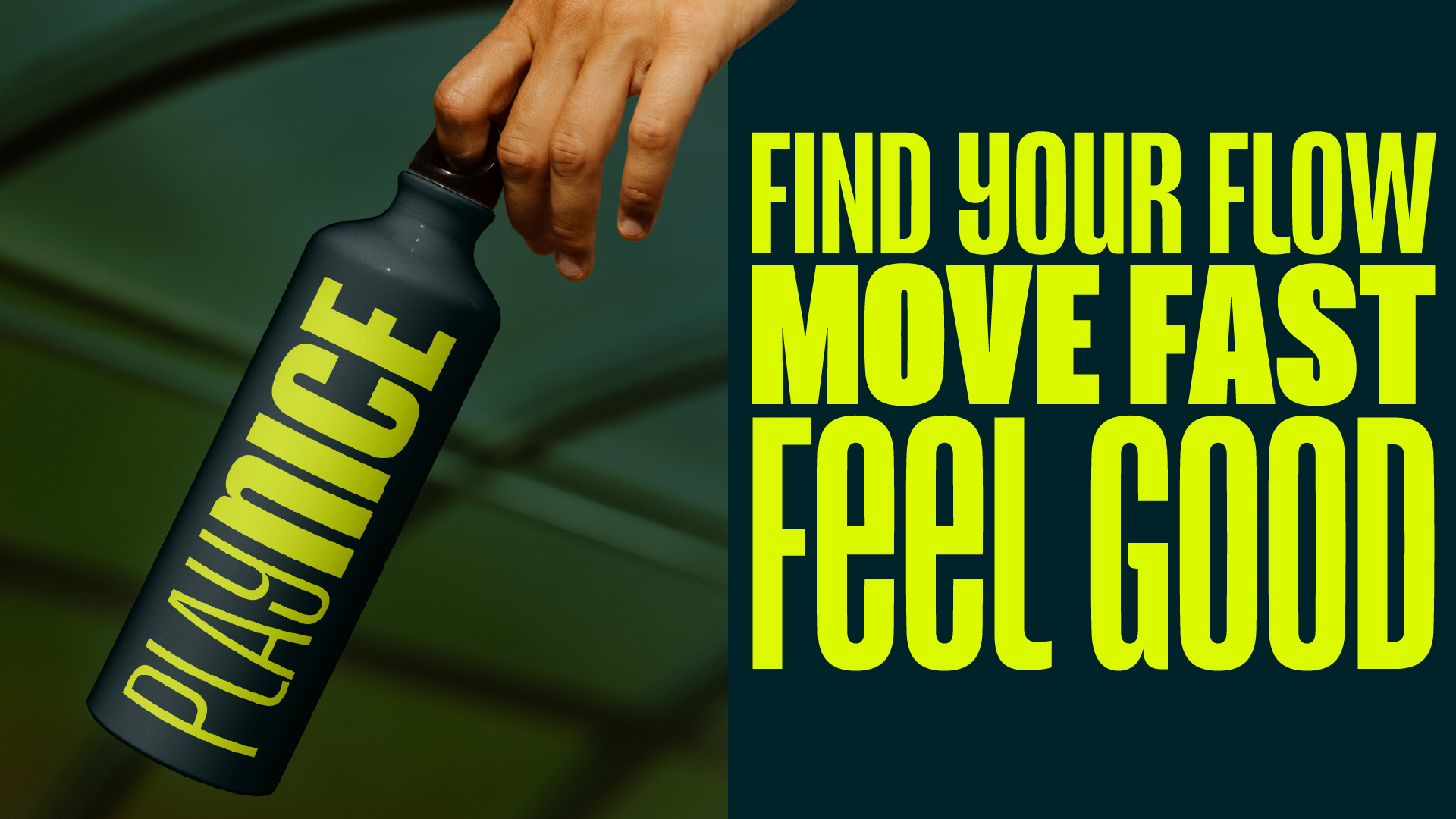
- Uniform Height: Crucially, the lowercase letters in Reel are designed to have an equal height and visual presence to their uppercase counterparts. This isn’t achieved by simply scaling up lowercase glyphs, which would distort their proportions. Instead, each lowercase character is meticulously crafted to fit within the consistent height metrics of the typeface, often by adjusting their ascenders and descenders to align with the cap-height.
- Optical Adjustments: Every character in the Flexi-case system undergoes careful optical adjustments to ensure an even rhythm and "colour" (visual density) across a line, regardless of the case mix. This prevents visual "holes" or uneven spacing that can plague poorly designed mixed-case condensed fonts.
- Preservation of Condensed Structure: Despite the flexibility, Reel rigorously maintains the tight, space-efficient rectangular structure inherent to condensed headline type. This ensures that the typeface remains highly effective in situations where space is at a premium and maximum impact is required.
- OpenType Features: From a practical standpoint, the Flexi-case system is likely implemented through advanced OpenType features, allowing designers to easily access and manipulate these blended cases through stylistic sets or contextual alternates within their design software. This technical underpinning makes the system user-friendly and highly adaptable.
This meticulous design process ensures that Reel offers genuine typographic movement and tonal control without sacrificing the core strengths of a condensed headline face. It allows designers to "dial tone up or down within a single piece of type, sharpening it for a moment of real impact, or softening it where the message calls for something more conversational," all while preserving the visual integrity that is paramount for effective display typography.
Cultural Resonances of Lowercase: Authenticity and Vulnerability
The shift towards lowercase in cultural messaging is more than just a passing fad; it reflects a deeper societal yearning for authenticity and vulnerability. In an era saturated with performative social media and often aggressive public discourse, the deliberate choice of lowercase signals a departure from the combative. Artists like Taylor Swift (e.g., "folklore," "evermore"), Charli XCX, and Bad Bunny have masterfully utilized lowercase to cultivate an aesthetic of intimacy, relatability, and introspection.
This choice suggests a willingness to be less imposing, more conversational, and genuinely human. It counters the perception that power must be loud, proposing instead that genuine connection can be found in a quieter, more personal register. For brands and designers, understanding this cultural resonance is critical. Lowercase is no longer merely a stylistic alternative; it has become a potent statement in itself, a pushback against the "shoutiness" of contemporary visual culture. Reel’s Flexi-case system provides the perfect tool to harness this sentiment, allowing designers to imbue their messages with this desired authenticity while retaining the necessary visual weight for impact.
Official Responses and Industry Reception: A Statement of Intent
While "official responses" from a broad industry perspective are yet to fully materialize for a newly launched typeface, Jamie Clarke’s own articulation of Reel’s purpose serves as the primary "official response" to the evolving typographic landscape. His intentions are clear and resonate deeply with current design challenges.
The Designer’s Intent: Expressive, Not Oppressive
Jamie Clarke himself succinctly captures the essence of Reel’s philosophy: "Reel is designed to be expressive, not oppressive. I wanted to see if a typeface could still have strength while feeling more conversational and human." This statement is a powerful declaration, challenging the long-held assumption that typographic strength must necessarily equate to an unyielding, authoritative, or even aggressive stance. It signals a move towards a more emotionally intelligent typography, where impact can be achieved through nuanced expression rather than blunt force.
Clarke’s intent is to provide designers with a tool that expands their communicative palette, allowing for greater subtlety and adaptability. He acknowledges the inherent "muscularity" required of condensed headline type – its ability to grab attention and convey urgency – but insists that this power can be tempered with a more inviting and relatable tone. This philosophical underpinning positions Reel not just as a new font, but as a potential catalyst for a broader re-evaluation of how type interacts with human emotion and cultural context. It’s an invitation to designers to consider the ethical and emotional implications of their typographic choices, advocating for a more empathetic approach to visual language.
Anticipated Industry Impact: Shaping Future Typographic Dialogue
The industry’s reception to Reel is likely to be significant, particularly among branding agencies, editorial designers, and advertisers who are constantly seeking ways to differentiate their messaging in a crowded market. Reel offers a tangible solution to a pervasive problem: how to stand out without shouting.
- Branding: For brands aiming to project confidence, modernity, and approachability, Reel could become an indispensable tool. It allows them to maintain a strong visual identity while softening their communication in specific contexts, fostering deeper connections with their audience. The ability to shift tone within a single brand typeface offers consistency and versatility.
- Editorial Design: In magazines, websites, and digital publications, where headlines need to draw readers in without being overly aggressive, Reel provides a dynamic range. It can be used to emphasize key words with capitals while grounding the overall headline in a more inviting lowercase aesthetic.
- Advertising: Advertisers can leverage Flexi-case to craft headlines that are both attention-grabbing and emotionally resonant, tailoring the intensity of their message to specific campaign goals and target demographics.
- Influence on Typeface Development: Reel’s innovative approach to mixed-case systems could inspire other type designers to explore similar adaptive and responsive typographic solutions. It might spark a new wave of typefaces designed with inherent tonal flexibility, moving beyond rigid case classifications.
While some traditionalists might initially view the blurring of case distinctions with skepticism, the practical advantages and cultural relevance of Reel are likely to win over a significant portion of the design community. It addresses a real-world communication challenge with an elegant and technically robust solution, positioning itself as a typeface that is not just aesthetically pleasing but strategically intelligent. Its impact could extend beyond mere aesthetics, influencing how future conversations about typographic tone and expression are framed within the industry.
Implications for Future Design and Communication: Beyond the Aesthetic
Reel’s Flexi-case system extends far beyond a simple aesthetic choice; it carries profound implications for the future of design and communication, signaling a shift towards more nuanced, strategic, and culturally aware typographic practices.
Redefining Typographic Tone of Voice: A Flexible Language
The most immediate implication of Reel is its ability to redefine what a typographic "tone of voice" can be. Traditionally, a typeface family might offer different weights (light, regular, bold) to convey varying degrees of emphasis, or perhaps stylistic variations (italic, condensed, expanded). However, the ability to fluidly adjust the emotional register within a single headline, by blending cases while maintaining visual integrity, introduces an entirely new dimension of control.
This means designers are no longer forced to choose between the blunt impact of ALL CAPS and the quiet intimacy of all lowercase. Instead, they gain a flexible language that allows them to modulate their message with unprecedented precision. A campaign can open with a sharp, attention-grabbing statement using strategically placed capitals and then transition to a more intimate, conversational tone without the jarring effect of switching to an entirely different font. This consistency within flexibility is invaluable for building strong, adaptable brand identities that can speak to diverse audiences in varied contexts.
Beyond Aesthetics: Strategic Communication in a Complex World
In today’s highly fragmented and often polarized media landscape, effective communication requires more than just visual appeal; it demands strategic intelligence. Brands and organizations are under increasing pressure to project confidence and authority without alienating audiences with aggressive or overly assertive messaging. The connotations of heavy, all-caps treatments have become particularly fraught in political and social contexts, often perceived as shouting down opposition rather than engaging in dialogue.
Reel offers a powerful strategic advantage in this environment. It provides a means to "keep the visual punch of condensed capitals while dialling back the implied aggression." This capability is crucial for brands seeking to resonate with a culturally sensitive public that values authenticity and empathy. It allows for the crafting of messages that are both impactful and inviting, assertive yet approachable. This isn’t just about making things look good; it’s about making communication work better, fostering connection and understanding in a world often characterized by division and noise. Reel facilitates a more sophisticated dialogue, enabling brands to build trust and rapport through their very typography.
The Broader Cultural Shift: A Reflection of Societal Evolution
Reel is not just an isolated design innovation; it is a symptom and a solution within a larger cultural shift. The trend towards lowercase in popular culture reflects a societal yearning for authenticity, intimacy, and a rejection of the often confrontational nature of modern public discourse. As society increasingly values personal connection over corporate dictate, and nuanced conversation over declarative statements, typography must evolve to reflect these values.
Reel positions itself at the forefront of this evolution, offering a practical design tool that embodies these contemporary sensibilities. Its success could encourage further exploration into adaptive type systems, where fonts are designed with inherent intelligence to respond to context, tone, and even audience demographics. This could lead to a future where typefaces are not static collections of glyphs but dynamic systems that actively participate in the emotional and strategic goals of communication.
A Call to Action for Designers: Embrace Nuance
For designers, art directors, and brand strategists, Reel represents an opportunity to elevate their craft. It encourages a deeper consideration of the psychological impact of letterforms and the power of subtle tonal shifts. It challenges the default, inviting creatives to experiment with a more expressive and empathetic typographic language.
As Jamie Clarke succinctly puts it, Reel is "not because it’s the loudest option on the market, but precisely because it isn’t." This encapsulates its ultimate value: providing a pathway to impact that is intelligent, refined, and deeply resonant with the contemporary cultural mood. It is a powerful reminder that true strength in communication often lies not in how loudly one speaks, but in how thoughtfully one expresses.
For those eager to embrace such innovative approaches, the Brand Impact Awards 2026 are now open for entries, offering a platform to recognize and celebrate outstanding branding projects that push the boundaries of design and communication, much like Reel promises to do. Designers have until July 9 to submit their standout work on the Brand Impact Awards website.
 Evan Lee Salim
  Nana
Nana  Ammar Sabilarrohman