
 By Iffa Jayyana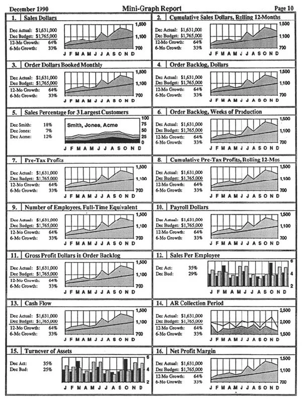
In the high-stakes world of corporate business intelligence, there is an uncomfortable, often unspoken truth that veteran analysts have spent years grappling with: Your meticulously crafted, highly interactive Tableau dashboard is destined to become a static PowerPoint slide.
After six years in the trenches of reporting and analytics—specifically within sales operations, finance, and executive-facing data teams—the reality is clear. Your Vice President of Sales or your Chief Financial Officer is not logging into Tableau Server at 9:00 a.m. to engage in deep-dive filtering before a board meeting. They are not exploring your tooltips or manipulating parameters. Instead, they are downloading your dashboard as a PNG or a PDF, dragging it onto slide 17, and presenting it to the C-suite as a static image.
For many data professionals, this is a painful pill to swallow. We spend hours perfecting hover effects, dynamic actions, and complex calculations. Yet, once the reality of executive behavior is accepted, a new design philosophy emerges. We must move away from the "interactive playground" mindset and toward a "document-first" design approach. Here is how to reconcile the power of Tableau with the limitations of the boardroom.
The Reality of Executive Consumption
Why Interactivity Dies in the Boardroom
The primary function of an executive dashboard is to convey critical information as quickly as possible. When a decision-maker is in a meeting, they do not have the time to load a server-based application, wait for data to refresh, or click through filters.
The "PowerPoint Paradox" is the phenomenon where the utility of a dashboard is inversely proportional to the effort spent on its interactivity. In the boardroom, the most effective tool is the one that fits perfectly into the flow of a presentation. If your dashboard requires a user to click a button to see the "real" answer, assume that answer will never be seen. The hierarchy of information must be visible on the initial load. If it’s hidden, it’s effectively nonexistent.

1. Design for PowerPoint from Day One: The Aspect Ratio Mandate
Establishing a Foundation for Export Success
Device preview matters exponentially more when your final destination is a slide deck. In the early stages of designing an executive-level sales report, many analysts make the fatal error of building in Tableau’s default "Desktop Browser" view. When that dashboard is exported to PowerPoint, it is often crushed, distorted, or truncated.
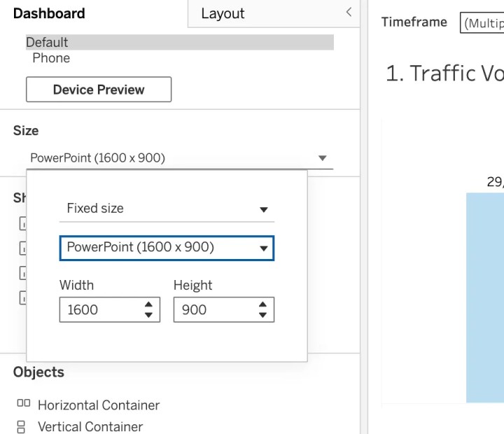
The Fix: Use Tableau’s built-in PowerPoint layout (16:9 aspect ratio) from the very first pixel.
By setting your dashboard size to 16:9 (typically 1280×720 or 1920×1080), you ensure that your design fits perfectly into standard Google Slides or PowerPoint templates without awkward cropping or excessive white space. You must stop designing for the infinite canvas of a web browser and start designing for the constrained, fixed dimensions of a physical slide deck.
Pro Tip: Never assume your export will look like your workspace. Regularly use the "Dashboard > Export as PowerPoint" function throughout the development process. If it doesn’t look perfect in the export, it won’t look professional on the screen.
2. The Great Functionality Trade-off
Building for a "Zero-Interactivity" Environment
Accepting that 80% of your dashboard’s functionality will disappear in a static export is a sobering realization. In a PowerPoint environment, the following features effectively "die":
- Hover-based tooltips: The information is hidden, so if it isn’t labeled on the chart, it’s lost.
- Dynamic filtering: You cannot change the date range or region mid-presentation.
- Parameter-driven charts: Users cannot toggle between views.
The Strategy: Because you cannot rely on interactivity, you must adopt a "multi-dashboard" approach. If your stakeholders need to see pipeline performance across various segments (e.g., regions, business units, product lines), you should build separate, static versions of these views.
While this feels redundant and labor-intensive, it is the only way to ensure your stakeholders see the data they need without requiring a mouse click. Every critical insight must be front-and-center. If an executive has to "click to reveal," that data point is dead on arrival.
3. Structural Integrity: Why Containers are Non-Negotiable
Preventing Layout Drift in Exports
When your dashboard contains multiple visualizations, containers are the only thing keeping your design from collapsing during the export process. Without fixed or tiled containers, floating objects will shift unpredictably. Your perfectly aligned KPI cards may end up overlapping your bar charts, resulting in a cluttered, unreadable mess.
The Container Philosophy:
- Lock it down: Use horizontal and vertical containers to create a rigid structure.
- Density is Key: Unlike a web dashboard, where white space can be elegant, PowerPoint downloads do not tolerate it. Executives expect dense, information-rich slides. Use containers to maximize the utility of every square inch.
- Standardization: Create a template where your header, footer, and KPI boxes are locked in the same containers across every dashboard you build.
Before you build your next project, review the Tableau documentation on container best practices. It will save you hours of "pixel-pushing" and reformatting frustration.

4. Governance and Version Control
A Professional System for Managing Iterations
If you are working in a collaborative environment, the "v1, v2, Final_v2_Updated" naming convention is a recipe for disaster. You need a robust, visual system for managing dashboard versions.
The Governance Framework:
- Color-Coding: Use the color-coding available for dashboard tabs to signify the status of the report (e.g., Green for "Ready for Production," Yellow for "Draft," Red for "Archived").
- Worksheet Naming: Adopt a strict naming convention. "Bookings (1)" is not acceptable. Use descriptive names like "Q4_Bookings_Final" or "Pipeline_Coverage_BarChart."
- Centralized Repository: Maintain a clear, documented path for where the "source of truth" resides so that stakeholders are never looking at a legacy version of a report.
Consistent naming and organized tabs don’t just keep you sane; they ensure that when your VP needs to find the "latest" version, they are not relying on guesswork.
5. The Branding Imperative: Adding Company Logos
Why Professionalism Matters in External Circulation
Your dashboard might be an internal tool today, but it will be in a client presentation tomorrow. When your VP forwards your report externally—often without asking you—the branding on that slide will reflect directly on your professionalism and the company’s brand equity.
Align your dashboard as closely as possible to your organization’s standard slide deck template. Place company logos consistently, use corporate-approved color palettes, and ensure that fonts match the internal brand guidelines. By treating your dashboard as a branded asset, you elevate the perceived value of the data you are presenting.

The Bottom Line: Designing for the Reality of Data
A Shift in Perspective for the Modern Analyst
The moment you accept that your Tableau dashboard will ultimately become a PowerPoint slide, your design process will fundamentally improve. You stop optimizing for the "cool factor" of interactivity and start optimizing for the "utility factor" of a screenshot.
Great analytics isn’t just about technical mastery; it is about understanding the user. Your stakeholders don’t care about the sophisticated parameter actions or the complex LOD expressions you used if they can’t easily paste your findings into their Monday morning slide deck.
Summary Checklist for the Data-Driven Designer:
- Format: Always use a 16:9 aspect ratio.
- Static Readiness: Assume no interactivity exists; design for the printed page.
- Structure: Use containers to prevent layout drift.
- Naming: Maintain rigorous, professional version control.
- Branding: Always include company logos and maintain brand consistency.
Sometimes, being a truly great analyst means accepting that your masterpiece will be copied and pasted into slide 23 of a deck. Design for that reality from the start, and you will find that your data is not just seen—it is understood, utilized, and respected in the highest levels of the organization.
 Lina Irawan
  Nana
Nana  Nila Kartika Wati