
 By Muslim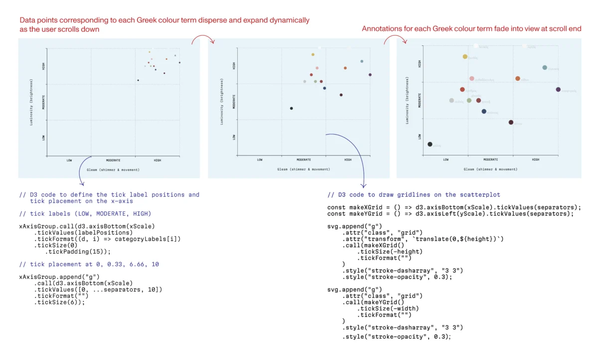
In the quiet, hallowed halls of the San Domenico monastery, the passage of time is measured not just in years, but in the subtle, rhythmic shifts of wood and pigment. In the early 1420s, the Dominican friar and master painter Fra Angelico completed a monumental commission for the high altar: a polyptych that would define the aesthetic trajectory of the Early Renaissance. For centuries, this masterpiece served as the visual focal point for the friars’ daily Divine Office. Yet, behind the serene visage of the Virgin and Child, guarded by angels with wings of prismatic brilliance, lies a hidden history of structural turbulence.
Last year, as this masterwork underwent an exhaustive restoration, it became a mirror for a modern crisis in communication. The work of Roberto Buda, a conservator specializing in wooden panel paintings, reveals a profound truth: whether one is preserving a 600-year-old icon or crafting a digital data dashboard, the surface is only as honest as the foundation beneath it.
The Chronology of Decay: From Masterpiece to Collage
To view the front of the San Domenico Altarpiece is to witness divine order; to view the reverse is to see a chaotic record of human intervention. Over the centuries, as aesthetic tastes shifted, the painting was subjected to the whims of carpenters who recut the original panels to force the work into a standardized rectangle.
The back of the altarpiece is a literal collision of eras. Beechwood “butterfly” inserts, intended to stabilize the wood, were hammered into the panels across the grain. Because wood is a living, breathing material that expands and contracts with atmospheric humidity, these discordant insertions created internal stresses that threatened to buckle the very surface of Fra Angelico’s paint. Poplar, beech, and centuries of disparate climate exposure had left the work in a state of structural jeopardy.
Roberto Buda’s intervention, which spanned nine months, was an act of "digital carpentry" in the physical world. By replacing the rigid, stress-inducing inserts with matched poplar wood aligned parallel to the original grain, and by introducing a chestnut frame equipped with conical springs, Buda allowed the work to "breathe" again. As Buda famously remarked, “It’s a house. If you don’t have a good foundation, it doesn’t hold up. The painting will never look good if the support is not right.”
The Pivot: Neuroscience to Data Narratives
This lesson in structural integrity resonates deeply within the field of data visualization. In 2025, I reached a professional crossroads. Having spent years in academia during a PhD in experimental neuroscience, I had become adept at the "academic sprawl"—designing experiments, building hardware, analyzing complex datasets, and teaching.
However, I found myself drawn to the final stage of the research pipeline: the moment where raw data meets human interpretation. In the academic environment, visualizations are frequently treated as afterthoughts, produced in haste to meet publication deadlines. Tools like Excel or the default settings of Matplotlib offer a "fast-food" approach to graphics, providing pre-formatted charts that prioritize speed over communicative intent.
I sought something more rigorous. I found it in D3.js, an open-source JavaScript library that treats data as raw material. Unlike high-level tools that hand you a bar chart, D3 demands that the designer build every component: the scales, the coordinate systems, the margins, and the specific behavior of every graphical element. It is, effectively, a workshop filled with raw timber and hand saws.
Supporting Data: The Sensory Dimensions of Ancient Greek Color
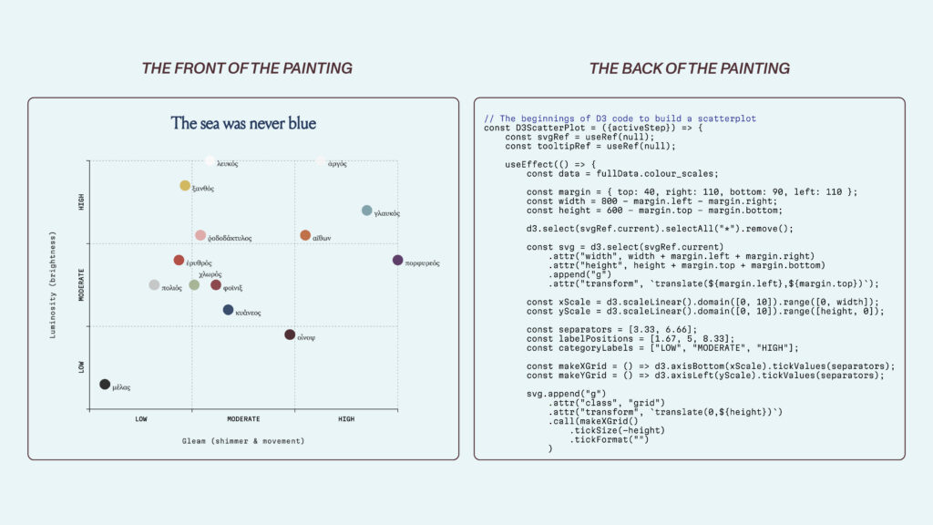
My mentorship with Sam Bloom, facilitated by the Data Visualization Society, provided the laboratory for this transition. We chose to explore the sensory dimensions of color as described in Homer’s Iliad.
Ancient Greek color perception was fundamentally different from our modern, hue-centric taxonomies. To the Homeric mind, color was a unit of information linked to motion, shimmer, and luminosity. It was an experience of "light-play" across textures—a vocabulary rooted in lived perception rather than the arbitrary categorization of light waves.

By building an interactive scatterplot in D3 to visualize these adjectives, I learned that visualization is construction. Every tick mark, every scale domain, and every interaction was a structural decision. The resulting project, The Sea Was Never Blue, serves as a testament to the idea that clarity is not a default state; it is an engineered outcome.
Official Perspectives: The Ethics of the Axis
The importance of this "foundational reasoning" is a sentiment echoed by the field’s most respected voices. Alan Smith, Head of Visual and Data Journalism at the Financial Times, treats a chart like a sentence—a piece of prose that must be parsed with logical intent. Similarly, Alberto Cairo, in his work The Art of Insight, argues that there are no "rules" in data visualization, only rational responses to specific problems.
This philosophy is best demonstrated by the work of Hans Rosling, whose 2006 TED talk remains the gold standard for narrative data design. Rosling did not simply present a static scatterplot; he animated the history of global development, mapping GDP and life expectancy over time. By pairing clear visual structure with emphatic narration, he transformed a dry dataset into a compelling human story.
Yet, this power comes with significant ethical risks. As evidenced by the work of Steven Franconeri at Northwestern University, the manipulation of axes can fundamentally alter the perceived reality of data. A temperature chart anchored at zero degrees Fahrenheit may look "objective," but it can effectively flatten the visual evidence of climate change. Conversely, a chart scaled to the relevant range reveals the urgency of the trend. The infamous, now-removed National Review graphic, which used an misleadingly wide axis to mask global warming, serves as a cautionary tale of what happens when the "scaffolding" of data is built with the intent to deceive.
Implications: The Invisible Craft
The parallels between the restoration of the San Domenico Altarpiece and the design of modern data interfaces are striking. When a reader views a polished interactive graphic, they are seeing the "painted surface." They do not see the scaffolding, the state management, or the careful decisions about what to exclude.

In my own work, I have adopted React as the modern equivalent of Buda’s chestnut frame. React provides the structural framework—a way to think about how the state of a page should change—while D3 handles the mathematical heavy lifting. Together, they form a robust support system for the narrative "paint" of the visualization.
The central implication of this study is that integrity in design is an invisible act. It is the realization that the most vital work—the choice of scale, the alignment of axes, the decision to simplify—occurs before the first pixel is rendered.
When the public looks at the restored San Domenico Altarpiece, they see a miracle of Renaissance art. They do not see the poplar inserts running parallel to the grain, nor do they feel the tension of the conical springs. But those hidden elements are precisely why the art endures. Similarly, in the era of big data, our responsibility as designers is to build houses for information that are not only beautiful but structurally sound. Every line of code, every design constraint, and every ethical choice regarding scale is a poplar insert aligned to the grain. We are not just making charts; we are restoring the public’s ability to see the world as it truly is.
In a world drowning in information, the most radical thing a designer can do is to build a foundation that allows the truth to stand on its own.
 Lina Irawan
  Nana
Nana  Nila Kartika Wati