
 By rifanmuazin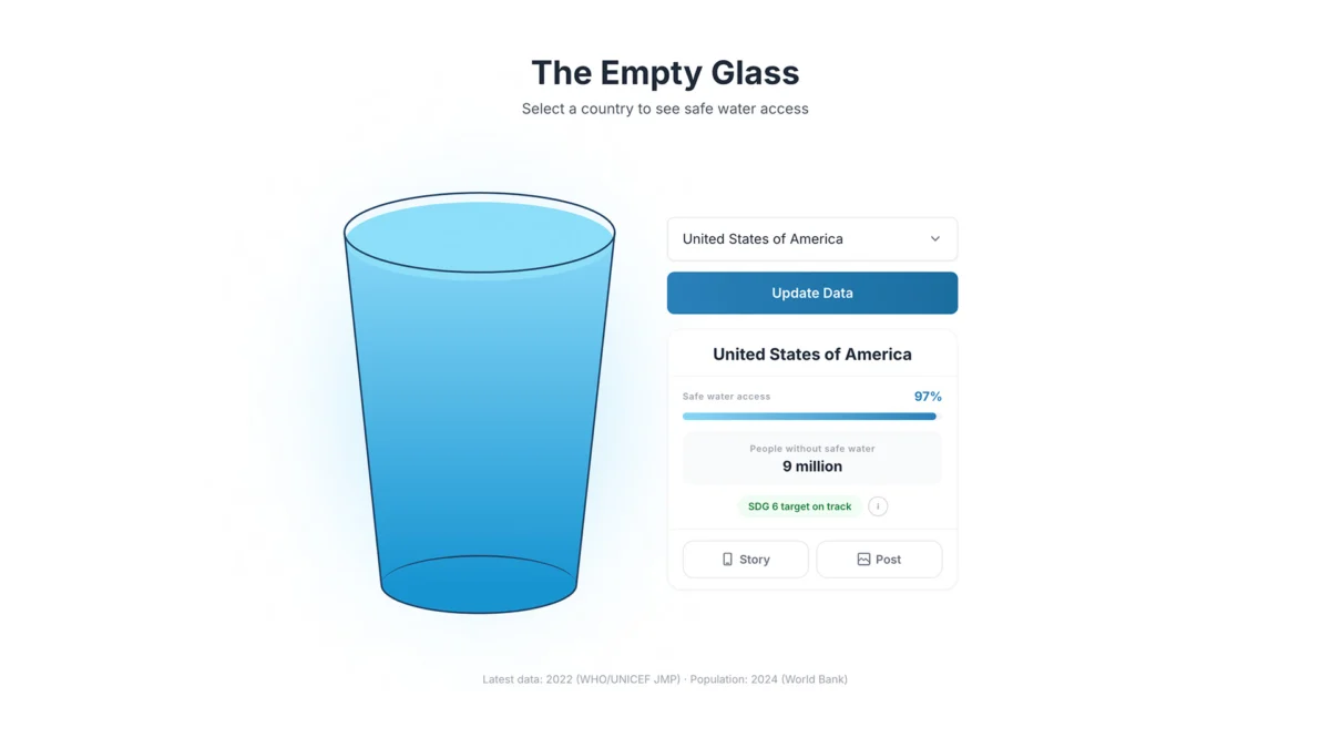
In an era defined by an unrelenting deluge of information, the most sophisticated data visualizations are often the ones that say the least. While global development reports from institutions like the World Health Organization (WHO) and UNICEF provide an exhaustive, granular look at the state of our world, they often fail to bridge the critical gap between intellectual awareness and human empathy.
When a report declares that a nation has "60% access to safe drinking water," the statistic is precise, scientific, and undeniably important. Yet, for the average observer, it is also strangely hollow. It remains a sterile abstraction, a number stripped of the visceral reality of thirst, the physical burden of collection, and the profound inequality of daily life. This disconnect is the impetus behind "The Empty Glass Project," a provocative, metaphor-driven design initiative that challenges the conventional wisdom of data visualization by arguing that, sometimes, the most powerful tool in a designer’s arsenal is not complexity, but radical simplicity.
The Problem: The "Translation Gap" in Global Data
For decades, the standard for visualizing development indicators has been the choropleth map or the multi-layered dashboard. These tools prioritize completeness: they show geographic distribution, historical trends, and statistical outliers across hundreds of variables. They are the gold standard for researchers and policymakers.
However, for the general public, these visualizations suffer from a "translation gap." A map shaded in varying hues of blue may illustrate the density of water access, but it requires the viewer to decode the legend, interpret the spatial scale, and synthesize the data into a personal narrative. Most viewers do not—or cannot—make that leap. When the data requires too much cognitive heavy lifting, the emotional impact is lost.
This is not a failure of the data itself, but a limitation of the medium. We have become so enamored with the accuracy of our charts that we have forgotten the primary purpose of communication: to make the invisible visible and the distant feel immediate.
Chronology of the Project: From Concept to Intuition
The development of "The Empty Glass Project" did not begin with a complex algorithm, but with a fundamental question of design philosophy: What does this data feel like in real life?
Phase 1: Identifying the Universal Symbol
The creator of the project, multidisciplinary designer Inumimo Idowu, sought a symbol that transcended cultural, linguistic, and socioeconomic barriers. He arrived at the glass of water. It is perhaps the most universal object in human existence—a vessel for the very essence of survival. By shifting the focus from a percentage on a spreadsheet to the literal fullness of a glass, the project creates an immediate, intuitive reference point that requires zero training to understand.
Phase 2: The Iterative Design Process
In early 2026, Idowu began prototyping the interface. The objective was to strip away the "noise" of modern dashboards. The design eliminated axes, legends, and complex color-coding. The interaction model was kept intentionally sparse: a user selects a country, and the glass fills to reflect the current, data-backed reality of that nation’s safe water access.
Phase 3: Public Engagement
The project launched as an interactive digital experience, designed to prioritize "discovery over display." Unlike a static infographic, the project encourages the user to move from curiosity to comparison. By toggling between nations, users see the disparity in real-time, sparking questions that static charts rarely evoke: Why is this glass nearly empty? What is the human cost of this specific percentage?
Supporting Data: Grounding Metaphor in Reality
While "The Empty Glass Project" eschews the visual clutter of traditional dashboards, it remains deeply rooted in rigorous, verified data. The visualizations utilize the latest datasets provided by the WHO and UNICEF, ensuring that the "fill level" of every glass is mathematically accurate.

The Anatomy of Inequality
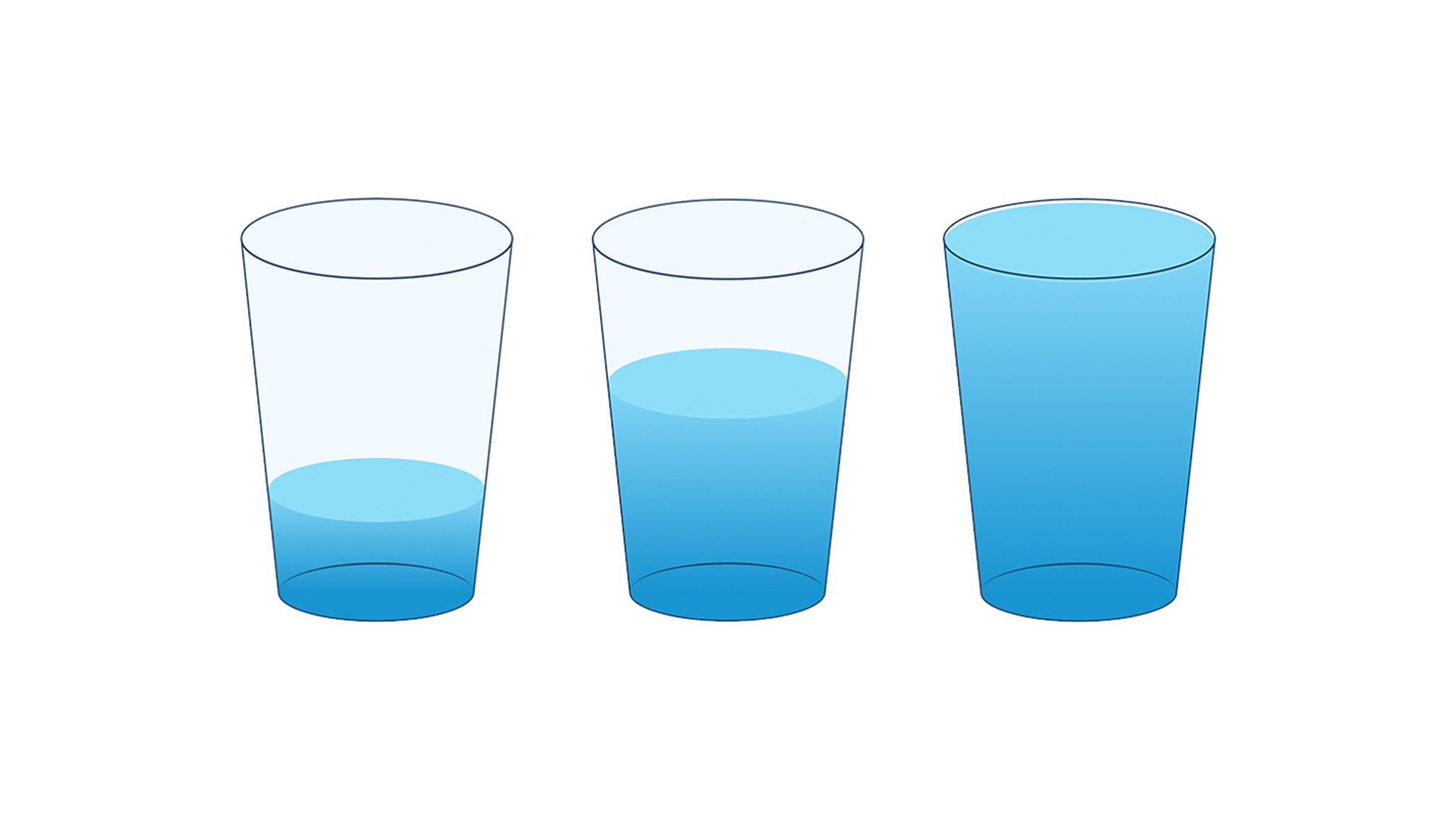
The data highlights a stark, global dichotomy. In high-income nations, the digital glass appears almost full, reflecting near-universal access to treated, piped water. In contrast, the glass for regions suffering from chronic scarcity is rendered nearly empty.
The power of the visualization lies in its ability to highlight the inequality of access. When a user compares a full glass (representing a 99% access rate) to a nearly empty one (representing a 30% access rate), the disparity is no longer just a mathematical difference—it is a visual shock. This method of "emotional scaling" allows users to perceive the scale of the global water crisis without having to mentally process abstract coefficients of development.
The Philosophy of "Emotional Clarity"
The project has sparked a broader conversation within the design and data science communities regarding the trade-off between "accuracy" and "clarity."
The Tension of Minimalism
Traditional data design often falls into the trap of "maximalism"—the belief that more context, more labels, and more variables equate to a more honest representation of the truth. However, Idowu argues that this approach can inadvertently alienate the audience.
By removing the crutches of traditional charting, "The Empty Glass Project" forces the user to confront the subject matter directly. The absence of a complex legend is a design choice that invites the viewer to look at the water rather than the data. It is a shift from designing for the intellect to designing for the intuition.

Beyond Accuracy: Why Empathy Matters
"The Empty Glass Project" serves as a reminder that data visualization is not merely an analytical tool; it is a rhetorical one. If the ultimate goal of disseminating development data is to influence policy, increase awareness, or drive humanitarian aid, then the data must be memorable. A number can be forgotten in seconds, but a visual representation of an empty glass—a symbol of a fundamental human need—is far harder to dismiss.
Official Responses and Industry Implications
The project has been met with critical acclaim from the design community, particularly for its contribution to the "Data for Good" movement. Experts in human-computer interaction (HCI) have praised the project for its "frictionless communication," noting that it sets a new benchmark for how we present humanitarian crises in a digital-first world.
However, some data traditionalists raise concerns about the risks of oversimplification. They argue that by stripping away context, the project might obscure the systemic reasons why access is low—such as political instability, infrastructure decay, or climate change.
In response, proponents of the minimalist approach argue that the project is not intended to replace scholarly research, but to act as a "gateway" to it. By capturing the user’s attention through emotional resonance, the visualization serves as the first step in a journey of inquiry. It makes the reader care enough to seek out the complex, nuanced reports that follow.
Implications: The Future of Data Storytelling
"The Empty Glass Project" marks a significant evolution in how we conceive of information design. As we move further into an age of data saturation, the ability to synthesize complexity into relatable, human-centric narratives will become a defining skill for the next generation of designers.

The Shift Toward Human-Centric Design
We are witnessing a paradigm shift: from "How much data can we show?" to "What is the most effective way to make this data felt?" This transition is vital. If we want global citizens to remain engaged with the critical challenges of the 21st century—be it climate change, resource scarcity, or public health—we must stop speaking in the language of spreadsheets and start speaking in the language of human experience.
A New Standard for Advocacy
The implications for NGOs and international organizations are profound. If a minimalist, metaphor-driven approach can increase engagement and retention of information, these organizations must rethink their digital strategy. By embracing simplicity, they can transform their archives of dry statistics into compelling, advocacy-driving narratives that reach audiences who would otherwise never click on a standard development report.
Ultimately, "The Empty Glass Project" proves that the most sophisticated way to communicate a complex, multifaceted global crisis is to reduce it to its most elemental form. It reminds us that behind every data point, there is a person, a life, and a glass that needs to be filled. By making the data feel simple, we make the mission of global development feel urgent, tangible, and achievable. The future of data is not in the density of our pixels, but in the clarity of our connection to the human condition.
 Lina Irawan
  Nana
Nana  Nila Kartika Wati