
 By Sagoh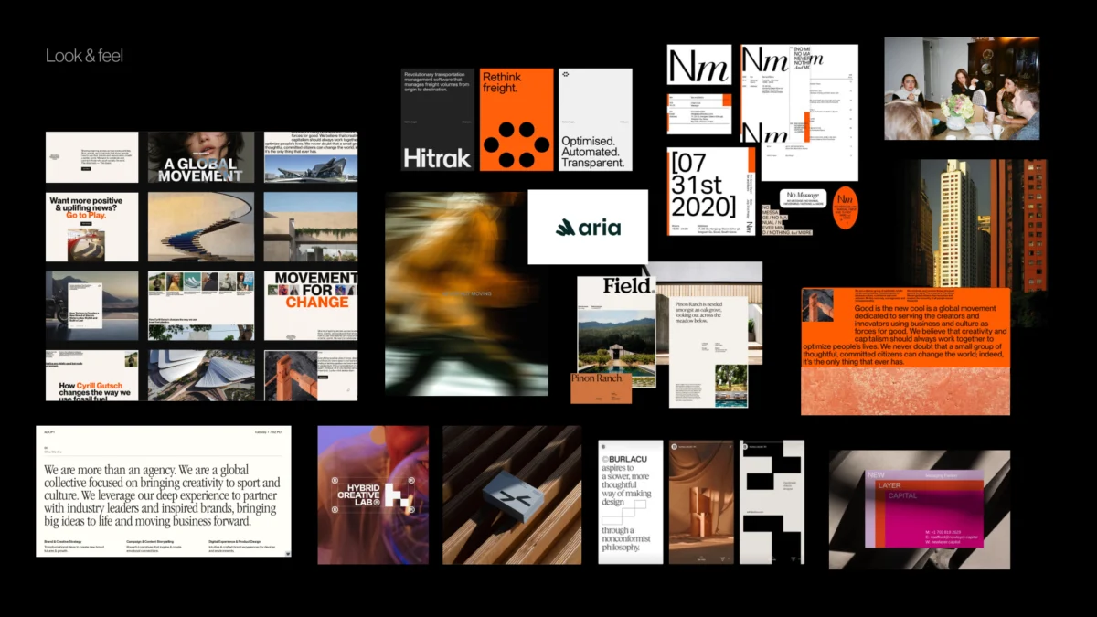
In the modern design industry, a pervasive myth dictates that the most compelling visual identities are born directly on the canvas of a design tool like Figma or Illustrator. Teams kick off branding initiatives with high-energy workshops, gather a list of flattering adjectives, and immediately task designers with translating those amorphous concepts into polished logos, color palettes, and typography systems.
Yet, when branding projects inevitably stall or fail, the post-mortem rarely points to poor execution at the vector stage. Instead, the breakdown occurs much earlier—during the strategic phase. When foundational descriptors like “modern,” “trustworthy,” “premium,” “friendly,” and “disruptive” are left undefined, a dangerous chasm opens between what a company intends to communicate and what a designer is expected to produce.
To bridge this critical gap, leading branding practitioners advocate for an intensive, highly structured stage that occurs after the kickoff meeting but long before the first concept is drawn: the “pre-concept” phase.
The Core Problem: Vague Language vs. Concrete Design
At the genesis of any visual identity project, designers are inundated with inputs: creative briefs, stakeholder interviews, competitor mood boards, and sweeping lists of brand attributes. They are then implicitly told to make the brand “feel right.” However, judging whether a design is “right” is nearly impossible when a team has failed to reach a rigorous, shared consensus on what the brand is actually supposed to communicate.
Consider a recent engagement with a health-tech company. During initial discovery sessions, the client’s leadership team unanimously agreed that they wanted their brand to look “modern, trustworthy, and disruptive.”
At first glance, “disruptive” suggested a mandate for bold, unconventional, and perhaps rebellious visual expressions. However, as qualitative discussions deepened, a critical nuance emerged. The startup’s primary clientele consisted of large, highly conservative government medical institutions. In that specific ecosystem, a brand that felt too visually loud, experimental, or rebellious would instantly destroy credibility.

For this specific client, their version of “disruptive” had to look remarkably traditional. The problem was never that the client used the wrong vocabulary; rather, the language was far too broad to serve as a reliable compass for design decisions.
Before a designer can transform strategy into a visual concept, abstract words must be interrogated:
- What kind of modern?
- Trustworthy in what specific context?
- Disruptive compared to whom?
- And how far can the brand stray from category expectations before alienating its core audience?
Addressing these questions is the sole mandate of the pre-concept phase—a strategic bridge connecting what a brand needs to mean with how it must ultimately look.

Chronology of the Pre-Concept Framework
Moving a brand from abstract strategic intent to concrete visual direction requires a methodical, step-by-step chronology. Rather than treating discovery as a one-off meeting, successful branding requires a structured progression that moves from outer market contexts inward to internal brand character.
[Strategy Kickoff]
       │
       ▼
[Stage 1: Researching Brand Context & Perception]
       │
       ▼
[Stage 2: Facilitating Stakeholder Alignment Exercises]
       │    ├── Competitor Perception Mapping
       │    └── Visual Brand Driver (Metaphor & Association)
       │
       ▼
[Stage 3: Building the Visual Foundation]
       ├── Look and Feel (Perception Boards)
       ├── Design Code (Visual Principles)
       └── Brand Asset Direction (Typography, Color, Style)
       │
       ▼
[First Concept Generation & Evaluation]
Stage 1: Researching the Brand Context
A standard brand workshop covers baseline discovery: business models, long-term goals, product specifications, competitive landscapes, and target demographics. However, designers must dig deeper into perception.
As legendary brand architect Marty Neumeier famously noted in The Brand Gap, "A brand is a person’s gut feeling about a product, service, or company." Because a brand ultimately lives within the subjective consciousness of the audience, discovery sessions must actively clarify what perception the internal team is trying to engineer. This involves challenging surface-level assumptions. When three stakeholders nod in agreement that a brand should be "premium," one may secretly envision an editorial, minimalist Scandinavian aesthetic, while another pictures exclusive luxury, and a third imagines clean, quiet corporate efficiency. Uncovering these discrepancies early prevents catastrophic misalignments downstream.

Stage 2: Facilitating Stakeholder Alignment Exercises
To drag abstract strategic goals out of the realm of theory and into tangible reality, designers rely on tactile, participatory exercises. Passive stakeholders—those who simply review slide decks—often nod along without confronting their own hidden biases. Active participants, however, must make definitive choices that expose their internal frameworks.
Exercise A: Competitor Perception Mapping
Before entering the workshop, design teams curate visual artifacts from competitors—website screenshots, mobile interfaces, social media collateral, and marketing touchpoints. During the session, stakeholders plot these entities across a two-axis grid.
The axes are tailored to the specific tensions the brand must navigate. For instance:

- A health-tech firm might map competitors on axes of Traditional vs. Progressive and Corporate vs. Human.
- A fintech platform aiming to stand out without sacrificing security might utilize axes of Understated vs. Bold and Accessible vs. Exclusive.
The true value of this exercise rarely lies in the final map itself, but in the healthy debates it sparks. When one stakeholder views a key competitor as "progressive" while another dismisses them as "generic," the team is forced to confront ambiguous definitions of trust, innovation, and market differentiation.
Exercise B: The Visual Brand Driver
To isolate brand perception from individual aesthetic preferences, teams employ the Visual Brand Driver exercise. Stakeholders select images representing the company across completely unrelated categories: transport types, typefaces, physical activities, pieces of furniture, moods, objects, animals, architecture, and beverages.
Crucially, participants are instructed to choose images that represent the company, not their personal tastes. For example: If the enterprise were a mode of transport, is it a quiet electric vehicle, a high-speed freight train, or a bicycle? If it were a piece of furniture, is it a heavy boardroom table or a soft lounge chair?

Following image selection, participants supply four to five descriptive adjectives explaining their choices. This exercise forces stakeholders to think through metaphor and association, exposing contradictions between how different team members perceive the core DNA of the organization.
Supporting Data and Industry Insights
Industry frameworks consistently reinforce the necessity of aligning abstract strategy with concrete visual parameters before execution. According to design research highlighted in frameworks such as GV’s Three-Hour Brand Sprint, abstract concepts like "our company culture" or "market positioning" remain useless to a designer until they are anchored to physical references.
Furthermore, case studies across digital product design indicate that projects utilizing a structured pre-concept phase experience:

- A 40% reduction in revision rounds during initial concept presentations.
- Significantly higher stakeholder buy-in, as clients see their direct input reflected in the underlying visual principles rather than arbitrary artistic choices.
- Elimination of subjective feedback loops, replacing unproductive statements like "I just don’t like the blue" with objective evaluations such as "This shade of blue leans too corporate and fails to signal our intended human-centric accessibility."
Official Perspectives from Branding Experts
Industry leaders emphasize that the transition from strategy to design must be handled as a deliberate, layered architecture. Rather than dumping an entire visual identity on a client during a high-stakes reveal, studios break the pre-concept phase down into three distinct, manageable tiers of alignment:
- Look and Feel (Perception Boards): Curated collections of third-party visual references used to discuss emotional tone, category tension, and character attributes. Clients react to broad emotional frequencies before evaluating proprietary assets.
- Design Code (Visual Principles): The translation of strategic pillars into visual guidelines. For instance, translating a strategic pillar like "Personalized support for your unique journey" into potential design codes such as organic shapes, handwritten lines, or asymmetrical compositions.
- Brand Asset Direction: Early explorations of foundational building blocks—typography weights, color theory territories, photographic styles, and illustration frameworks.
By presenting these layers sequentially, design teams establish strict, healthy boundaries without stifling subsequent creative exploration.
Implications for Future Brand Development
The growing emphasis on the pre-concept phase signals a maturation of the brand identity design sector. As digital products become increasingly complex and market competition intensifies, companies can no longer afford the financial and temporal costs of trial-and-error branding.

By formalizing the pre-concept stage, agencies and internal product teams achieve several vital outcomes:
- Demystification of Creativity: Design is reframed from a mysterious, black-box artistic endeavor into a collaborative, problem-solving discipline.
- Sharper Risk Assessment: A robust pre-concept phase explicitly maps out what a brand should not be—identifying visual territories that are too cold, too loud, too generic, or too far removed from customer expectations.
- Elevated Discourse: Client-designer relationships improve dramatically. When initial concepts are unveiled, conversations pivot away from personal whims and toward rigorous evaluations: Does this specific visual direction accurately express the brand we collectively agreed to build?
Ultimately, the first concept should never feel like a blind guess or a theatrical surprise. It should represent the natural, inevitable next step in a journey the entire team has navigated together from day one.
 Raul Delapena Setiawan
  rifanmuazin
  Azzam Bilal Chamdy