
 By Azzam Bilal Chamdy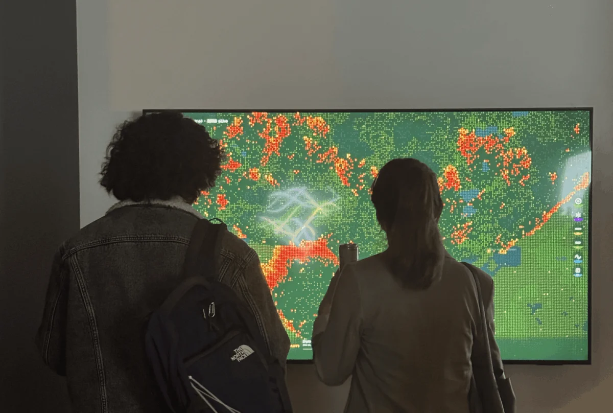
In the quiet, climate-controlled offices of San Francisco’s energy sector, the work of data design is often a clinical, detached affair. For Pranavi Aourpally, a creative technologist and data designer, the daily routine involves translating soaring demand forecasts and complex grid expansion curves into actionable insights. Yet, she quickly encountered a pervasive professional frustration: the "empathy gap."
In the high-stakes world of energy infrastructure, data frequently fails to bridge the divide between a spreadsheet’s cold statistics and the visceral reality of the physical world. A number in a report remains a number; a chart in a slide deck is often nodded at and promptly forgotten. This disconnect is particularly glaring when discussing the intersection of artificial intelligence (AI) data centers and the escalating threat of wildfires. As AI consumes power at a rate rivaling entire nations, the physical grid must expand deeper into terrain that grows drier with every passing season.
Aourpally’s project, Wired to Burn, is an attempt to close this gap. By moving away from static charts toward an emergent, interactive simulation, she seeks to make the invisible costs of our digital consumption tangible.
The Chronology: From Academic Theory to Real-World Impact
Aourpally’s journey began in the rigorous halls of Northeastern University, where she studied Information Design and Data Visualization. Her academic training emphasized the concept of data as a "design material"—something with physical texture, weight, and inherent meaning. However, moving from academic theory to professional application proved challenging.
The turning point occurred when Aourpally joined the Data Visualization Society (DVS) mentorship program. Seeking a way to articulate the connection between energy demand and wildfire risk, she was paired with Divya Meghnani, Head of Product at Databricks.
"My mentor didn’t just support the technical build," Aourpally explains. "He pushed me to move beyond the what of the data and into the why of the experience."
Under Meghnani’s guidance, the project transitioned from a theoretical concept to a functional, generative simulation. Drawing inspiration from Daniel Shiffman’s The Nature of Code and the "Data Humanism" movement championed by Giorgia Lupi, Aourpally spent months iterating on the mechanics of Wired to Burn. The project culminated in an exhibition at the TIAT (Technology, Innovation, and Art Technology) showcase in San Francisco, where it finally reached its target audience.
Supporting Data: The Energy-Climate Feedback Loop
The urgency behind Aourpally’s work is grounded in undeniable, if often ignored, data. The rapid expansion of AI and high-performance computing has created a surge in energy demand. Data centers—the "brains" of the modern digital economy—require immense amounts of electricity for processing and cooling.
This demand necessitates the expansion of electrical grids, often through remote, high-risk wildland areas. Simultaneously, anthropogenic climate change has lengthened "burn windows"—the periods during which environmental conditions are optimal for wildfires—and increased the frequency of extreme weather events.
These factors are not independent variables; they are part of a closed-loop system.
- Grid Expansion: As energy providers struggle to meet the power requirements of AI, infrastructure is pushed further into the Wildland-Urban Interface (WUI).
- Climate Sensitivity: Rising temperatures and erratic precipitation patterns increase fuel aridity.
- The Spark: The interaction between aging or expanding infrastructure and dry vegetation creates an ever-present risk of ignition.
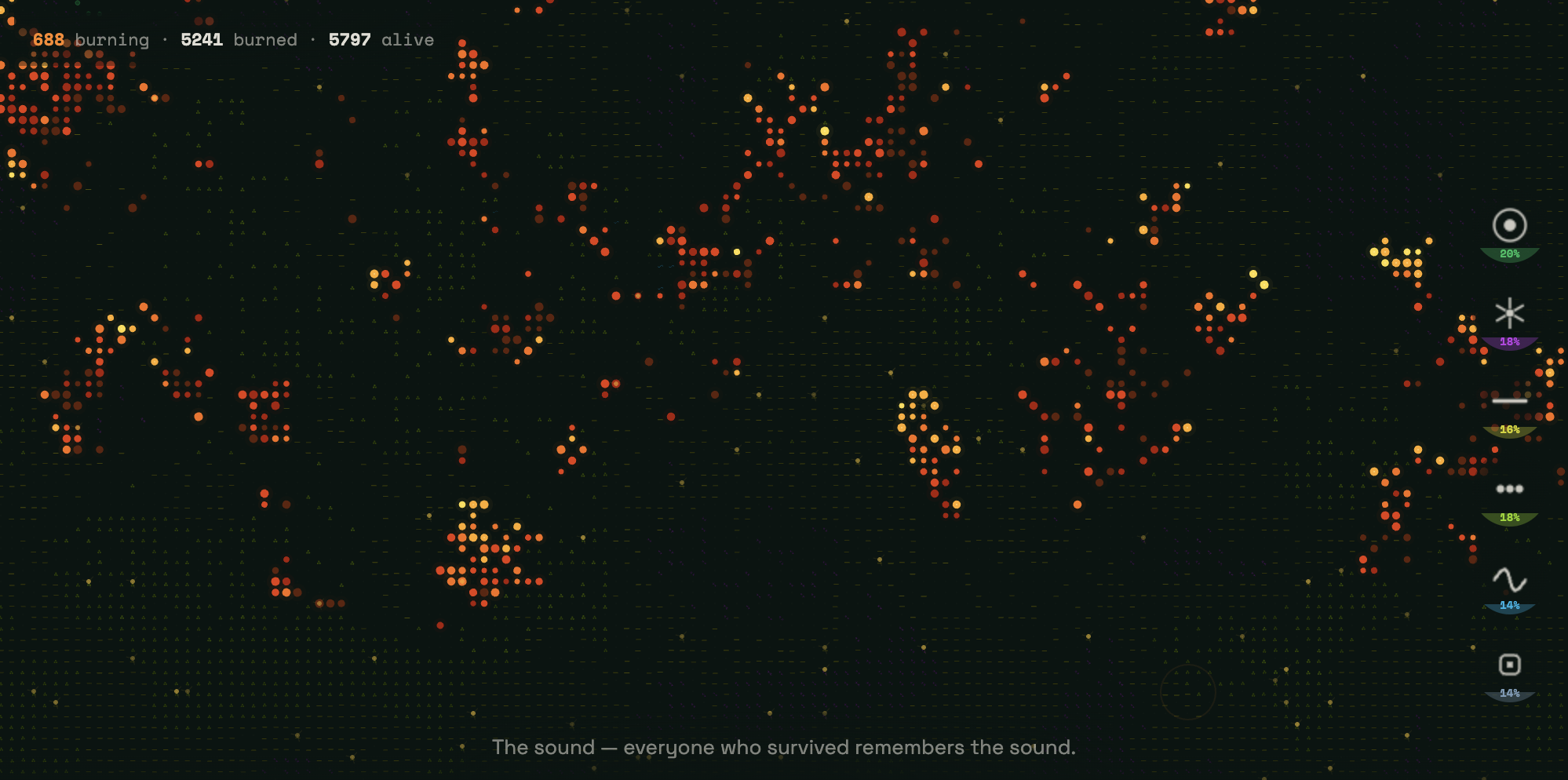
Aourpally’s simulation, Wired to Burn, utilizes these variables as its foundation. Built with p5.js, the simulation operates on a grid of over 9,000 cells. Each cell behaves according to cellular automata principles, where the state of the land—ranging from dry grassland to dense timber—reacts to environmental settings and the user’s "spark."
The Simulation: A Human-Centric Design Approach
Wired to Burn is designed to provoke reflection. The interface presents a near-black canvas where six terrain types are represented by vibrant, neon-coded symbols:

- Emerald green targets: Dense forest.
- Violet starbursts: Shrubland.
- Acid yellow dashes: Agricultural land.
- Lime green dots: Grassland.
- Cyan sine waves: Wetland.
- Slate blue squares: Developed, hardened land.
The user acts as the catalyst. By choosing the terrain and setting the environmental conditions, the user becomes the agent of the fire. Once the cursor clicks, the "math" takes over, simulating the spread of fire through the grid based on fuel density and dryness.
Crucially, the simulation avoids the common pitfall of turning destruction into aesthetic spectacle. As the fire moves across the screen, it leaves behind "ash." In keeping with Lupi’s philosophy of Data Humanism, this ash is not merely a dark pixel; it is a narrative vessel. Text emerges within the scorched areas, detailing the hidden, real-world infrastructure costs of our digital behaviors. This transformation of abstract data into a narrative sequence forces the viewer to confront the consequences of their digital footprint.
Official Responses and Public Reaction
The reaction at the TIAT exhibition served as the ultimate validation of Aourpally’s approach. Observers, initially drawn by the aesthetic of the generative fire, were consistently observed slowing down as the text appeared in the wake of the flames.
"One of the most powerful moments was seeing people go back and read the narration in the ash zones multiple times," Aourpally notes. "It proved that when we give data a human pulse, people stop scrolling and start reflecting."
By forcing the audience to pause, the project successfully bridges the empathy gap. The feedback from the exhibition suggests that while traditional data visualizations (bar charts, line graphs) are effective for professional dissemination, they are insufficient for public engagement on emotive, complex topics like climate risk. The interactive, narrative-driven nature of Wired to Burn provides a "cognitive hook" that static data lacks.
Implications: The Future of Data Visualization
As the data design community looks toward the upcoming Outlier Conference, the theme of "The Final Draft" has become a central point of discussion. For Aourpally, this theme represents the realization that no data project is ever truly complete.

The Evolving Nature of Design
Data visualization is an iterative process. As climate conditions fluctuate and energy demands evolve, the models underpinning simulations must also be updated. The "Final Draft" is not a static endpoint, but a milestone in a continuous process of learning and refinement.
The Responsibility of the Designer
Aourpally’s work carries a profound lesson for all data professionals: our responsibility does not end at the visualization of the number. It extends to the reception of that information. In an era of information overload, the role of the designer is to ensure that complex systems are presented with the humility and clarity required to make the stakes felt by the end user.
A Call to Action for Tech
The implication for the tech industry is clear: if the industry is to continue expanding its digital footprint, it must be transparent about the physical risks that accompany such growth. Projects like Wired to Burn demonstrate that the public is not indifferent to these risks; they simply require a medium that translates the language of the grid into the language of the human experience.
In conclusion, the work of Pranavi Aourpally highlights a shift in the field of data design—a move away from purely functional, technical outputs toward a more evocative, human-centered approach. As the climate changes and our energy needs accelerate, the ability to make the invisible consequences of our digital lives visible—and felt—will be one of the most vital skills in the modern designer’s toolkit. The terrain will always regenerate, the fire will always start again, and the data will always demand to be understood. It is our responsibility to ensure that the message is not lost in the smoke.
 Lina Irawan
  Nana
Nana  Nila Kartika Wati