
 By Azzam Bilal Chamdy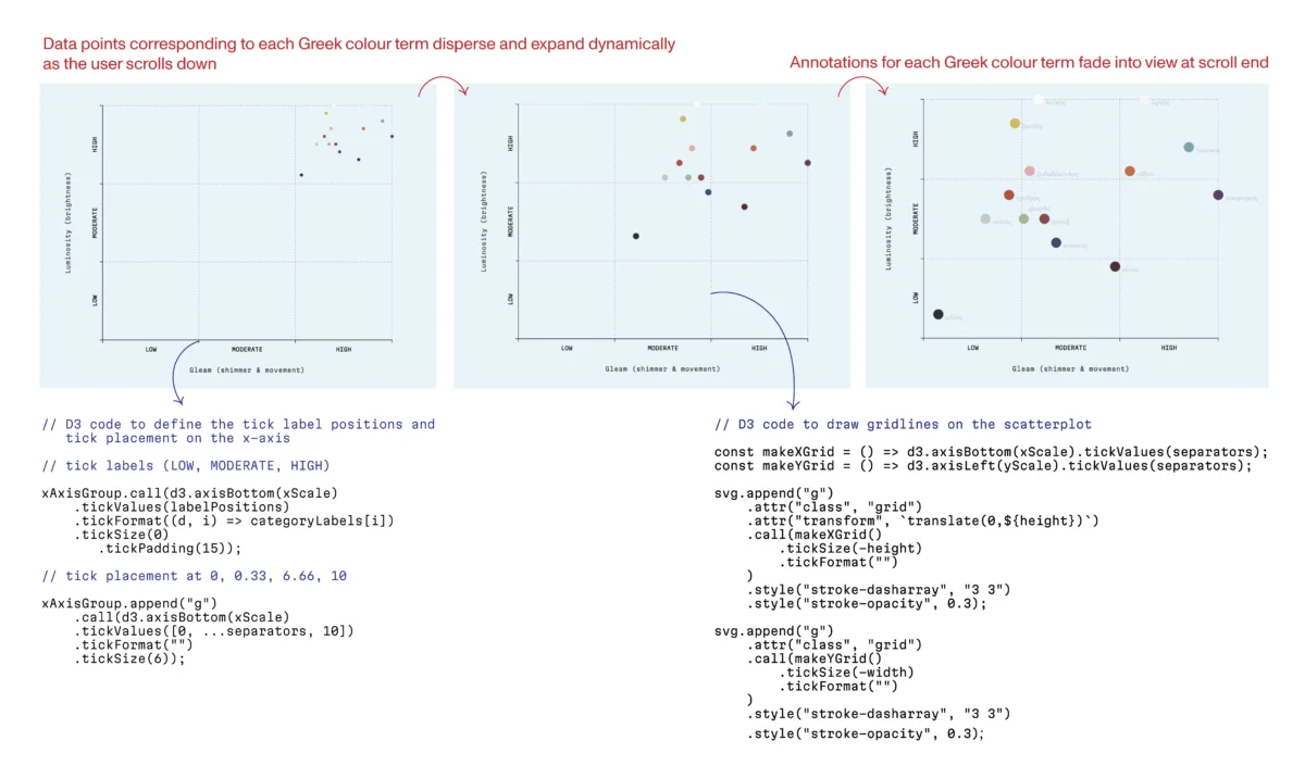
In the early 1420s, the Dominican friar and master painter Fra Angelico completed a commission that would define the aesthetic of the Early Renaissance: the San Domenico Altarpiece. Designed for the high altar of the newly constructed monastery at San Domenico, the polyptych was more than a devotional object; it was a feat of structural and artistic engineering. For centuries, the friars sang their hymns before this radiant image, its angels’ wings shimmering in a prismatic palette that remains a hallmark of Angelico’s genius. Yet, beneath the surface of the Virgin and Child, the altarpiece tells a darker, more tumultuous story of physical decay and misguided intervention.
Last year, the masterpiece was removed from its home to undergo a rigorous restoration process, culminating in a major exhibition across Florence. This restoration revealed that to look at the back of the high altarpiece is to confront an intricate, discordant collage of wood from various centuries. It is a physical ledger of how aesthetic tastes—and preservation attempts—have shifted over time. In the seventeenth century, carpenters, seeking to impose a rigid rectangular symmetry onto the work, recut the original panels and inserted beechwood “butterflies” that forced the poplar wood into an unnatural alignment. These inserts, running against the grain, created a tension that threatened to tear the painting apart.
The story of the San Domenico Altarpiece serves as a profound metaphor for the discipline of data visualization. As I transitioned from a decade of experimental neuroscience—a field defined by rapid, often hurried data processing—to the intentional craft of visual storytelling, I found that the lessons learned in the conservation lab were identical to those required in the data studio. Whether we are preserving a Renaissance masterpiece or rendering a complex dataset, we are essentially building "houses" for information. If the foundation is weak, the narrative will eventually crack.
The Anatomy of a Masterpiece: A Chronology of Conservation
The degradation of the San Domenico Altarpiece was not an act of malice, but of misunderstanding. Throughout the seventeenth century, the prevailing desire for uniform, rectangular art led to the violent restructuring of the original polyptych. Carpenters joined poplar wood—which breathes and expands with humidity—to beechwood, using crossbeams that effectively locked the materials in a state of permanent, structural combat. As humidity levels fluctuated over centuries, these species moved in discordance, placing immense stress on the delicate paint layer.
In 2025, Roberto Buda, a conservator specializing in wooden panel paintings, embarked on a nine-month mission to stabilize the work. The process was one of "digital carpentry" in the physical world. Buda’s team painstakingly removed the invasive crossbeams and butterfly inserts. They replaced them with matched, seasoned poplar infills, carefully aligned to the natural grain of the original wood. Most crucially, they installed a new frame equipped with conical springs, a mechanical solution that allows the wood to expand and contract naturally—to "breathe"—without compromising the integrity of the paint.
"It’s a house," Buda remarked to the Financial Times during the restoration. "If you don’t have a good foundation, it doesn’t hold up. The painting will never look good if the support is not right."
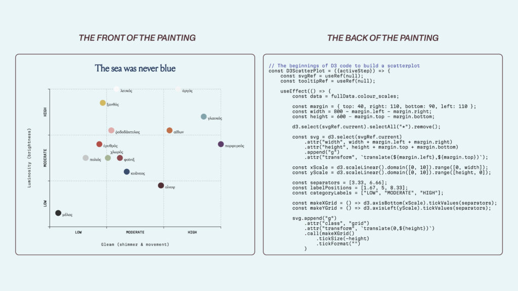
This philosophy resonates deeply with the modern data practitioner. As I sat at my laptop, placing an axis in the center of a blank digital canvas, I realized that the "scaffolding" of a visualization—the choices regarding scale, domain, and geometry—are the hidden foundations that allow a narrative to stand.
From Neuroscience to Data Narrative: A Career Transition
My transition in 2025 was a deliberate shift from the breadth of academia to the depth of design. During my PhD in experimental neuroscience at University College London, the workflow was relentless. I was simultaneously a hardware engineer, a software developer, an experimental designer, and a data analyst. In academia, breadth is the currency of survival; one must do everything at once to keep the pipeline moving.
However, I found myself most engaged at the very end of the workflow: the moment of interpretation. When you sit with a raw dataset, you are essentially looking at a pile of timber. I grew frustrated with the "haste" of standard academic visualization. Whether it was the default plt.bar() call in Matplotlib or the automated aesthetics of Microsoft Excel, I felt a lack of agency. These tools gave me a finished house, but I wanted to understand the framing.
This desire for technical freedom led me to D3.js (Data-Driven Documents), a low-level JavaScript library. Unlike high-level tools that hand you a pre-packaged chart, D3 is a workshop. To represent data in D3, you must manually calculate scales, define coordinate systems, and bind data to graphical elements. You must decide exactly where an axis sits, how much white space allows a margin to "breathe," and how a data point behaves when the input shifts. Nothing appears unless you build it. It is a process of construction, not just output.
The Sensory Dimensions of Data: A Case Study
To test this approach, I joined the Data Visualization Society’s mentorship program under the guidance of Sam Bloom. We spent ten weeks exploring the "first principles" of visualization by analyzing Ancient Greek color perception—specifically, the major color adjectives used by Homer in the Iliad.
Ancient Greek color vocabulary was not rooted in modern hue-based categories; it was a sensory experience inseparable from motion, shimmer, and luminosity. The Greeks prioritized the play of light across surfaces and the social standing implied by a specific sheen. By building an interactive scatterplot in D3, I sought to encode these "sensory dimensions" into the visualization.

Every line of code served as structural work. When I wrote the functions to position tick marks along an axis, I wasn’t just drawing lines; I was defining the logic of the narrative. The resulting project, The Sea Was Never Blue, illustrates that when a designer understands the structural requirements of their data, they can translate abstract concepts into intuitive visual experiences.
Official Responses and Theoretical Frameworks
The necessity of "intentional design" is a growing consensus among leaders in the field. Alan Smith, the Financial Times’ Head of Visual and Data Journalism, has long championed the idea that a chart should be as readable as a sentence. The FT’s rigorous style guides—which dictate everything from the weight of an axis line to specific hex codes—act as a visual grammar. This is not mere vanity; it is about cognitive efficiency. By reducing the visual noise, the journalist allows the data to speak.
Similarly, Alberto Cairo, in his seminal work The Art of Insight, argues that the most important part of a visualization is the "reasoning" that occurs before the first pixel is placed. There are no rigid rules in data visualization, only rational responses to the data and the audience. Every design choice must be defensible.
This reasoning is evident in the work of the late Hans Rosling. His 2006 TED talk is a masterclass in narrative structure. By using an animated scatterplot to map life expectancy against GDP over time, Rosling didn’t just present data; he conducted a symphony. He understood that by pairing visual motion with clear, emphatic narration, he could guide the audience through complex global health trends that would otherwise be lost in a static table.
Implications: The Integrity of Design
The implications of this "structural approach" are vital, particularly in an era of climate anxiety and misinformation. Consider the ongoing debate regarding y-axis scaling in climate data. A common convention suggests that a y-axis should always start at zero to prevent distortion. However, as researcher Steven Franconeri has noted, this rule can sometimes obscure vital variation. If a temperature trend is subtle, anchoring the chart at zero degrees Fahrenheit may flatten the change to the point of invisibility. Conversely, scaling the axis to the relevant range makes the trend legible.
When we fail to consider the structural integrity of our charts, we risk more than just poor aesthetics; we risk the truth. A chart that appears "simple" but lacks a defensible foundation is like a painting with improperly aligned wood—it will inevitably warp under the pressure of scrutiny.

In modern web development, the library React acts as the chestnut frame in Buda’s restoration. It manages the state and lifecycle of the application, while D3 handles the mathematical precision. Together, they allow for a "living" visualization that can respond to user interaction while maintaining its structural coherence.
Conclusion: Building Houses for Data
The most profound work of a data visualization designer is often invisible. When a reader encounters a clean, responsive scatterplot, they see only the surface—the "Virgin and Child." They do not see the hours spent refining the scales, the deliberate decisions about what not to encode, or the logic underpinning the interactivity.
When we design with integrity, we are not merely creating graphics; we are building foundations. We are ensuring that the story we wish to tell can stand on its own, resilient against the passage of time and the scrutiny of the audience. Every axis, every scale, and every line of code is a poplar insert, aligned precisely to the grain of the truth. As we move further into a world saturated with information, our responsibility is to ensure that the houses we build for our data are not only beautiful but structurally sound.
 Lina Irawan
  Nana
Nana  Nila Kartika Wati