
 By Ammar Sabilarrohman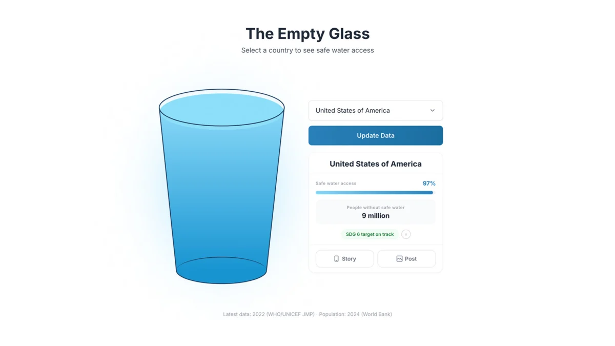
In the modern era of "Big Data," we are drowning in information. Every day, global health organizations like the World Health Organization (WHO) and UNICEF release vast, meticulous datasets detailing the state of the world. Yet, despite the precision of these metrics, a profound disconnect remains. When we read that a nation has "60% access to safe drinking water," we process a statistic, but we rarely grasp a reality. The human brain is not wired to experience the weight of percentages; it is wired to understand the visceral, the tactile, and the immediate.
"The Empty Glass Project," a striking new endeavor by Canadian-based designer and creative strategist Inumimo Idowu, seeks to bridge this chasm. By stripping away the complex architectural scaffolding of traditional data visualization—the legends, the axes, the convoluted choropleth maps—Idowu has created a medium that favors emotional intuition over raw calculation. The project poses a fundamental question: What happens when we prioritize the "feeling" of data over its mere accuracy?
The Problem with Precision: Why Charts Fail to Connect
For decades, the standard for data visualization has been objectivity. We demand scatter plots, heat maps, and multi-layered dashboards that capture every nuance of a dataset. While this is essential for academic research and policy formulation, it often creates a barrier for the average viewer.
When a reader encounters a map showing varying shades of blue representing water access, they are forced to perform a cognitive translation. They must cross-reference the color with a legend, determine the geographic boundaries, and intellectually synthesize the result. This process is analytical, cold, and—most importantly—easy to ignore.
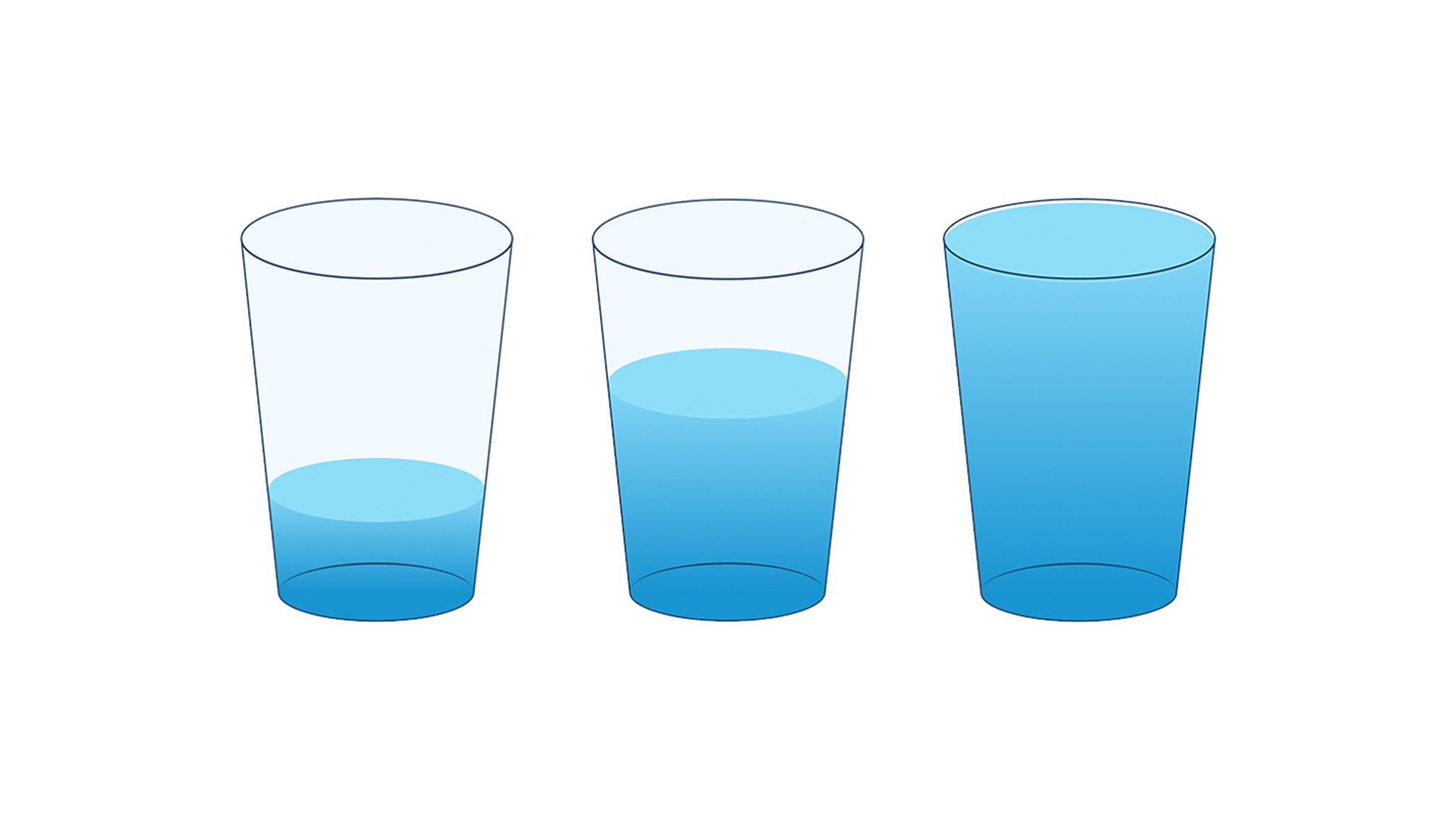
Idowu argues that this approach often leads to a failure of empathy. "A number can be dismissed," Idowu notes. "A chart can be skimmed. But a nearly empty glass is harder to forget." By prioritizing "analytical precision" over "emotional clarity," designers may inadvertently be alienating the very audience they seek to inform.
The Anatomy of a Metaphor: A Chronology of Discovery
The genesis of "The Empty Glass Project" was not rooted in complex programming, but in a simple, universal question: What does this data feel like in real life?
Phase I: Conceptualization
The project began with the realization that water access is not merely a logistical challenge; it is a human struggle. Idowu moved away from the digital clutter of traditional dashboards to identify an object that occupies a space in every person’s daily life, regardless of culture or geography. The glass of water became the project’s anchor—a metaphor that requires no explanation.
Phase II: The Design Sprint
In the development phase, the challenge was to balance the rigor of the data with the simplicity of the metaphor. Each glass is a literal representation of access: a 100% full glass represents universal access, while a glass with a fraction of liquid represents a deficit. The design process focused on removing everything that wasn’t essential. By stripping away axes and complex keys, the user is left with a singular, intuitive visual experience.

Phase III: The Interactive Launch
The final interface is designed for discovery. When a user interacts with the digital tool, they are not presented with a static chart. They select a country, and the glass fills to the corresponding percentage. This act of "filling" creates a moment of active engagement. The user is no longer a passive observer of a chart; they are a witness to a reality, comparing the fullness of their own reality to the emptiness of another’s.
Supporting Data: The Global Context
The effectiveness of the project relies on the contrast between the simplicity of the metaphor and the severity of the underlying statistics. According to the latest figures from the WHO and UNICEF, billions of people still lack access to safely managed drinking water services.
- The Global Disparity: While developed nations often boast near-100% access, large swathes of the Global South face systemic, persistent scarcity.
- The Infrastructure Gap: The data shows that access is rarely a matter of individual failure, but rather a reflection of infrastructure, political stability, and economic resources.
- Health Implications: The correlation between "empty glasses" and public health crises—such as cholera, dysentery, and stunted development in children—is profound.
Idowu’s visualization captures these disparities in a way that allows the viewer to see the "gap" in the glass, which serves as a constant reminder of the work that remains to be done.
Official Responses and Industry Impact
The design community has taken note. "The Empty Glass Project" has been lauded by data visualization experts as a masterclass in minimalism. By moving away from the "more is better" philosophy, Idowu has highlighted a growing trend in UX (User Experience) design: the shift toward human-centric data storytelling.

Advocacy groups have also begun to embrace this style of visualization. Where traditional white papers are often shelved and forgotten, the intuitive, shareable nature of the glass metaphor has proven highly effective for digital campaigns. It simplifies the conversation without diluting the urgency of the cause. By making the data "feel" like a lived experience, it invites a more profound, visceral response from policymakers and the public alike.
Implications: The Future of Data Storytelling
The success of this project suggests a shift in how we might handle complex global issues in the future. If we can represent water access through a glass, what other humanitarian crises could be demystified through similar metaphors?
1. From Information to Empathy
The primary implication of this work is the potential for data to serve as a bridge to empathy. When information is presented in a format that mirrors our daily existence, it becomes harder to distance ourselves from the subject. We stop looking at "data points" and start looking at the conditions of human lives.
2. Accessibility of Understanding
Designers often confuse "completeness" with "accessibility." Idowu’s project proves that by reducing complexity, we can actually increase understanding. If a person cannot engage with the data, the accuracy of that data is moot. Accessibility of understanding must become a primary metric for success in the data design field.

3. The Power of Minimalism
Minimalism is not about taking things away; it is about highlighting the essence of the story. In an age of information overload, the most powerful tool a designer has is the ability to filter the noise and focus the viewer’s attention on the fundamental truth.
Conclusion: Making the Complex Feel Simple
"The Empty Glass Project" is not intended to replace the rigorous work of statisticians, nor is it a critique of traditional mapping. Rather, it is a necessary evolution in how we communicate global challenges. By using a universal, relatable, and deeply symbolic object, Inumimo Idowu has demonstrated that we don’t always need more data to understand a problem—sometimes, we simply need a better way to see it.
As we look toward the future of data visualization, the lessons here are clear. We must stop asking how to fit more data onto the screen and start asking how to fit more meaning into the viewer’s mind. When we succeed in that, we move beyond simply informing the public; we invite them to care. In the end, the most effective way to communicate a global crisis might just be to show it as it is: an empty glass, waiting to be filled.
 Lina Irawan
  Nana
Nana  Nila Kartika Wati