
 By Neng Nana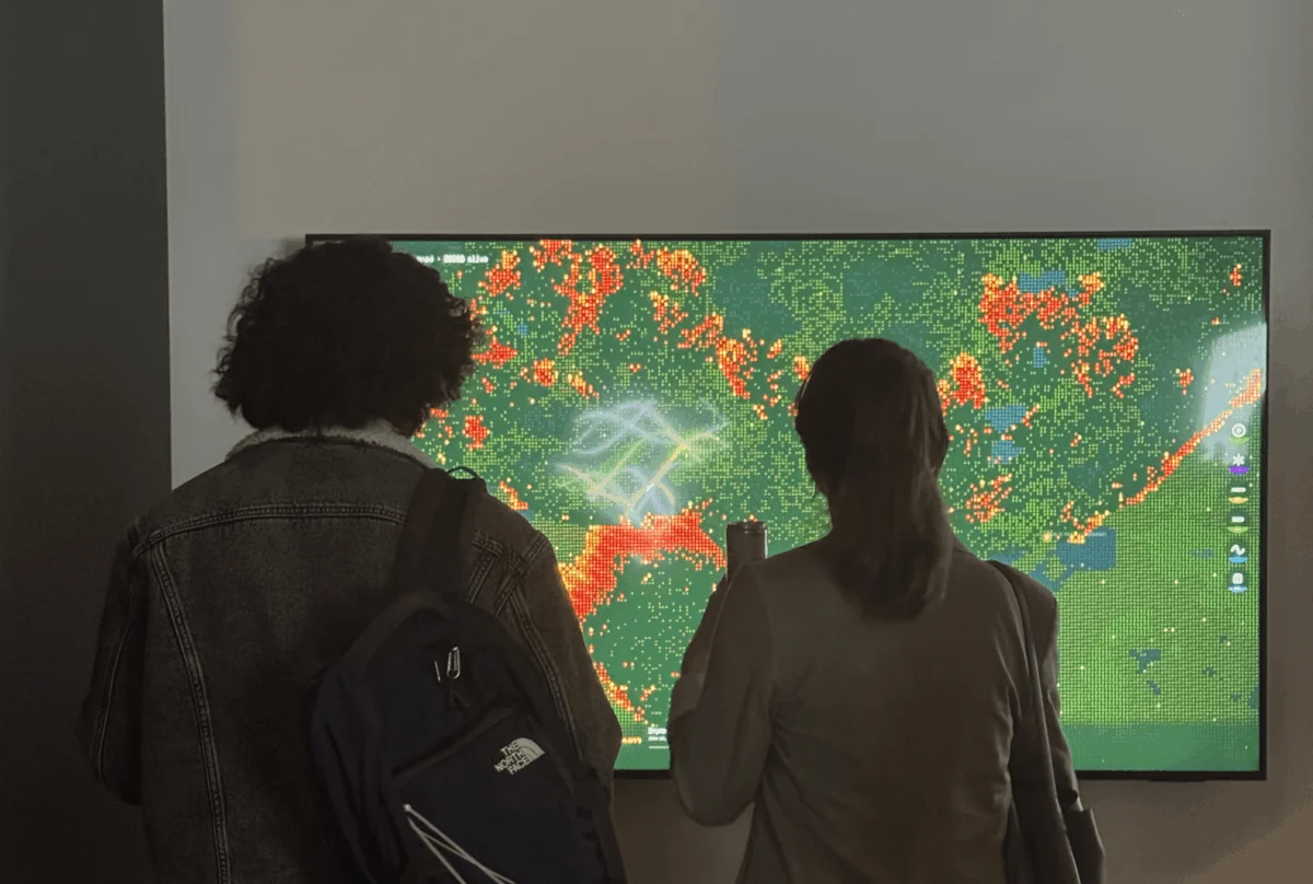
In the high-stakes world of energy infrastructure, data is the lifeblood of decision-making. Yet, for those of us working at the intersection of power grids and environmental risk, there is a recurring, gnawing problem: the “empathy gap.” We spend our days staring at soaring demand forecasts and grid expansion curves, translating abstract numbers into slide decks that are nodded at, filed away, and promptly forgotten. We have become experts at reporting the "what," but we are failing to communicate the "why."
Data, in its rawest form, is cold. A number in a report remains just a number. But in the energy industry, particularly in the fire-prone landscape of Northern California, these numbers represent physical, existential threats. As a data designer, my mission has evolved from simply visualizing information to making the invisible stakes of our digital consumption—such as the power demands of massive AI data centers—tangible.
The Geography of Risk: Connecting AI to Wildfire
Living and working in San Francisco provides a front-row seat to the accelerating crisis of climate change. Energy infrastructure and wildland fire risk are no longer separate, siloed issues; they share both geography and causality. Our climate is shifting, resulting in longer "burn windows" and more frequent, high-intensity weather events. These are not merely natural cycles; they are components of a feedback loop where our relentless digital demand places a heavy, physical burden on a warming planet.
As the grid expands to meet the exponential power needs of modern AI, we are seeing energy infrastructure snaking through increasingly arid terrain. Data centers now consume power at a scale that rivals entire nations, requiring grid expansion into regions that are becoming drier and more combustible with every passing season.
I knew these connections intimately. I could cite the statistics on megawatt consumption, fuel moisture levels, and grid hardening costs. Yet, I struggled to make the average person—or even a stakeholder—feel the weight of a simple AI prompt. How do you translate a query in a chatbot into a spark in a dry forest?
The Mentorship: From Theory to Spark
My academic foundation in Information Design and Data Visualization at Northeastern University taught me to treat data as a material—something with texture, weight, and inherent properties. However, moving from academic theory to public impact required a different kind of guidance.
When I joined the Data Visualization Society (DVS) mentorship program, I brought a singular, difficult challenge: How do you make someone feel the cost of something invisible?
I was paired with Divya Meghnani, Head of Product at Databricks. Divya’s mentorship was the catalyst I needed to bridge the gap between my professional data background and my creative intent. He didn’t simply provide technical guidance on the build; he challenged me to move beyond the aesthetic surface of data visualization and into the emotive core of the experience. He pushed me to ask: If the user doesn’t feel the risk, have I actually communicated anything at all?
The Simulation: Building "Wired to Burn"
To solve the empathy gap, I decided to abandon the safety of static charts. I wanted to build an emergent, interactive world. Drawing inspiration from Daniel Shiffman’s The Nature of Code and the radical, human-centric philosophies of Giorgia Lupi, I turned to cellular automata—a system where simple, local rules lead to complex, global patterns.
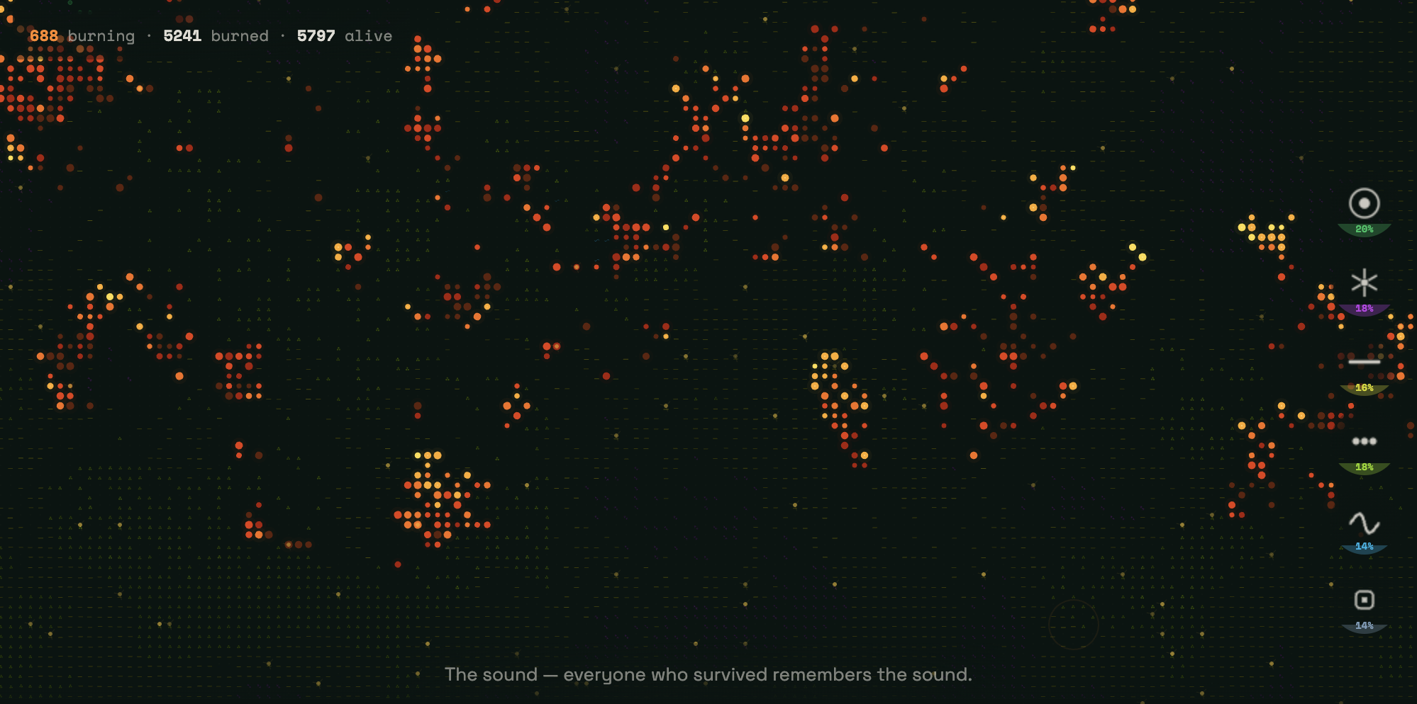
The result is Wired to Burn, an interactive wildfire simulator. In this environment, the user is not a passive observer; they are the catalyst. Your cursor acts as the spark. You choose the terrain—ranging from dry, volatile grasslands to dense, timber-heavy forests—and you set the environmental conditions for ignition. Once you click, the "math" takes over.
The simulation runs on a grid of over 9,000 cells. Each cell’s state is determined by its neighbors and the environmental variables set by the user. Utilizing p5.js, I created a living system where fire behaves according to real-world logic. It is a live calculation of risk, accounting for fuel density and dryness levels—variables that are, in reality, being pushed to their limits by the escalating energy demands of our AI-driven lives.
The visual language of the simulation is intentional. It opens on a near-black canvas, populated by six distinct terrain types, each rendered as a neon symbol:

- Emerald green targets: Dense forest
- Violet starbursts: Shrubland
- Acid yellow dashes: Agricultural zones
- Lime green dots: Grassland
- Cyan sine waves: Wetlands
- Slate blue squares: Developed, human-built land
The landscape is quiet and still until the user interacts with it. But as the fire propagates, it leaves behind "ash." Following Lupi’s Data Humanism, I refused to let the burned ground be reduced to dead, black pixels. Instead, as the fire sweeps through the grid, it leaves behind narrative text—a digital trail of breadcrumbs explaining the hidden infrastructure costs of our modern, energy-intensive behaviors.
The TIAT Exhibition: When Data Meets Human Pulse
The ultimate test of Wired to Burn came during the TIAT exhibition in San Francisco. Watching strangers interact with the piece was a revelation.
At the start, there was the expected visual awe—the beauty of the generative fire as it rippled across the screen. But as the fire cleared, users began to read the text appearing in the "ash." The tone in the room shifted. The interaction was no longer a game; it was a mirror of our current climate reality.
I observed attendees returning to the ash zones, re-reading the narratives multiple times. It was a profound validation of the core hypothesis: when we give data a human pulse, when we provide a narrative weight to abstract statistics, people stop scrolling and start reflecting. The empathy gap, previously a chasm, was finally closing.
Implications for the Future of Data Design
My journey from a student to an exhibitor in the span of a single mentorship has fundamentally changed my perspective on the field. As I look toward this year’s Outlier Conference and its theme of "The Final Draft," I find myself reflecting on the nature of progress.
"The Final Draft" is an ironic concept in data visualization. In the world of climate and energy, there is no final draft. The terrain is constantly regenerating, the fires are starting again, and the data continues to grow in complexity, demanding to be understood and felt. We are currently in a cycle where our technological acceleration is outstripping our ecological capacity, and the role of the designer is to ensure that this tension is not lost in the noise of big data.

The implications for the industry are clear:
- Complexity requires humanity: As data sets grow larger and more abstract, our visualizations must become more grounded in the human experience.
- Interaction breeds responsibility: By putting the power of the "spark" in the user’s hands, we force an engagement with causality that a static chart simply cannot achieve.
- Humility in system design: We must remain humble in the face of complex environmental systems. We are not just visualizing data; we are documenting the consequences of our collective choices.
Our job as data designers is not merely to "show the numbers." It is to act as conduits for reality, ensuring that when we talk about the world—about the power grids that sustain our lives and the landscapes that are burning around us—we make the people in it feel exactly what is at stake.
Wired to Burn is not a finished project; it is an ongoing experiment in how we might begin to visualize the future we are building, one spark at a time. The data will continue to mount, the demand will continue to rise, and our responsibility to translate that into a shared, human understanding has never been more urgent.
 Lina Irawan
  Nana
Nana  Nila Kartika Wati