
 By Asro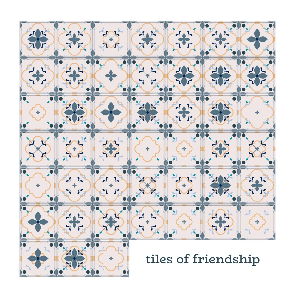
The Oxford English Dictionary defines friendship as a “voluntary, personal relationship characterized by mutual affection, trust, and support.” It is a clinical, objective summary of one of the most subjective experiences of human life. For Or Misgav, a data designer and researcher, that definition lacks the messy, vibrant reality of human connection. To her, friendship is not merely a dictionary entry; it is the spark of recognition when a familiar face appears, the conscious effort to nurture a bond across time and distance, and the uncomfortable, fragile silence that emerges when paths diverge.
In an era defined by digital metrics and algorithmic influence, Misgav recently embarked on a personal experiment to quantify the intangible. By mapping the people who have shaped her life, she sought to move beyond the "balance sheet" of relationships to understand the patterns of intimacy. What began as a simple attempt to catalog her social circle evolved into a profound meditation on how we use technology to process our most human experiences.
The Taxonomy of Connection
The project—titled The Taxonomy of Connection—began with a foundational question: How do we classify the people we love? Misgav started by listing everyone she cared about, drawing first from memory and then verifying against her digital footprint on Facebook. However, the act of sorting names into a spreadsheet immediately triggered a crisis of categorization.
"Can family members count as friends?" Misgav asks. "My nieces and I have been chatting nonstop for years. We grew fond of each other through the circumstance of birth, but we stayed in touch by choice. Does that make them friends?"
The inquiry became even more complex when she addressed the friction of life transitions. She found herself grappling with the status of friends who had become unsupportive of her life choices. If a connection that was vibrant eight months ago has now cooled, does omitting that person from a "current" map constitute an abandonment of the friendship? Furthermore, the casual nature of modern language—where "friend" is a term applied to anyone from a lifelong confidant to a neighbor with whom one has shared a few cups of tea—forced her to develop a more rigorous framework.
To bring order to this social chaos, Misgav distilled friendship into three core metrics, each scored on a scale of one to three:

- Affection: The emotional depth of the bond.
- Trust: The reliance and security felt within the relationship.
- Support: The presence of mutual advocacy and encouragement.
To maintain empirical integrity, she added two judgment values: Duration (the length of the friendship) and Contact (recency of interaction). She limited her scope to individuals with whom she had interacted within the previous 24 months—a timeframe marked by the birth of her daughter. The results provided a startling revelation: during a period in which she often felt the profound, isolating loneliness common to new motherhood, the data proved she was, in fact, deeply and consistently loved.
From Sketching to Scripting: The Technological Pivot
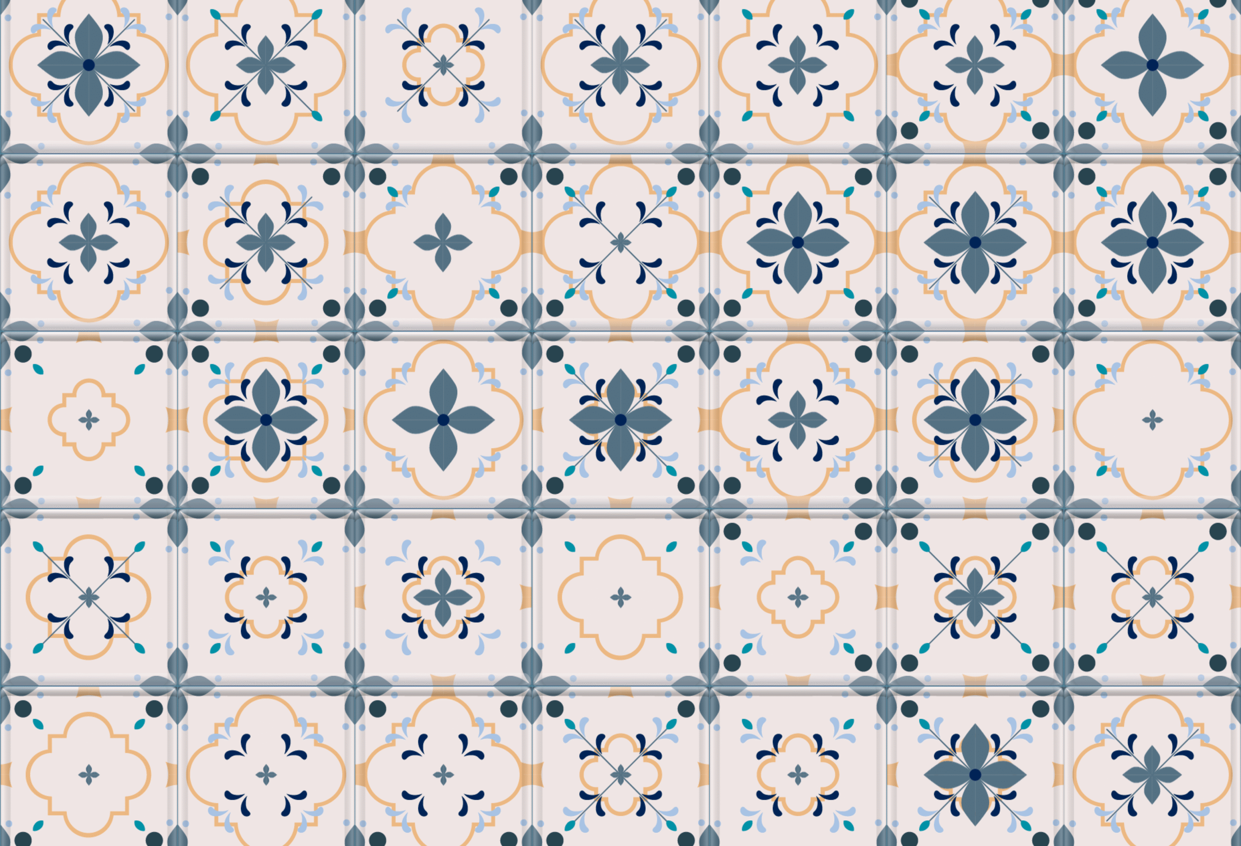
The transition from conceptualizing the data to rendering it was where the project took an unexpected turn. Initially, Misgav worked in her notebook, envisioning the relationships as a series of "tiles." Level one served as a simple base, while levels two and three added layers of visual complexity.
Early attempts at visualization, however, failed to capture the intended narrative. She experimented with background colors to denote the duration of friendships, but the resulting palette felt overly vibrant—almost boastful. "It made the story about ‘how good I am at making friends’ rather than ‘how these friendships built me,’" she noted.

Determined to streamline the process, Misgav pivoted from manual creation to automation. Historically, building such visualizations via software like Illustrator or Figma would consume hours of meticulous clicking, layering, and double-checking. Seeking a more efficient path, she turned to large language models (LLMs), specifically Claude and Gemini.
"I asked Gemini to help me write the prompt for Claude," she explains. "It generated a Python script that processed my Excel file and created stacked layers as PNG files." With Claude acting as her technical guide, Misgav navigated the process of installing Python on her Mac—a task that reminded her of the retro, terminal-heavy era of 1990s computing. "Then, ‘Boom. Your tiles are ready.’ With a single click, the assets were generated."
The Cost of Efficiency: An Unexpected Disconnect
While the automation allowed for rapid execution, it introduced a philosophical dilemma regarding the role of the designer. Upon opening the folder of generated tiles, Misgav experienced a jarring sense of detachment. She did not recognize the data she had just produced.

By outsourcing the labor of construction, she had inadvertently bypassed the "data familiarization stage"—that critical, meditative period of manual work where a designer touches each data point, considers the individual behind the entry, and contemplates the context of the connection. The resulting tiles were aesthetically polished, but they lacked the emotional weight of the manual sketches.
This brings the project into the broader conversation surrounding AI in creative fields. If an AI performs the heavy lifting of execution, is the human creator a partner in the process, or merely a curator of their own life? The efficiency gained in the digital sphere resulted in a loss of the very intimacy she sought to visualize.
Implications for Data Design
The implications of Misgav’s project extend well beyond her own social network. As generative AI becomes increasingly integrated into data visualization, designers must contend with the "black box" of creation. The human element—the subtle, intuitive choices made during the design process—often encodes the meaning of the data.

When that process is automated, the designer risks alienating themselves from the final product. For professionals in the field, this poses a risk to the narrative integrity of their work. If the designer does not "feel" the data during the build, will the audience feel it when they view the final output?
Misgav’s experience suggests that the future of data visualization may require a hybrid approach: using AI for the technical scaffolding, but intentionally retaining manual, tactile stages to ensure the "soul" of the data remains intact.
A Testament to Connection
Despite the initial sense of distance, the final grid serves as a powerful testament to a life lived in relation to others. These tiles, though generated by silicon, are grounded in the organic realities of the human experience. They represent the friends who weathered the storms of puberty, the confidants who signed her wedding book, and the new, burgeoning relationships formed at school gates.

This project is ultimately a token of gratitude. It functions as a snapshot of the author’s soul as it existed in 2026—a map of connections shaped by human history, rendered by machines, and held together by the voluntary, personal relationships that define our existence. It reminds us that while we can map our lives with precision, the true value of friendship lies in the messy, unquantifiable space between the tiles.
In the final analysis, Or Misgav has demonstrated that while technology can help us organize our world, it cannot—and should not—replace the deliberate, thoughtful act of reflecting on the people who make us who we are. The "voluntary, personal relationship" is not just a definition to be studied; it is the architecture of a life well-lived.
 Lina Irawan
  Nana
Nana  Nila Kartika Wati