
In the quiet, hallowed halls of the monastery at San Domenico, a masterpiece of the Early Renaissance—Fra Angelico’s San Domenico Altarpiece—has recently undergone a transformation. While the public eye is drawn to the vibrant, prismatic wings of the angels and the serene expressions of the Virgin and Child, the true story of this work lies not in the paint, but in the support.
For centuries, the altarpiece has survived as a physical record of shifting tastes and structural neglect. Its restoration, led by conservator Roberto Buda, offers a profound metaphor for the modern discipline of data visualization. Just as a painting requires a sound foundation to prevent the canvas from cracking, data visualization requires a rigorous, often invisible, structural integrity to ensure that the narrative remains honest and enduring.
The San Domenico Altarpiece: A History of Structural Strain
Commissioned in the early 1420s, the San Domenico Altarpiece served as the visual focal point for the friars’ daily Divine Office. For centuries, it hung above the high altar, a testament to Angelico’s mastery. However, the survival of such a piece is never guaranteed. In the seventeenth century, in an attempt to modernize the aesthetic, carpenters took the radical step of recutting the original panels to force the work into a standardized rectangular frame.
This intervention proved disastrous for the work’s longevity. The introduction of beechwood "butterfly" inserts—placed directly against the natural grain of the original poplar—created a discordant internal tension. As humidity fluctuated through the centuries, the wood species moved at different rates, causing the panel to buckle and threatening the integrity of the paint layer itself.
Last year, the altarpiece was removed for a meticulous nine-month restoration process. Roberto Buda and his team approached the task not as mere cleaners, but as structural engineers. They removed the damaging seventeenth-century reinforcements, replacing them with poplar infills aligned perfectly with the original grain. They installed a new, flexible frame equipped with conical springs, allowing the wood to "breathe" with the environment. As Buda noted, "It’s a house. If you don’t have a good foundation, it doesn’t hold up."
The Pivot: From Neuroscience to Data Carpentry
The lessons learned in the conservation lab find a striking parallel in the evolving career of data practitioners. In 2025, a significant transition occurred within the field of data science: a move away from the "fast-fashion" approach to visualization—where charts are generated as quick, disposable afterthoughts—toward a more artisanal, structural methodology.
For many researchers, particularly those coming from high-pressure academic backgrounds like experimental neuroscience, the initial approach to data is often utilitarian. In academia, breadth is rewarded; a scientist might build hardware, write software, conduct experiments, and analyze results simultaneously. Often, visualization is the final step, relegated to the default settings of Python’s Matplotlib or Microsoft Excel. One simply calls plt.bar() or clicks a button, and a graphic appears.
However, this convenience masks the underlying fragility of the data story. True data visualization requires the designer to act as a digital carpenter. By moving toward low-level libraries like D3.js (Data-Driven Documents), designers gain the technical freedom to define their own coordinate systems and scale domains. Like the restoration of the San Domenico Altarpiece, this process is labor-intensive and demands that the designer understand the "grain" of the data they are working with.
The Sensory Logic of Ancient Greek Color
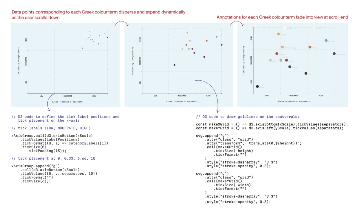
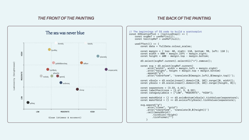
To understand how intentionality shapes perception, one need only look at the historical evolution of language and color. A recent exploration into the Iliad reveals that the Ancient Greeks did not categorize color based on modern hue-based taxonomies. Instead, their vocabulary was rooted in luminosity, shimmer, and the play of light across surfaces.
Building an interactive scatterplot to visualize this requires more than just plotting X and Y coordinates. It requires a deep understanding of the "sensory dimensions" of the data. Using D3.js, one must manually calculate scales and margins—decisions that are rarely visible to the final viewer but are essential to the clarity of the presentation. When a viewer looks at a clean, responsive scatterplot, they see the "front of the painting." They do not see the thousands of lines of code—the digital poplar inserts—that keep the axis aligned and the interaction fluid.

Principles of Clarity: The Financial Times and Beyond
The necessity of structure is well-understood in the world’s leading newsrooms. The Financial Times (FT), for instance, has achieved a level of visual coherence that makes its charts instantly recognizable. This is not accidental; it is the result of a rigorous visual grammar—a set of style guides that govern everything from the weight of a line to the specific hex code of a color.
Alan Smith, the FT’s Head of Visual and Data Journalism, has famously argued that a chart should be as readable as a sentence. This sentiment is echoed by Alberto Cairo, a professor at the University of Miami and author of The Art of Insight. Cairo posits that there are no "rules" of data visualization, only "reasoning." Every design choice—the choice of color, the starting point of an axis, the decision to use a scatterplot over a bar graph—must be a defensible, rational response to the data.
When these principles of structural integrity are paired with narrative intent, the results can be transformative. Hans Rosling’s 2006 TED talk remains the gold standard of this approach. By animating a complex dataset of global health and GDP, Rosling did not just show numbers; he showed the story of human progress. He used the "frame" of his animation to guide the audience’s attention, proving that when the foundation is sound, the narrative becomes accessible to everyone.
The Implications: Why Foundations Matter
The danger of ignoring structural integrity in data visualization is best illustrated by the misuse of axis scaling. In many climate change debates, for instance, the temptation to manipulate the y-axis to make trends appear more or less volatile is a constant threat to objective reporting.
A study by Steven Franconeri of Northwestern University highlights this clearly: anchoring a temperature chart at zero degrees Fahrenheit can artificially flatten the visual evidence of climate change, rendering it "negligible" to the layperson. This is the data equivalent of the seventeenth-century carpenters forcing wood into a shape it was not meant to hold—it creates a stress point where the truth eventually cracks.

To prevent this, modern web frameworks like React serve as the "chestnut frame" for data visualization. React allows developers to manage the "state" of a visualization, ensuring that as data conditions shift, the interface remains stable and responsive. When React handles the lifecycle of the data and D3 handles the math, the resulting visualization becomes a "three-dimensional object of logic."
Conclusion: Designing with Integrity
The work of a data visualization developer, much like the work of Roberto Buda, is often largely unseen. When a reader interacts with a well-designed dashboard, they are experiencing the final product of countless hours of structural refinement. They are seeing the "Virgin and Child," while the "poplar inserts" and "conical springs" remain hidden beneath the surface.
Ultimately, the goal of data visualization is not to create a flashy graphic; it is to build a house for data that is strong enough to withstand the scrutiny of time. Whether through the precise placement of an axis or the careful selection of a color palette, every design choice is a form of carpentry. We are constructing the foundations of knowledge, ensuring that the stories we tell with data are not just beautiful, but structurally sound. In an age of information overload, this integrity is not merely a technical requirement—it is a moral imperative.