
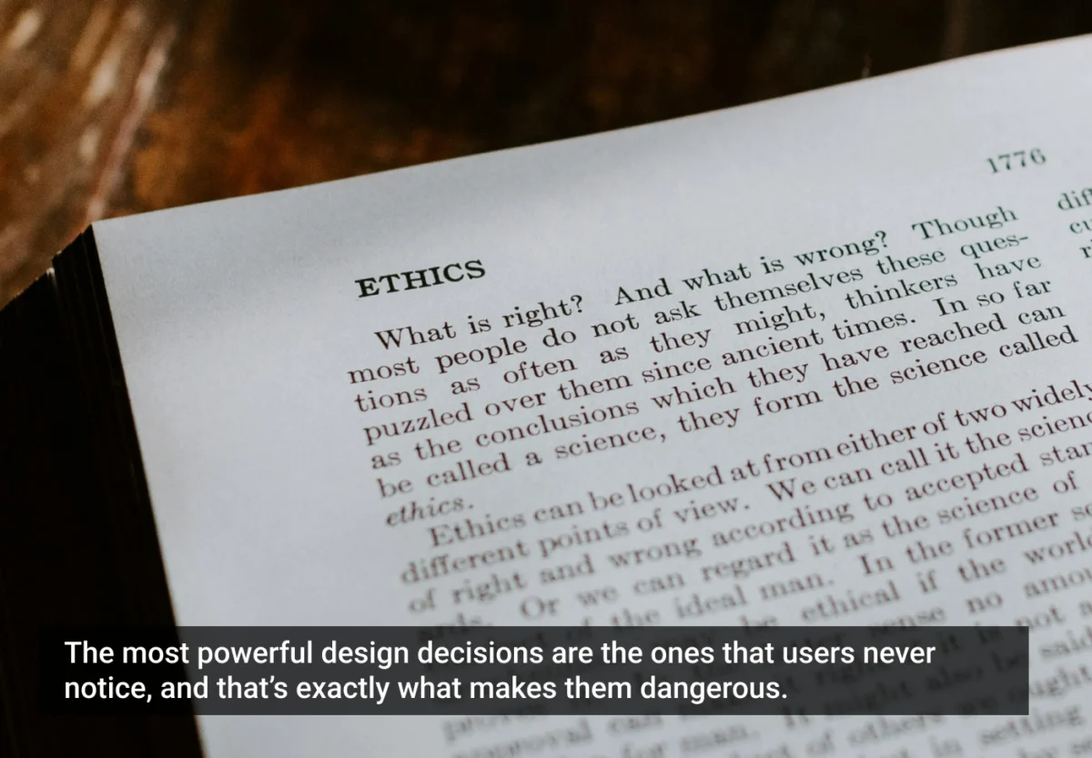
In the high-stakes world of digital product design, the most significant changes often occur in the smallest spaces. A slight shift in button color, the subtle phrasing of a checkbox, or the placement of a progress bar can fundamentally alter how millions of people interact with technology. These micro-signals, known as "nudges," are the silent architects of user experience.
As part of the ongoing Ethical UX Series, we examine how these psychological triggers influence behavior and where the line between helpful guidance and digital manipulation is drawn. In an era where user attention is the most valuable commodity, understanding the ethics of choice architecture is no longer just a design preference—it is a professional necessity.
The Genesis of the Nudge: A Historical Context
The term "nudge" was popularized by Nobel laureate Richard H. Thaler and legal scholar Cass R. Sunstein. In their landmark work, they defined a nudge as any aspect of the choice architecture that alters people’s behavior in a predictable way without forbidding any options or significantly changing their economic incentives.
The evolution of the nudge in digital design can be traced back to the early 2000s, when e-commerce giants began optimizing "frictionless" checkout flows. Initially, these were simple usability improvements. However, as data analytics matured, these optimizations transformed into complex behavioral loops.
- 2008–2012: The emergence of "defaults" as a primary design tool. Companies realized that users rarely change pre-selected settings, leading to the widespread adoption of "opt-out" rather than "opt-in" models.
- 2013–2018: The rise of gamification and social proof. Designers began integrating badges, leaderboards, and "fear of missing out" (FOMO) triggers into everyday apps, from fitness trackers to social media platforms.
- 2019–Present: The era of the "Ethical Audit." As regulators (such as those overseeing the GDPR and the Digital Services Act) and privacy advocates have scrutinized digital platforms, the design community has shifted its focus toward transparency and user-centric accountability.
The Mechanics of Micro-Tactics
To understand how nudges operate, one must look at the specific mechanisms that sway human decision-making. These tactics rely on cognitive biases—shortcuts the brain takes to conserve energy.
1. The Power of Defaults
Defaults act as the path of least resistance. When a platform pre-checks a box for a newsletter subscription or data tracking, it leverages the status quo bias. Users, by nature, prefer to keep things as they are unless prompted otherwise.
2. Color Hierarchy and Contrast
Visual prominence is a psychological command. A bright, high-contrast "Buy Now" button placed against a muted background directs the eye and creates an immediate call to action. Conversely, hiding an "Unsubscribe" or "Cancel" option in low-contrast, small text is a classic manipulation tactic.
3. Progress Indicators
Humans have a natural psychological drive to complete what they have started—a phenomenon known as the Zeigarnik Effect. By showing a progress bar (e.g., "75% of your profile complete"), designers nudge users to finish a task they might otherwise abandon.

4. Scarcity and Urgency
"Only 2 items left in stock!" or "Sale ends in 10 minutes!" are psychological triggers that induce anxiety. While these can be honest reflections of stock, when used artificially, they cross the line into dark patterns.
5. Social Proof
Displaying "10,000 other people bought this" creates a herd mentality. It validates the user’s choice by leveraging the psychological need for social belonging and consensus.
Nudges vs. Dark Patterns: Drawing the Ethical Threshold
The central tension in modern UX is distinguishing between a nudge and a dark pattern. A nudge is designed to benefit the user, helping them achieve their goals more efficiently. A dark pattern is designed to benefit the business at the expense of the user’s autonomy.
The ethical threshold is crossed when:

- Transparency is sacrificed: The user is unaware they are being influenced.
- Opt-out becomes difficult: Friction is intentionally added to prevent the user from making a choice that hurts company revenue (e.g., making it easy to sign up but nearly impossible to cancel).
- Information is obscured: Vital details are hidden behind complex menus or legalese, forcing the user to agree to terms they don’t understand.
The Behavioral Psychology Behind the Mechanism
Designers operate within the reality of "bounded rationality." Users are rarely perfectly rational; they are emotional, tired, and distracted. They often fall back on heuristics—mental shortcuts—to make decisions.
For example, the UK government’s use of language in organ donor signups serves as a gold-standard case study. By shifting the messaging to a simple, altruistic query—"If you needed an organ, would you take one?"—they bypassed the complexity of legal bureaucracy and tapped into the user’s inherent sense of fairness and reciprocity, resulting in a 96% increase in signups.
This proves that design, when applied ethically, has the potential to solve societal problems rather than merely drive conversion metrics.
Cultural and Demographic Sensitivity
A universal "best practice" in UX is a myth. Nudges that work in Western, individualistic cultures often fail or even cause offense in collectivist societies.

Consider the use of "Urgency" nudges. In high-context cultures where relationships and trust are paramount, an aggressive countdown timer may be perceived as rude or untrustworthy, leading to high churn rates. Conversely, in fast-paced retail environments, such nudges are expected and ignored.
Effective UX requires responsive psychology. Designers must conduct localized testing to understand how their target demographic perceives influence. An ethical design process must include:
- Diverse Research Panels: Ensuring that nudges don’t alienate or exploit specific socio-economic or cultural groups.
- Accessibility Audits: Ensuring that nudges are not confusing for users with cognitive impairments.
- Language Neutrality: Ensuring that calls to action do not use manipulative or guilt-tripping language.
Auditing Your Design: A Research-Driven Framework
To ensure that your design team is prioritizing the user, implement the following "Ethical Nudge Audit" in your next design review:
- The Beneficiary Test: Ask, "Who gains the most from this specific interaction?" If the answer is exclusively the business, reconsider the design.
- The Reversibility Check: How easy is it for the user to undo their action? If the "undo" button is buried, you are likely using a dark pattern.
- The Cognitive Load Analysis: Are we simplifying a complex decision, or are we intentionally overwhelming the user to force a snap judgment?
- The "Front-Page" Test: Would you be comfortable explaining this design pattern to a journalist or an ethics committee? If the answer is no, change the design.
The Future of Ethical UX: Accountability as a Core Competency
As AI-driven interfaces become more common, the power of the nudge will increase exponentially. Predictive models can now tailor nudges to individual users in real-time based on their browsing history, mood, and past behavior. This level of personalization is both a massive opportunity and a massive risk.

We are moving toward a future where "Choice Architecture" will be a central pillar of digital governance. Designers, researchers, and product managers are the new gatekeepers of digital autonomy. Our responsibility is to ensure that while we guide users toward their goals, we respect their agency to say "no."
Implications for the Industry
The shift toward ethical design is not just a moral crusade; it is a long-term business strategy. Users are becoming increasingly savvy. They are learning to spot dark patterns, and their trust is harder to earn but easier to lose than ever before. Companies that build their reputation on transparency and respect for user time will inevitably outperform those that rely on short-term manipulation.
As we continue this Ethical UX Series, the focus will shift toward "Consent Fatigue"—the phenomenon where users are so bombarded with notifications and agreements that they stop reading altogether. By designing with empathy, we can break the cycle of manipulation and build a digital landscape that truly serves the human experience.
Final Thought:
Technology is a tool, and like any tool, it reflects the values of its creator. When we design a flow, we are not just moving pixels; we are guiding human lives. Let us choose to build systems that empower, rather than exploit, the people who use them.

This article is part of the ongoing "Ethical UX Series," exploring the intersection of psychology, design, and human responsibility. Next in the series: "Consent Fatigue: Are We Designing People into Compliance?"
References and Further Reading:
- Thaler, R. H., & Sunstein, C. R. (2008). Nudge: Improving Decisions About Health, Wealth, and Happiness.
- Brignull, H. (2010). Dark Patterns: User interfaces designed to trick people.
- Kahneman, D. (2011). Thinking, Fast and Slow.
- The Digital Services Act (DSA) Guidelines on Dark Patterns.
