
 By Ali Ikhwan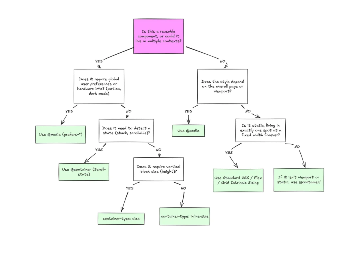
Despite widespread modern browser support hovering near 94%, CSS container queries remain surprisingly underused, frequently misunderstood, and often misapplied by developers treating them like drop-in replacements for traditional media queries.
To understand why this gap in adoption exists, it helps to examine how the web industry builds layouts today. When container queries first rolled out across major browsers, many developers—including veterans—asked a fundamental question: "Why do we need this when media queries already exist?"
That initial hesitation created an adoption bottleneck. According to the 2025 State of CSS survey, while 86% of developers are aware of container queries, only 41.4% actively use them in production. Industry experts, including frontend educator Kevin Powell at SmashingConf Amsterdam, have highlighted this discrepancy, noting that container query adoption has been remarkably slow—especially given that component-based adaptability has topped developer wishlists for years.
Main Facts: The Core Problem with the Viewport
The primary reason developers struggle with container queries is visual familiarity. Syntactically, an @container block looks almost identical to an @media query. Because they look the same, it is easy to assume they serve identical purposes. They do not.
For decades, the viewport has acted as a proxy for responsive design. Media queries ask the browser a single question: "How wide is the screen right now?"

@media (min-width: 1024px)
  .card
    display: flex;
This works fine for macro-level page structures. However, what happens when that exact .card component is placed inside a grid cell that is only 300 pixels wide on a sprawling 1920px desktop monitor? The media query evaluates the viewport, sees 1920 pixels, fires the rule, and forces the card into a multi-column flex layout. The card, starved for horizontal space, quickly deforms, overflows, or breaks entirely.
As Kevin Powell famously noted, media queries are "dumb"—not conceptually, but because they are structurally blind. They possess zero awareness of a component’s local environment.
Chronology: From Viewport Dependence to Component Awareness
The Era of the Viewport Proxy
- Early 2010s: Responsive Web Design (RWD) emerges, anchoring the industry to viewport-based media queries.
- The Modern Multi-Device Boom: As responsive design matured, developers built increasingly modular systems using frameworks like React, Vue, and Svelte. Components were designed to be reused anywhere—from full-width hero areas to narrow sidebars.
- The Mismatch: Viewport logic failed component-driven architectures. Developers were forced to write complex, brittle descendant selectors (e.g.,
.sidebar .card) to hack around missing layout intelligence.
The Arrival and Stagnation of Container Queries
- Standardization and Shipping: Container queries landed in baseline web browsers, ultimately climbing to roughly 94% global support.
- The Adoption Lag: Despite high awareness rates in developer surveys (reaching 86% in recent metrics), actual production usage lagged at just over 41%.
- The Shift in Perspective: The industry is slowly realizing that layout logic belongs closer to the component’s container rather than the global viewport.
Supporting Data: The Fragmentation of the Modern Web
The argument for container queries isn’t just theoretical; it is driven by the physical reality of modern device fragmentation.
- 2,300+ Viewport Sizes: Casual data collection across modern web traffic reveals more than 2,300 unique viewport sizes. Accounting for every edge case with global media queries is mathematically and practically impossible.
- The 94% vs. 41% Divide: While browser compatibility is no longer a valid excuse to avoid container queries, developer habits remain anchored to older mental models.
Looking Inward: How Container Queries Work
Container queries invert the responsive paradigm. Instead of looking outward at the browser window, they look inward at the immediate parent container. They ask: "How much space is available for me in this specific spot, right now?"
.card-wrapper
  container-name: card;
  container-type: inline-size;


@container card (min-width: 450px)
  .card
    display: flex;
    flex-direction: row;
In this setup, the card ignores the viewport entirely. It only checks whether its designated parent wrapper (.card-wrapper) has at least 450 pixels of inline space.

Official Responses and Expert Perspectives
Industry leaders have been vocal about the architectural shift required to leverage container queries effectively. The prevailing consensus separates responsive design into two distinct categories: Macro Layouts versus Micro Layouts.
- Macro Layouts (Media Queries): These govern page-level architecture. Think of headers that span the window, global grids, footers, system preferences like
prefers-color-scheme, and device capabilities. Media queries remain the right tool for these global contexts. - Micro Layouts (Container Queries): These govern component-level architecture—cards, widgets, forms, navigation bars, and independent UI modules.
Components should not transform into "tablet-sized" variants just because an arbitrary global breakpoint (like 768px) is crossed. They should adapt when their specific container affords them the room to do so.
Practical Applications
1. Fluid Typography Inside Components
Historically, responsive typography relied heavily on viewport units (vw, vh) via functions like clamp():
.card-title
  font-size: clamp(100%, 1rem + 2vw, 24px);
When moved into a constrained sidebar, this typography scales improperly because it references the wrong coordinate space. Container queries introduce specialized units—such as cqi (container query inline-size)—allowing for truly self-contained fluid typography:
.card-title
  font-size: clamp(1rem, .5rem + 3cqi, 2rem);
2. Flexbox Wrap Detection
Media queries cannot detect internal layout shifts, such as when flex items wrap onto a new line. By nesting container queries inside flex items, developers can build reactive components that respond to wrapping events without relying on heavy JavaScript ResizeObserver scripts.

.flex-layout
  display: flex;
  flex-wrap: wrap;


.flex-item
  container-type: inline-size;
  flex: 1 1 390px;


@container (min-width: 600px)
  .card
    flex-direction: row;
    background: #e2f0d9;
Implications and Side Effects to Watch For
While powerful, container queries introduce unique constraints and side effects that developers must navigate:
- Self-Querying Loops: A container cannot query its own dimensions. Attempting to apply
container-typeand an@containerrule to the exact same element creates a logical infinite loop. Components require an explicit parent wrapper. - Layout Collapse with Block Sizes: Querying a container’s block (vertical) size via
container-type: sizewithout setting an explicit height or aspect-ratio will collapse the element to0px. Developers should default toinline-sizeunless block querying is strictly necessary. - Custom Property Limitations: Container queries currently cannot evaluate CSS custom properties directly in conditions (e.g.,
@container (min-width: var(--breakpoint-lg))), due to the cascading nature of variables and potential circular logic dependencies.
Conclusion
Container queries are not meant to entirely eradicate media queries. Both tools occupy vital spaces in modern CSS architecture. Media queries excel at orchestrating global, macro-level page layouts, while container queries empower reusable components to adapt naturally to any micro-environment they inhabit.
By shifting our design mindset away from the rigid confines of the viewport and toward the flexible boundaries of our components, we can build more resilient, maintainable, and truly modular web applications.
 Nila Kartika Wati
  Ammar Sabilarrohman