
In the hallowed, quiet corners of the San Domenico monastery, the high altarpiece by the Dominican friar Fra Angelico has served as a silent witness to history for over six centuries. Yet, as recent restoration efforts have revealed, the true story of this masterpiece lies not merely in its ethereal depictions of the Virgin and Child, but in the unseen structural integrity that has allowed it to endure.
For the modern data practitioner, the conservation of this 15th-century polyptych offers a profound metaphor. Just as the stability of a painted surface depends on the alignment of wood grain and the resilience of its frame, the clarity and longevity of a data visualization depend entirely on the "digital carpentry" hidden beneath the surface. As we move into an era where data literacy is as essential as reading and writing, the lessons from the workshop of a Renaissance master and the modern coding environment are converging: to build a visualization is to build a house for information.
A Legacy of Layers: The San Domenico Altarpiece
Commissioned in the early 1420s, the San Domenico Altarpiece is a seminal work of the Early Renaissance. Its front face—a harmonious arrangement of haloed saints gathered around the Virgin and Child—is iconic for its use of vibrant, prismatic colors and the signature multi-colored wings of Fra Angelico’s angels. However, the rear of the panel reveals a far more chaotic narrative.
Centuries of well-intentioned but misguided interventions have left the back of the painting a patchwork of clashing materials. Seventeenth-century carpenters, prioritizing aesthetic uniformity over structural longevity, recut the original panels and inserted rigid beechwood crossbeams that ran counter to the natural grain of the poplar wood. Over time, these discordant species expanded and contracted at different rates in response to humidity, creating internal stresses that threatened to buckle the very surface of the masterpiece.
In 2025, conservator Roberto Buda and his team undertook a painstaking nine-month stabilization project. Their approach was radical in its simplicity: they removed the restrictive, misaligned crossbeams and replaced them with poplar inserts aligned precisely to the natural grain. They then housed the entire structure in a new, flexible chestnut frame equipped with conical springs, allowing the wood to "breathe" as it naturally responds to the environment. As Buda noted during the restoration, "If you don’t have a good foundation, it doesn’t hold up. The painting will never look good if the support is not right."
The Pivot: From Neuroscience to Narrative
The realization that structural integrity precedes visual beauty is a lesson that resonates deeply with the modern data practitioner. In 2025, I reached a professional crossroads. Having spent years in the high-pressure environment of experimental neuroscience—where I designed hardware, executed complex experiments, and analyzed dense datasets—I found myself yearning for a shift in focus.
In academia, visualization is often an afterthought, a hasty appendage to a research paper produced under the looming pressure of a deadline. Using libraries like Matplotlib or software like Excel, one can generate a chart with a single line of code or a click of a button. While efficient, this approach often obscures the "reasoning" that should precede the act of visualization.
Driven by a desire to prioritize narrative clarity and technical precision, I transitioned toward the open-source JavaScript library D3.js. Unlike higher-level tools that provide pre-packaged chart templates, D3 is a "workshop of raw timber." It demands that the developer manually calculate scales, define coordinate systems, and bind data to graphical elements. It is a tool that requires intention: every axis, every margin, and every mark must be explicitly defined.
The Digital Carpentry of Data
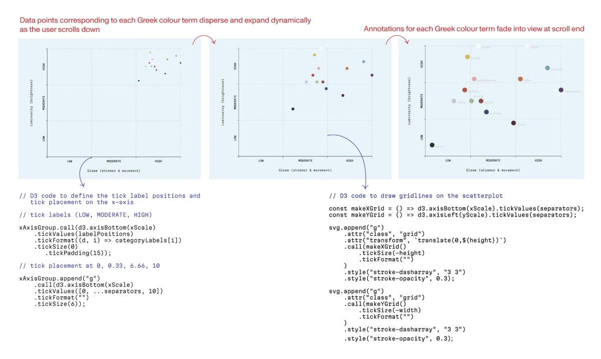
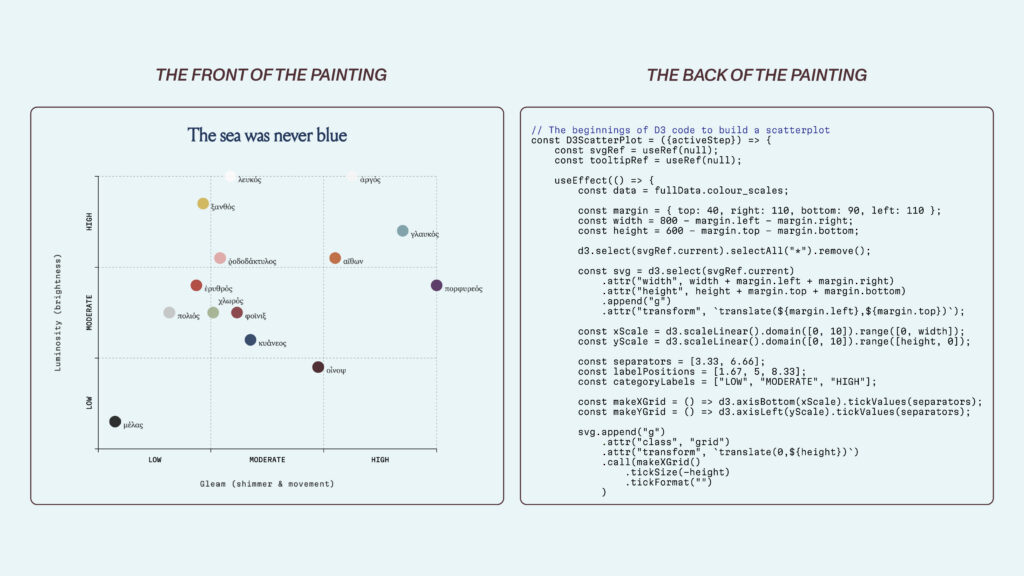
To master this medium, I joined the Data Visualization Society’s mentorship program, working under the guidance of Sam Bloom. Our project, an exploration of Ancient Greek color perception, served as an exercise in digital structural engineering.
The Greek experience of color, as recorded in Homer’s Iliad, was not governed by the hue-based categories of the modern world. Instead, it was defined by luminosity, shimmer, and texture—a vocabulary rooted in lived experience. Reconstructing this sensory dimension required more than just plotting numbers; it required building a visual structure that could represent abstract qualities like "brightness" and "sheen."

As I wrote the code to position each tick mark and scale each axis, I began to see the parallel to the San Domenico restoration. Every line of code was, in effect, a structural beam. When a reader views a finished scatterplot, they see only the "paint"—the data points and the labels. They do not see the scaffolding of the code. Yet, without the precise alignment of the underlying logic, the narrative risks "cracking" under the weight of poor design.
The Philosophy of Reasoning: Why Structure Matters
The field of data visualization is increasingly recognizing that its most important work happens before the first pixel is placed. Alberto Cairo, a titan of visual journalism, has long argued that there are no "rules" in visualization, only "reason."
The Financial Times, under the leadership of Alan Smith, serves as the industry gold standard for this philosophy. Their graphics are highly recognizable not because of flair, but because of a rigorous visual grammar. By adhering to a strict style guide that governs everything from axis weight to hex codes, the FT ensures that their charts remain as readable as a well-crafted sentence.
This level of intentionality is essential when handling sensitive data. Consider the debate surrounding climate change visualizations. As research by Steven Franconeri has shown, the way an axis is scaled can fundamentally change how a reader interprets a trend. A temperature chart anchored at zero degrees Fahrenheit might make a significant warming trend appear stagnant, whereas a chart scaled to the relevant temperature range renders the trend undeniable. The "scaffolding" of the axis determines the truth of the narrative.
Integrating Modern Frameworks: React as the Chestnut Frame
In my own work, I began to treat the modern JavaScript framework React as the chestnut frame in the San Domenico analogy. If D3 is the tool for calculating the geometry of the data, React is the system that manages the state of the interface. It allows the visualization to remain responsive and "breathe" as the data shifts.

By combining the structural rigidity of D3 with the lifecycle management of React, I was able to build an interface that behaves with the same deliberate harmony that Buda achieved with the altarpiece. The visualization does not just present data; it holds it, protects it, and allows it to exist in a state that is both honest and aesthetically legible.
The Integrity of the Invisible
As we move deeper into the digital age, the volume of data we encounter grows exponentially. The temptation to reach for the fastest, most automated tool is constant. Yet, the lessons of the San Domenico Altarpiece remind us that the most enduring works of human endeavor are those built on sound, invisible foundations.
Whether we are restoring a 15th-century masterpiece or designing a real-time dashboard for a global audience, our responsibility remains the same. We are not merely creating images; we are building systems of communication. We are the architects of insight, and our work is only as good as the foundations we lay.
When a reader engages with a visualization, they should not have to work to understand the data. They should be able to focus on the story, confident that the structure beneath it—the axis, the scale, the logic—is sound. Just as the public will walk into the monastery and see only the serene face of the Virgin, the audience for our work will see only the story we have told. They will not see the thousands of lines of code or the hours spent debugging the interaction logic. That is the nature of good design. It is the hidden labor of the craft, the poplar inserts running parallel to the grain, and the satisfaction of knowing that, because of our work, the truth will stand the test of time.
