
 By Dwi Wanna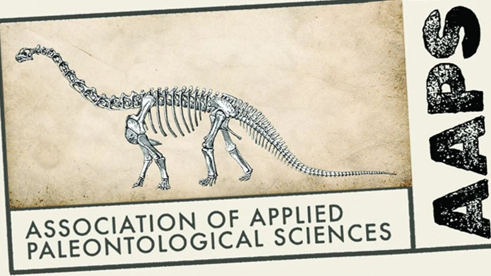
The Challenge of Time: Modernizing an Ancient Identity
In an era where digital presence and sleek aesthetics often dictate brand identity, the task of modernizing an institution deeply rooted in the distant past presents a unique design conundrum. How does one encapsulate eons of history, the meticulous work of unearthing ancient life, and the vibrant community dedicated to it, within a contemporary visual emblem? This was the precise challenge faced by the Association of Applied Paleontological Sciences (AAPS), an organization that bridges the gap between commercial fossil dealers, academic paleontologists, dedicated collectors, and passionate enthusiasts. Their recent unveiling of a new logo design has not only captured attention but also ignited a fascinating debate within the design community, demonstrating that sometimes, the most effective path forward involves a deliberate departure from established norms.
The conventional wisdom in logo design often steers towards minimalist abstraction, bold colours, and universal legibility – principles designed to ensure instant recognition and broad applicability across diverse media. However, the AAPS’s new identity, crafted by creative director Grant Sanders of the New England-based SAND Agency, takes a surprisingly intricate and conceptually rich approach. It boldly fuses a minimalist contemporary aesthetic with grungy typography and a vintage archival feel, culminating in an identity that is strikingly different. This design not only challenges many of the revered rules of logo creation but, in doing so, excels profoundly in its ability to tell a compelling story, one that resonates deeply with the very essence of paleontology.
Bridging Epochs: AAPS’s Unique Mission
The Association of Applied Paleontological Sciences occupies a vital niche, fostering a dynamic ecosystem where scientific discovery, ethical commerce, and passionate interest converge. Its mission extends beyond mere academic discourse, embracing the intricate relationships between professional fossil dealers who excavate and prepare specimens, academic paleontologists who study them, and the vast network of collectors and enthusiasts who contribute to and preserve the field’s heritage. This diverse constituency demands an identity that is both professional and approachable, serious in its scientific undertones yet inviting to a broad spectrum of individuals united by their fascination with prehistoric life. The previous logo, while functional, lacked the contemporary resonance and narrative depth required to effectively communicate the association’s multifaceted role in the 21st century.
The Rebranding Imperative
For any organization, a rebranding initiative is rarely undertaken lightly. It signifies a strategic decision to realign public perception, invigorate internal morale, and project a renewed sense of purpose. For AAPS, the imperative was clear: to evolve from an identity that might have been perceived as purely institutional or dated into one that felt modern, professional, and evocative, without sacrificing the gravitas inherent in its subject matter. The objective was not simply cosmetic; it was about fostering stronger commercial and academic relationships, attracting new members, and elevating the profile of applied paleontological sciences in an increasingly interconnected world. The new logo needed to be more than just a symbol; it needed to be a narrative device, a gateway to understanding the profound journey of discovery that defines the field.
A Bold Departure: The New AAPS Logo Unveiled
The moment the new AAPS logo was unveiled, it became clear that this was no ordinary rebrand. It represented a significant ideological shift from its predecessor, embracing a more modern and professional aesthetic while deliberately sidestepping the often-stifling conventions of institutional design. In its sophisticated blend of elements, the new identity even verges on territory more commonly associated with high-end fashion brands, where meticulous detail and nuanced storytelling are paramount.
The Visionary Behind the Design: Grant Sanders and SAND Agency
The architect of this daring visual transformation is creative director Grant Sanders, leading the charge at SAND Agency, a firm renowned for its innovative approach to brand identity. Sanders was presented with a brief that was both straightforward and profoundly complex: to devise a logo possessing a contemporary aesthetic, yet one that authentically reflected the ancient fossils and the deep historical context that defines the Association of Applied Paleontological Sciences. This required a delicate balance – an understanding of modern design trends coupled with a deep respect for the timeless nature of paleontology. His challenge was to reconcile the ephemeral nature of current design sensibilities with the enduring permanence of geological time.
Deconstructing the Design: Elements and Intent
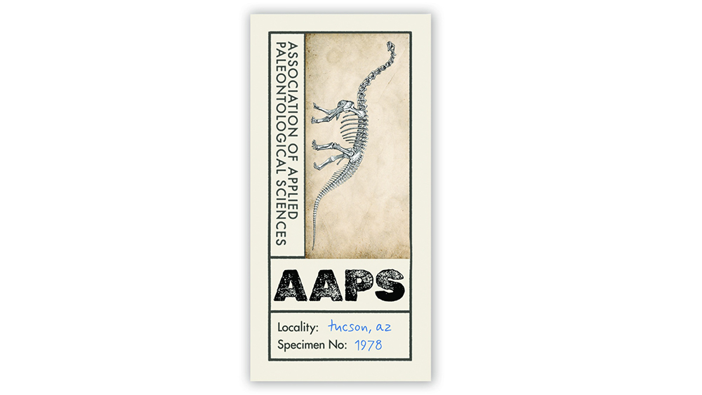
The new AAPS logo is a masterful composition of seemingly disparate elements that coalesce into a cohesive and compelling narrative. At its core, the design features a rigid rectangular shape, reminiscent of an archival label or a specimen tag, immediately grounding it in a sense of historical documentation. Within this frame, a detailed illustration of a dinosaur skull — likely an iconic Tyrannosaurus Rex or similar theropod, though not explicitly named in the original description, its fierce silhouette instantly communicates the field of paleontology. This illustrative detail is rendered with a degree of realism that speaks to scientific accuracy, yet it remains integrated within the overall aesthetic.
The textual elements are where the design truly begins to weave its intricate tale. Multiple typefaces and hierarchies of text are employed, running in different directions, creating a dynamic visual tension. The slightly aged, cream-coloured background evokes the texture of old parchment or faded field notes, lending an immediate sense of history and authenticity. This is further enhanced by a hand-applied blue script font, which adds a personal, almost handwritten touch, suggesting the intimate process of discovery and the human element in scientific pursuit. This script font creates a scholarly "found in an archive" feel, perfectly mirroring the organization’s work.
A prominent stencil font is used for the acronym "AAPS," imbuing it with a rugged, almost industrial personality. This choice suggests the arduous physical work of excavation and the robust, enduring nature of the specimens themselves. Below this, the phrase "Specimen No." is accompanied by a year, which the article states represents the year of the organization’s founding in Tucson. This detail serves as a direct historical anchor, connecting the brand to its origins and providing a sense of established legacy. The intentional layering of these elements — the ancient fossil, the archival paper, the distinct typography, and the foundational date — creates a visual tapestry that is rich in symbolism and deeply immersive.
From Concept to Creation: The Rebranding Journey
The journey from the initial spark of an idea to the final polished logo is often fraught with creative challenges and strategic decisions. For AAPS, this process involved navigating the inherent tension between honoring a profound past and forging a relevant future.
The Genesis of AAPS: A Historical Context
The mention of "Specimen No. [Founding Year]" on the new logo serves as a powerful historical marker. While the exact year isn’t explicitly stated in the provided text, its inclusion is a deliberate nod to the Association’s roots in Tucson. This detail anchors the organization in a specific time and place, lending it a sense of continuity and tradition. Understanding this founding context – the motivations of its early members, the challenges they faced, and the vision they held for the future of applied paleontology – is crucial to appreciating the significance of a rebrand. It underscores that AAPS is not a nascent entity but a venerable institution with a storied past, one that the new logo endeavors to both acknowledge and propel forward. The previous logo, while perhaps serving its purpose for a time, may have failed to fully articulate this rich history or connect with a new generation of paleontological enthusiasts and professionals.
The Evolution of an Identity: From Old to New
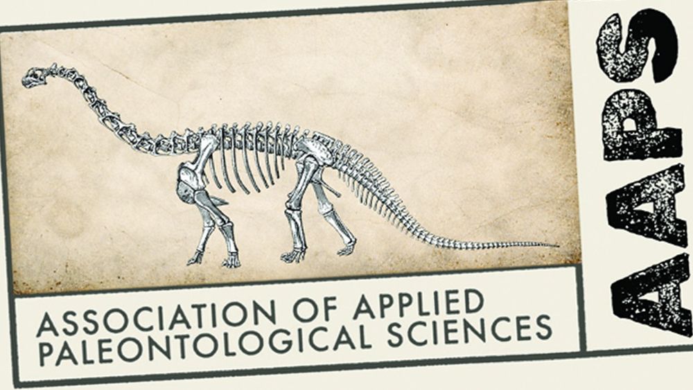
The previous AAPS logo, as depicted, appears to have been more conventional, likely adhering to a simpler, perhaps more generic institutional design language. It served as a straightforward identifier but lacked the evocative power and sophisticated narrative potential that the new design embodies. The transition from this functional, unadorned emblem to the current, multi-layered artwork represents a conscious strategic decision. It reflects a desire to move beyond mere recognition to active engagement, to transform a static symbol into a dynamic representation of the association’s values and activities. This evolution signals a growing confidence within AAPS to assert a distinctive identity, one that dares to be memorable even if it means challenging design orthodoxy.
Crafting a Narrative: The Creative Process
Grant Sanders’s creative process for the AAPS logo likely began with an extensive period of research and immersion. To effectively translate the "nature of the ancient fossils" into a "contemporary aesthetic," he would have needed to delve into the visual language of paleontology – from scientific illustrations and field journals to museum exhibits and archival documents. The "grungy type" and "vintage archival feel" were not arbitrary choices but informed decisions aimed at capturing the tactile, hands-on reality of paleontological work. The decision to break traditional rules was likely a calculated one, driven by the specific need to create a unique story rather than just a generic mark. This iterative process of conceptualization, prototyping, and refinement, guided by the client’s brief and Sanders’s creative vision, would have ultimately led to the striking design now associated with AAPS. It demonstrates a deep understanding that for certain organizations, a logo’s primary function is not just identification, but profound communication.
A Study in Contrasts: Breaking the Rules of Logo Design
The AAPS logo stands as a compelling case study in intentional rule-breaking. In a field often governed by strict guidelines, its success lies in its defiance, proving that sometimes, convention must be challenged to achieve a truly distinctive and meaningful outcome.
The Established Principles: Simplicity, Versatility, Scalability
Traditional logo design principles are not arbitrary; they are born from decades of experience in creating effective, enduring brand marks.
- Simplicity: A simple logo is easy to recognize, memorable, and timeless. It avoids clutter and focuses on a core idea. The AAPS logo, with its multiple typefaces, detailed illustration, and layered textures, is decidedly not simple.
- Versatility: A versatile logo works across all media and applications – from a tiny social media avatar to a large billboard, from print to digital. It should look good in full colour, black and white, and different sizes. The AAPS logo, with its inherent complexity and rigid rectangular shape, faces immediate challenges here, particularly concerning legibility and impact at smaller scales. The original article acknowledges this, noting "it’s likely to have legibility issues" and "competing elements… all conspire against many applications."
- Scalability: Closely related to versatility, scalability refers to a logo’s ability to retain clarity and impact when resized. Highly detailed logos often lose their nuances when scaled down, becoming indistinct. The AAPS logo’s intricate dinosaur illustration and the fine textures of the aged paper background would inevitably suffer in this regard.
- Memorability: A memorable logo sticks in the mind. While the AAPS logo is certainly distinctive, its complexity could make it harder for casual observers to recall accurately.
- Timelessness: A timeless logo avoids fleeting trends, ensuring longevity. While the "vintage archival" feel aims for a classic quality, the "grungy type" and specific aesthetic could potentially date it in the future, although its conceptual depth might mitigate this.
- Appropriateness: The logo should be suitable for the organization it represents. While the AAPS logo is conceptually appropriate, its departure from expected "institutional" aesthetics is what makes it controversial yet compelling.
The AAPS Approach: Intentional Complexity and Richness
Grant Sanders’s design for AAPS seems to intentionally subvert these tenets. Instead of striving for minimalist simplicity, he embraced a rich complexity. The multiple typefaces, the detailed dinosaur illustration, the textured background, and the varied text orientations are not accidental flaws but deliberate choices. This approach suggests a philosophy where the depth of information and emotional resonance takes precedence over conventional functional efficiency. The design is less about being an instantly decipherable symbol and more about being an artifact in itself – a piece of history, discovered and presented.
Storytelling as the Guiding Star
Where the AAPS logo truly shines, and arguably justifies its unconventional design, is in its unparalleled ability to tell a story. This is the central tenet that overrides the perceived "rule-breaking." Every element is a narrative device:
- Aged Cream Background: Immediately transports the viewer to an old library, a dusty archive, or a paleontologist’s field notes, evoking a sense of history and discovery.
- Hand-Applied Blue Script Font: Suggests the personal touch of a scholar, the careful annotation of a specimen, or the unique handwriting found in historical documents. It adds a human, intimate layer to the scientific endeavor.
- Grungy Stencil Font for "AAPS": Conveys the ruggedness of the field, the enduring nature of fossils, and perhaps the practical, industrial aspect of fossil extraction and preparation. It gives the acronym a strong, almost utilitarian presence.
- "Specimen No. [Founding Year]": This detail transforms the logo into an artifact, a categorized specimen from the organization’s own history, reinforcing its legacy and authority.
- Detailed Dinosaur Illustration: While challenging for scalability, its inclusion provides immediate context, grounding the abstract concepts in a tangible representation of paleontology’s core subject matter.
Together, these elements create an immersive theme, a visual journey into the world of applied paleontology. It doesn’t just represent AAPS; it is AAPS, embodying its spirit, history, and mission in a way a simpler, more abstract logo never could. It argues that for an organization so deeply intertwined with historical narrative, the logo itself must be a narrative.
Voices from the Rebrand: Official Perspectives
Understanding the rationale behind such a distinctive rebrand requires delving into the perspectives of those who conceived and commissioned it. While direct quotes from AAPS leadership or Grant Sanders are not provided in the original text, we can infer their likely reasoning based on the outcome and the nature of the brief.
The Designer’s Rationale: Grant Sanders on Balancing Past and Present
Grant Sanders’s task was to create a "contemporary aesthetic" that also "reflected the nature of the ancient fossils the association works with." This implies a deliberate effort to avoid clichés and to find a sophisticated visual language that speaks to both modernity and antiquity. Sanders likely recognized that a purely minimalist logo, while "contemporary," might feel sterile or disconnected from the tactile, earth-bound reality of paleontology. Conversely, a logo that was overtly "vintage" might appear dated or less professional.
His solution – the blend of grungy typography, archival textures, and a detailed illustration within a structured frame – suggests a conscious decision to embrace the tension between these two poles. He aimed for a logo that felt "found" rather than "designed," an artifact that had emerged from the earth itself, or from a forgotten scientific collection. The "rule-breaking" was likely a consequence of prioritizing conceptual depth and narrative over strict adherence to conventional functional requirements. Sanders would likely argue that the immersive quality of the design, its ability to evoke a specific feeling and tell a rich story, was more valuable for AAPS’s unique identity than perfect scalability or minimalist simplicity. The "separate avatar for things like social media" also suggests that Sanders and SAND Agency anticipated the practical limitations and developed complementary assets to ensure brand consistency across various platforms, thus mitigating some of the versatility concerns.
AAPS Leadership: Embracing a New Chapter
For the Association of Applied Paleontological Sciences leadership, the decision to approve such an unconventional logo speaks volumes about their vision for the organization. They likely sought a brand identity that was:
- Distinctive and Memorable: One that would stand out in a crowded landscape of scientific and professional associations.
- Reflective of Their Mission: Accurately conveying the blend of scientific rigor, historical depth, and community engagement.
- Modern and Professional: Moving beyond a potentially outdated image to attract new members and partnerships.
- Story-Driven: A logo that could communicate the passion and wonder of paleontology, resonating with their diverse membership of dealers, academics, and enthusiasts.
The fact that they greenlit a design that "breaks many rules of logo design" indicates a progressive and confident leadership willing to take calculated risks for a unique and impactful outcome. They understood that for an organization dealing with millions of years of history, a generic, "safe" logo would be a missed opportunity to connect emotionally and intellectually with their audience. They are likely proud of the "big departure from the previous design," seeing it as a symbol of their evolution and their commitment to a dynamic future for applied paleontology.
Implications and Future Outlook
The new AAPS logo is more than just a visual mark; it’s a statement, a conversation starter, and a potential harbinger of evolving trends in brand identity, particularly for organizations rooted in heritage and scholarship.
Reshaping Perception: Impact on the Paleontological Community
For the diverse community of professional fossil dealers, academic paleontologists, collectors, and enthusiasts that AAPS serves, the new logo is likely to have a multifaceted impact.
- Enhanced Professionalism and Modernity: The sophisticated aesthetic, despite its grunge elements, projects a heightened sense of professionalism and contemporary relevance. This could elevate AAPS’s standing within the scientific community and attract more high-profile academic collaborations.
- Strengthened Identity for Dealers and Collectors: The "archival" and "specimen" feel directly resonates with the core activities of collecting, documenting, and dealing in fossils. It validates their contributions to the field and provides a strong, unifying symbol.
- Increased Engagement: A visually compelling and story-rich logo is more likely to capture attention and spark curiosity, potentially drawing in new members and enthusiasts who might otherwise overlook a more conventional organization.
- Brand Loyalty: A logo that so deeply embodies the essence of the field can foster a stronger sense of belonging and pride among existing members, reinforcing their connection to AAPS.
- Fundraising and Partnerships: A strong, distinctive brand identity can be a powerful asset in securing grants, sponsorships, and forming strategic partnerships, as it communicates a clear vision and professional competence.
A New Paradigm for Heritage Branding?
The AAPS logo could very well signal a shift in how heritage organizations approach their branding. For institutions dealing with history, archaeology, museums, or scientific archives, the temptation is often to default to overtly traditional or overly academic designs. The AAPS logo demonstrates that it’s possible to embrace the richness of history and the complexities of a field without resorting to blandness or being perceived as outdated. It champions the idea that authenticity and deep storytelling, even if they challenge established design "rules," can create a more powerful and memorable brand experience. It suggests that future heritage brands might prioritize emotional resonance and narrative depth over strict adherence to minimalist trends, seeking instead a unique visual language that is true to their specific legacy.
Navigating Adaptability: The Brand’s Future
While the new logo excels in storytelling, its inherent complexity does pose practical challenges, as acknowledged in the original article. Legibility issues, particularly at small sizes, and difficulty in application across certain media are real concerns. However, the mention of a "separate avatar for things like social media" indicates a pragmatic approach to versatility. This strategy, where a simplified or iconic version of the logo is developed for digital and small-scale applications, is a common and effective way to manage complex brand identities.
In the future, AAPS may need to continue refining its brand guidelines to ensure consistent and effective deployment of the logo and its variations. This could involve developing a suite of brand assets: the full, detailed logo for primary use; a simplified mark (perhaps just the "AAPS" stencil or the dinosaur illustration) for avatars and merchandise; and a specific colour palette and typography system that complements the main logo. The longevity of this design will depend not only on its initial impact but also on how effectively AAPS and SAND Agency manage its application and evolution over time.
Risk vs. Reward: The Enduring Lesson
The AAPS logo is a powerful testament to the adage that sometimes, the rules are there to be broken. It highlights the inherent risks in defying conventional design wisdom – potential issues with versatility, simplicity, and scalability. However, it also showcases the immense rewards when such risks are taken thoughtfully and strategically: a brand identity that is exceptionally distinctive, deeply meaningful, and powerfully communicative. For the Association of Applied Paleontological Sciences, the new logo is not merely a symbol; it is an immersive narrative, an artifact of their own making, perfectly encapsulating the wonder of unearthing the past to shape a vibrant future. It’s a bold move that firmly plants AAPS as a leader not just in paleontology, but also in innovative brand strategy.
 Evan Lee Salim
  Nana
Nana  Ammar Sabilarrohman