
 By Siti Muinah
Introduction: Beyond the Myth of the Blue Hedgehog’s Creator
In the pantheon of video game giants, few names evoke as much nostalgia and fierce loyalty as Sega. For generations of gamers, the vibrant blue logo and the name "Sega" are synonymous with speed, innovation, and a distinct rebellious edge that challenged the established order. Yet, despite its colossal impact on global entertainment, the origin of the company’s seemingly simple moniker remains shrouded in a surprisingly common misconception. While Nintendo’s early history as a playing card manufacturer is relatively well-known, Sega’s foundational narrative, particularly the genesis of its name, often surprises even dedicated fans.
The urban legend persists: that the name "Sega" is an intentional nod to an Italian slang term for a particular illicit act. This salacious, if amusing, theory has circulated for decades, offering a curious, almost scandalous, backstory to a company that brought us Sonic the Hedgehog, Out Run, and the Sega Genesis. However, the truth is far less risqué and significantly more rooted in the practicalities of international business and a pioneering spirit that laid the groundwork for the modern video game industry. Sega’s name is, in fact, a straightforward and rather ingenious portmanteau, a linguistic shorthand for its original, less catchy corporate identity. Understanding this origin is key to appreciating the remarkable journey of a company that transformed from a modest provider of coin-operated machines to a global titan of interactive entertainment.
Main Facts: Dispelling the Myth, Revealing the Genesis
The enduring myth surrounding Sega’s name is a testament to how easily misinterpretations can take root and spread, particularly in the pre-internet era where information was less readily verifiable. The truth, however, paints a picture of pragmatic business acumen and a strategic rebranding effort that ultimately birthed one of the most recognizable names in entertainment.
Sega is not, as the urban legend suggests, named after an Italian slang term. Instead, its name is a concise abbreviation of "Service Games." This portmanteau was adopted in 1965 following a crucial merger that consolidated the company’s operations and set the stage for its future growth. The evolution from "Service Games" to "Sega" reflects a common corporate strategy: distilling a longer, descriptive name into a punchy, memorable, and globally marketable brand. This transformation was not just a superficial change; it marked a pivotal moment in the company’s history, signaling its intent to streamline its identity as it ventured into new markets and technological frontiers. The clean, modern sound of "Sega" belied its humble origins, preparing it for a future where it would compete on the world stage against established entertainment giants.
Chronology: From Post-War Japan to Global Gaming Dominance
The narrative of Sega’s genesis is a fascinating tale interwoven with post-World War II American enterprise in Japan, the burgeoning entertainment industry, and a relentless drive for innovation.
The Early Years: American Roots in Post-War Japan (1940s-1950s)
The story begins not in Japan, but in Honolulu, Hawaii, in 1940, with the establishment of Standard Games by American businessmen Martin Bromley, Richard Stewart, and Irving Bromberg. Their initial venture involved manufacturing slot machines and other coin-operated amusement devices for American military bases. Following World War II, a significant opportunity arose in Japan, which was then under Allied occupation. In 1951, Bromley and Stewart relocated to Tokyo, establishing Service Games of Japan. This move was strategic, capitalizing on the presence of numerous American military personnel stationed across Japan who sought familiar forms of entertainment. Service Games specialized in importing and distributing coin-operated amusement machines, including jukeboxes and slot machines, primarily to U.S. military installations. This niche market provided a stable foundation and invaluable experience in the nascent entertainment machine industry.
Expansion and Rebranding: Nihon Goraku Bussan and the Rosen Merger (1960-1965)
By 1960, the company, seeking to diversify and expand beyond mere distribution, founded Nihon Goraku Bussan (meaning "Japan Amusement Products"). This new entity aimed to manufacture its own amusement devices, reducing reliance on imports and allowing for greater control over product development. Jukeboxes were a significant addition to their product lineup during this period.
A pivotal moment occurred in 1965 with the merger of Nihon Goraku Bussan and Rosen Enterprises. Rosen Enterprises was founded by David Rosen, another visionary American businessman who had arrived in Japan in the mid-1950s. Rosen initially imported coin-operated photo booths and later expanded into importing and distributing arcade games, including mechanical driving games and gun games. Rosen’s business was characterized by a keen understanding of the Japanese market and a forward-thinking approach to entertainment. The merger of these two companies was a synergistic move, combining Service Games’ distribution network and manufacturing capabilities with Rosen’s innovative product lines and market insights. It was at this juncture that the combined entity was officially renamed Sega Enterprises, Ltd. – a direct abbreviation of "Service Games." This new name was sleek, memorable, and perfectly positioned for the ambitious future Rosen envisioned. David Rosen became the CEO, steering the company towards its next phase of growth.
Arcade Innovation and Corporate Transitions (1966-1970s)
Under Rosen’s leadership, Sega Enterprises quickly pivoted towards developing its own arcade games. Their first major success came in 1966 with Periscope, an electro-mechanical submarine simulation game that featured flashing lights and sound effects, becoming a global hit and demonstrating Sega’s capacity for innovation. This success was followed by others, marking Sega as a significant player in the booming arcade market.
In 1969, Sega Enterprises was acquired by Gulf and Western Industries, an American conglomerate that also owned Paramount Pictures. This acquisition provided Sega with substantial capital and resources, allowing it to further invest in research and development. During the 1970s, Sega continued to thrive in the arcade industry, transitioning from electro-mechanical games to more sophisticated electronic ones as technology advanced. This period saw the company develop a strong reputation for quality and innovation in arcade experiences.
The Golden Age: Console Wars and Global Recognition (1980s-1990s)
The 1980s marked Sega’s ambitious entry into the home console market. After a management buyout in 1984 by David Rosen and Japanese executive Hayao Nakayama, Sega became a Japanese-owned entity once again, listed on the Tokyo Stock Exchange. This independence fueled a new era of aggressive competition. The Master System was Sega’s initial foray, but it was the Sega Genesis (known as the Mega Drive in most of the world) launched in 1988, that truly propelled Sega into global superstardom.
The 16-bit era was defined by the legendary "console wars" between Sega and Nintendo. Sega positioned itself as the cooler, edgier alternative, epitomized by its new mascot, Sonic the Hedgehog, who debuted in 1991. Sonic, with his lightning speed and rebellious attitude, was a direct counterpoint to Nintendo’s more wholesome Mario. The iconic blue logo, which had been in use since 1975, became globally recognized, symbolizing a generation’s passion for gaming. This era saw Sega deliver groundbreaking arcade conversions and original console titles that pushed technological boundaries and captivated millions.
Post-Console Era: Third-Party Development and Enduring Legacy (Late 1990s-Present)
Despite its triumphs, Sega’s console division faced increasing challenges in the late 1990s. The Saturn console struggled against the PlayStation, and while the Dreamcast (1998) was critically acclaimed and technologically advanced, it ultimately failed to gain sufficient market share against Sony’s PlayStation 2. In 2001, Sega made the momentous decision to withdraw from the console hardware business and transition into a third-party software developer. This move, while painful for many fans, allowed Sega to focus on its core strength: game development.
Today, Sega remains a prominent force in the gaming industry, releasing titles across all major platforms, from its beloved Sonic series to critically acclaimed franchises like Yakuza and Persona. The blue "Sega" logo continues to be a symbol of quality and innovation, a testament to the company’s enduring legacy and its ability to adapt and evolve within a constantly changing landscape.
Supporting Data: The Visual Evolution of a Brand
A company’s name is its identity, but its logo is its face. The evolution of the Sega logo is a visual chronicle of its journey, reflecting changing design sensibilities, technological shifts, and strategic branding objectives.
The Pre-Sega Logos: From Elegant Italic to Bold Typography
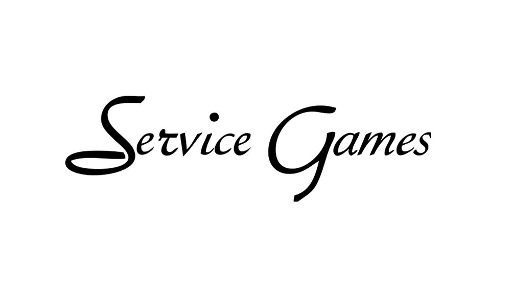
Before the iconic blue wordmark, Sega’s predecessors had their own distinct visual identities. The initial Service Games logo, as described in the original article, featured "elegant italics." This choice of typography would have conveyed a sense of professionalism and established business, suitable for a company providing amusement machines in a more traditional market. It didn’t "scream video game icon" because the concept of video games as we know them didn’t exist yet; the focus was on a different kind of entertainment.
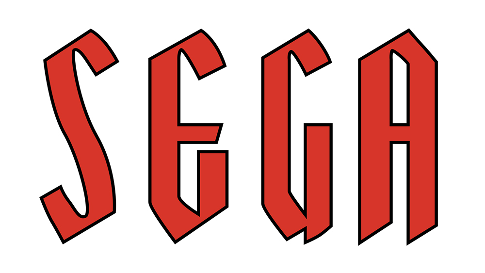
When the company transitioned to Sega Enterprises in 1965, its first logo was markedly different. It featured "tall, bold sans serif letters with diagonally cut tops," giving it a somewhat "fantasy novel kind of vibe." This design was more assertive and perhaps hinted at the company’s aspirations for a more dynamic and futuristic image, a precursor to the fast-paced, high-tech world of arcade games it would soon dominate. This logo, used until 1975, represented a bridging period, moving away from the purely functional toward a more stylized brand presentation.
The Birth of an Icon: The Blue "Sega" Wordmark (1975 Onwards)
The year 1975 marked the adoption of the Sega logo that, with minor refinements, remains instantly recognizable today. This pivotal design utilized the Yagi Double font, a bold and distinctive typeface also famously seen in the CNN logo. Initially, this logo was used in black, a standard choice for corporate branding.
However, a crucial strategic decision was made in 1982: the adoption of blue as the brand color. This wasn’t merely an aesthetic preference; it was a calculated move to enhance brand visibility and impact within the bustling, neon-lit environments of arcade halls. Blue, often associated with trust, reliability, and innovation, but also speed and excitement, provided a strong contrast against the vibrant backdrop of arcade machines. The white line integrated into the letters further amplified this contrast, making the logo pop and ensuring its legibility even amidst visual clutter. This blue wordmark became synonymous with cutting-edge arcade technology and, later, the revolutionary home consoles that challenged Nintendo’s dominance. The font was eventually updated to a bespoke design based on Yagi Double, ensuring exclusivity and precise brand control. This blue logo wasn’t just a corporate identifier; it was a cultural symbol, representing a generation’s entry into the digital frontier.
The "Mean Bean Machine" Anomaly: A Glimpse into Early Development Constraints
The anecdote about the misspelling of "Dr. Robotnik’s Mean Bean Machine" on the Game Gear port offers a fascinating insight into the technical constraints and practical compromises common in early video game development. The original title, Dr. Robotnik’s Mean Bean Machine, was a mouthful, and fitting it onto the limited screen real estate of the Game Gear’s small display, particularly for a prominent logo, posed a significant challenge.
To solve this, Sega’s developers made a pragmatic decision: they abbreviated "Machine" to "MACH." This wasn’t a mistake due to oversight or lack of proofreading; it was a deliberate, albeit unconventional, solution to a design problem. The "Dr. Robotnik’s Mean Bean MACH" logo allowed the title to be displayed clearly and legibly within the game’s graphical limitations, prioritizing functionality over strict adherence to the full title. This minor, yet memorable, deviation highlights the ingenious problem-solving often required in the pixelated worlds of early gaming, where every byte and every pixel counted. It also became a quirky detail that fans fondly remember, adding another layer to Sega’s rich history of creative solutions.
Official Responses: Crafting the Brand Narrative
While the original article doesn’t provide direct quotes from Sega officials on the logo’s meaning, the company’s historical actions and consistent branding efforts offer clear insights into its official narrative. From its inception as Sega Enterprises, the company has consistently presented itself as a forward-thinking entity, focused on entertainment and technological advancement.
The adoption of the concise "Sega" name itself was an "official response" to the need for a modern, international brand. It distanced the company from the more descriptive, slightly clunky "Service Games," signaling a shift from a service-oriented provider to a creative enterprise. This abbreviation was a statement of intent: simplicity, memorability, and global appeal.
Later, the strategic choice of the blue logo in 1982 further solidified Sega’s brand identity. Blue, as a color, is frequently associated with technology, professionalism, trust, and intelligence. For Sega, it also came to symbolize speed and innovation, perfectly aligning with its arcade hits like Out Run and Space Harrier, and later, its flagship character, Sonic the Hedgehog. The company consistently used this logo to project an image of dynamism and a competitive spirit, especially during the console wars of the 1990s. Its marketing campaigns, often aggressive and direct (e.g., "Genesis does what Nintendon’t"), were underpinned by this bold, blue visual identity. The logo became a promise to consumers: Sega would deliver exciting, cutting-edge experiences. The evolution to a bespoke font based on Yagi Double underscored the company’s commitment to owning its unique visual signature, ensuring its brand was distinctive and instantly recognizable in a crowded market.
Implications: Legacy, Lessons, and Lingering Myths
The journey of Sega’s name and logo carries significant implications for its enduring legacy, offering valuable lessons in branding, and highlighting the peculiar persistence of urban myths.
An Enduring Brand Legacy
Sega’s name, born from a practical abbreviation, evolved into a powerful and iconic brand that transcends its literal meaning. Today, "Sega" is not just a portmanteau; it is a cultural touchstone. It represents a specific era of gaming, a philosophy of innovation, and a distinct aesthetic that continues to resonate with millions worldwide. Even after exiting the console hardware business, the Sega brand has maintained its prestige and recognition. Its logo, particularly the distinctive blue wordmark, remains a symbol of quality and a connection to a rich history of entertainment. This enduring recognition demonstrates the power of consistent branding and the deep emotional ties consumers can form with a company’s identity. The initial pragmatic decision to shorten "Service Games" ultimately created a timeless brand that continues to thrive in the digital age.
Lessons in Branding and Identity
Sega’s story offers crucial lessons for businesses on the importance of brand identity. Firstly, simplicity and memorability are paramount. "Sega" is short, easy to pronounce across languages, and distinct. Secondly, visual identity is critical. The blue logo wasn’t just decorative; it was a strategic choice that enhanced visibility and reinforced brand attributes like speed and innovation. The consistency in its core design, despite minor refinements, ensured continuous recognition. Finally, the narrative behind a brand, even if initially mundane, can become compelling over time. While the "Service Games" origin might lack the initial allure of an urban legend, it speaks to a foundation of entrepreneurial spirit and adaptation, qualities that ultimately define Sega’s success. The company’s ability to evolve its visual identity while retaining its core brand message is a masterclass in corporate branding.
The Power of Myth and the Need for Clarity
The persistence of the "Italian slang" myth surrounding Sega’s name underscores the power of folklore and misinformation, especially in the absence of easily accessible, authoritative information. For decades, this playful, yet inaccurate, backstory offered a more intriguing explanation than the straightforward truth. This highlights the importance for companies to proactively communicate their history and brand origins to control their narrative. While the myth may have added a layer of irreverent charm for some, the true story of "Service Games" provides a more substantial and respectable foundation for understanding Sega’s pioneering role in the global entertainment industry. It reminds us that behind every iconic brand lies a real history, often more fascinating than the legends that grow around it.
In conclusion, the name "Sega" is far more than a simple abbreviation; it is a linguistic artifact that encapsulates decades of innovation, strategic evolution, and cultural impact. From its origins providing amusement to American troops in post-war Japan to its status as a global gaming powerhouse, Sega’s journey, mirrored in its name and logo, is a compelling narrative of adaptation, competition, and an unwavering commitment to interactive entertainment. The blue logo, etched into the memories of millions, continues to signify a legacy that redefined fun and pushed the boundaries of what video games could be.
 Evan Lee Salim
  Nana
Nana  Ammar Sabilarrohman