The Oxford Dictionary defines friendship with clinical precision: a “voluntary, personal relationship characterized by mutual affection, trust, and support.” Yet, for most of us, this definition feels insufficient—a sterile skeleton lacking the warmth of lived experience. For Or Misgav, a data designer and researcher, friendship is far more nuanced. It is the authenticity of a shared secret, the unspoken weight of a fragile silence, and the simple, radiant smile that signals recognition.
Recently, Misgav embarked on an ambitious, deeply personal project: to translate the intangible architecture of her social life into a structured, visual taxonomy. By mapping the people who have shaped her existence, she sought not to create a balance sheet of her connections, but to uncover the underlying patterns of her human experience. In doing so, she stumbled upon a profound existential question: When we offload the heavy lifting of data visualization to Artificial Intelligence, do we gain efficiency at the cost of our own humanity?
The Taxonomy of Connection
The project began as an exercise in introspection. Misgav started by cataloging every person she holds dear, first relying on her own memory and then validating her list against the digital archive of her Facebook connections. However, the act of naming them immediately sparked a crisis of categorization.
“Can family members count as friends?” Misgav asked herself. She pointed to her nieces, with whom she has shared years of constant, chosen dialogue. While their initial bond was forged through the circumstance of birth, their ongoing relationship is a deliberate, daily choice.
The taxonomy grew more complicated when she addressed the fluidity of human interaction. What happens to the "friend" who no longer supports your life choices? If she excluded those who had drifted away in the last eight months, was she effectively discarding the history of that bond? Moreover, in an era where the term "friend" is used with increasing looseness, where does the neighbor—someone with whom she has shared only a few cups of tea—fit on the spectrum of intimacy?
To bring order to this chaos, Misgav distilled friendship into three core, weighted metrics (each scored on a scale of one to three):

- Affection: The level of emotional resonance.
- Trust: The reliability of the bond.
- Support: The degree of mutual encouragement.
She further anchored her dataset with two "judgment values": Duration (the length of the connection) and Contact (the recency of interaction). She limited her scope to the past 24 months—a period marking the birth of her daughter. This constraint yielded an unexpected revelation: during a time when she often felt isolated as a new mother, the data provided a cold, hard truth: she was, by every metric, deeply and consistently loved.
From Sketching to Scripting: A Technological Shift
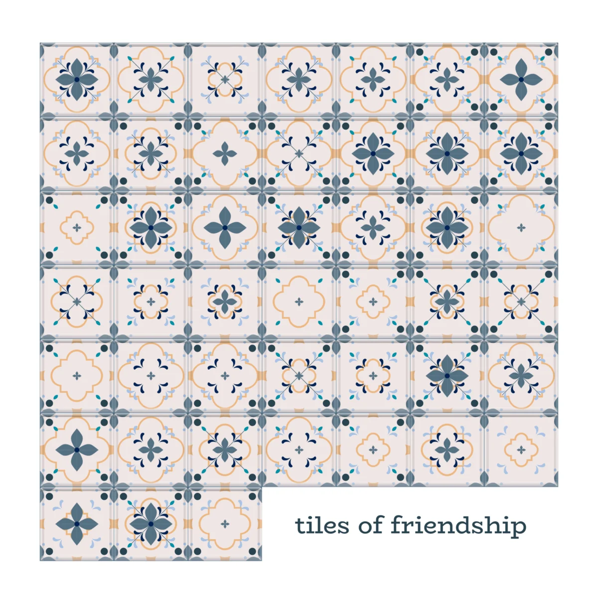
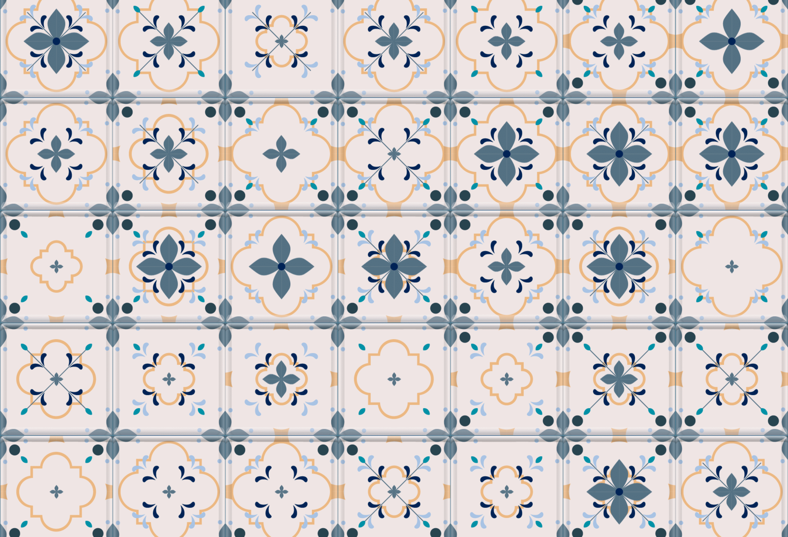
The project began in the traditional analog realm. In her notebook, Misgav sketched a series of “tiles,” visualizing the hierarchy of her relationships. Level one served as the base, while level three incorporated increasingly complex details to represent deeper intimacy.
Initially, she experimented with color-coded backgrounds to denote the duration of these friendships. However, she quickly abandoned this approach. The palette felt too loud, shifting the narrative focus from the profound impact these individuals had on her life to a superficial display of her own social prowess. “It made the story about ‘how good I am at making friends’ rather than ‘how these friendships built me,’” she noted.

Then came the pivot. Traditionally, Misgav would have spent hours in Adobe Illustrator and Figma, manually clicking, copying, and aligning layers. Seeking to streamline her workflow, she turned to the current generation of generative AI tools: Claude and Gemini.
The process became a hybrid of human intent and machine execution. She tasked Gemini with drafting a prompt for Claude, which then generated a Python script. This script processed her Excel data and produced the stacked layers as high-resolution PNG files. For someone used to manual design, the experience was jarringly efficient. “Claude taught me how to install Python on my Mac,” she recalled. “Honestly, I felt like I was back in the 90s, typing into a terminal to launch a game.”
With a few back-and-forth prompts, the grid was aligned, and the visual assets were generated in seconds. The labor-intensive process of months had been compressed into a single, automated afternoon.

The Unforeseen Cost of Efficiency
As Misgav reviewed the final folder of generated tiles, she was struck by a disquieting sensation: she didn’t recognize the data.
In the world of data visualization, the "data familiarization" stage is often considered a meditative rite of passage. It is the hour where the designer handles each data point with care, mentally linking the numbers back to the person, the memory, and the history behind them. By automating the execution through code, Misgav had inadvertently bypassed this essential emotional engagement.
The tiles were technically perfect—visually harmonious and mathematically sound—but they felt hollow. This experience raises a fundamental, perhaps uncomfortable question for the field of data design: If the AI builds the layers, are we truly co-creators, or are we merely becoming the curators of our own memories? When we lose the manual friction of creation, do we also lose the connection to the story the data is meant to tell?

Implications for the Future of Data Storytelling
The implications of Misgav’s experiment extend far beyond the aesthetic of her personal friendship map. We are entering an era where the barrier between raw data and polished visualization is dissolving. While this democratizes the ability to create, it poses a threat to the "human-in-the-loop" philosophy.
If we offload the labor of design to algorithms, we must be vigilant about what is lost in translation. The "meditative" phase of working with data is where empathy is encoded into the design. Without that phase, data visualization risks becoming a sterile, albeit beautiful, product that lacks the soul of the subject matter.
However, the project also highlights a new form of agency. By using AI as a tool rather than a replacement, designers can iterate faster, allowing more room for conceptual exploration. Misgav’s work suggests that the role of the data designer is shifting from that of a "drafter" to an "architect of intent."

A Token of Gratitude
Ultimately, despite the initial feelings of digital detachment, Misgav’s final grid stands as a powerful testament to her life. These tiles—whether rendered by hand or by code—represent the people who stayed through the awkwardness of puberty, the friends who signed her wedding book, and the new companions discovered during the mundane routines of motherhood.
The project transformed into something greater than a simple visualization; it became a "token of gratitude." It is a snapshot of her soul as it existed in 2026, shaped by the people she has chosen to keep close. It serves as a reminder that while machines can handle the scripting and the layering, the underlying substance of the work remains fundamentally human.
In an increasingly automated world, the act of mapping our connections is a radical one. It forces us to confront who we are and who we value. Whether we build these maps with a mouse or a prompt, the goal remains the same: to document the fragile, voluntary, and beautiful relationships that make life worth living—and worth mapping.