
The Oxford English Dictionary defines friendship as a "voluntary, personal relationship characterized by mutual affection, trust, and support." It is a clinical, objective description for a phenomenon that is arguably the most subjective experience of human life. For data designer Or Misgav, however, the dictionary definition falls short. To her, friendship is an architecture of authenticity—a trustworthy partnership woven from the threads of shared humor, kindness, and deep, unspoken understanding.
In a recent experiment, Misgav sought to bridge the gap between the clinical and the emotional by applying the rigorous logic of data design to the messy, intangible nature of human social circles. The result was more than just a visualization; it was a meditation on how we quantify the people who define us.
The Taxonomy of Connection: Defining the Indefinable
As a practitioner who has spent her career obsessed with categorizing the intangible, Misgav faced a fundamental challenge: How does one map a social network that is inherently fluid? A relationship is never static; it is a snapshot in time, constantly evolving through seasons of growth, conflict, and quiet endurance.
"I didn’t want a balance sheet," Misgav explains, "but I did want to see the patterns."

The project began with a raw, unfiltered list of everyone she holds dear. She started with memory, then cross-referenced her findings with her Facebook friends list. Immediately, the limitations of standard taxonomy became apparent. Does family count as friendship? If she and her nieces maintain a connection through choice rather than just biological obligation, are they friends?
Furthermore, she grappled with the "drift" inherent in adult friendships. What of the confidante who failed to support a major life decision seven months ago? If they are no longer in active alignment, does their exclusion from the map signify the end of the bond, or merely a change in its state? These questions highlight the tension between our digital tools—which often categorize people into binary "friend/not-friend" buckets—and the nuanced reality of human interaction.
To impose order on this chaos, Misgav distilled the concept of friendship into three core metrics, each scored on a scale of one to three:
- Trust: The degree of reliance and safety within the bond.
- Affection: The emotional warmth and mutual appreciation.
- Support: The presence of a reliable "safety net" during life’s challenges.
To ensure the data remained anchored in the present, she introduced two temporal judgment values: Duration (the length of the relationship) and Contact (the recency of interaction). She limited her scope to individuals with whom she had maintained contact within the last 24 months—a period defined by the arrival of her daughter.

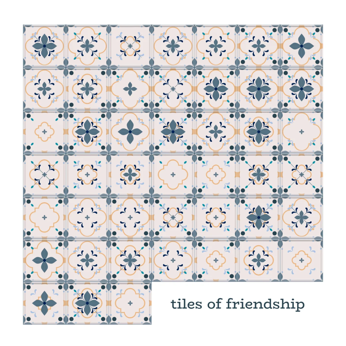
Chronology of the Project: From Sketchbook to Script
The evolution of the visualization followed a path from organic, hand-drawn intuition to algorithmic precision. Initially, Misgav conceptualized the project through a series of "tiles" in her notebook. She viewed herself as a vessel, allowing the visual language of the relationships to spill onto the paper. Level one was a simple base; level three added layers of complex detail.
However, the process soon hit a wall. Her initial attempt to use background colors to denote duration created a palette that was too "loud." She realized the aesthetic was misaligned with the intent: the visualization was beginning to celebrate her ability to make friends, rather than the ways in which those friends had shaped her personal narrative.
The second phase of the project marked a significant shift in methodology. Historically, Misgav would have spent hours in Adobe Illustrator and Figma, manually clicking, copying, and aligning layers. Seeking a more efficient "vision to execution" workflow, she pivoted to large language models.
Working with Gemini and Claude, she began to treat her coding environment as a design studio. She utilized Gemini to construct the necessary prompts for Claude, which then generated a Python script to process her Excel dataset. The script translated the raw data into a series of stacked PNG files.

"Honestly, I felt like I was back in the 90s, typing into a terminal to launch a game," Misgav notes. With a single command, the automated system generated the assets. A few iterative cycles with the AI, and the grid was aligned. The technical labor of hours had been compressed into a single, seamless click.
Supporting Data: The Insight of the "New Mother"
The most striking finding of the project was not the final visual, but the realization that occurred during the analysis phase. As a new mother, Misgav had often felt the isolating, lonely weight of early parenthood. She frequently questioned the strength of her support network during those taxing months.
However, the data told a different story. By mapping her connections over the last two years, she was able to look past the anecdotal feeling of loneliness and see the objective reality of her social landscape. The data revealed that she was, in fact, deeply and consistently supported. It was a poignant reminder of how our internal emotional state can blind us to the external reality of the community that surrounds us.
Implications: The Cost of Efficiency and the Future of Curation
The conclusion of the project brought about an unexpected crisis of authorship. As she reviewed the final, perfectly rendered grid, Misgav experienced a sense of profound detachment. She realized that by automating the execution of the visual, she had bypassed the "data familiarization" stage—the meditative, often tedious hours spent handling each data point, remembering the context of the person behind the number.

"The tiles were beautiful, but they felt distant," she admits.
This raises a fundamental, existential question for the field of data visualization: If the AI handles the heavy lifting of construction, are we still designers, or have we transitioned into mere curators of our own memories?
The implication is that the "friction" of manual labor in design is not just a nuisance; it is a vital part of the creative process. It is in the manual manipulation of the data that the designer connects with the story. When that friction is removed, the risk is a loss of intimacy with the subject matter.
Conclusion: A Token of Gratitude
Despite the technological detachment, the final project stands as a monumental testament to Misgav’s life in 2026. The tiles are more than data points; they are placeholders for the friends who walked through puberty by her side, the guests who signed her wedding book, and the parent she met at preschool whose friendship grew in the daily rhythm of school runs.

This project suggests that while we can use sophisticated tools to map our lives, the value of the work remains rooted in the human connections themselves. It is a snapshot of a soul, rendered by machines, but held together by the "voluntary, personal relationships" that make the data worth mapping in the first place.
As we move toward an increasingly automated future, Misgav’s experiment serves as a cautionary and hopeful guide. It suggests that while we may delegate the "how" of creation to algorithms, the "why"—the impulse to understand, to cherish, and to map the people who make us who we are—remains a deeply, uniquely human endeavor.
Or Misgav, a critical thinker and data visualization expert, has shown that when we look at our data, we aren’t just looking at charts—we are looking at the architecture of our own humanity. Whether she is leading UX strategy or conducting doctoral research on decision-making, her work continues to bridge the cold logic of BI with the warm, unpredictable, and essential reality of the human experience.
