In the modern age, we are drowning in data. From the World Health Organization (WHO) to UNICEF, global development indicators are tracked, charted, and mapped with scientific precision. Yet, there is a recurring problem: information does not always equate to impact. When we read that a country has "60% access to safe drinking water," we process the statistic as a mental abstract. It informs us, but it rarely moves us.
This disconnect between raw data and human empathy is the catalyst for The Empty Glass Project, a bold experiment in minimalist data design. Created by designer and creative strategist Inumimo Idowu, the project challenges the prevailing orthodoxy that complex problems require complex visualizations. By reducing the global water crisis to its most visceral, relatable form—a simple glass of water—Idowu is proving that in the quest for global awareness, simplicity is the most powerful tool in the shed.
The Problem with Precision: When Data Fails to Connect
For decades, the standard for data visualization has been accuracy, comprehensiveness, and analytical rigor. We use choropleth maps to color-code the planet, bar charts to compare GDPs, and scatter plots to correlate variables. These tools are undoubtedly useful for policymakers and researchers. However, for the general public, these visualizations often act as a barrier rather than a bridge.
"When you see a percentage like 60%," Idowu notes, "you are being asked to do mental labor. You have to translate that number into a reality. For most people, that translation never happens. They see the number, they nod, and they scroll past. The data remains distant because it hasn’t been grounded in the user’s lived experience."
The traditional dashboard approach often prioritizes "data density"—cramming as much context as possible into a single frame. While this is scientifically "correct," it often triggers a cognitive fatigue that causes the viewer to disengage. The challenge, therefore, is not how to show more data, but how to make the existing data felt.
Chronology of a Design Shift: From Complexity to Intuition
The genesis of The Empty Glass Project began with a fundamental shift in the designer’s internal questioning. Instead of asking, "How can I represent this dataset with maximum efficiency?" Idowu asked, "What does this data feel like in the hands of a person living without access?"
The journey of the project can be traced through several critical phases:
- The Recognition of the Gap (Early 2025): Idowu identified that despite the abundance of high-quality water data, public apathy regarding the global water crisis remained high. He analyzed successful social advocacy campaigns and realized they almost always centered on a single, evocative object.
- The Conceptualization of the Metaphor (Mid-2025): The "glass of water" was selected for its universal accessibility. Every human on earth understands what it means to hold a glass of water. It is a daily, mundane action that, when disrupted, becomes a symbol of existential crisis.
- Prototyping and De-cluttering (Late 2025): The initial designs included maps, legends, and comparative tables. These were systematically stripped away. The final iteration removed axes, complex legends, and tooltips, leaving only the glass and the fluid level.
- The Public Launch (May 2026): Upon release, the project gained traction for its immediate, intuitive interface. Users were no longer analyzing a chart; they were "filling" a glass, creating an interactive, emotional loop that turned data consumption into a sensory experience.
Supporting Data: The Reality Behind the Glass
The beauty of The Empty Glass Project lies in its deceptively simple exterior, which masks a foundation of rigorous, verified data. The project relies on the same trusted datasets used by global humanitarian organizations.

- The Baseline: The data is drawn from WHO/UNICEF Joint Monitoring Programme (JMP) for Water Supply, Sanitation, and Hygiene.
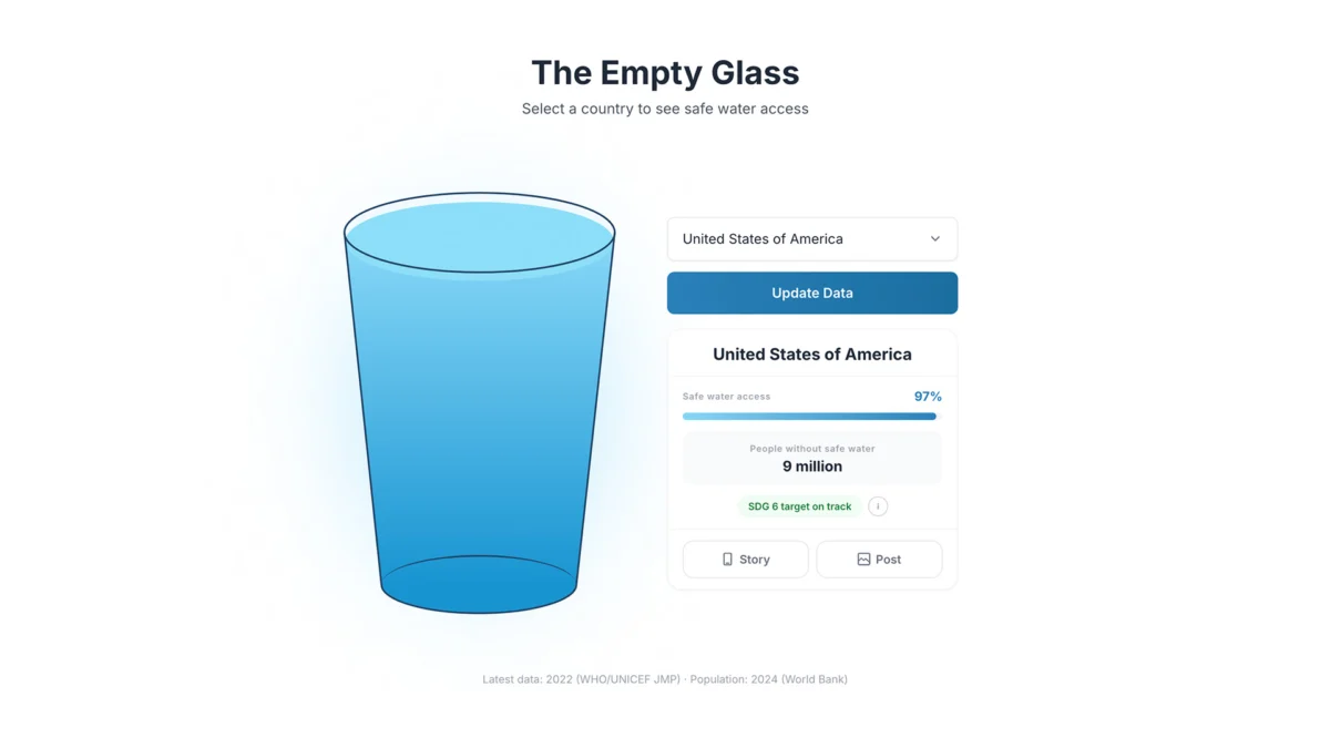
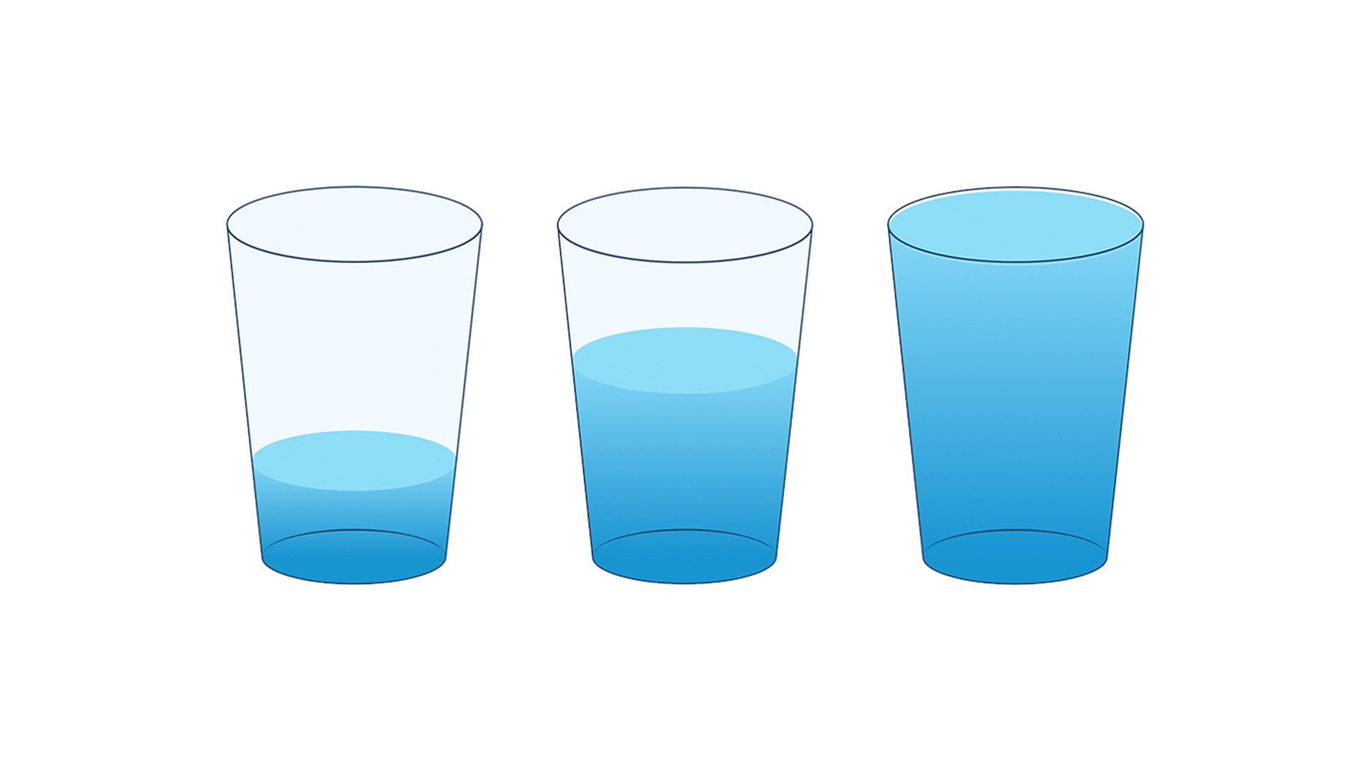
- The Scaling: Each glass is rendered proportionally to the percentage of the population with access to safely managed drinking water. A full glass represents 100% access, while a glass with a sliver of water represents acute scarcity.
- The Comparative Layer: By allowing users to select different countries, the interface facilitates a "side-by-side" comparison that is more visceral than a spreadsheet. When a user compares a glass from a high-income nation to one from a region experiencing severe water stress, the disparity is not just understood mathematically—it is perceived as a moral urgency.
This approach acknowledges that while the data is fixed, the human reaction to it is fluid. By removing the technical noise, the user is forced to confront the reality of the scarcity rather than the accuracy of the methodology.
Official Perspectives: The Role of Design in Advocacy
Humanitarian organizations have long struggled with the "compassion fatigue" associated with statistics. Experts in the field of data ethics and design argue that The Empty Glass Project represents a new frontier in "empathetic design."
"We are moving past the era of the ‘big data’ obsession," says Dr. Elena Vance, a sociologist specializing in humanitarian communication. "We are entering the era of ‘human-centered’ data. When you present an empty glass, you are not just showing a lack of water; you are showing a lack of dignity, a lack of health, and a lack of opportunity. You are forcing the viewer to project themselves into the scenario. That is the highest form of communication."
However, there is a tension between this approach and the traditional demands of academia. Critics occasionally point out that simplifying data can lead to a loss of nuance. Idowu responds to this by clarifying the role of his tool: "I don’t expect a scientist to use my project to publish a paper. My project is not a replacement for a spreadsheet; it is an entry point for the public. It is a hook that pulls the viewer in, so that they eventually want to look at the spreadsheets."

Implications for the Future of Data Storytelling
The success of this minimalist experiment carries profound implications for the future of information design across all sectors, from environmental reporting to economic policy.
1. The Death of the "Dashboard Mentality"
The corporate and non-profit worlds are often obsessed with the "all-in-one" dashboard. Idowu’s work suggests that when everything is important, nothing is important. Future design trends will likely favor "singular-focus" visualizations that prioritize one core truth over ten peripheral variables.
2. Empathy as a Design Metric
Historically, data visualization has been measured by its clarity and speed. Moving forward, "empathetic resonance" should be added to the metrics of success. If a visualization can make a user care about a statistic they previously ignored, it has succeeded where more "accurate" charts have failed.
3. Accessibility of Information
Minimalism is, by definition, more accessible. By removing jargon, complex legends, and dense formatting, we lower the barrier to entry for the general public. This democratizes knowledge, allowing citizens—not just experts—to participate in global conversations about inequality.

Conclusion: Making the Complex Feel Simple
In the end, The Empty Glass Project serves as a poignant reminder that data is not an end in itself; it is a lens through which we view the world. If that lens is too cluttered, the world becomes obscured by the very tools we use to study it.
Inumimo Idowu’s work invites us to reconsider our relationship with information. By stripping away the layers of abstraction, he has not made the issue of global water access "simpler"—he has made it more urgent. He has reminded us that if we want to change the world, we must first make people feel the weight of the problems we are trying to solve.
As we move toward a future defined by ever-increasing data volumes, the ability to distill that information into a singular, human-centric truth will be the most valuable skill a communicator can possess. Sometimes, the most sophisticated design choice is to set everything else aside and simply show the glass. Because, as the project proves, when we see a glass that is nearly empty, we don’t just see a statistic—we see a call to action.
