
After six years in the trenches of reporting and analytics, I have come to accept an uncomfortable truth that many data professionals spend their entire careers denying: Your meticulously crafted, highly interactive Tableau dashboard is likely destined to become a static, two-dimensional screenshot on Slide 17 of a corporate presentation.
For those working in sales operations, finance, or executive-facing analytics, this is not a hypothesis—it is a daily operational reality. Your VP is not going to log into Tableau Server, navigate to a project folder, and toggle filters at 9:00 a.m. before a high-stakes board meeting. They are going to download your work, paste it into a slide deck, and present it to the C-suite.
Once I accepted that my "interactive masterpiece" was essentially a visual asset for a slide deck, my approach to design shifted fundamentally. To bridge the gap between technical brilliance and executive utility, I have developed five non-negotiable rules for modern dashboard design.
1. Design for PowerPoint from Day One
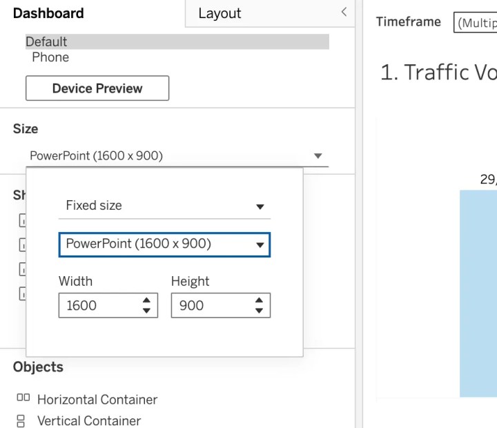
The most common mistake junior analysts make is designing for the "Tableau Desktop Browser" view—a vast, expansive canvas that rarely translates to the rigid, 16:9 constraints of a boardroom projector.
When you build a dashboard without considering the export medium, you invite disaster. I once spent days perfecting a complex sales funnel, only to see it "crushed" into a single slide during a leadership review. Text that was legible on my monitor became microscopic, and the layout shifted into a cluttered, unreadable mess.
The Fix: Use Tableau’s built-in PowerPoint layout (16:9 aspect ratio) from the very first wireframe. By designing specifically for the dimensions of a slide, you ensure your work fits perfectly into standard Google Slides or PowerPoint without the risk of awkward cropping, broken white space, or distorted aspect ratios.

Pro Tip: Never assume your layout will hold. Always use the "Dashboard > Export as PowerPoint" function early and often during the development process. If it doesn’t look professional in a static export, it isn’t ready for your stakeholders.
2. The Illusion of Interactivity: Designing for Zero Engagement
The hardest lesson for any data visualization expert to swallow is this: In an executive context, you must build assuming zero interactivity. When a dashboard is pasted into a slide deck, all the "magic"—the hover actions, the tooltips, the dynamic parameters, and the drill-down capabilities—vanishes.
This forces a massive shift in strategy. If your users need to see performance across four different regions, you cannot rely on a single filter. You must create four distinct, static versions of the view. While this may feel like redundant work, it is the only way to guarantee that your stakeholders see exactly what they need at the precise moment they need it.
If a critical insight is hidden behind a "click," assume it will never be seen. Every essential metric, trend line, and variance analysis must be visible on the "page load." If the data isn’t immediately apparent to the viewer, it effectively does not exist.
3. The Structural Power of Containers
When your dashboard contains multiple visualizations, containers are the only thing standing between you and a formatting catastrophe. Without strictly defined containers, your floating objects will shift unpredictably during the export process. I have seen perfectly aligned KPI cards overlap bar charts simply because the developer failed to lock the objects into a horizontal or vertical container.
Furthermore, PowerPoint does not tolerate white space well. A minimalist dashboard might look elegant on a wide-screen monitor, but in a slide deck, that same space looks like an unfinished draft. Executives prefer dense, information-rich visuals.
Best Practice Workflow:
- Use Tiled Layouts: Avoid floating objects at all costs.
- Standardize Padding: Keep padding consistent across containers to ensure the "grid" feels intentional.
- Audit Your Hierarchy: Ensure your containers are nested logically so that they collapse or expand in a predictable fashion during export.
4. Establishing Governance and Version Control
Collaboration is where most analytics projects fall apart. If you are working in a team environment, you need a rigorous, visual, and naming-convention-based system to prevent "Version Hell."
I have seen countless projects derailed by files named "Bookings_Final_v2_Revised_Actuals." This is not just annoying; it is a governance failure that leads to incorrect data being presented to leadership.
The Golden Rules of Governance:
- Color-Code Dashboards: Use the "Dashboard Tab Color" feature to denote status. For example, use red for "In Development," yellow for "Under Review," and green for "Production-Ready."
- Naming Conventions: Adopt a strict syntax. A good format looks like:
[Period]_[Metric]_[Version]. For example:Q4_Bookings_FinalorPipeline_Coverage_BarChart. - Documentation: Maintain a simple, centralized log of what each dashboard does, who it is for, and when it was last updated.
5. The Professional Standard: Corporate Branding
Your dashboard is a product. Like any product, it requires consistent branding. Aligning your dashboard with your organization’s standard slide deck template is not just a vanity project—it is a matter of credibility.
When a VP exports your dashboard, they are not just sharing data; they are sharing a representation of your department’s quality. If that dashboard looks like a generic Tableau output, it feels like an afterthought. If it incorporates company logos, specific color palettes, and professional typography that matches your company’s official PPT deck, it feels like an integrated, high-value asset.

Place your logo consistently—typically in the top-left or bottom-right corner—so that when the export happens, the branding remains anchored and authoritative.
Implications: The Shift Toward "Static-First" BI
The evolution of business intelligence is moving away from the "choose your own adventure" style of data exploration and toward a "curated insight" model. While Tableau is a powerful tool for discovery, it is also a powerful tool for communication.
The industry must reconcile the fact that as we move higher up the corporate ladder, the demand for interactivity decreases, while the demand for narrative clarity increases. Executives don’t want to play with parameters; they want a clear, data-backed answer to a specific question.
By treating the PowerPoint export as a design constraint rather than a failure of the software, we can produce work that is both beautiful and functional.
The Bottom Line
The moment you accept that your Tableau dashboard will ultimately live in a PowerPoint slide, you start designing better dashboards.
Stop optimizing for complex interactivity that will never be used. Start optimizing for the screenshot. Use the 16:9 layout. Build static versions of your filtered views. Lock your components into rigid, well-managed containers. Name your files like a professional. Add your company logo.

Sometimes, being a great analyst means accepting that your masterpiece will be copied and pasted into slide 23 of a presentation. By designing for that reality from the very beginning, you ensure that your data is not just seen—it is understood, trusted, and utilized to drive high-level decision-making.
Your stakeholders don’t care about your elegant parameter actions if they can’t paste your dashboard into their Monday morning board deck. When we stop fighting the reality of how executives consume data, we stop being mere "dashboard builders" and start becoming strategic partners in the business.
