
 By Siti Muinah
For six years, the world of reporting and analytics has taught me an uncomfortable, often ignored truth about data visualization: The more beautiful and interactive your Tableau dashboard is, the more likely it is to be stripped of its functionality and relegated to a static, two-dimensional PowerPoint slide.
If you operate within the high-stakes environments of sales operations, finance, or executive-facing analytics, this reality is likely already familiar. Your Vice President of Sales or your CFO is rarely going to open a Tableau Server URL at 9:00 a.m. on a Monday. They won’t hover over your tooltips or toggle your parameter actions. Instead, they will download your hard work as a PNG or a slide deck, paste it into "Slide 17," and present it to the C-suite.
Once I reconciled my idealism with this practical reality, I stopped viewing it as a failure of adoption and started treating it as a fundamental design challenge. To thrive in the modern corporate reporting landscape, you must design for the boardroom, not just for the browser.
The Reality of the Modern Data Workflow: Main Facts
The primary function of a business intelligence tool is to drive decision-making. However, the mechanism of that decision-making has shifted. While modern BI platforms are built for exploration and "data discovery," the organizational culture of most enterprises is built on the narrative power of slide decks.
When a dashboard is moved from a browser to a slide, it undergoes a "lossy" transformation. The interactivity—the very thing that makes Tableau powerful—is severed. Filters become inert, tooltips vanish, and drill-down capabilities are rendered useless. Yet, the insight must remain. The data analyst’s role is to ensure that even when the dashboard is static, the message is clear, legible, and actionable.

A Chronology of the "Dashboard-to-Deck" Evolution
The disconnect between developers and executives often stems from a fundamental difference in timelines and priorities.
- The Development Phase: The analyst builds in the native environment, optimizing for filter speed, data density, and user exploration. They are focused on the "how"—the underlying technical complexity.
- The Distribution Phase: The report is shared. Executives receive the link, but they are time-poor. They require an immediate summary to present to their superiors.
- The Conversion Phase: The executive captures the screen. This is where the disaster often occurs: text overlaps, fonts shrink, and the layout breaks because the developer never accounted for a 16:9 export.
- The Presentation Phase: The image is projected on a screen in a conference room. If the visualization was not designed for this, the data becomes invisible to anyone sitting more than five feet away.
Recognizing this lifecycle, I have developed five non-negotiable pillars for designing analytics that survive the journey from Tableau to PowerPoint.
1. Design for PowerPoint from Day One
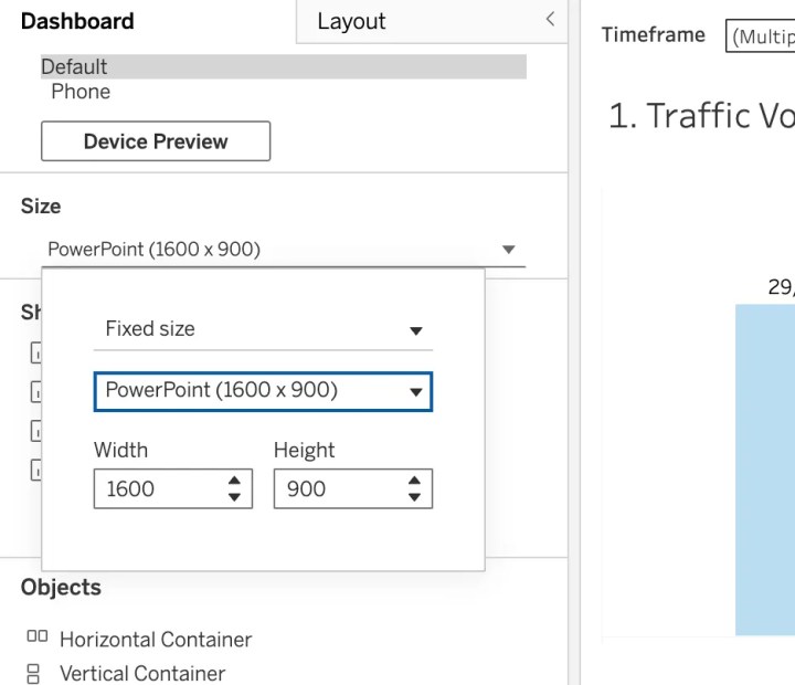
Device preview matters exponentially more when your dashboard is destined for a deck. In the early stages of my career, I built dashboards in the default "Desktop Browser" view, which is far too wide and shallow for standard presentation software. When exported, the entire dashboard would compress, rendering the text illegible—a professional disaster right before a leadership briefing.
The Strategy: Utilize Tableau’s built-in PowerPoint layout (16:9 aspect ratio) from the very start of your project. This ensures your dashboard fits seamlessly into Google Slides or PowerPoint without the need for awkward cropping or excessive white space. Stop designing for the screen; start designing for the slide.
Pro Tip: Before finalizing, navigate to ‘Dashboard > Export as PowerPoint’ to preview exactly what your stakeholders will see. Never assume your formatting will hold up without verifying the output.
2. Accept That 80% of Functionality Will Vanish
The most painful lesson for an analyst is the realization that you must build assuming zero interactivity. When you export to PowerPoint, you lose:
- Hover-based tooltips (the most valuable way to provide context).
- Dynamic filter updates (users cannot change views).
- Drill-down hierarchies (users cannot see the "why" behind the "what").
- Parameter-driven chart swapping.
This forces a change in your strategy. You must build multiple, distinct, static versions of the dashboard to cover the various scenarios that would otherwise be handled by a single filter. If your stakeholders need to see pipeline performance across different business units, create separate, high-quality static views for each. Every critical insight must be visible the moment the slide is turned. If a user has to "click" to find an answer, assume they will never see it.
3. The Power of Containers for Layout Control
In the world of static exports, white space is not your friend—it is the enemy of professional polish. A minimalist, airy dashboard might look sophisticated on a monitor, but it looks empty and "unfinished" when pasted into a corporate deck. Executives expect density and information-rich slides.
The Container Workflow:
- Locking Elements: Containers act as the structural skeleton of your dashboard. They keep your KPI cards, charts, and legends locked in place during the export, preventing the dreaded "overlapping chart" syndrome.
- Tiled vs. Floating: While floating objects are tempting for design freedom, they are volatile in exports. Use tiled containers for consistency.
- Density: Aim for a layout that fills the space. Use containers to stack information vertically, ensuring that no single element is forced to shrink to compensate for a large, empty gap.
4. Governance Standards and Version Control
When you are creating multiple "static" versions of a dashboard to account for different views, the risk of confusion increases exponentially. You must treat your dashboard files with the same rigor as software code.

Governance Best Practices:
- Color-Coding: Utilize Tableau’s tab color-coding. Use a specific color for "Ready for Production," "In Development," and "Archived."
- Naming Conventions: Never use "Sheet 1," "Sheet 2," or "Dashboard (1)." Adopt a strict format:
[Date]_[Metric]_[Context]_[Version]. For example:2024-Q4_Sales_Pipeline_v3_Final. - Consistent Naming: This is not just for you—it’s for the team. If a teammate needs to update your work, clear naming conventions prevent hours of frustration.
5. Professional Branding and Logo Integration
Your dashboard is a reflection of your professional brand. Often, these slides are forwarded to clients or external stakeholders without your knowledge. If your dashboard is unbranded or uses inconsistent fonts, it reflects poorly on the entire organization.
- Placement: Align your placement with your company’s official slide master. Placing a logo in the top-right corner, consistent with the corporate template, makes the dashboard feel like a native part of the presentation rather than a third-party screenshot.
- Typography: Match your dashboard fonts to your company’s style guide. It creates a cohesive narrative that builds trust with the audience.
Implications for the Analytics Profession
The shift toward "designing for the screenshot" has broader implications for our field. Some argue this dumbs down analytics, but I view it as an evolution of maturity.
Data Maturity: An analyst who ignores the user’s preferred delivery method is failing to communicate. By embracing the limitations of the slide deck, we are not sacrificing our craft; we are ensuring that the data actually lands in front of the people who make the decisions.
The Human Factor: When you design for the boardroom, you are forced to prioritize what truly matters. You stop cluttering the dashboard with "nice-to-have" features and focus on the KPIs that drive the business. You become an editor, not just a builder.

Final Thoughts: The Bottom Line
The moment you accept that your Tableau masterpiece is destined to be a PowerPoint slide, you become a more effective analyst.
Stop optimizing for the "cool factor" of interactivity and start optimizing for the clarity of the screenshot. Use the 16:9 layout. Build static versions for key segments. Lock your elements in containers. Apply rigorous naming conventions. Add your brand identity.
Your stakeholders do not care about your elegant parameter actions if they cannot copy-paste your dashboard into their Monday morning meeting deck. True mastery in data visualization is not just about what you can build; it is about ensuring that what you build is consumed, understood, and acted upon, regardless of the medium. Sometimes, being a great analyst means accepting that your masterpiece will be copied and pasted into "Slide 23"—and designing for that reality from the very beginning.
 Lina Irawan
  Nana
Nana  Nila Kartika Wati