
 By Azzam Bilal Chamdy
CLICHY, FRANCE — When French National Centre for Scientific Research (CNRS) research director and textile artist Lauriane Mouysset launched her inaugural data visualization project, she anticipated a wave of digital engagement. Entitled “À sa place” (In Her Place), the digital piece was meticulously designed to accompany her physical art installation, “Guerrières” (Warriors), at the Pavillon Vendôme contemporary art center in Clichy.
Published online on February 11, 2025—coinciding intentionally with the International Day of Women and Girls in Science—the project was meant to jump-start online conversations before the physical gallery doors opened six days later.
Instead, it hit a wall of silence.
The digital object failed to circulate beyond tight-knit activist circles. That failure, initially viewed as a marketing misstep, ultimately triggered a profound methodological re-examination. By forcing Mouysset to peel back her project’s artistic layers and scrutinize her underlying data, the failed viral attempt transformed a piece of esoteric gallery art into a rigorous, empirical tool for exposing how systemic gender bias operates—and how it can be reversed.

The Genesis of an Installation: Bridging Art and Activism
To understand the trajectory of “À sa place,” one must look to the intersection of Mouysset’s professional and creative lives. As a CNRS research director specializing in the biodiversity crisis at the crossroads of economics, ecology, and philosophy—and a recognized ambassador for the French association Femmes & Sciences—Mouysset occupies a unique dual space. Having navigated a scientific career unhindered by overt gender stereotyping, she dedicates her time to ensuring that younger generations face no such hurdles.
Between 2022 and 2024, this commitment took physical form in her studio, Mouysset Studio. Mouysset embroidered a striking series of portraits depicting overlooked women scientists. These works featured vintage black-and-white photographs overlaid with brightly colored, hand-stitched masks.
When the Pavillon Vendôme invited her to exhibit these pieces in a group show running from February 17 to May 2, 2025, Mouysset saw an opportunity to scale her message. She wanted to engage teenage visitors who might otherwise feel alienated by contemporary art.
“A QR code would resonate with their digital habits and their heavy phone use, and it would spark their curiosity,” Mouysset explained. Positioned between the embroidered portraits, the digital data visualization accessed via the QR code was intended as a bridge. It would pull younger audiences into the digital space, encouraging them to look more closely at the historical portraits lining the gallery walls.
Chronology of a Digital Stumble
The timeline of the project reveals a calculated strategy that ultimately collided with the realities of modern digital consumption:
- 2022–2024: Mouysset produces “Guerrières,” a series of embroidered textile portraits honoring historical women scientists whose contributions were overshadowed by male colleagues.
- Autumn 2024: The Pavillon Vendôme contemporary art center in Clichy invites Mouysset to exhibit the portraits in an upcoming group show. She decides to build her first-ever data visualization to accompany the physical display.
- February 11, 2025: “À sa place” is published online, deliberately timed for the International Day of Women and Girls in Science to catch a wave of mainstream media attention.
- February 11–17, 2025: The piece circulates, but strictly within localized activist networks. Family, friends, and colleagues offer polite praise, but warn that the project feels cryptic and overly dependent on art-world conventions.
- February 17, 2025: The physical exhibition opens. Gallery visitors confirm the pre-launch diagnosis: while visually striking, the digital piece is too elusive for casual observers to digest or share.
- Late February to Summer 2025: Recognizing that aesthetic elegance has compromised the work’s political utility, Mouysset initiates a massive redesign. Over 10 formal iterations, she refines the UI, sequences the narrative, and re-analyzes her dataset.
- 2026: The revised, highly clarified version of “À sa place” replaces the original on her website, offering a blueprint for how politically engaged art can achieve civic virality without sacrificing intellectual rigor.
The Clash of Two Regimes: Art vs. Social Media
The core diagnosis of the initial failure lay in a fundamental incompatibility between the expectations of contemporary art and the ruthless mechanics of social media.
In a physical gallery, viewers willingly surrender time. Contemporary art thrives on ellipsis, subtlety, and the slow, contemplative unpacking of meaning. An installation can afford to be enigmatic because the captive viewer stands still, willing to invest cognitive energy.
Social media operates under an entirely different regime. Reading time is measured in seconds. Content that cannot be immediately grasped, contextualized, and rephrased by the viewer is routinely ignored.

“What this failure showed me was that a digital object attached to a politically engaged work of contemporary art, and meant to circulate, cannot simply extend the aesthetics of the installation,” Mouysset realized. Graphic restraint—stripping away the unnecessary—remains fully compatible with fast reading. What proves fatal is argumentative ellipsis: leaving the core message implicit under the assumption that the audience will connect the dots. On a digital feed, the audience has already scrolled past.
Supporting Data: When Clarity Forces a Return to the Numbers
Driven by the realization that clarity is a prerequisite for political impact, Mouysset reopened her data. Her initial version had relied on Wikipedia page views and language versions to compare male-female scientific cosignatories. However, that first iteration offered a superficial and analytically flawed takeaway: that historical memory favored men, but contemporary attention was naturally evening the score.
Cleaning up the visualization forced her to rigorously re-examine the pairs. She tracked English-language Wikipedia page views retrieved via the Wikimedia Pageviews Analysis API from July 2015 to December 2025, establishing a Female-to-Male (F/M) viewing ratio.
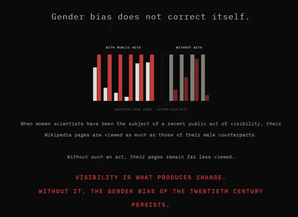
What the data actually revealed was far more striking: gender bias does not correct itself.
The Visibility Factor
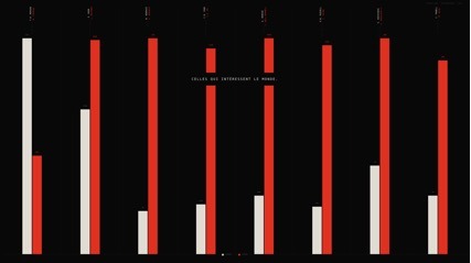
Upon analyzing ten specific scientific pairs, Mouysset discovered a binary division with virtually no exceptions. Pairs where the female scientist had been the subject of a recent public act of visibility showed massive reversals in modern attention. Pairs lacking such an intervention remained deeply skewed in favor of their male colleagues.
| Woman Scientist | Male Colleague | Recent Public Act of Visibility | F/M Ratio (Page Views) |
|---|---|---|---|
| Katherine Johnson | John Glenn | Hidden Figures (film, 2016) | × 1.2 |
| Jocelyn Bell Burnell | Antony Hewish | Breakthrough Prize (2018) | × 5.7 |
| Cecilia Payne | Henry Norris Russell | Google Doodle (2019) | × 11.6 |
| Chien-Shiung Wu | Chen-Ning Yang | US postal stamp (2021) | × 3.5 |
| Rosalind Franklin | James Watson | ESA rover (2019) | × 1.2 |
| Lise Meitner | Otto Hahn | Meitnerium (1997), 150th birthday (2023) | × 1.4 |
| No Recent Public Act | |||
| Kathleen Lonsdale | John Desmond Bernal | None | × 0.9 |
| Marthe Gautier | Jérôme Lejeune | None | × 0.24 |
| Esther Lederberg | Joshua Lederberg | None | × 0.5 |
| Marguerite Perey | Glenn Seaborg | None | × 0.13 |
The data revealed the nuance of time. Lise Meitner’s modest ratio ($times 1.4$) compared to Cecilia Payne’s ($times 11.6$) highlighted that the freshness of an intervention matters. Naming a chemical element meitnerium in 1997 carries less immediate viral currency in the 2020s than a Hollywood film, a Google Doodle, or a postage stamp.
Ultimately, the data proved that institutional bias inherited from the 20th century remains locked in place unless deliberately disrupted by external cultural acts.
Implications and the Redesign of “À sa place”
Armed with these sharper insights, Mouysset executed 10 formal iterations of her digital visualization. Guided by the philosophy of Data Feminism—as articulated by Catherine D’Ignazio and Lauren Klein—she restructured the piece around three core dramaturgy principles:
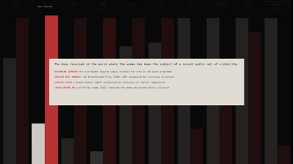
- Two-Movement Narration: The updated visualization opens with an aggregate view termed “the system,” displaying the 10 pairs as anonymous distributions to demonstrate the macro-pattern. The second movement, “the individuals,” lights up each pair sequentially, revealing names and specific historical acts of visibility.
- Editorialized Restraint: The bar charts remain clean and clinical, but they are deliberately sequenced to guide the user cognitively through the exact discovery path Mouysset herself traveled.
- Explicit Naming: Instead of leaving the historical interventions implicit, the project explicitly names the catalysts—Hidden Figures, stamps, rovers, and prizes—transforming passive observation into an actionable blueprint for cultural intervention.
Conclusion
Lauriane Mouysset’s journey with “À sa place” offers a vital lesson for contemporary artists, data scientists, and political activists alike. The friction between the contemplative regime of gallery art and the high-speed ecosystem of digital media cannot be bridged by compromising on legibility.
By allowing the imperatives of digital circulation to break through her artistic process, Mouysset discovered that clarity is not merely a communications tool; it is a fundamental instrument of inquiry. In redefining how her data was presented, she did not dilute her art—she unlocked its true political power.
 Asep Darmawan
 Suro Senen
 Lina Irawan
