
 By Evan Lee Salim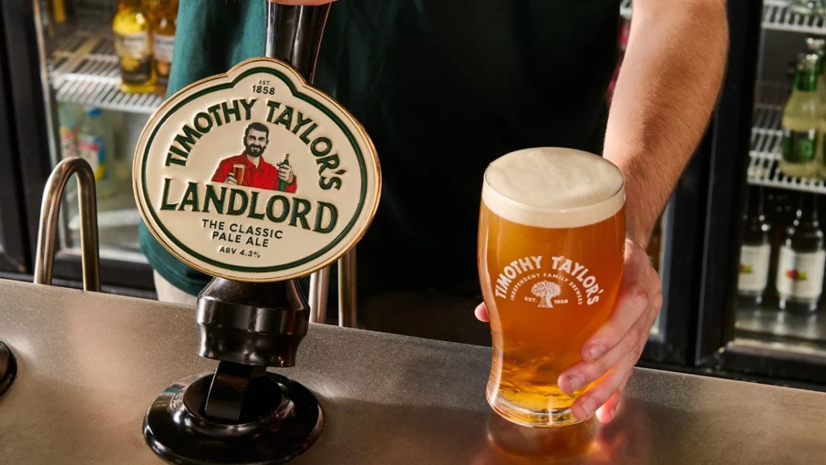
In the volatile world of modern branding, there exists a pervasive, often misguided, assumption that heritage is a burden rather than an asset. From the minimalist homogenization of luxury fashion houses to the controversial pivot of automotive giants like Jaguar, the trend of "modernizing" established icons has become a high-stakes gamble. The latest entry into this fray is the venerable Yorkshire brewery Timothy Taylor’s.
The brewery, a titan of the British cask ale scene, has unveiled its first major visual overhaul in over a decade. While the intent—to capture the hearts and palates of a younger, Gen Z demographic—is understandable in a competitive market, the execution has sparked a vocal backlash. This is not merely a complaint about aesthetics; it is a fundamental debate about the value of character, authenticity, and the danger of stripping away the "peculiarities" that make a brand timeless.
The Core Facts: A Brew with a New Face
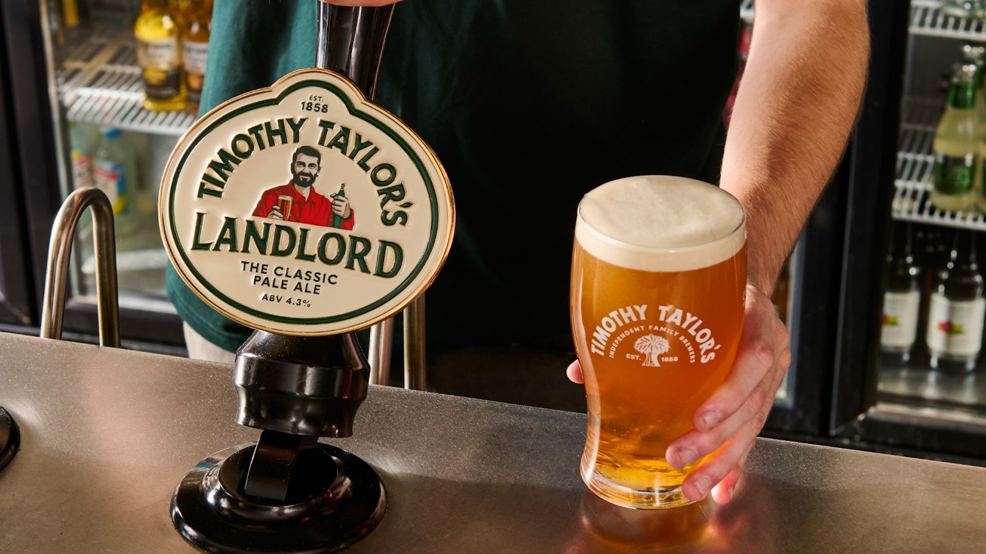
The rebrand, which touches every facet of the Timothy Taylor’s consumer touchpoints, includes a refined logo, updated packaging, and redesigned pump clips. However, the focal point of the controversy is the Landlord character—the iconic figurehead gracing the brand’s flagship ale.
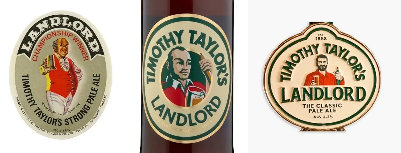
For years, the Landlord was represented by a caricature that felt rooted in the history of the British pub: a grizzled, lived-in, and unmistakably "authentic" character. The new iteration, by contrast, is decidedly polished. He is younger, fitter, and possesses a full, groomed head of hair. To many long-term fans and design critics, the change feels less like an evolution and more like a sanitization. It replaces the rugged charm of a traditional publican with the aesthetic of a character cast for a modern microbrewery startup.
The brewery asserts that this refresh is intended to align the brand’s visual identity with the "quality and care" inherent in their brewing process. CEO Andrew Carter has been clear in his messaging: the liquid remains the same, but the presentation must evolve to remain relevant to the next generation of drinkers who are increasingly exploring the world of cask ale.
A Chronology of the Refresh
To understand the scope of the change, one must look at the timeline of the brand’s visual history. For over a decade, Timothy Taylor’s maintained a steady, recognizable visual language that served as a visual shorthand for quality, tradition, and Yorkshire pride.
- Pre-2024: The "old" look relied heavily on heritage-focused design elements—serif typography, muted, earthy color palettes, and a character illustration that favored personality over perfection. It stood out on crowded bar tops precisely because it didn’t look like a hyper-modern, mass-produced lager.
- Early 2024: Internal discussions at the brewery prioritized a shift toward "relevance." Research into the burgeoning Gen Z interest in traditional cask ale suggested that while the product was appealing, the packaging was perceived as potentially exclusionary or outdated.
- Mid-2024 (The Reveal): The new brand identity was rolled out. The reaction was almost immediate. While the brewery saw a professionalized, cleaner aesthetic, the public—particularly the core constituency of ale enthusiasts—saw the erasure of a familiar, comforting identity.
- Post-Launch: The conversation shifted from the product to the branding. Critics, including design journalists and social media commentators, began to highlight the "homogeny" of the new design, comparing it to the broader trend of corporate minimalism.
Supporting Data: The Case for Heritage
Why does a logo change cause such a stir? The answer lies in the concept of "cultural currency." In an era dominated by AI-generated imagery, flat design, and an endless cycle of ephemeral digital fads, brands that retain their quirks are increasingly rare.
Data from the broader design industry supports the idea that consumers are actually craving heritage, not rejecting it. Many successful brands, such as Burger King and Pepsi, have recently executed "heritage rebrands." These initiatives involved digging into their archives to resurrect older, bolder logos rather than flattening them out.
Timothy Taylor’s occupies a unique position as the UK’s best-selling cask ale by both value and volume. This success is not an accident; it is the result of decades of consistent brand equity. By attempting to "smooth out" the edges of the Landlord, the brewery risks losing the very thing that made it a household name. The "unfashionable" colors and eccentric typography of the past were not liabilities; they were markers of a brand that had nothing to prove.
Official Responses and Corporate Strategy
The official stance from Timothy Taylor’s emphasizes continuity. The leadership team is keen to stress that the "Landlord" beer remains, in their words, the same high-quality product. The rationale for the rebrand is framed as a matter of presentation—the goal is to mirror the high standards of the brewing process with a modern, sophisticated visual wrapper.
CEO Andrew Carter noted that the brewery wants to be "just as relevant to the next generation of drinkers as we’ve been to the last." This is a classic strategic pivot: the company is betting that a more contemporary visual aesthetic will lower the barrier to entry for younger drinkers who might otherwise associate traditional ale branding with "old-fashioned" values that don’t align with their lifestyle.
However, critics argue that this strategy relies on a flawed premise: that young people are looking for a brand that looks like every other sleek, modern startup. If anything, the "cask ale renaissance" among younger demographics is driven by a desire for authenticity, craft, and a rejection of the hyper-processed nature of macro-brews.

Implications: The Lesson for Modern Brands
The Timothy Taylor’s case serves as a poignant case study for any heritage brand considering a facelift. The primary lesson is that modernizing does not require looking modern.
1. The Trap of Homogenization
When a brand pursues a "cleaner" look, it often ends up looking like its competitors. The loss of a distinct, slightly "messy" character is a high price to pay for aesthetic consistency. In a crowded marketplace, being different is a strategic advantage.
2. Character as an Asset
The old Landlord illustration was an icon. It told a story. The new character, while technically proficient, lacks the narrative depth of the original. For brands with long histories, their characters are often their most valuable intellectual property.
3. Understanding the Audience
The assumption that Gen Z demands minimalism is often a corporate projection. If the goal is to attract a younger audience to a traditional product, the "old" look may have actually been the most attractive feature—providing a sense of grounding and history in an increasingly unstable world.
4. Avoiding the "Jaguar Effect"
While the Timothy Taylor’s rebrand is far from the catastrophic reputational damage seen by other major brands, it highlights the danger of alienating a loyal customer base for the sake of an unproven demographic pivot.
Conclusion: A Toast to the Past?
As the dust settles on the Timothy Taylor’s rebrand, it is clear that the beer itself will survive the transition. The quality of the liquid is the ultimate test of any brewery, and in that regard, the brand remains on solid ground. However, the controversy serves as a reminder that branding is not just about graphic design; it is about stewardship.
A brand’s identity is built on thousands of small interactions, memories, and associations. When a company changes that identity, they are not just changing a logo; they are altering their relationship with their community.
For Timothy Taylor’s, the next few years will be telling. Will the new, "handsome" Landlord succeed in bringing in a new generation of cask ale drinkers, or will the brand find that its greatest strength was always its ability to remain, unapologetically, itself?
The lesson for the industry is clear: In an age of artificial perfection, the most powerful thing a brand can do is embrace its history. Authenticity is not a trend to be pursued; it is a legacy to be protected. For now, the debate continues, and while we wait for the long-term data on sales and sentiment, one thing is certain: the old Landlord will be missed, not because he was perfect, but because he was real.
 Nana
Nana  Ammar Sabilarrohman