
 By Nana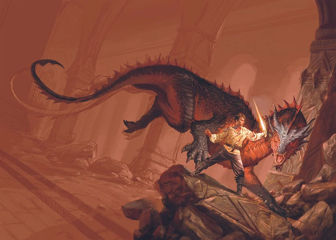
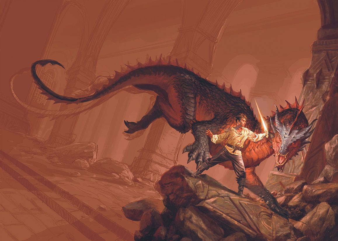
In the competitive world of contemporary publishing, the cover art serves as the primary gateway to a reader’s imagination. When Armenia Edizioni commissioned a piece for the debut fantasy novel by RF Obsydios, the objective was clear: to capture the visceral, high-stakes essence of epic fantasy in a single, evocative image. The result is a masterful display of digital artistry that balances technical precision with narrative tension.
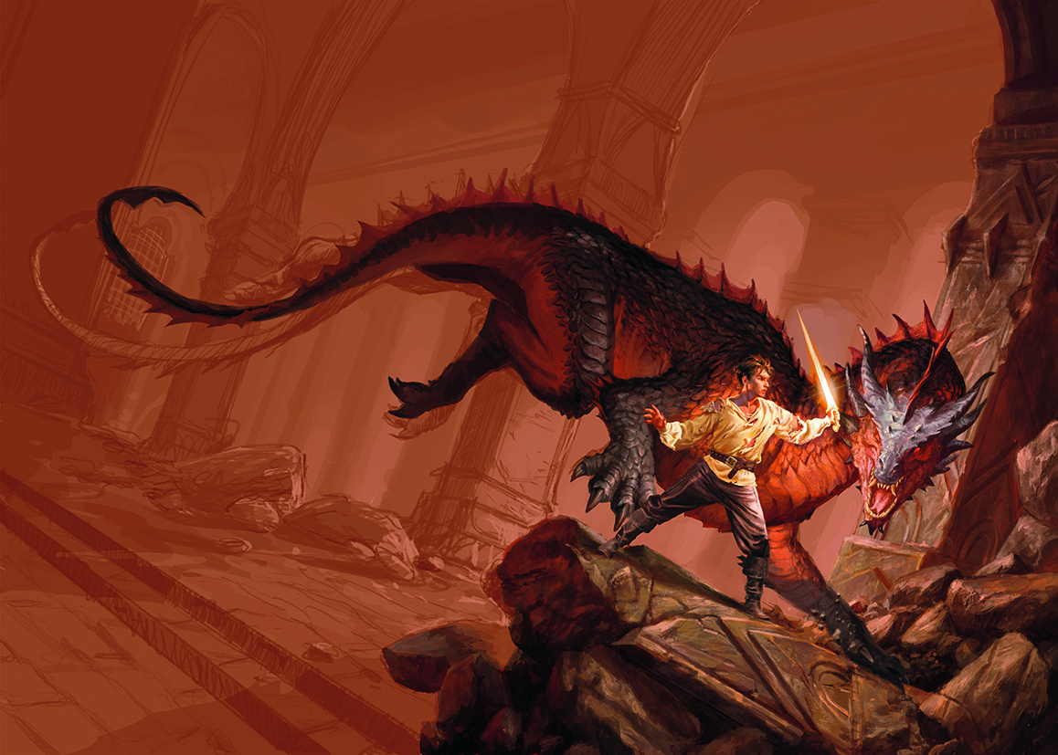
The brief demanded a classic fantasy aesthetic, focusing on a battle-hardened protagonist—a young warrior, bloodied and disheveled—standing in defiance against a formidable wingless dragon cloaked in a palette of deep reds and obsidian blacks. Set within the crumbling, vaulted halls of an ancient fortress, the composition was designed to evoke the grand, atmospheric traditions of genre masters.
The Genesis of a Vision: Conceptualizing the Epic
For the artist, this project was a homecoming of sorts. Having grown up immersed in the golden age of epic fantasy illustration, the creative process felt both intuitive and deeply personal. The artistic direction leaned into a warm, saturated color scheme, utilizing intense reds and fiery oranges to mirror the volatility of the confrontation.
To calibrate the tone, the editorial team suggested referencing Joe Abercrombie’s The Devils. This provided a benchmark for the balance between grit and wonder—a cornerstone of modern dark fantasy. Creating a scene of this magnitude requires more than just technical skill; it necessitates a deep understanding of lighting, volumetric composition, and the ability to weave a story without the use of words.
Chronology: A Step-by-Step Breakdown of the Workflow
Transforming a complex narrative brief into a polished final illustration is a methodical process. For this project, the workflow was structured into distinct phases, ensuring that the artist could maintain quality control while meeting the demanding specifications of the publishing house.
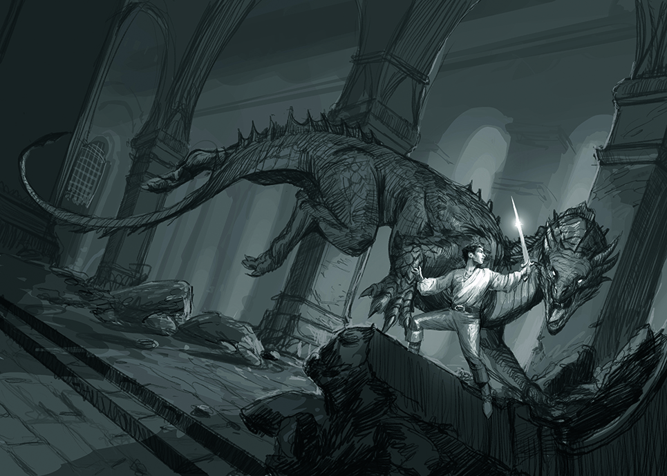
Phase 1: The Preliminary Sketch
The artist’s philosophy toward sketching is one of intentionality. Eschewing the habit of creating dozens of iterations, the focus remains on one or two high-fidelity black-and-white sketches. These initial drafts serve as the blueprint for composition, light distribution, and spatial volume. By establishing these elements early, the artist ensures that the client is aligned with the vision before time is invested in color theory or fine detail.
Phase 2: Painting the Protagonist
To ensure the central character commanded the necessary presence, the warrior was painted as an isolated asset in a high-resolution format. This "modular" approach allowed for an uncompromising level of detail regarding the character’s expressions, the texture of his torn clothing, and the weathered nature of his armor. Once the character was perfected, he was imported into the main composition, allowing for optimal scaling and placement without sacrificing quality.
Phase 3: Structural Foundation and World-Building
Once the protagonist was established, the focus shifted to the environment. The dragon and the architectural ruins were mapped out, creating a cohesive stage for the battle. The artist noted the importance of the "test-phase" in this step: assessing whether the interactions between the dragon’s mass and the environment felt organic. Only after the geometry was confirmed did the work move into the refinement of textures and color grading.
Phase 4: The Technical Challenge of Anatomy
A significant portion of the work was dedicated to the dragon’s physiology. The artist focused on the hind legs of the creature, a decision rooted in visual storytelling. By carefully crafting the curve of the dragon’s anatomy, the artist created a natural "line of sight" that pulls the viewer’s eye from the perimeter of the frame directly toward the confrontation between man and beast.
Phase 5: Environmental Texture and Atmosphere
The fortress itself serves as a silent antagonist. Inspired by the sprawling, claustrophobic ruins of Moria, the structure needed to feel massive, dark, and ancient. To achieve this, the artist utilized "dry" brushes to simulate the rough, porous texture of stone. Subtle variations in color were applied to the cracks and debris, lending the fortress a sense of history—the physical remnants of a long-forgotten war.
Phase 6: The Tilted Perspective
To heighten the emotional stakes, the artist employed a Dutch angle—a cinematic technique where the camera is tilted. This choice was deliberate: it introduces a subtle sense of unease and instability, perfectly reflecting the chaotic, life-or-death nature of the battle taking place in the foreground.
Supporting Data: Tools of the Trade
For digital artists looking to replicate this level of narrative depth, the barrier to entry has never been lower, yet the demand for skill remains high. The production of this cover relied on industry-standard digital art software and high-precision drawing tablets.
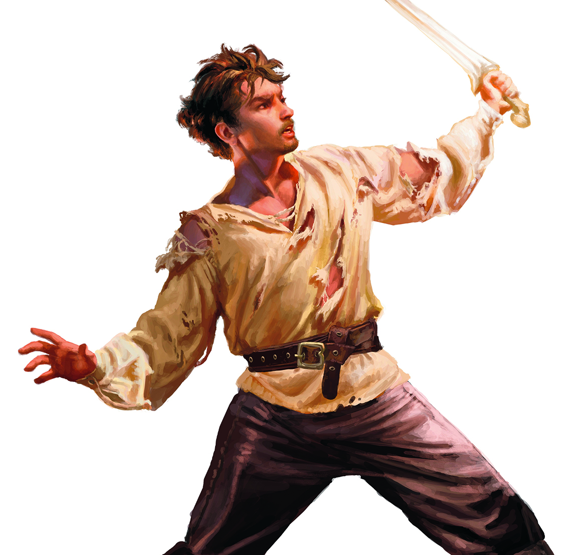
The artist emphasized the importance of physical references. By collecting historical-style fabrics and costumes, the creator was able to simulate specific lighting scenarios, ensuring that the shadows and highlights on the warrior’s attire were grounded in physical reality rather than mere conjecture. This "analog-to-digital" bridge is a common technique among high-end illustrators to avoid the "plastic" look often associated with purely digital compositions.
Official Responses and Industry Implications
The publishing industry is currently seeing a resurgence in highly detailed, painterly cover art, as readers look for physical books that function as art objects. By opting for a bespoke commission that prioritizes traditional epic fantasy tropes, Armenia Edizioni is signaling a commitment to quality that resonates with the core fantasy demographic.
Professional critics have noted that this cover does more than just depict a monster; it invites the reader into a world. The use of warm, high-contrast lighting is a strategic choice, designed to pop on both digital store thumbnails and physical bookshelves. As digital platforms like Creative Bloq continue to support the professional growth of artists, the integration of traditional artistic disciplines with modern software is likely to become the gold standard for genre fiction.
The Future of Fantasy Illustration
The success of this collaboration between the artist and Armenia Edizioni serves as a template for future projects. It highlights that even in a digital-first era, the fundamental principles of art—composition, lighting, anatomy, and narrative focus—remain the most valuable assets in an illustrator’s toolkit.
For aspiring artists, the takeaway is clear: develop a workflow that allows for modular flexibility, prioritize the emotional impact of the scene through composition, and never underestimate the value of physical reference materials. As the fantasy genre continues to evolve, the demand for illustrators who can bridge the gap between classic epic themes and modern digital execution will only continue to grow.
Whether it is the dragon’s scale or the warrior’s scar, every detail is a narrative choice. By meticulously layering these choices, the artist has successfully crafted an image that does not just illustrate a book—it promises an adventure.
 Evan Lee Salim
  Ammar Sabilarrohman