
 By Layla Zulfa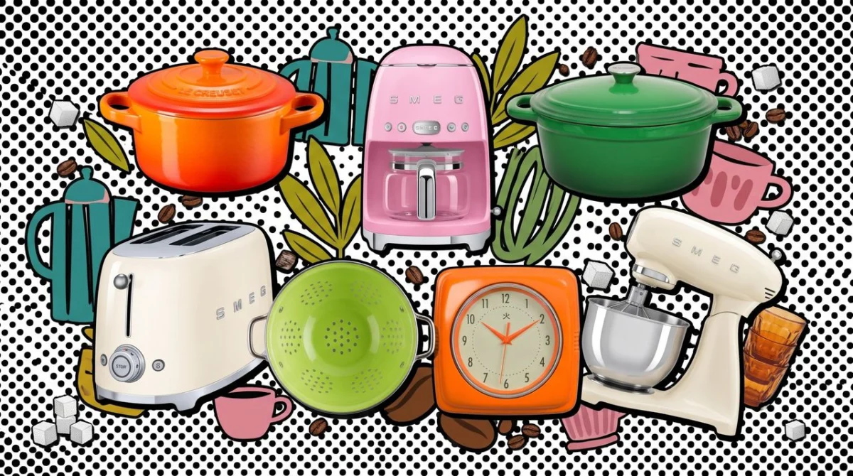
New York Fashion Week has long served as the global barometer for aesthetic shifts, dictating the visual language that will permeate everything from high-end couture to mass-market retail. However, the influence of the runway is no longer confined to the closet. As the dust settles on the latest collections, the color experts at the Pantone Color Institute have synthesized the season’s most potent visual narratives into a definitive forecast: the Spring/Summer 2027 Fashion Color Trend Report.
This year’s report is more than just a list of shades; it is a declaration of intent. Pantone has identified five "seasonless" hues that signal a departure from the muted, understated palettes of recent years. In their place, we see a surge of vitality, optimism, and raw energy. For those looking to translate these runway aesthetics into their domestic lives, the transition from high fashion to home interiors has never been more accessible.
The Main Facts: Defining the 2027 Palette
Pantone’s Spring/Summer 2027 report centers on a core philosophy: "Zest for Life." The colors selected are inherently bold, intended to evoke feelings of rejuvenation and defiance against monochromatic minimalism.
The five standout colors—which range from electric citrus tones to deep, grounded botanicals—are designed to be used as accents that transform a room’s atmosphere. The primary contenders include:
- Electric Lime: A neon-adjacent green that screams modernity and technological optimism.
- Radiant Rose: A saturated, unabashedly feminine pink that moves away from "Millennial Pink" into a more aggressive, confident territory.
- Solar Flare: A fiery, deep orange that bridges the gap between sunset hues and industrial heat.
- Deep Ocean Teal: A grounding, sophisticated blue-green that offers a respite from the intensity of the brighter shades.
- Crisp Cream: A neutral base that provides the necessary negative space to allow the bolder colors to sing.
These colors are being positioned as "seasonless," meaning they are designed to transcend the traditional cycle of seasonal trends, encouraging consumers to invest in pieces that feel relevant year-round.
Chronology: The Evolution of Trend Forecasting
The journey to these colors began nearly 18 months prior to the Spring/Summer 2027 runway shows. Trend forecasting is a rigorous, data-driven discipline that combines sociological research with aesthetic analysis.
Early 2026: The Research Phase
Pantone’s team of global color consultants began tracking socio-economic patterns. Following a period of global uncertainty and economic fluctuation, historical data suggested a collective desire for "dopamine dressing"—the use of bright colors to trigger a psychological sense of happiness.
Mid-2026: The Synthesis
As designers began sketching their S/S 2027 collections, Pantone consultants visited major design hubs in Milan, Paris, and New York. They noted a consistent departure from beige and grey, identifying a shift toward high-saturation pigments in luxury textiles and sustainable synthetic materials.
Early 2027: The Runway Debut
During New York Fashion Week 2027, the colors were officially codified. Designers showcased heavy usage of Solar Flare in outerwear and Electric Lime in accessories, confirming that these were not mere suggestions, but the dominant visual language of the year.
Post-Runway: The Interior Pivot
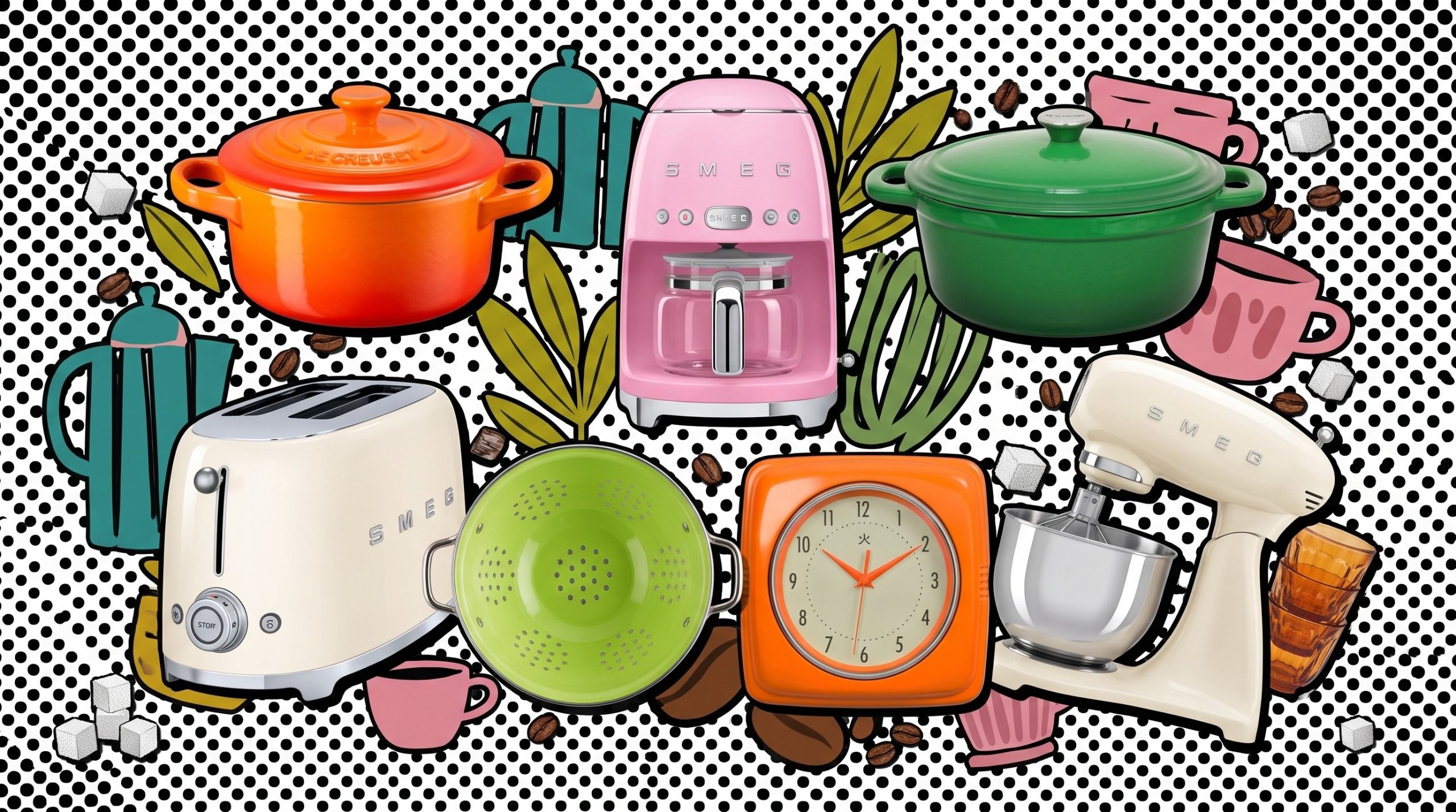
Immediately following the runway presentations, the focus shifted to the home decor industry. Brands like Smeg and Le Creuset, known for their ability to synthesize fashion trends into functional household objects, began aligning their product releases with these specific color profiles.
Supporting Data: Why Brights are Dominating
The shift toward these vibrant colors is not merely an aesthetic whim; it is supported by significant market data. According to recent retail analytics, searches for "colorful kitchen appliances" have spiked by 42% year-over-year.
Furthermore, consumer psychology studies conducted in early 2027 indicate that households are increasingly viewing their kitchens as "social showrooms." As the kitchen has evolved into the central hub of the modern home, the desire to express personality through bold hardware—rather than just neutral cabinetry—has become a priority for demographics aged 25–45.
Data from interior design marketplaces shows that:
- The "Pop of Color" Trend: 68% of interior designers now recommend at least one high-contrast item in an open-plan kitchen to increase visual interest.
- Longevity of Investment: Despite the bold nature of these colors, consumers are opting for "evergreen" appliances (like high-end coffee machines or dutch ovens) in these hues, suggesting that the "seasonless" marketing approach is working.
Official Responses and Industry Perspectives
Leatrice Eiseman, Executive Director of the Pantone Color Institute, recently remarked on the transition: "We are moving away from the ‘safe’ spaces we created during the pandemic. People want to inhabit rooms that feel alive. The Spring/Summer 2027 palette is about claiming space, celebrating energy, and using color as a tool for emotional regulation."
Retailers have been quick to respond. A spokesperson for a major kitchen appliance distributor noted, "We’ve seen a marked increase in demand for our limited-edition colorways. When a color hits the runway in February, we see a direct correlation in our sales data by May. Consumers aren’t just buying a coffee maker anymore; they are buying an accessory that completes their home’s ‘outfit’."
However, some traditionalists argue that such bold colors may lead to "design fatigue." Critics suggest that while these shades are exciting, they should be utilized in modular ways—such as removable accessories or kitchen gadgets—rather than permanent fixtures like cabinets or major appliances, which are harder to replace when the trend cycle inevitably shifts.
Implications: Integrating the Trend into Your Home
Integrating high-fashion color trends into your home does not require a total renovation. In fact, the beauty of the 2027 palette lies in its versatility as an accent. Here is how experts suggest incorporating these shades without overwhelming your space:
1. The Appliance Upgrade
The easiest way to introduce these colors is through small, high-quality appliances. A Smeg toaster in Electric Lime or a Le Creuset dutch oven in Solar Flare acts as a functional sculpture. Because these items are high-quality, they justify their place on your countertop, effectively becoming part of your home’s decor.
2. Strategic Textiles
If you are hesitant to commit to a bright color, start with linens, tea towels, or seat cushions. Incorporating "Radiant Rose" through soft furnishings allows you to rotate the trend out as seasons change or as your personal tastes evolve.
3. Balancing with Neutrals
The "Crisp Cream" shade identified by Pantone is the perfect stabilizer. If you choose to go bold with a large item, such as a refrigerator or a colorful backsplash, keep your cabinetry and floorings in neutral, warm tones. This allows the color to remain the focal point without causing visual clutter.
4. The Sustainability Angle
With the rise of "seasonless" design, consumers are encouraged to view these purchases as long-term investments. Instead of buying cheap, fast-fashion home goods that will be discarded in six months, look for quality craftsmanship in these vibrant shades. A durable, well-made kitchen accessory in a bold color is a sustainable way to keep your home updated while minimizing waste.
Conclusion: A Future in Technicolor
As we look toward the remainder of 2027, it is clear that the barrier between fashion and interiors has all but dissolved. The Pantone Fashion Color Trend Report provides a roadmap for those who wish to live in a more vibrant, expressive environment.
Whether you choose to fully commit to the electric energy of "Solar Flare" or prefer to dip your toes into the trend with a subtle "Deep Ocean Teal" accessory, the goal remains the same: to curate a home that reflects the boldness of the current moment. By focusing on quality pieces and strategic color placement, you can ensure that your home remains as fashion-forward as your wardrobe, proving that the zest for life isn’t just for the runway—it’s for the kitchen, the living room, and every space in between.
 Lina Irawan
  Reynand Wu
  Lina Hope