
 By Nana Muazin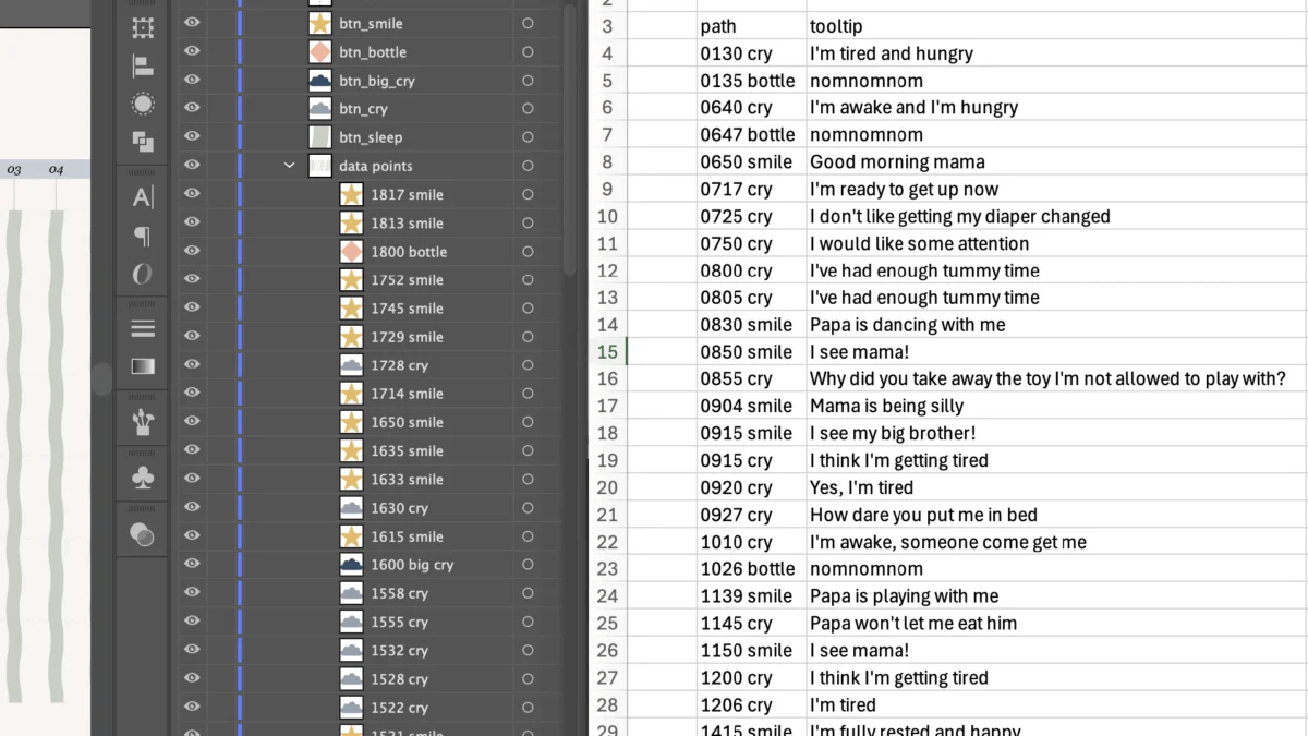
By Nightingale Staff
Published in Information Design & Data Visualization
Main Facts
Information design is undergoing a quiet revolution, bridging the gap between static graphic design and dynamic web development. For Cristal Fernandes, a freelance information designer and mother of two based in Belgium, this intersection became the foundation of a deeply personal portfolio piece. Balancing the demands of parenting a seven-month-old infant with a burgeoning career change into data visualization, Fernandes set out to map a single day in her baby’s life.
The resulting project—titled "A day of smiles and cries"—tracks twenty-four hours of granular data, including smiles, cries, sleep patterns, milk feeds, and the specific qualitative reasons behind the infant’s vocalizations and expressions.
However, translating a complex, custom Adobe Illustrator vector graphic into a web-ready, interactive data visualization presented a massive technical hurdle. While traditional data visualization tools like Tableau, Flourish, or Datawrapper offer out-of-the-box interactivity, they lack the fine-tuned, pixel-perfect custom aesthetic achievable in vector design software. Conversely, coding an interactive Scalable Vector Graphic (SVG) from scratch typically requires advanced knowledge of JavaScript and DOM manipulation—skills outside the everyday toolkit of many graphic designers.
Rather than compromising her design or uploading proprietary creative files to large language models (LLMs) like Claude—a practice fraught with data privacy concerns—Fernandes developed a methodical, privacy-conscious workflow. By strategically organizing vector layers in Illustrator, exporting clean SVG code, leveraging a local code editor (VS Code), and prompting an AI assistant textually rather than visually, she successfully created a fully interactive web graphic featuring hover-activated tooltips and click-to-filter legend buttons.

Chronology: From Parent-Infant Data Tracking to Web Deployment
The genesis of the project and its technical execution unfolded over several weeks, driven by daily parenting realities and creative problem-solving.
Phase 1: Data Collection and the "Unicorn" Problem
Approximately seven months after welcoming her second child, Fernandes pivoted professionally toward information design. To showcase her capabilities, she meticulously recorded a day in the life of her infant. The dataset captured multiple overlapping variables: sleep blocks, milk feeds, the exact minute-by-minute occurrence of smiles and cries, and the contextual triggers for those emotional shifts.
Initially, Fernandes attempted to incorporate the qualitative reasons for smiles and cries directly into the static visual layout by color-coding individual categories. The attempt failed visually. With too many nuanced categories, the graphic became visually overwhelming, resembling what Fernandes wryly described as "a unicorn spewed all over my screen."
Phase 2: The Pivot to Interactivity and AI Consultation
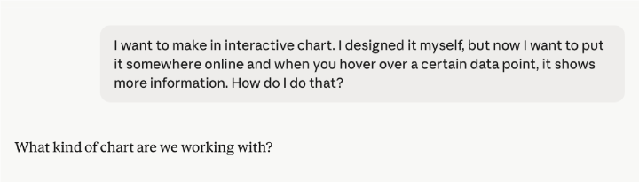
Recognizing that static representation could not hold the sheer volume of qualitative data without visual clutter, Fernandes turned her attention to interactive design. Wondering how designers bridged the chasm between custom vector art and web interactivity, she consulted the AI assistant Claude.
Initial prompts yielded suggestions for standard business intelligence and data visualization platforms. Because Fernandes had already built her custom layout in Adobe Illustrator, these template-driven platforms were inadequate. Further dialogue with the AI introduced the underlying technical vehicle: Scalable Vector Graphics (SVG), which renders vector artwork as editable, structured code containing explicit layer names.
Phase 3: Layer Structuring and Naming Conventions
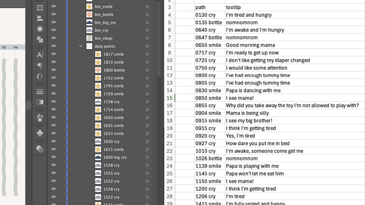
Realizing that the SVG code would serve as the structural foundation for JavaScript interactions, Fernandes restructured her Adobe Illustrator layers. Every single data point was isolated into its own layer. She compiled a companion Microsoft Excel spreadsheet mapping each individual layer ID to its corresponding descriptive tooltip text (e.g., pairing a cry data point with the qualitative note, "I’m tired and hungry").
Phase 4: Local Code Editing and Script Generation
To maintain strict data privacy and avoid uploading proprietary graphic assets to cloud-based AI training servers, Fernandes kept her Illustrator files local. She downloaded Visual Studio Code (VS Code), a free code editor.
She then prompted Claude strictly via text, providing her Excel-derived layer list and outlining two specific functional requirements:
- Hover Tooltips: Displaying contextual text near the cursor when hovering over a specific data point.
- Legend Filtering: Clicking an icon in the legend (e.g., "btn_cry") to highlight matching data points while automatically reducing the opacity of all non-matching data points to 50%, with a secondary click resetting the view.
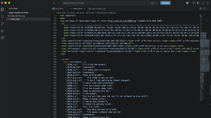
Claude generated the requisite HTML and JavaScript block. Fernandes combined the exported SVG code and the generated script into a single index.html file locally, troubleshooting minor syntax discrepancies with the AI along the way.
Phase 5: Publishing to the Web
Following successful local testing, Fernandes integrated the compiled HTML and SVG markup directly into her Squarespace-powered portfolio website, delivering a seamless interactive experience for prospective clients and visitors.
Supporting Data: Visualizing the Infant Lifecycle
To understand the complexity of Fernandes’s final interactive visualization, one must examine the density of the underlying dataset packed into a twenty-four-hour timeline.
- Temporal Scope: 24 continuous hours mapped across 24 pale wavy vertical strings, with each string representing one hour, anchored by a minute-scale axis along the left margin.
- Event Categorization:
- Smiles: Represented by gold stars, with larger star clusters indicating concentrated periods of positive engagement.
- Cries: Marked by grey-blue clouds for standard crying episodes and navy icons for intense crying bouts.
- Sleep: Designated via solid green horizontal bands, dominating overnight and evening hours.
- Milk Feeds: Represented by pink diamonds distributed across daytime hours.
- Behavioral Clustering: The static visualization—and its interactive counterpart—reveals distinct behavioral rhythms. Sleep anchors the late evening and early morning hours; cries cluster heavily in the early morning; and the highest concentrations of smiles occur during afternoon and early evening intervals.
Official Perspectives and Expert Context
While the intersection of generative AI and graphic design is frequently debated through the lens of automated layout generation, Fernandes’s case study highlights a different paradigm: AI as a technical bridge rather than a creative replacement.
"I don’t use AI to save time. I love spending hours designing pixel by pixel and searching through data," Fernandes noted in her project documentation. "I use AI either to streamline tedious tasks or to learn new skills. And this skill was just out of reach for me."
For decades, custom web interactivity required either deep fluency in front-end web languages (HTML, CSS, JavaScript, and libraries like D3.js) or reliance on heavyweight development teams. By utilizing LLMs as translation engines between graphic design software formats (SVG) and native web code, practitioners can bridge the technical divide without sacrificing creative autonomy.
At the same time, privacy advocates and design organizations have increasingly warned against the indiscriminate uploading of proprietary files, brand assets, and personal datasets into public AI platforms. Fernandes’s workflow—relying on local file management in tools like VS Code and restricting AI interactions to text-based logic and script generation—offers a blueprint for ethical, privacy-conscious AI adoption in creative industries.
Implications for the Future of Information Design
The methodology pioneered in this project carries significant implications for freelance information designers, editorial illustrators, and data journalists.
1. Democratization of Custom Web Interactivity
Historically, custom data storytelling fell into two polarized camps: rigid, highly polished static graphics that lacked user engagement, or heavily engineered interactive dashboards constrained by the styling limitations of business intelligence tools. By mastering the Illustrator-to-SVG-to-HTML pipeline with AI-assisted scripting, independent designers can deliver bespoke, highly branded interactive experiences directly to client websites without requiring a dedicated front-end software engineer.
2. Overcoming Cognitive Load in Visual Datasets
One of the persistent challenges in information design is managing data density. Displaying multifaceted qualitative data—such as pairing quantitative timestamps with emotional categorization and qualitative explanations—often results in visual chaos. Interactivity solves this dilemma through progressive disclosure. By hiding auxiliary details behind hover states and filter toggles, designers can present clean, uncluttered macro-visualizations while retaining micro-level depth for curious viewers.
3. Workflow Evolution and Data Sovereignty
As data privacy regulations tighten globally, creative professionals face growing scrutiny regarding how client data and proprietary design files are handled across cloud services. Fernandes’s decision to bypass direct image uploads in favor of text-based code prompting establishes a viable standard for safeguarding intellectual property while still harnessing the computational and instructional power of modern language models.
The interactive, fully explorable version of Cristal Fernandes’s data visualization can be viewed directly on her professional portfolio at cristalbydesign.be/baby-smiles.
 Ammar Sabilarrohman
  Lina Irawan