
After six years in the trenches of reporting and analytics, I have come to accept an uncomfortable truth that many data practitioners spend their entire careers denying: Your masterpiece, the highly interactive, drill-down-ready Tableau dashboard you spent weeks perfecting, is destined to be a static image on slide 17 of a corporate PowerPoint deck.
If you work in sales operations, finance, or any executive-facing analytics team, you know the drill. It is 9:00 a.m. on a Monday. A board meeting is approaching. Your Vice President is not going to log into Tableau Server, navigate the project folder, and fiddle with filters to find the insight they need. Instead, they will download your dashboard as a PDF or an image, drop it into a slide deck, and present it to the C-suite.
Once you stop fighting this reality, you can begin to treat it as a design problem. The goal of this article is to outline five non-negotiable strategies for creating "PowerPoint-ready" analytics without sacrificing the analytical integrity of your work.
The Main Facts: Bridging the Gap Between Tool and Presentation
The primary disconnect in data visualization is the friction between exploration (the strength of tools like Tableau) and explanation (the strength of presentation software). Analysts often design for the former, while stakeholders prioritize the latter.
When a user moves from an interactive environment to a static one, the "interactivity tax" is paid in full. Tooltips, hover states, and dynamic filters are stripped away, leaving behind a frozen frame that may no longer tell a coherent story. To design for this reality, one must adopt a mindset of "static-first" development. This does not mean abandoning Tableau’s power; it means acknowledging that the dashboard is often merely the source of the data story, not the final destination.
Chronology of a Design Shift
My realization did not happen overnight. It was a slow, painful process of watching "formatting disasters" unfold in real-time.

- Phase 1: The Naive Phase. I built dashboards assuming the user would interact with every element. The result? Users complained they couldn’t see the data when it was printed or pasted into slides.
- Phase 2: The Frustration Phase. I spent hours trying to train executives to "click here" or "hover there." It was a futile effort. They didn’t have time to learn the tool; they had time to look at a chart.
- Phase 3: The Design-First Pivot. I began building to the output. I started testing exports at every stage of the design process, treating the "Export to PowerPoint" function as the primary quality assurance (QA) test.
This transition turned me from an "analyst who builds tools" into an "analyst who crafts narratives."
1. Design for PowerPoint from Day One
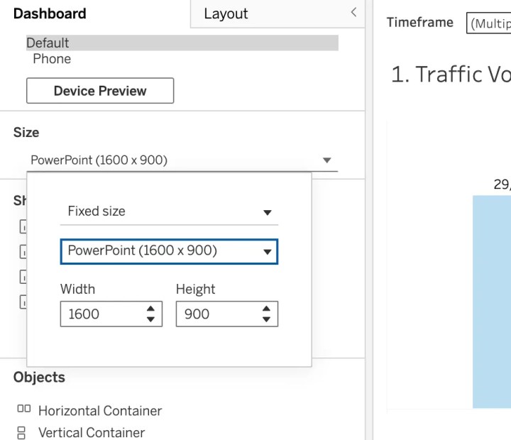
Device preview is important, but for the corporate analyst, the PowerPoint aspect ratio is the only frame that matters.
In my early career, I built using Tableau’s default "Desktop Browser" view. When exported, the result was a crushed, illegible mess of overlapping text and squeezed charts. The fix is simple: Set your dashboard dimensions to a fixed 16:9 ratio from the moment you open a new workbook.
This ensures that your dashboard fits perfectly into Google Slides or PowerPoint without awkward cropping or excessive white space. By designing for the container in which the data will actually live, you eliminate the "last-minute formatting panic" that ruins many analyst presentations.
Pro Tip: Always test your export early. Click Dashboard > Export as PowerPoint repeatedly during the development phase. If the text is too small at that stage, it will be unreadable on the projection screen in the boardroom.
2. The Death of Interactivity
This is the most difficult pill to swallow: You must build your dashboards assuming zero interactivity. When you export to PowerPoint, you lose tooltips, hover effects, and URL actions.
This fundamental shift changes your strategy entirely. Instead of creating one "super-dashboard" that contains every possible view, you must build multiple, static versions. If your stakeholders need to see pipeline performance across regions, business units, and product lines, you should create separate, dedicated views for each.
Yes, this feels redundant. Yes, it creates more work for you as the developer. But it is the only way to ensure that your stakeholders receive the information they need without requiring a mouse click. Every critical insight must be visible on the initial page load. If a key metric requires a user to click a filter to reveal it, assume that for the purposes of a presentation, it effectively does not exist.
3. Mastering Layout Control with Containers
When a dashboard contains multiple visualizations, containers are the only way to keep everything locked in place during the PowerPoint export. Without them, objects float, shift, and overlap unpredictably.
PowerPoint does not tolerate white space well. A minimalist dashboard might look elegant on a wide-screen monitor, but it often looks "unfinished" or "empty" when dropped into a slide deck. Executives, particularly in finance and sales, expect high information density.
Best Practice Workflow:
- Use Vertical/Horizontal Containers: Treat your dashboard like a webpage grid.
- Distribute Evenly: Use the "Distribute Evenly" feature to ensure uniform spacing between charts.
- Audit the Export: After adding a new object, export the slide again. If the white space is excessive, adjust the padding or the size of the charts immediately.
Taking the time to master container hierarchy will save you hours of "reformatting frustration" down the road.

4. Governance and Version Control
If you are working in a team environment, your dashboard graveyard is likely littered with files named Bookings (1), Bookings (1)(1), and Sheet 3. This is a recipe for disaster.
Implementing a strict governance standard is not just about cleanliness; it is about trust. If an executive sees a chart labeled Draft_Final_v2, they lose confidence in the data.
The Golden Rules of Naming:
- Version Control: Use clear, dated, and descriptive naming conventions (e.g.,
Q4_Sales_Final_v3). - Worksheet Naming: Every worksheet should be named clearly. Never leave a sheet as
Sheet 1. - Color-Coding: Use Tableau’s tab-coloring feature to differentiate between "Finished" (Green), "In Progress" (Yellow), and "Archived" (Red) dashboards.
When you present a professional, well-organized workbook, you are signaling to your stakeholders that the data inside is equally reliable.
5. The Professionalism of Branding
Finally, treat your dashboard like a piece of corporate collateral. Your dashboard might be internal today, but it will be in a client presentation tomorrow. Your VP will forward it without asking.
Ensure your dashboards align with your organization’s standard slide deck template. Place company logos in the same position as they appear on your company’s slide master. Use consistent font families, brand colors, and border styles. When your work is stripped from its digital environment and pasted into a deck, it should look like it belongs there—not like an alien object pasted from a different software.

Implications for the Analytics Industry
The "PowerPoint Paradox" forces us to ask a larger question: Is the era of the "interactive dashboard" dying?
The answer is no, but its role is shifting. We are moving toward a dual-mode future:
- The Exploratory Tool: Used by analysts and power users to dig into root causes, perform ad-hoc analysis, and clean data.
- The Narrative Slide: Used by leadership to communicate findings, set strategy, and drive decisions.
The modern analyst must be proficient in both. We must stop optimizing exclusively for the "elegant parameter action" or the "slick custom hover" and start optimizing for the "screenshot."
Sometimes, being a truly great analyst means accepting that your masterpiece will be copied and pasted into slide 23 of a deck. By designing for that reality from the very first pixel, you ensure that your data is not just seen, but heard.
Your stakeholders don’t care about your complex calculated fields if they can’t paste your work into their Monday morning meeting. Design for them, and you will find that your work gains more traction, more visibility, and more respect than it ever did when it was just an interactive link buried in a server folder.