 By Ali Ikhwan
When a corporate rebrand or digital product identity fails, the autopsy usually points to a mistake made long before a single vector was drawn in Figma. It happens in the strategy room, where ambitious adjectives like "modern," "trustworthy," "premium," "friendly," and "disruptive" are thrown around, nodded at, and left entirely undefined.
The immediate fallout is a severe misalignment between what a brand intends to communicate and what a designer is tasked with building. This critical, frequently overlooked intermediary stage is what industry professionals call the "pre-concept" phase.
By diving deep into brand context, unearthing hidden stakeholder assumptions, and forging a shared visual foundation ahead of time, design teams can dramatically improve outcomes. The pre-concept phase serves as a vital bridge, transforming abstract business goals into concrete design parameters.
The Core Problem: Vague Language vs. Visual Reality
At the inception of a branding project, designers are typically handed a standard suite of inputs: a creative brief, notes from a handful of stakeholder interviews, competitor links, a loose moodboard, and a list of desired adjectives. They are then expected to conjure visual concepts that magically "feel right."
However, judging whether a design is "right" becomes an impossible task when a team has failed to agree on foundational communication goals.
Consider a recent engagement with a health technology company. The client’s executive team insisted their new identity needed to look "modern," "trustworthy," and "disruptive." Initially, "disruptive" sounded like a mandate for something bold, loud, and radically unconventional.

However, through structured dialogue, a vital nuance emerged: within their conservative market environment, disruption still had to command absolute credibility. Their primary buyers were large government medical institutions. A brand that leaned too rebellious, experimental, or visually aggressive would actively destroy trust. In short, their version of "disruptive" was far more traditional than the literal definition implied.
The issue was not that the client used incorrect language; it was that the language was far too broad to steer precise design decisions. Before translating strategy into visual assets, words must be interrogated. What kind of modern? Trustworthy to whom? Disruptive compared to which competitors? And just how far can a brand push the envelope before alienating its core audience?
Chronology of a Brand Identity Project
To understand where the pre-concept phase sits, it helps to map out the standard timeline of a modern brand identity initiative:

- The Kickoff & Strategic Discovery: High-level business goals, target demographics, and market positioning are established.
- The Pre-Concept Phase (The Bridge): Researching brand context, running perception exercises, mapping competitors, and developing Look-and-Feel boards, Design Codes, and early Asset Directions. (This is where the heavy lifting of alignment occurs).
- Concept Generation & Exploration: Designers finally open their software to build distinct visual systems and logo concepts.
- Refinement & Implementation: The chosen direction is polished, expanded into a comprehensive design system, and deployed across digital products and physical touchpoints.
Stage 1: Researching Brand Context and Clarifying Perception
While standard brand workshops cover baseline topics like business models, product offerings, and competitor landscapes, the pre-concept phase demands a sharper focus on perception.
As legendary designer Marty Neumeier famously noted in The Brand Gap, "A brand is a person’s gut feeling about a product, service, or company." Because a brand ultimately lives in the minds of its audience, discovery sessions must clarify precisely what perception the team intends to cultivate.
To achieve this, designers must move beyond collecting opinions and start exposing underlying assumptions. When three different stakeholders agree that a brand should be "premium," they may harbor entirely different mental images. One might picture refined editorial minimalism; another envisions high-end corporate exclusivity; a third thinks of clean, quiet simplicity. If left unexamined, these conflicting definitions will fracture the design process later.

To turn vague adjectives into actionable design problems, studios deploy targeted interactive exercises.
Exercise 1: Competitor Perception Mapping
Before entering a workshop, teams gather visible touchpoints of competing brands—websites, product UI, social media collateral, and marketing materials. During the workshop, stakeholders map these competitors across a two-axis grid.
This exercise avoids labeling competitors as "good" or "bad." Instead, it reveals how the client reads their category: What looks credible? What looks generic? Where are the open gaps in visual territory?

For a fintech brand seeking to stand out without sacrificing security, axes might range from Understated to Bold and Accessible to Exclusive. The most valuable output is rarely the final map itself, but rather the internal disagreements it exposes. If one stakeholder views a key competitor as "progressive" while another sees it as "generic," that tension must be resolved before design begins.
Exercise 2: Visual Brand Drivers
To separate actual brand strategy from personal aesthetic preferences, teams often use the "Visual Brand Driver" exercise. Stakeholders are asked to select images representing the company across completely unrelated categories: transport, typography, activities, furniture, moods, objects, animals, architecture, and beverages.
Crucially, participants must select images based on how the company behaves, not what they personally like. If the company were a vehicle, is it a quiet electric car, a high-speed freight train, or a private jet? If it were a piece of furniture, is it a soft lounge chair or a heavy boardroom table?

Adding four or five descriptive adjectives to these choices uncovers deep metaphors. It forces the team to align on character and association rather than arguing over hex codes and font weights.
Synthesizing Strategy Into a Visual Foundation
Once stakeholder assumptions are surfaced, the next step translates shared understanding into a tangible visual foundation, broken down into three progressive layers:
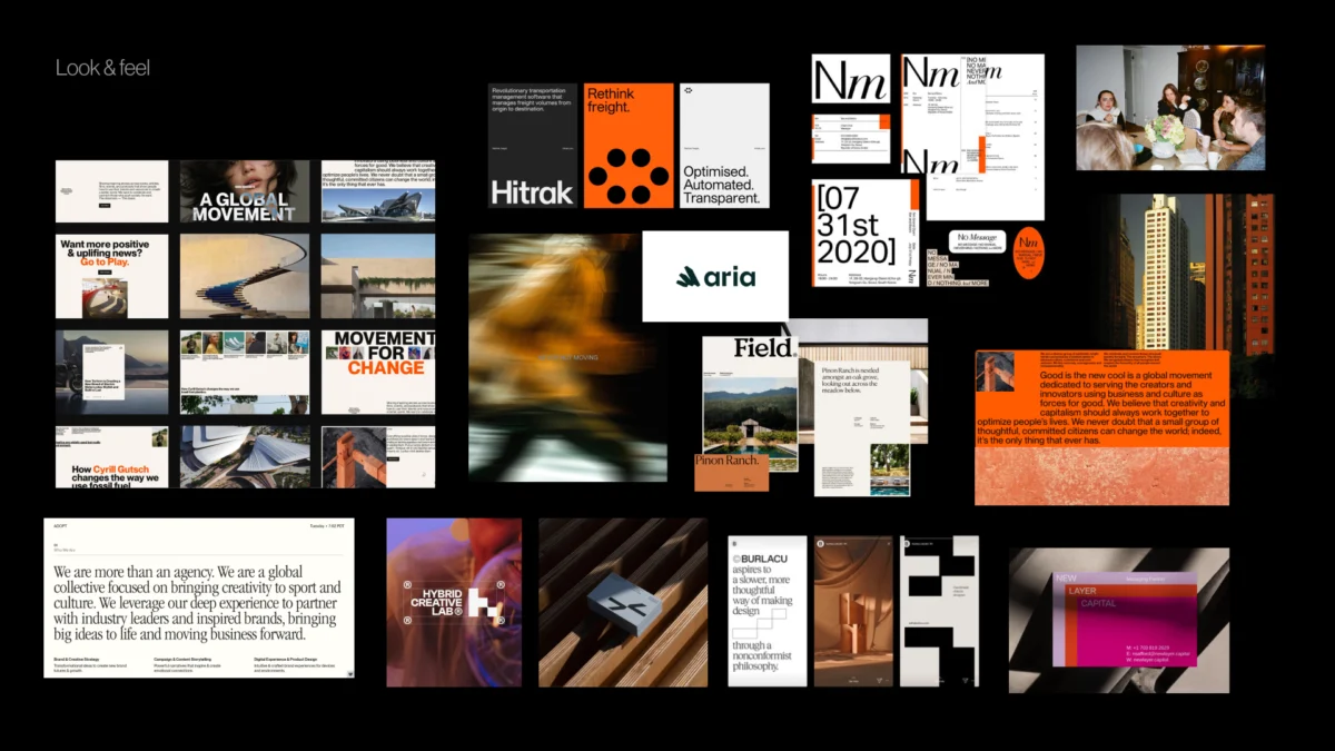
- Look and Feel: Perception boards built from third-party references that allow the client to react to mood, tone, and character before seeing any original logo work.
- Design Code: Translating core brand attributes into practical visual principles (e.g., turning "research-backed support for real life" into data snapshots and editorial layouts).
- Brand Asset Direction: Establishing early guardrails for typography, color palettes, photography styles, and illustration languages.
Supporting Data & Industry Implications
Industry data consistently shows that poorly defined creative briefs are among the leading causes of budget overruns and timeline delays in agency-client relationships. According to design operations benchmarks, projects that incorporate a structured alignment phase prior to asset creation experience:

- Up to 40% fewer revision cycles during the initial concept presentation.
- Significantly higher stakeholder satisfaction, as client feedback shifts from subjective emotional reactions ("I don’t like it") to strategic evaluations ("Does this reflect our agreed-upon design code?").
Implications for Product and Design Teams
- For Designers: Pre-concept work eliminates the exhausting game of guesswork, protecting creative energy and grounding proposals in strategic logic.
- For Stakeholders: Active participation in perception mapping and brand driver exercises transforms clients from passive reviewers into invested co-creators.
- For Businesses: Aligning expectations early prevents costly redesigns down the road, ensuring that the final brand identity is both visually compelling and commercially resilient.
Conclusion: The First Concept Should Never Be a Guess
A well-executed pre-concept phase ensures that the first design reveal never feels like a blind guess or an unwelcome surprise. By clarifying brand character, testing visual perceptions through structured metaphors, and defining explicit design boundaries, teams pave the way for true creative excellence.
When the foundation is solid, the conversation naturally shifts away from subjective taste and toward a singular, powerful question: Does this visual direction faithfully express what our brand needs to become?
 Azzam Bilal Chamdy
 Nila Kartika Wati
 Evan Lee Salim
