
 By Nana Muazin
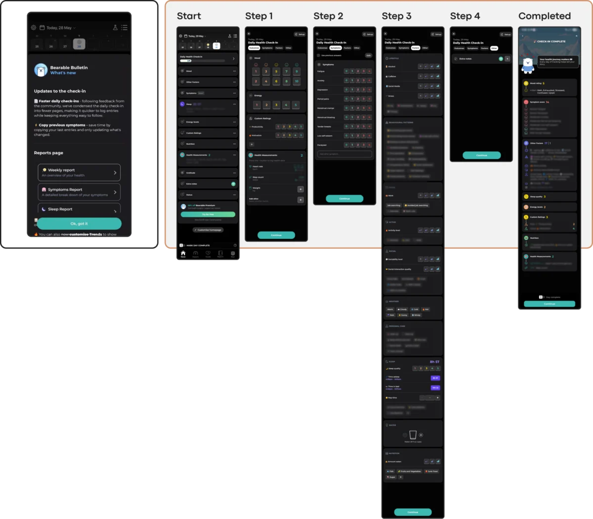
Main Facts: The Crisis of Retention and the Cost of Visual Fashion
In the rapidly expanding ecosystem of digital therapeutics, a sobering paradox persists: while the demand for psychological support tools is skyrocketing globally, users are abandoning mental health applications at an alarming rate. Industry data underscores a severe retention collapse. According to longitudinal studies published in the Journal of Medical Internet Research (JMIR), nearly 95% of users who open a mental health app on day one abandon it entirely by day thirty, leaving a median 30-day retention rate of a dismal 3.3%. Even market leaders in the digital well-being space suffer steep drop-offs, losing roughly 50% of their user base within the first ten days.
For product designers and clinical operators, these figures signal more than a standard engagement challenge—they point to a fundamental friction between modern UI trends and the psychological realities of distressed users. While UI trends are typically engineered to capture attention, signal high-tech innovation, and maximize screen time, mental health interfaces require an entirely different paradigm. They must actively reduce cognitive strain, foster deep psychological safety, and function as a digital refuge.

According to UX researcher Kat Homan, chasing visual fashion in a space defined by vulnerability and acute emotional fatigue risks trading away the utility and trust upon which these platforms depend. When users open a mental health app, they are rarely driven by casual curiosity; they arrive stressed, anxious, overwhelmed, or exhausted. In these low-capacity states, an unconventional navigation gesture, an abstract icon, or a jarringly bright animation ceases to be a delightful surprise. Instead, it becomes a severe cognitive tax—and a catalyst for permanent disengagement.

Chronology: The Evolution of mHealth Design and the Trend Trap
To understand how mental health applications arrived at this retention crisis, it is necessary to examine the trajectory of mobile health (mHealth) development over the past decade:

- Phase 1: The Clinical Translation Era (Early 2010s): Initial digital mental health tools were direct digital translations of paper-based cognitive behavioral therapy (CBT) workbooks. While clinically sound, these early apps suffered from dry, utilitarian interfaces that lacked user engagement loops, resulting in low initial adoption.
- Phase 2: The Gamification and Growth Boom (Mid-to-Late 2010s): Seeking to combat high abandonment rates, developers borrowed heavily from consumer tech and mobile gaming. Mechanics like daily streaks, push notification loops, badges, and cheerful mascot characters were imported wholesale to drive daily active users (DAUs).
- Phase 3: The Trend-Driven UI Convergence (2020–Present): As the wellness market matured, consumer-facing apps began adopting cutting-edge graphic trends—such as neo-brutalism, high-contrast minimalism, hidden menus, glassmorphism, and complex interactive dashboards.
- Phase 4: The Recognition of Cognitive Overload (Current State): Recent clinical and UX research has begun to push back against trend-first development. Designers like Kat Homan and various mHealth researchers are advocating for an "empathy-first" evaluation framework, shifting the focus from attention-grabbing aesthetics to state-aware, low-friction interactions tailored for users in psychological distress.
Supporting Data: The Anatomy of User Abandonment
The argument against uncritical trend adoption is heavily anchored in empirical research concerning cognitive load, color psychology, and accessibility in digital health:

- The 30-Day Drop-Off: JMIR data indicates that 30-day retention rates hover around a meager 3.3%, proving that traditional consumer retention loops fail to translate into therapeutic contexts.
- The Burden of Complexity: Studies highlighted by the National Institutes of Health (NIH) demonstrate that individuals experiencing acute anxiety or depressive episodes exhibit reduced executive functioning. Complex layouts, dense multi-step check-ins, and non-standard navigation demand scarce cognitive resources, triggering user flight.
- Color and Emotional Alignment: Research published in archival human-computer interaction journals reveals that users in emotional distress show an overwhelming preference for subtle, grounded visual palettes (such as muted earthy tones and dark modes). Conversely, hyper-saturated, aggressively cheerful aesthetics frequently induce sensory friction and feelings of alienation.
- The Scale of Need: According to the World Health Organization (WHO), over one billion people globally live with a mental health condition, with depressive and anxiety disorders rising by 25% over the past decade. The sheer magnitude of this population amplifies the societal cost of poorly designed digital interventions.
Official Responses and Expert Perspectives
As the digital health community grapples with these retention statistics, digital health regulators, clinical psychologists, and UX specialists are calling for a strict re-evaluation of design ethics in software development.

Industry advocates emphasize that user engagement in healthcare cannot be measured by the same metrics used for social media or e-commerce. Capturing attention through urgency-based notifications or punitive streak counters is increasingly viewed by clinical UX experts as a form of "coercive design." When a user struggling with depression is greeted by a broken streak or an unskippable celebration screen, the application inadvertently shifts from a supportive ally to an additional source of performance anxiety and guilt.

Furthermore, accessibility advocates point out that popular minimalist trends—such as ultra-low-contrast typography, hidden gesture controls, and complex micro-animations—systematically exclude individuals with visual, motor, or cognitive impairments. Because populations requiring mental health support disproportionately overlap with accessibility needs, ignoring established guidelines like the Web Content Accessibility Guidelines (WCAG 2.2) represents a failure of inclusive design.

Designers pushing for reform argue that sustainable retention in mental health technology is earned not by hijacking dopamine pathways, but by becoming a consistently respectful, predictable, and low-friction presence in a user’s daily life.

Implications: A Practical Evaluation Framework for Designers
To bridge the gap between aesthetic innovation and therapeutic utility, Kat Homan has introduced a practical evaluation framework. This framework requires product teams to pressure-test any proposed UI trend against five core criteria before implementation:

1. Cognitive Friction
- The Question: Does this design pattern reduce or increase the cognitive effort required to complete a task?
- Application: For users experiencing brain fog, panic, or extreme fatigue, interfaces must offer direct, linear paths (such as dedicated "Quick Relief" buttons or voice-to-text inputs) rather than hidden menus or abstract icons that require interpretation.
2. Emotional Mismatch
- The Question: Does the visual tone align with the user’s likely emotional state?
- Application: Avoid imposing artificial cheerfulness or jarringly bright color schemes on users seeking solace. Instead, utilize subtle, grounded palettes and calm interfaces that provide a genuine sense of digital refuge.
3. Inconsistency Penalty
- The Question: Does this novel interaction pattern disrupt established routines?
- Application: While novelty drives engagement in entertainment apps, predictability is vital for mental health routines. Core navigation must remain stable so users do not have to "relearn" the app during moments of distress.
4. Silent Exclusion
- The Question: Does this trend violate basic accessibility standards?
- Application: Ensure all text meets contrast ratios (4.5:1), interactive targets are appropriately sized, and gesture-driven actions always feature clear button fallbacks for users with motor or visual impairments.
5. The Coercion Paradox
- The Question: Do these engagement mechanics motivate or pressure the user?
- Application: Re-engineer retention loops like streaks to be forgiving (e.g., non-punitive multi-day buffers) rather than utilizing aggressive notifications and guilt-inducing prompts that penalize non-linear recovery.
Conclusion
Ultimately, the future of mental health app design relies on moving past portfolio-driven aesthetics—the proverbial "Dribbble shot"—and prioritizing human vulnerability. By applying a context-aware evaluation framework, product teams can build tools that do more than win design awards: they can create quiet, trustworthy helpers that users can rely on when they need them most.
 Iffa Jayyana
 Azzam Bilal Chamdy
 Nila Kartika Wati
