
 By Iffa Jayyana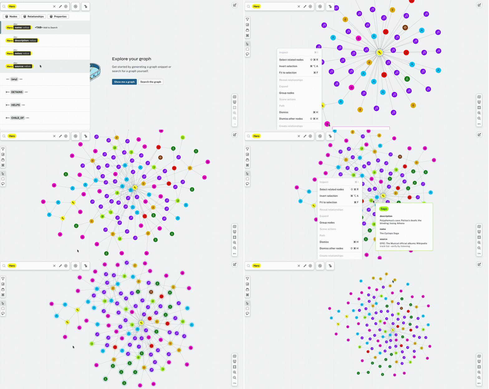
Main Facts: Translating a 2,700-Year-Old Epic into Code
For millennia, Homer’s The Odyssey has served as a foundational pillar of Western literature, inspiring countless retellings, scholarly debates, and artistic interpretations. Recently, the 2,700-year-old epic poem has experienced a massive cultural resurgence across the internet, driven largely by two major adaptations: EPIC: The Musical, an avant-garde musical retelling whose cast was famously discovered via TikTok, and Hollywood director Christopher Nolan’s cinematic blockbuster The Odyssey, starring Matt Damon as the legendary, wandering king of Ithaca.
Despite sharing the same ancient source material, these two modern adaptations—alongside Homer’s original verse—approach the narrative through wildly different creative lenses. This divergence has naturally fueled endless online fandom debates regarding narrative omissions, character adaptations, and structural pacing.
Seeking to bring empirical clarity to these subjective literary arguments, data scientist and technical curriculum developer Kemi Elizabeth Ojogbede undertook a meticulous, unconventional project: hand-building a comprehensive relational dataset of the entire epic. By mapping 130 nodes—representing heroes, deities, monsters, mortals, geographical locations, musical numbers, and actors—alongside 235 distinct relational connections using Neo4j Aura’s graph database, Ojogbede did not merely settle fan disputes. Instead, she uncovered a profound lesson in data integrity: some errors are entirely invisible until you stop reading spreadsheets and start looking at spatial geometry.
Chronology: From Spreadsheet Gridlock to Graph Constellations
The Spreadsheet Phase
Ojogbede’s investigative journey began in the humble domain of tabular data. Operating primarily from Emily Wilson’s acclaimed contemporary translation of the epic, cross-referenced meticulously against production cast lists for both the musical and the cinematic adaptation, she populated two distinct CSV files.
The first file cataloged the entities: 130 nodes encompassing every mortal, immortal, and artistic artifact in the ecosystem. The second file captured the relational dynamics between them, running to 235 structured rows formatted like elemental sentences:
- Odysseus — BLINDS — Polyphemus
- Polyphemus — CURSES — Odysseus
- Poseidon — OPPOSES — Odysseus
To the untrained eye, scrolling through these spreadsheets revealed a picture of absolute tidiness. The columns were consistently named, the formatting was uniform, and a spot-check of individual rows confirmed that every isolated historical and literary assertion was fundamentally correct. Every individual record was an established truth.

However, as Ojogbede soon realized, this was an intellectual trap. Because every isolated row was true, the errors did not live in the data points; they lived between them. A traditional table, by its very structural limitations, was fundamentally blind to these interstitial gaps.
Turning the Story into a Graph
Recognizing that the data was inherently structured around tripartite relationships (Subject–Verb–Object), Ojogbede migrated the information into a graph database environment. Utilizing the free tier of Neo4j Aura and its zero-setup visualization utility, she executed a pair of concise Cypher scripts to ingest the dataset.
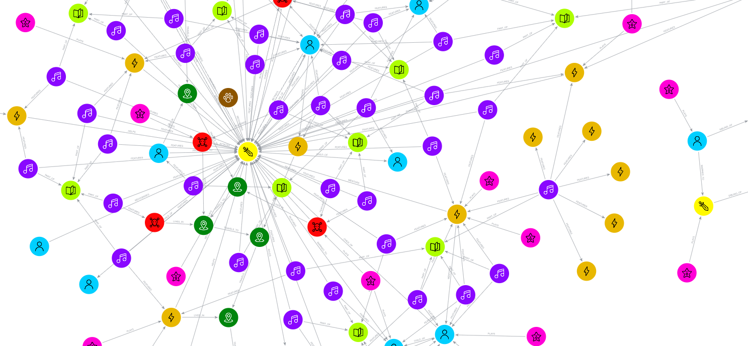
The result was visually stunning. As the queries executed, the story assembled itself organically on the canvas. Connections bloomed outward in rhythmic waves until all 130 nodes hung suspended like a glowing, color-coded celestial constellation. Gods, monsters, geographical waypoints, thematic musical tracks orbiting their respective characters, and dual casts of actors locked into their theatrical roles formed a complex, interactive web.

Yet, as Ojogbede stepped back to admire her digital tapestry, a jarring spatial anomaly caught her eye.
Supporting Data: The Discovery of the Orphaned Island
Off to the distant periphery of the canvas, entirely detached from the central narrative ecosystem by a vast expanse of empty white space, floated an isolated micro-cluster of data points. This detached island consisted of Agamemnon, Menelaus, Helen of Troy, Clytemnestra, and the contemporary actors portraying them.
While the nodes within this isolated cluster were internally linked through marital, sibling, and casting relationships (MARRIED_TO, SIBLING_OF, PLAYS), not a single directional arrow bridged the gap to Odysseus’s broader journey. The entire Trojan War plotline had been structurally severed from the rest of the epic dataset.

MATCH (t:Character name: "Telemachus")
MATCH (m:Character name: "Menelaus")
MERGE (t)-[:VISITS]->(m)
In a traditional spreadsheet, this structural schism was completely undetectable. Scrolling through rows of text offered no indication that an entire narrative sub-network was floating unmoored. The graph visualization, however, leveraged a force-directed layout algorithm—a mathematical approach where nodes organically pull together when linked and drift apart when isolated. In this visualization, topological disconnection manifested quite literally as physical distance.
The remedy required just three lines of declarative Cypher code. In Book 4 of Homer’s epic, Odysseus’s son Telemachus journeys to Sparta to visit Menelaus in search of intelligence regarding his missing father. By executing a simple query establishing that Telemachus VISITS Menelaus, the isolated island instantly snapped into alignment, bridging the Trojan War plotline to the overarching narrative canvas with a single relational line.
Official Responses and Comparative Methodologies: Tables vs. Graphs
The insights gleaned from Ojogbede’s experiment offer a compelling framework for data professionals, researchers, and journalists alike regarding the distinct epistemological capabilities of tables versus graphs.

What Tables Catch Best
Tabular structures excel at quantitative validation, aggregate verification, and scalar accuracy. When Ojogbede initially queried her raw data, a basic count returned 125 nodes—an immediate red flag, as her baseline spreadsheets accounted for 130 entries.
Tables make these discrepancies glaringly obvious because they allow human analysts to easily audit values, identify empty cells, spot duplicate records, and verify dates. If an error resides inside a specific data value, a structured row-and-column layout will readily expose it.
What Graphs Catch Best
Conversely, graphs are uniquely specialized for identifying structural anomalies—missing relationships, orphaned entities, or illogical directional flows. Because traditional tables do not possess a dedicated cell format to represent an absent connection, missing links are entirely invisible to row-based audits.

This phenomenon transcends literary analysis and poses critical challenges across modern data landscapes:
- Corporate Governance: An enterprise organizational chart may look immaculate in a spreadsheet, yet remain completely blind to an entire subsidiary department operating without a designated reporting manager.
- Web Architecture: Website auditing tools often evaluate individual page metrics successfully within a flat list, whereas a graph-based sitemap immediately highlights orphaned landing pages stripped of internal hyperlinks.
- Financial Fraud Investigation: Sophisticated illicit networks frequently mask their activities by dispersing shell entities across disparate tabular records; however, graph analytics effortlessly expose fraud by revealing seemingly unrelated bank accounts sharing a single telephone number or IP address.
As Ojogbede’s project demonstrates, the golden rule of data hygiene is straightforward: if an error resides within a value, rely on a table; if an error resides within a connection, rely on a graph.
Implications: A New Paradigm for Debugging Complex Data
The broader implications of Ojogbede’s work extend far beyond classical literature or fandom debates. By demonstrating how force-directed graph layouts can instantly expose structural absences, the project champions a broader adoption of visual data auditing in professional fields.

Data errors are rarely loud; more often than not, they are defined by their quiet absence. When complex datasets are constrained strictly to tabular formats, analysts run the risk of mistaking tidiness for accuracy, assuming that clean formatting equates to logical completeness.
By taking a creative detour through ancient Greek mythology, Kemi Elizabeth Ojogbede has provided developers, researchers, and data scientists with a powerful diagnostic reminder. Whether mapping the multi-generational traumas of the House of Atreus or auditing enterprise-scale relational databases, the message is clear: stop relying solely on the scrollbar. Sometimes, to truly understand your data, you have to let the story assemble itself in front of you—because somewhere in your network, an Agamemnon is waiting to be discovered.
For researchers and developers interested in replicating this methodology, the full dataset, Cypher scripts, and interactive tutorials are publicly available via GraphAcademy and the accompanying GitHub Repository.
 Basiran
  Nana Muazin
  Ammar Sabilarrohman