
 By Nila Kartika Wati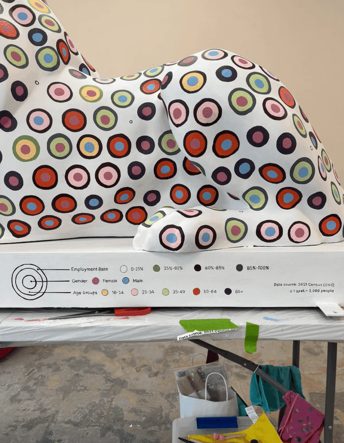
PORTSMOUTH, UK — When data visualization specialist and researcher Or Misgav was scrolling through her phone one quiet evening, an advertisement for the upcoming "Pride of Portsmouth" art trail immediately shifted her mindset from passive observer to active creator. Could a three-dimensional, fiberglass sculpture of a lion serve as an unconventional canvas for data art? More importantly, could this massive public art initiative double as a vibrant, visual love letter to her home city?
The answer is now roaming the streets of Hampshire. Launched on July 13, 2026, as a cornerstone of the historic Portsmouth 100 celebrations, the Pride of Portsmouth trail has transformed the urban landscape into an open-air gallery. Across the city, 45 lion sculptures stand tall, each uniquely designed by shortlisted artists chosen specifically by project sponsors to reflect Portsmouth’s diverse identity, creativity, and community spirit.
For Misgav, however, the project was far more than a standard artistic commission—it was a grueling, deeply personal experiment in translating sterile, digital spreadsheets into a tactile, breathing, and humanized piece of public storytelling.
The Main Facts: Merging Statistics with Sculpture
At its core, Misgav’s contribution to the Pride of Portsmouth trail is a towering statistical portrait. Measuring roughly 100 cm in height, 175 cm in length, and 60 cm in width, the fiberglass lion presented Misgav with the largest physical canvas of her career.

Rather than reducing Portsmouth to a single, monolithic narrative, Misgav turned to the vast repositories of the Office for National Statistics (ONS), specifically mining data from the completed 2021 UK Census. Facing an embarrassment of riches—spanning ethnicity, household history, religion, health, and employment—she resolved to weave two distinct datasets across the animal’s anatomy:
- The Left Flank: Cross-references health status, religion, and age groups among Portsmouth residents.
- The Right Flank: Maps employment rates segmented precisely by age and gender.
The data yielded fascinating local insights. The statistics revealed a predominantly employed population across most working age brackets. Furthermore, it highlighted a striking cultural pattern: the vast majority of Portsmouth residents reported having "no religion," with Christianity standing as the largest religious denomination, followed closely by Islam. Other religious demographics fell below Misgav’s standardized factor threshold, grouping together for fewer than 15 spots total.

Chronology of a Masterpiece: From Figma Grids to the Streets
Translating a pixel-perfect digital vector design into a curved, three-dimensional physical object is a notorious hurdle for digital artists. For Misgav, the journey was defined by late-night panic, sudden epiphanies, and relentless manual labor.
Phase 1: Conceptualization and the Digital Studio
Working within Figma, Misgav spent hours establishing her color palette and visual hierarchy. Her initial plan was straightforward: rely on neat, auto-aligned digital grids. However, a major hurdle emerged when project sponsor Lakeside North Harbour requested that their primary corporate brand color be integrated into the lion to anchor its visual identity.

Misgav achieved this through a stroke of poetic design: she utilized the sponsor’s brand color to represent "Good Health Status." This seamlessly aligned with the ONS census data revealing that the vast majority of Portsmouth citizens thrive in good health.
Phase 2: The Projection Nightmare
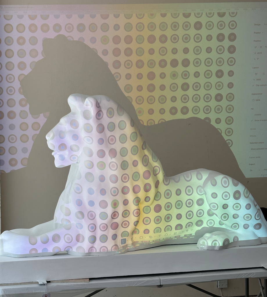
Before painting could begin, Misgav faced the monumental task of transferring her digital grid onto a curved, undulating lion body. Her initial instinct was to use a digital projector to cast the pattern directly onto the sculpture.

The approach failed catastrophically. The projector’s vertical angle distorted the margins and threw off row spacing entirely. Worse still, the projected pattern appeared completely flat, ignoring the lion’s natural muscular contours. Marking spots repeatedly with a washable pen left the sculpture a chaotic mess of overlapping dots. The digital perfection of the screen had utterly collapsed against the realities of 3D geometry.
Phase 3: The Bus Ride Epiphany
Salvation arrived during a routine rush-hour commute on a double-decker bus. Gazing at the traffic ahead, Misgav noticed how the arrangement of cars naturally formed a staggered, "brick-wall" pattern.

An "aha" moment struck. By converting her Figma auto-layout grid into a honeycomb pattern and spacing the circles slightly further apart, the design could breathe and gracefully contour to the lion’s shape. Aided by her husband, using flexible paper templates and rulers, Misgav manually plotted the center of every single circle—totaling roughly 1,500 distinct data points.
Phase 4: The 4-Week Marathon
Working in a communal studio filled with chatty artists, Misgav had to count every single spot out loud to ensure mathematical accuracy, adhering strictly to data visualization pioneer Alberto Cairo’s pillar of absolute truthfulness to the data.

Realizing the immense scale of the groundwork, she drafted a rigorous Gantt chart to balance her PhD workload, family commitments, and painting schedule. Sleep, social outings, and weekend runs were swiftly sidelined. After four brutal weeks of constant labor, paint-stained fingers, and circles haunting her dreams, the lion was finally complete.
Supporting Data & Methodology
Misgav’s work challenges traditional notions of how data should be consumed. By intentionally stripping away explicit numbers, axes, and legends, she transformed complex ONS census tables into pure visual language.

+-----------------------------------------------------------------+
|                       LION DATA TOPOGRAPHY                      |
+---------------------------------+-------------------------------+
| LEFT FLANK                      | RIGHT FLANK                   |
| - Health Status                 | - Employment Rates            |
| - Religious Demographics        | - Segmented by Age            |
| - Age Group Distribution        | - Segmented by Gender         |
+---------------------------------+-------------------------------+
| * Visualized via 1,500 hand-painted honeycomb circles           |
| * Primary Sponsor Color: Lakeside North Harbour (Good Health)   |
+-----------------------------------------------------------------+
Rather than presenting a sterile infographic, Misgav relied heavily on the geometry of circles. Beyond their obvious nod to traditional pie charts, she leveraged circles for their unique capacity to hold multiple definitions and overlapping narratives, inviting viewers to engage in visual interpretation.
Official Responses and Stakeholder Perspectives
The integration of corporate sponsorship with grassroots public art proved to be a resounding success for the city’s centenary initiatives.

Representatives from Lakeside North Harbour, the primary project sponsor, expressed profound enthusiasm during the official launch event. Integrating their corporate identity into the statistical representation of "Good Health" transformed a standard sponsorship into a meaningful civic partnership.
Project managers for the Pride of Portsmouth trail lauded the unprecedented diversity of the 45 lion sculptures. While traditional artists contributed murals of local wildlife, landmarks, and abstract concepts, Misgav’s contribution carved out a totally unique niche: bridging hard socio-economic data with high public art.

Implications: Rethinking Data Visualization in the Physical Realm
Misgav’s harrowing and ultimately triumphant journey offers profound implications for the fields of data visualization, urban art, and academic research:
- The Death of "CTRL+Z": Digital artists working in software environments like Figma or Tableau grow accustomed to infinite undo buttons and instant color-swapping. Moving into the physical world forces creators to confront the permanent, messy consequences of manual labor.
- Democratizing Complex Data: By removing numbers and relying on a rhythmic, honeycomb pattern of colored dots, the installation successfully lowers the barrier to entry for statistical literacy. Viewers do not need an economics degree to appreciate the employment or health realities of their neighbors; they simply need to look closely.
- Cognitive Load vs. Aesthetic Engagement: While Misgav acknowledges that her piece carries a high cognitive load—demanding that viewers act as "data detectives"—it reframes public monuments as active sites of learning rather than passive backdrops for selfies.
As the Pride of Portsmouth trail continues to draw crowds throughout the summer of 2026, Misgav’s statistical lion stands as a testament to resilience, community collaboration, and the untapped power of data art. When asked if she would ever undertake such an exhausting endeavor again, her response was instantaneous and unequivocal:

“Would I reapply to this project given another opportunity? YES! Where do I sign up?”
 Lina Irawan
  Nana
Nana  Lina Hope