
 By Nana Wu
In the high-stakes world of automotive branding, where legacy is measured in tenths of a second and heritage is as valuable as the engineering itself, a rebrand is a precarious maneuver. Today, McLaren has officially unveiled a comprehensive new brand identity, signaling a pivotal shift for the luxury manufacturer. By pivoting toward a leaner, more refined aesthetic that draws directly from its 1920s origins in New Zealand, the brand is attempting to bridge the gap between its humble, grassroots mechanical beginnings and the hyper-competitive, tech-driven future of high-performance vehicles.
The Core Transformation: A New Visual Language
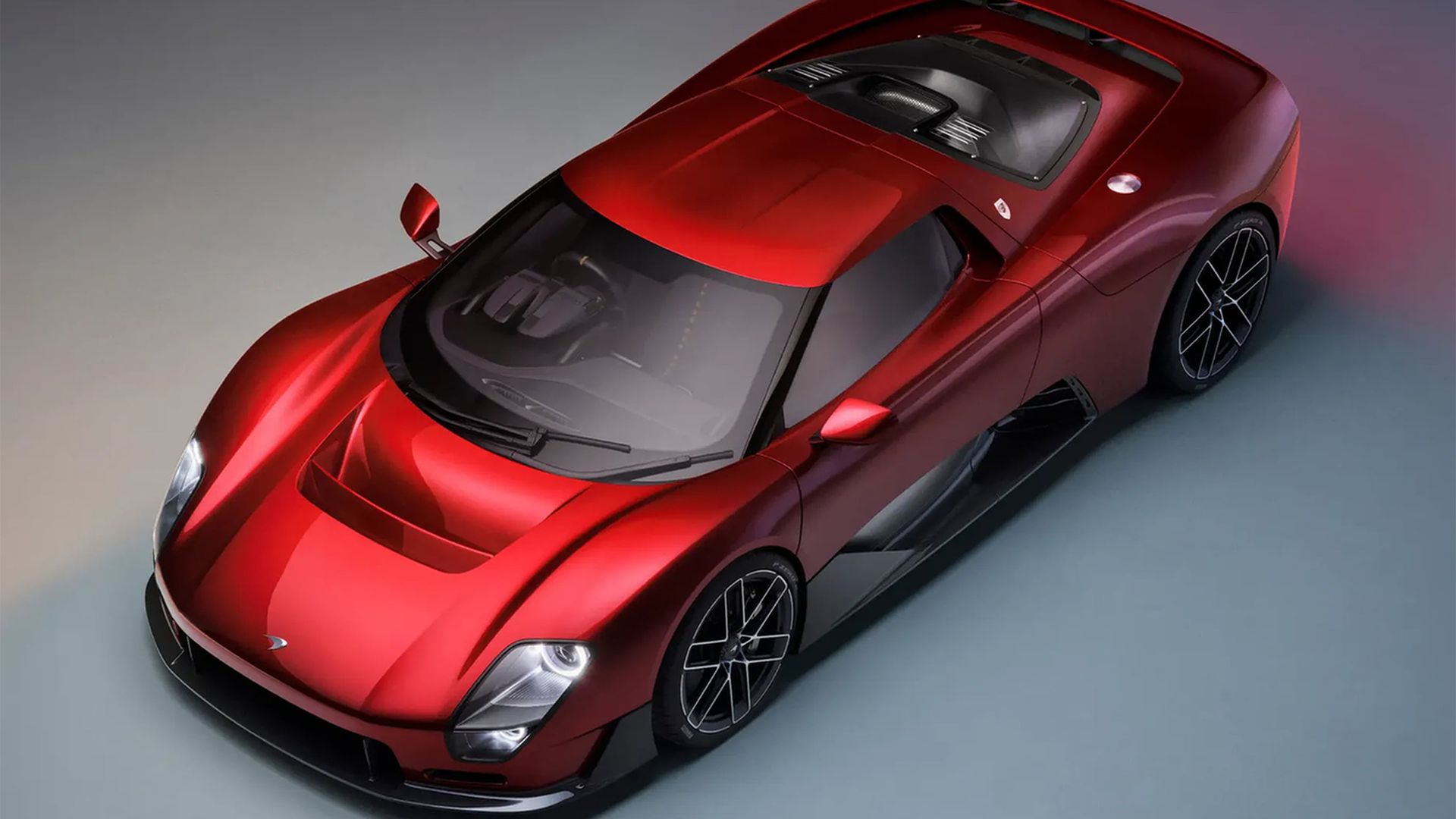
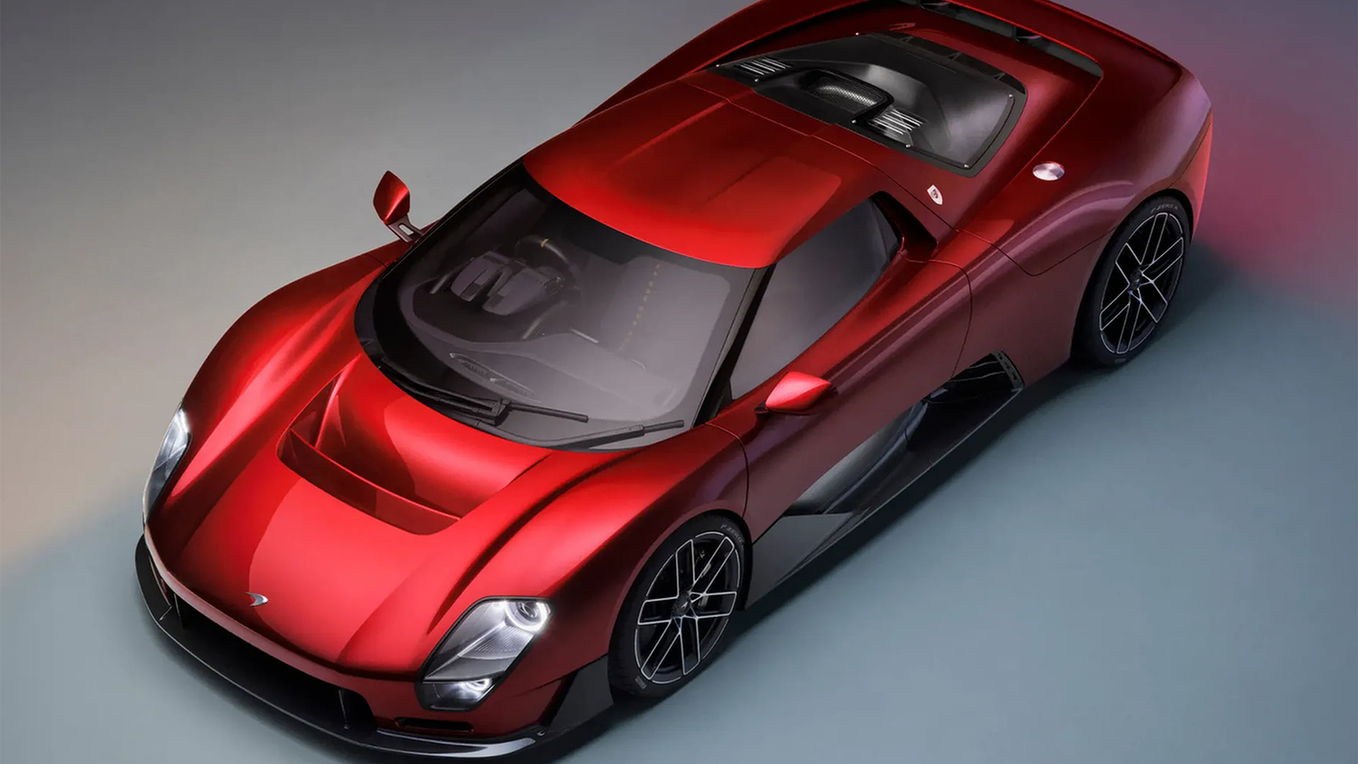
At the heart of this identity overhaul is a redesigned wordmark. Moving away from the heavier, more aggressive typeface that defined its recent era, the new McLaren logo utilizes a sophisticated, lighter-weight sans-serif font. This shift is not merely cosmetic; it represents a strategic move toward "stealth luxury," a design philosophy currently favored by high-fashion houses and premium lifestyle brands.
The most subtle yet impactful detail of this new wordmark is the intentional underscore beneath the lowercase ‘c.’ This design flourish serves to ground the typography, adding a layer of architectural stability that mirrors the precision engineering found in their road cars. By thinning the lines and increasing the kerning, McLaren has achieved a cleaner, more legible silhouette that functions as effectively on a digital dashboard interface as it does on the chassis of a track-ready supercar.
A Journey Through Time: The Chronology of an Icon
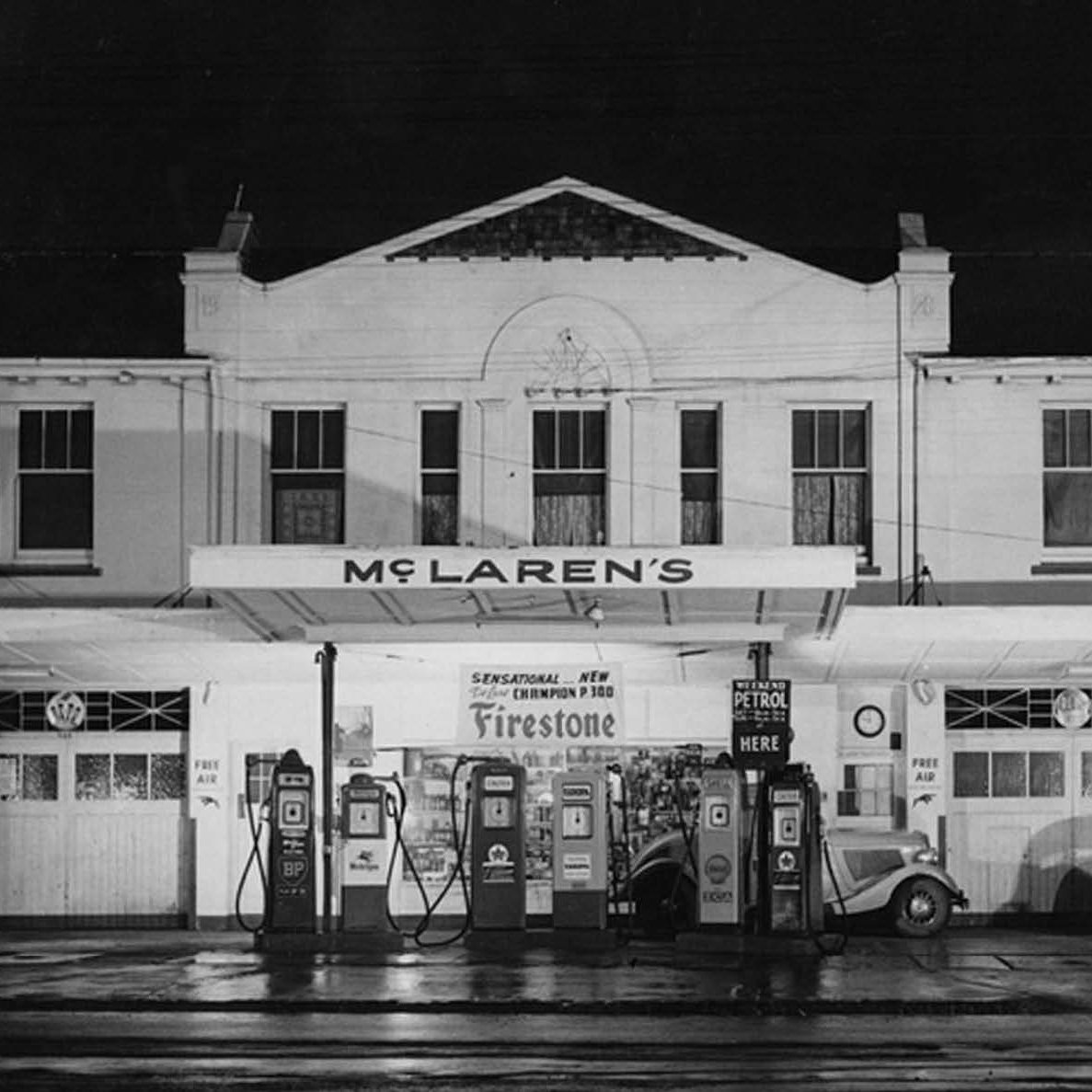
To understand the significance of this change, one must look back to the very foundations of the brand. The new wordmark finds its spiritual home in the signage of the original McLaren family service station in Remuera, Auckland, which dates back to the 1920s.
- 1920s – The Genesis: The McLaren family operates a service station in New Zealand. It was here that Bruce McLaren first encountered the mechanics of speed, laying the groundwork for what would become a global motorsport empire.
- The Mid-Century Ascendance: As the McLaren racing team began to dominate international circuits, the branding shifted toward the iconic "Speedmark." This mark became synonymous with innovation, aerodynamics, and victory at Le Mans and in Formula 1.
- The Modern Era (2010s-2024): The brand solidified its position as a consumer-facing manufacturer of high-end sports cars. During this period, the logo became bolder and more industrial, reflecting the mechanical prowess of machines like the P1 and the 720S.
- 2026 – The Pivot: Acknowledging that the future of automotive design lies in connectivity, electrification, and digital integration, McLaren initiates a total brand refresh. The goal: to strip away the clutter and return to the core "McLaren" DNA while preparing for a new generation of vehicles.
Balancing Heritage with Innovation: The "Speedmark" Dilemma
One of the most complex challenges in any corporate rebrand is deciding what to discard and what to preserve. For McLaren, the "Speedmark"—the iconic graphic element that has adorned their vehicles for decades—was far too valuable to lose.
However, the brand has opted for a tiered approach. While the new, clean wordmark will serve as the primary identifier for McLaren Automotive, the classic Speedmark will be preserved specifically for the brand’s golf and racing sub-brands. This dual-track strategy acknowledges the "value of continuity," as stated by company representatives, ensuring that the emotional connection fans have with the racing heritage remains intact, even as the consumer-facing luxury brand moves toward a more minimalist visual identity.
Official Responses: Defining the Vision
The leadership team at McLaren has been vocal about the intent behind these changes. It is a calculated move to harmonize the company’s internal culture with its external projection.
"It’s a reflection of the journey we are on as a company," says David Woodhouse, Chief Creative Officer at McLaren Automotive. "It marks the beginning of a new chapter for McLaren, giving a physical expression to the ambition, creativity, and forward momentum that is shaping our future."
From the racing side, the sentiment remains equally focused on identity. "It celebrates the symbols and stories our fans, partners, and team mates already know and love," adds Lou McEwen, Chief Marketing Officer at McLaren Racing. "It gives us a more connected expression of where we’re heading next. It feels unmistakably McLaren."
The Competitive Landscape: Why Now?
The automotive industry is currently witnessing a "branding crunch." In an age where electric vehicle startups are redefining what a car company looks like, established manufacturers are under immense pressure to prove they are not relics of the combustion engine era.
We have seen how difficult this transition can be. Recent high-profile rebrands—most notably Jaguar’s controversial pivot—have served as cautionary tales. When a brand moves too far from its roots or adopts a visual language that feels too generic or "tech-bro," the public reaction can be swift and unforgiving.
McLaren’s strategy appears to be one of "controlled evolution." By leaning into the 1920s Auckland service station aesthetic, they are anchoring their future in a human story. This provides a sense of authenticity that is difficult to manufacture. They are telling the consumer: "We haven’t changed who we are; we have simply refined how we tell our story."
Implications for the Future
What does this mean for the future of McLaren’s product line? A shift in branding is rarely just about the font. It often signals a shift in the product design language.
- Digital Integration: The lighter, more agile logo is designed for the high-resolution screens of the next generation of infotainment systems. It suggests a future where the car is as much a software product as it is a mechanical one.
- Luxury Positioning: By adopting a more "fashion-forward" wordmark, McLaren is signaling its intent to compete not just with Ferrari and Porsche on the track, but with luxury lifestyle brands in the eyes of the consumer.
- Sustainability and Minimalism: The move toward a "lighter" aesthetic is often a visual metaphor for weight reduction and efficiency—both critical pillars for the next generation of hybrid and electric supercars.
Conclusion: A Gamble on Elegance
The automotive sector is a crowded, noisy, and expensive place to do business. For a brand as storied as McLaren, the danger of staying the same is that they risk being perceived as stagnant. The danger of changing is that they might alienate the very loyalists who have built their reputation.
With this new identity, McLaren has taken a calculated risk. By choosing a design that is elegant, stripped-back, and deeply rooted in its own history, they have managed to avoid the pitfalls of the "soulless minimalist" trend that has plagued other major brands. The new logo does not scream for attention; it commands it through quiet confidence.
As the company looks toward its next chapter, the wordmark serves as a promise: the cars may change, the engines may evolve, and the technology may advance, but the spirit of the original service station in Remuera remains the driving force behind everything they do. For the McLaren fan, this is not a departure from the past, but an invitation to witness the future.
 Iffa Jayyana
  Jia Lissa
  Ali Ikhwan