
 By Jia Lissa
After six years in the trenches of reporting and analytics, I have arrived at an uncomfortable, perhaps even blasphemous, truth for the data visualization community: Your beautiful, highly interactive Tableau dashboard is destined to become a static PowerPoint slide.
If you work in sales operations, finance, or any executive-facing analytics team, you are likely already nodding in recognition. You spend hours—sometimes days—perfecting hover actions, complex parameter-driven navigation, and sleek tooltips. You publish it to Tableau Server with pride. Yet, at 9:00 a.m. on the morning of the quarterly board meeting, your Vice President of Sales isn’t logging into the server. They are downloading your masterpiece as a PNG, pasting it onto slide 17, and cropping it to fit the corporate deck.
This is not a failure of technology; it is a reality of executive workflows. When the stakes are high, leaders prefer the predictability of a slide deck over the potential for browser-based technical glitches or loading lag. Once I accepted this reality, I stopped fighting the workflow and started treating it as a design constraint.
Here is how you can transform your design philosophy to embrace the "Static Paradox."
The Evolution of Executive Reporting: A Chronology of the Shift
To understand why this shift in mindset is necessary, we must look at the historical trajectory of business intelligence (BI) adoption.
The Era of Static Spreadsheets (Pre-2010)
In the early days of corporate reporting, the data analyst’s primary tool was the Excel spreadsheet. Reporting was labor-intensive, manual, and prone to error. Executives were accustomed to receiving "the numbers" in a flat, predictable format.

The Rise of the "Interactive Promise" (2010–2020)
Tableau, PowerBI, and Qlik promised a revolution: the end of the static report. We moved into a decade where "interactivity" was the gold standard. Analysts were encouraged to build "data playgrounds" where stakeholders could filter, drill down, and explore.
The "Slide-Deck Reality" (2020–Present)
As data reached the C-suite, a new friction point emerged. While analysts favored the browser, executives favored the meeting room. Whether in person or over Zoom, the slide deck remains the "source of truth" for corporate strategy. Today’s senior leaders prioritize speed and narrative flow over exploration. They want the answer now, on the screen they are already presenting, without having to navigate away to a separate portal.
Supporting Data: Why Interactivity Often Fails the C-Suite
Why is it that even the most robust dashboards get downgraded to images?
- The "Live Demo" Risk: Nothing kills a board meeting’s momentum faster than a dashboard that times out or fails to load due to a server authentication error. Executives treat Tableau as a potential point of failure.
- Narrative Control: A PowerPoint deck allows a leader to guide a story from point A to point B. An interactive dashboard, by design, allows for divergent paths. If a CEO wants to make a specific point about Q3 revenue, they want to ensure their audience is looking exactly where they are pointing.
- Contextual Annotation: Tableau dashboards are often data-heavy. A PowerPoint slide, by contrast, allows the presenter to add text boxes, highlight key takeaways, and draw attention to specific anomalies with native callouts.
Five Non-Negotiable Pillars of Design
If we accept that the primary destination for our data is a slide deck, we must adjust our design process. Here are five non-negotiable rules for the modern analyst.
1. Design for PowerPoint from Day One
Device preview is no longer just a technical setting—it is the most important part of your workflow. In the early stages of my career, I would build dashboards in the default "Desktop Browser" view. The result? A massive, sprawling canvas that, when exported, became an illegible, tiny rectangle on a slide.
The Fix: Force your dashboard to a 16:9 aspect ratio from the very first minute. This ensures that your layout respects the dimensions of standard Google Slides or PowerPoint templates. Don’t build for the "Tableau world"; build for the "Business Presentation" world.
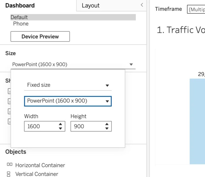
- Pro Tip: Always run a test export—
Dashboard > Export as PowerPoint—before you consider the dashboard "final."
2. Accept the Death of Interactivity
This is the most painful pill to swallow: You must build as if your dashboard has zero interactivity.
When you export to PowerPoint, you lose tooltips, filtering, parameter actions, and drill-downs. If your user needs to see the data broken down by "Region" and "Product Line," you cannot rely on a filter dropdown. You must create multiple, separate, static versions of that view.
While this feels like redundant work, it is the only way to ensure your stakeholders see the insights they need. If a critical piece of information requires a user to hover or click to reveal it, assume it will never be seen.
3. The Power of Containers
When you export to a slide, your dashboard’s layout is under pressure. Without rigid structure, floating objects will drift, overlap, and create a messy aesthetic.
Containers are the "bones" of a dashboard. They ensure that even when the dashboard is compressed or resized for a deck, the visualizations remain locked in their relative positions.
- The "Density" Requirement: Note that white space, while elegant in web design, often looks like "missing data" in a high-stakes meeting. Executives want dense, information-rich visuals. Use containers to pack your KPIs, bar charts, and trends tightly.
4. Governance: The Key to Sanity
If you are working in a team environment, your file management will make or break your credibility. If your server is cluttered with "Dashboard_Final," "Dashboard_Final_v2," and "Copy of Copy of Sheet 3," you are inviting chaos.

Implement a visual versioning system:
- Color-Code: Use Tableau’s tab-coloring feature to differentiate between "Drafts" (Yellow), "In Progress" (Blue), and "Production/Public" (Green).
- Naming Conventions: Abandon generic names. Use a standard format:
[Period]_[Topic]_[Version]. For example:Q4_Sales_Pipeline_v3.
5. Professional Branding (The Logo Strategy)
Your dashboard will eventually leave your department. It will be emailed, Slack-shared, and embedded in external client decks. If your dashboard looks like a generic web tool, it loses its professional authority.
Placement Matters: Always place your company logo in a consistent corner (usually top-right or top-left) that aligns with your organization’s official slide deck template. This subtle design choice ensures that when a VP drops your chart into a client presentation, it looks like a curated, branded asset rather than a screenshot of an internal tool.
Implications: The Analyst as a Narrative Architect
The transition from "Dashboard Developer" to "Business Intelligence Architect" requires a change in ego. We must stop mourning the loss of our interactive features and start celebrating the impact of our data-driven stories.
When we design for the PowerPoint reality, we become better at:
- Synthesizing Information: We learn to prioritize the most important KPIs because we know we don’t have an infinite amount of space.
- Anticipating Stakeholder Needs: We stop building for "explorers" and start building for "decision-makers."
- Driving Action: We recognize that the goal of the dashboard is not to keep the user engaged in the tool, but to provide the clarity needed to make a business decision.
Conclusion
The bottom line is simple: Stop optimizing for clicks and start optimizing for screenshots.

Your stakeholders do not care about your elegant parameter actions if they cannot paste your dashboard into their Monday morning executive meeting. Sometimes, being a world-class analyst means accepting that your masterpiece will be copied and pasted into slide 23 of a deck.
If you design for that reality from the very beginning, your work will not only be more useful—it will be indispensable. Embracing the static, rather than resisting it, is the hallmark of an analyst who truly understands how business is done at the highest levels.
 Lina Irawan
  Nana
Nana  Nila Kartika Wati