In the modern age of information, we are drowning in data. From the granular reports of the World Health Organization to the real-time dashboards of UNICEF, the global water crisis is perhaps one of the most meticulously documented challenges in human development. Yet, for all the precision of our spreadsheets and the technical accuracy of our choropleth maps, a dangerous gap remains: the disconnect between a statistic and the reality it represents.
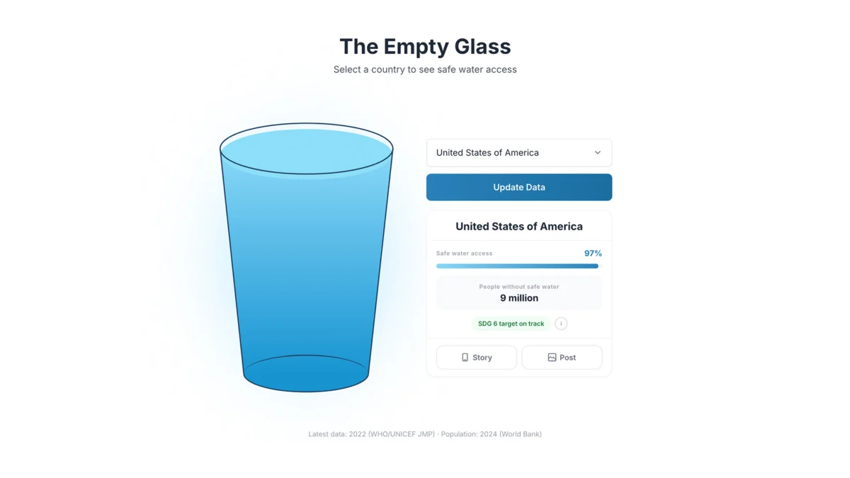
When a report declares that a nation has 60% access to safe drinking water, the number is informative, even precise. However, it is fundamentally abstract. For the average reader, this percentage fails to convey the physical, daily struggle of sourcing clean water, the health risks of contamination, or the profound inequality inherent in such a metric. This realization led designer Inumimo Idowu to launch "The Empty Glass Project"—a bold experiment in data visualization that argues that sometimes, the most sophisticated way to present data is to strip it down to its most human, intuitive form.
The Problem of Clinical Distance
Data visualization has long been dominated by a culture of "maximum information." We are trained to value completeness, color-coded layers, and precise axes. While these tools are essential for academic research and policy planning, they often fail to capture the public imagination.
A standard bar chart showing water access rates across continents is a cognitive exercise. The viewer must process the bars, compare the lengths, refer to the legend, and then mentally translate that into a concept of "water security." This process is prone to friction. The brain, seeking to conserve energy, often skims the data without feeling the weight of the underlying crisis.
"The Empty Glass Project" operates on a different philosophy. Instead of asking how to fit the maximum amount of information onto a screen, Idowu asks: What does this data feel like in real life? The answer is a universal, domestic symbol: a glass of water.
Chronology of a Minimalist Approach
The development of this project did not begin with code or datasets, but with a conceptual pivot.
- Phase 1: Conceptualization: Idowu identified that the primary barrier to public engagement with water scarcity was the "clinical distance" created by traditional charts.
- Phase 2: Source Integration: The project moved to integrate verified, high-trust datasets from global health organizations. The goal was not to discard scientific accuracy but to re-clothe it.
- Phase 3: Prototype Design: The design team removed all secondary data—no axes, no legends, no complex filters. The interface was reduced to a single, empty glass that fills or remains partially empty based on the user’s selection of a country.
- Phase 4: Public Interaction: The project was released as an interactive experience, where the act of "filling the glass" forced the user to confront the disparity between nations in a visceral, tactile way.
Supporting Data and the Architecture of Inequality
The data underpinning the project is derived from the same rigorous sources that inform international policy. However, by removing the "clutter" of standard dashboard design, the visual impact of the data is magnified.
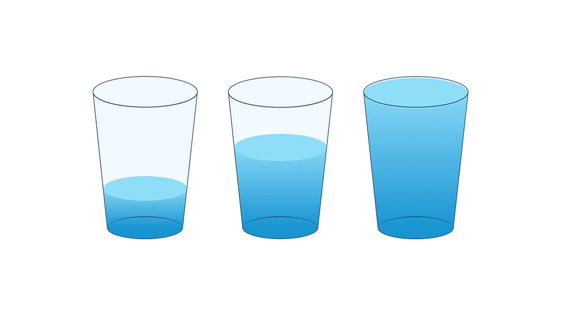
Current statistics show that billions of people still lack safely managed drinking water. In regions where access is high, the "glass" in the interface is nearly full, representing a standard of living that is often taken for granted. In regions where infrastructure is failing or non-existent, the glass remains largely empty.

This juxtaposition is intentional. By isolating a single variable—access—and displaying it through a familiar object, the design highlights the stark inequality between nations. The project does not need to provide a narrative text to explain the disparity; the visual evidence of an empty glass in one region versus a full one in another is self-evident. It forces the viewer to acknowledge the human cost of the "remaining percentage"—that missing 40% isn’t just a number; it is a life interrupted.
Official Responses and the Design Community
The response from the design and data-science communities has been one of both curiosity and critical reflection. Many experts in information design have praised the move toward "emotional clarity."
"We often confuse complexity with depth," says one design strategist reviewing the project. "Idowu’s work proves that if people don’t engage with the data, the accuracy is irrelevant. By making the data feel like an object we hold in our hands, he has lowered the barrier to empathy."
However, there are valid debates regarding the limitations of minimalism. Critics argue that by removing the axes and the context, the viewer may lose out on understanding the nuance of the data—such as the difference between "basic" access and "safely managed" access. In response, the project team maintains that their work is intended to be a gateway. It is a tool for initial engagement, meant to act as a bridge to the more dense, complex reports that follow.

The Implications: Why Less is More
The implications of "The Empty Glass Project" extend far beyond water access. It challenges the fundamental ethos of data storytelling in the digital age.
1. From Passive Viewing to Active Discovery
Traditional dashboards are often passive. The user looks at a screen and observes a trend. In contrast, this project requires the user to interact. When a user selects a country, they are not just looking; they are "filling" the glass. This simple act of participation creates a psychological link between the user and the subject matter.
2. Designing for Empathy over Efficiency
In the corporate world, data is often designed for "efficiency"—how quickly can a stakeholder understand the trend? But in social issues, efficiency is the wrong metric. Empathy should be the priority. When information is presented in a way that feels relatable, it becomes much harder for the viewer to ignore or dismiss.
3. The Power of Universal Metaphors
Every culture on Earth understands the need for a glass of water. By tapping into this universal experience, the project bypasses language barriers and cultural divides. It is a masterclass in using common human experiences to communicate the most complex of global crises.

Conclusion: A New Standard for Data?
Is minimalism the future of data visualization? Perhaps not in every context. For a scientist conducting climate research, precise, layered, and complex charts remain indispensable. However, for the communicator, the journalist, and the advocate, "The Empty Glass Project" offers a vital lesson: if we want to change the world, we must first ensure that the world understands the data we present.
As Inumimo Idowu notes, the goal is not to simplify the crisis, but to make it impossible to overlook. By reducing a massive global challenge to the simple, poignant image of a glass that is not quite full, the project succeeds where thousands of lines of spreadsheets have failed. It stops being about the numbers and starts being about the people.
In an era of information overload, the most powerful tool we have is not the one that tells us the most, but the one that makes us care the most. By turning data into a reflection of our shared humanity, we move one step closer to solving the very problems we have spent so long measuring.