
 By Laily UPN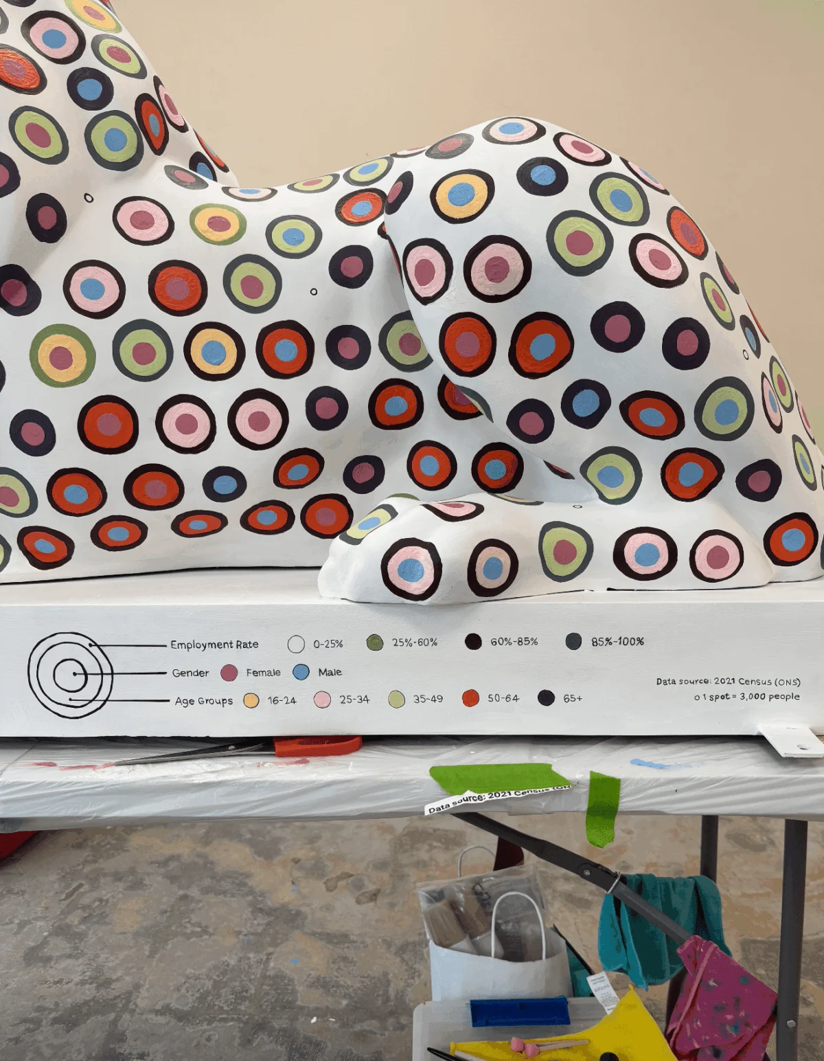
When the “Pride of Portsmouth” art trail was announced, it was framed as a celebration of the city’s centennial—a public art installation featuring 45 fiberglass lions, each a unique canvas for local identity. For data artist Or Misgav, however, the invitation to participate sparked a radical idea: could she bridge the gap between abstract, digital datasets and the tangible, three-dimensional world?
Her contribution to the Portsmouth 100 celebration is not merely a sculpture; it is a data-driven love letter to the city, transforming cold census figures into a vibrant, visual narrative that challenges the boundaries of contemporary data art.
The Genesis of a Data-Driven Icon
The project began with a moment of digital serendipity. While scrolling through social media, Misgav encountered the call for artists for the Portsmouth 100 trail. Her professional instinct shifted immediately from passive consumption to active analysis. “Could I use a three-dimensional canvas to advocate for data art?” she wondered. “Could I use this opportunity to create a data viz love letter for my city?”
Launched on July 13, 2026, the Pride of Portsmouth trail serves as a physical manifestation of the city’s spirit. Each of the 45 sculptures, standing roughly 100 cm tall and 175 cm long, provides a massive, curved surface area for artistic expression. For Misgav, this was the largest canvas she had ever tackled, presenting a formidable challenge: how to translate pixel-perfect digital aesthetics onto a complex, non-linear fiberglass form.

Chronology of a Creative Struggle
The process was far from linear. Misgav’s journey began with an intensive research phase, scouring datasets from the Office for National Statistics (ONS). She found herself paralyzed by the richness of the 2021 census data. Choosing between narratives on ethnicity, family history, health, and employment proved difficult, eventually leading her to adopt a dual-dataset approach.
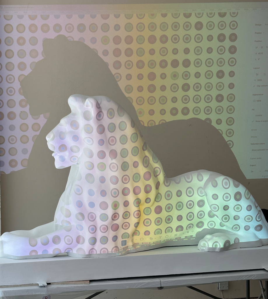
The first week was defined by "digital anxiety." Misgav, accustomed to the safety of Figma’s precision tools—where a single click can realign a thousand elements—found that physical reality was less forgiving. Her initial attempt to use a digital projector to cast a grid onto the sculpture ended in failure. The projector’s angle distorted the imagery, and the flat, projected patterns failed to account for the lion’s natural, organic contours.

“I tried different heights and sizes, marking spots on the lion with a washable pen over and over, until it was covered with too many dots to make anything out,” she recalls. The breakthrough arrived in the most mundane of places: during a rush-hour commute on a double-decker bus. Observing the "brick-wall" pattern of traffic, Misgav realized that a honeycomb grid would allow her design to breathe and flow with the lion’s form.
With the help of her husband, she spent days manually plotting 1,500 individual center points. This phase was an exercise in extreme focus, conducted in a communal studio filled with the chatter of other artists. As the project progressed, the sheer magnitude of the labor forced her to build a rigorous Gantt chart, sacrificing her weekends, exercise, and social life to meet the deadline. After four weeks of "brutal" daily labor, the piece was complete—a triumph of endurance and methodology.

The Data Under the Paint
Misgav’s work is grounded in the belief that data art must remain truthful to its source. To achieve this, she divided the lion’s narrative into two distinct visual hemispheres:
- The Left Flank: This side cross-references health status, religion, and age group. The data revealed that the vast majority of Portsmouth residents report being in good health. To emphasize this, she collaborated with her sponsor, Lakeside North Harbour, to incorporate their brand color into the visual representation of "Good Health Status."
- The Right Flank: This section maps employment rates, broken down by age and gender. Misgav noted with satisfaction that the data showed high employment rates across the city, providing a positive narrative anchor for the piece.
By utilizing circles as her primary data element, Misgav leveraged their capacity to hold multiple, overlapping narratives. She meticulously adjusted the visual weight of each attribute, deciding which data points belonged to the outer perimeter and which anchored the core. In a final, deliberate choice, she stripped away all numerical labels. “No numbers, pure visual language,” she says. The result is a piece that demands the viewer act as a "data detective," deciphering the patterns themselves.

Official and Community Perspectives
The project garnered significant support from both the Portsmouth 100 committee and the corporate sector. Lakeside North Harbour, the project’s primary sponsor, provided more than just financial backing; they allowed their brand identity to become part of the statistical story.
The project manager for the Pride of Portsmouth noted that Misgav’s lion stood out precisely because of its cognitive intensity. While most sculptures on the trail lean toward the illustrative or decorative, Misgav’s work invites a deeper, more analytical engagement. It is a piece that asks the public to consider their city not just as a collection of streets and buildings, but as a dynamic, shifting set of statistics that represent real lives, health outcomes, and economic realities.

Implications for the Future of Data Art
Misgav’s experiment offers a profound reflection on the state of data visualization. The transition from the screen to the physical world served as a critical lesson in the limitations of digital perfection.
“Moving from the screen to the physical world was terrifying,” she admits. “I learned how spoiled I was by the safety net of CTRL+Z.” The realization that her "digital perfection" had collapsed in the face of the sculpture’s curves forced her to accept a "messy," humanized aesthetic. This shift—from the sterile, grid-locked environment of software to the tactile, imperfect reality of paint and brush—marks a significant evolution in her practice.

The implications for the field of data science are clear: data art does not have to be binary or purely digital. By bringing data into the public square, Misgav has demonstrated that complex statistics can be made accessible, emotional, and profoundly local.
A Lasting Legacy
As the Pride of Portsmouth trail continues to draw visitors across the city, the "data lion" stands as a testament to the intersection of civic pride and technical rigor. For Misgav, the project was an exhausting, life-altering experience. When asked if she would do it again, her answer is an unequivocal "Yes."

The piece remains a point of contention and conversation. Some may find the dense, circular patterns challenging, but that is precisely the point. By asking the public to engage with the data on a visceral level, Misgav has succeeded in creating a monument to Portsmouth that is as complex and vibrant as the people who live there. As she looks back on the four weeks of stained fingers and sleepless nights, she finds peace in the knowledge that she has redefined her own approach to her craft, proving that even the most rigid datasets can be brought to life through the right artistic lens.
The roar of the lion, in this case, is the sound of data finding its voice in the public realm.
 Lina Irawan
  Nana
Nana  Nila Kartika Wati