
 By Nila Kartika Wati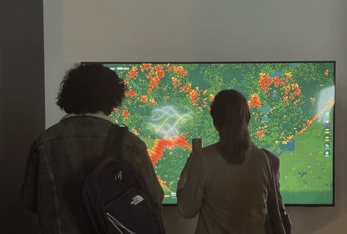
In the modern energy sector, the chasm between raw data and human comprehension is widening. For professionals like Pranavi Aourpally, a San Francisco-based designer specializing in energy data, the daily reality is a paradox: while we have more information about our power grids than ever before, we seem increasingly disconnected from the physical consequences of the energy we consume.
"I design data experiences in the energy industry," Aourpally explains. "Most days, that means translating alarming trends—soaring demand forecasts and grid expansion curves—into something actionable. But data does not automatically become understanding."
As the world pivots toward an AI-driven economy, the physical strain on our electrical grids has reached a fever pitch. Data centers, now consuming electricity at a scale that rivals entire nations, are necessitating rapid infrastructure expansion. When these power lines traverse regions increasingly prone to drought and wildfire, the abstract demand for computing power translates into a very real, very physical risk.
The Anatomy of the Empathy Gap
The "empathy gap" is a term increasingly used by data visualization experts to describe the disconnect between a statistical representation and the visceral human experience it represents. A chart in a corporate slide deck, no matter how accurate, often fails to trigger the emotional response necessary to drive meaningful change.
"A number in a report remains a number; a chart in a slide deck is often nodded at and promptly forgotten," says Aourpally. "I have witnessed this firsthand: the space between what the data says and what a human actually feels."
This gap is particularly dangerous in the context of climate change. Working in San Francisco, Aourpally is surrounded by the physical manifestations of the climate crisis. Wildfire risk and energy infrastructure are inextricably linked—not just by geography, but by causality. Longer "burn windows" and more frequent extreme weather events create a volatile environment where the digital demands of our modern lives impose a physical burden on a warming planet.
Chronology of a Project: From Theory to Spark
Aourpally’s journey to address this disconnect began with a desire to make the invisible costs of digital life palpable. Armed with a background in Information Design and Data Visualization from Northeastern University, she entered the Data Visualization Society (DVS) mentorship program with a singular, ambitious question: "How do you make someone feel the cost of something invisible?"
Under the guidance of her mentor, Divya Meghnani, Head of Product at Databricks, Aourpally began to move beyond the technical mechanics of visualization and toward a more narrative-driven approach. Meghnani’s mentorship was instrumental in helping Aourpally refine her creative intent, pushing her to interrogate not just the what of the data, but the why of the experience.
"He didn’t just support the technical build; he pushed me to move beyond the ‘what’ of the data and into the ‘why’ of the experience," Aourpally recalls. This shift in perspective was the catalyst for Wired to Burn, an interactive simulation that would eventually bridge the gap between abstract statistics and emotional resonance.
The Simulation: Designing for "Data Humanism"
Inspired by Daniel Shiffman’s Nature of Code and the "Data Humanism" philosophy championed by Giorgia Lupi, Aourpally turned to cellular automata to model wildfire behavior. Wired to Burn is not a static dashboard; it is an emergent system where the user’s cursor acts as the catalyst for destruction.
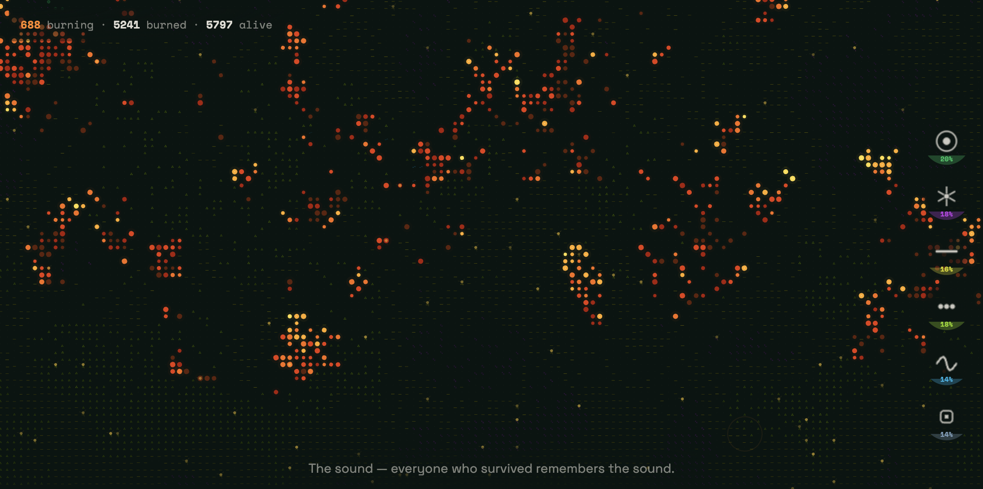
The simulation runs on a grid of over 9,000 cells. Using the p5.js library, Aourpally created a system where fire behaves as a living, breathing entity. The simulation accounts for fuel density, humidity, and dryness levels—environmental variables that are directly exacerbated by the escalating energy demands of modern digital infrastructure.
The aesthetic design of the project is intentionally striking. It opens on a near-black canvas, populated by six distinct, neon-colored symbols:

- Emerald green targets: Representing forests.
- Violet starbursts: Representing shrublands.
- Acid yellow dashes: Representing agricultural land.
- Lime green dots: Representing grasslands.
- Cyan sine waves: Representing wetlands.
- Slate blue squares: Representing developed areas.
As the user clicks to create a spark, the simulation begins. The fire spreads according to complex mathematical rules, but the output is deeply personal. In a departure from traditional data visualization, the "ash" left behind by the fire is not merely dead pixels—it is text. As the fire consumes the landscape, it displays narration explaining the hidden infrastructure costs of our digital behaviors, forcing the user to confront the human story behind the data.
Supporting Data: The Cost of the Digital Age
The implications of the project are rooted in sobering industry realities. As of the mid-2020s, the energy demand for AI data centers is surging, placing unprecedented stress on aging power grids. According to industry reports, the electricity required to train and run large-scale AI models is projected to triple in some regions by 2030.
The correlation between this expansion and wildfire risk is well-documented. As power lines are extended to reach remote, high-demand data facilities, they often pass through dry, combustible terrain. When these lines fail—due to extreme heat, wind, or equipment aging—the resulting sparks can trigger catastrophic wildfire events. Aourpally’s work serves as a reminder that every AI prompt, every cloud-stored video, and every automated process has a physical origin point, often located in the very forests currently threatened by climate change.
Official Responses and Industry Reception
When Wired to Burn was presented at the TIAT exhibition in San Francisco, the response from the public provided a rare, measurable validation of the "empathy gap" theory. Observers who initially approached the screen with curiosity were quickly subdued by the simulation’s narrative.
"I watched strangers walk up to the screen," Aourpally notes. "At first, there was the visual awe of the generative fire. But as they read the text appearing in the ash, the realization shifted. They weren’t just playing with a simulation; they were looking at a mirror of our current climate reality."
The success of the exhibit was marked by a specific behavior: visitors frequently returned to the "ash zones" to re-read the narration. By giving the data a human pulse, the project transformed passive consumers into active, reflective participants. This suggests that the future of environmental communication may lie not in more complex data, but in more human-centered storytelling.

Implications for the Future of Data Design
As Aourpally looks toward the upcoming Outlier Conference, where the theme is "The Final Draft," she remains committed to the idea that data visualization is an iterative process. "Wired to Burn has taught me that data visualization is never truly finished; it is constantly evolving," she states.
The implications for the data design community are clear:
- Prioritize Empathy: Technical accuracy is insufficient if it fails to evoke a response. Designers must consider the emotional weight of their subject matter.
- Move Beyond Static Models: Interactive simulations allow users to explore causality, making them more likely to internalize the stakes of the data.
- Embed Narrative in Context: By integrating text or storytelling directly into the data visualization, designers can ensure the "why" is never separated from the "what."
In the context of the climate crisis, the stakes could not be higher. As the terrain continues to regenerate and the threat of wildfire persists, the data will continue to demand attention. The challenge for the next generation of designers is to ensure that when we talk about the world, we make the people living in it feel the urgency of what is at stake.
"Our job as data designers is not just to show the numbers," Aourpally concludes. "It is to remain humble in the face of these complex systems and ensure that we make the people in it feel exactly what is at stake."
 Lina Irawan
  Nana
Nana 