
 By Reynand Wu
By Kat Homan | Special Editorial Report
In the fast-paced ecosystem of digital product design, visual trends are the currency of innovation. Designers constantly look toward neo-brutalism, fluid biomorphic animations, hidden gesture navigation, and hyper-saturated micro-interactions to capture attention, signal modernity, and drive short-term platform engagement.

However, when these exact UI paradigms are lifted and dropped into the realm of mental health and mobile health (mHealth) applications, they often trigger a catastrophic conflict of purpose. While commercial software strives to maximize screen time, capture attention, and create habits through dopamine loops, mental health applications operate under an entirely different mandate: to reduce cognitive strain, foster deep psychological trust, and act as a reliable refuge for users in distress.

Main Facts: The Retention Crisis and the Design Conflict
The stakes could not be higher. Mental health applications face an ongoing, measurable retention crisis that directly threatens clinical outcomes. According to benchmark studies published in the Journal of Medical Internet Research (JMIR), almost 95% of users who open a mental health app on Day 1 abandon it by Day 30, with the median 30-day retention lingering at a dismal 3.3%. Even the industry’s most recognized giants shed roughly 50% of their active user base within the first ten consecutive days.

This severe retention collapse proves that interface design in mHealth is not merely an aesthetic choice—it is a fundamental clinical tool. Users rarely open a mental health application out of idle curiosity; they arrive out of acute need, frequently while experiencing high anxiety, depressive numbness, panic, cognitive overload, or extreme exhaustion.

When a user in a low-capacity state encounters an unconventional icon, an abstract gesture-based menu, or a flashy, non-skippable onboarding animation, that interface ceases to be a delightful surprise. Instead, it becomes an extra layer of cognitive overhead—and a direct catalyst for immediate abandonment.

Chronology of an Industry Misstep: How mHealth Adopted Consumer Tech Playbooks
To understand how the mental health app sector arrived at this juncture, it is necessary to examine the chronological evolution of digital product design over the past decade:

- 2015–2018 (The Gamification Wave): As consumer apps like Duolingo and fitness trackers popularized streaks, progress badges, and aggressive push notifications, mental health developers eagerly adopted these retention mechanics to build daily wellbeing habits.
- 2019–2021 (The Aesthetics Rush): With the rise of Dribbble and Behance design culture, applications prioritized visual novelty—soft gradients, glassmorphism, and playful cartoon illustrations—to stand out in crowded app store listings. Clinical usability and cognitive load testing often took a back seat to visual charm.
- 2022–2024 (The Attention Economy Clash): Monetization patterns, subscription paywalls, and complex dashboards (such as multi-variable health trackers) became standard. Unfortunately, many apps inadvertently placed these monetization walls directly behind acute support pathways, causing friction precisely when users needed immediate, unhindered intervention.
- 2025–Present (The Call for Contextual Frameworks): Emerging research from public health bodies and clinical organizations began formally linking poor digital design choices to user stress, prompting designers like Kat Homan to introduce rigorous evaluation frameworks that measure UI patterns against human emotional capacity.
Supporting Data and Evidence: The Five Fronts of Design Friction
Published research on cognitive load, mHealth accessibility, and emotional response reveals that trend-driven UI fails users across five distinct fronts:

1. Cognitive Friction and Reduced Executive Capacity
When a user experiences anxiety or depression, executive functioning—the mental capacity required for planning, focusing, and making decisions—is severely compromised. Neo-brutalist layouts with harsh contrasts require intensive visual parsing, while hidden navigation drawers transform simple tasks into frustrating puzzles. Research shows that simple interfaces reduce the time and effort required to engage, whereas complex, trend-driven UIs turn the app into an obstacle course.

2. Emotional Mismatch and Trust Erosion
Studies investigating how color and aesthetics influence mood in mHealth apps indicate that distressed users exhibit a strong preference for subtlety. They lean toward dark palettes, sophisticated minimalism, and clean, uncluttered spaces. Bright, hyper-cheerful colors and bouncing cartoon characters can feel jarring, invalidating, and physically uncomfortable to someone experiencing a heavy depressive episode. Furthermore, cash-grab mechanics like discount wheels or celebratory confetti triggered immediately after a user logs a severe panic attack create a profound emotional mismatch that erodes trust.

3. The Inconsistency Penalty
Mental health relies heavily on routine, predictability, and stability. Yet modern UI trends thrive on disruption and novelty, intentionally hiding or altering core navigation paths to feel "fresh." When a user returns in a depleted state only to find that the app’s fundamental layout has shifted, they are forced to relearn the interface—an expenditure of mental energy they simply cannot afford.

4. The Silent Exclusion of Accessibility Needs
Pop-culture design trends often ignore foundational accessibility standards. Minimalist low-contrast text violates Web Content Accessibility Guidelines (WCAG), alienating users with visual impairments. Gesture-only navigation shuts out individuals with motor difficulties, while visually dense, rapid-fire animations overwhelm those with neurodivergence or attentional disorders. In mental health, where the target demographic frequently intersects with these accessibility needs, choosing trend over accessibility is an active decision to exclude the most vulnerable.

5. The Coercion Paradox of "Engagement"
Mechanics engineered for entertainment apps—such as aggressive streaks, urgent notifications, and guilt-inducing countdown timers—transform positive motivation into performance pressure. For a user managing chronic mental health conditions, a broken streak or a missed daily check-in is easily misinterpreted as personal failure, deepening the shame the app was meant to alleviate.

Official Responses and Industry Insights
Public health organizations are beginning to sound the alarm regarding the digital environment’s impact on psychological wellbeing. The World Health Organization (WHO) estimates that roughly one billion people globally live with a mental health condition, with depression alone affecting nearly 5% of adults. Over the past decade, reported cases of anxiety and depression have surged by 25%.

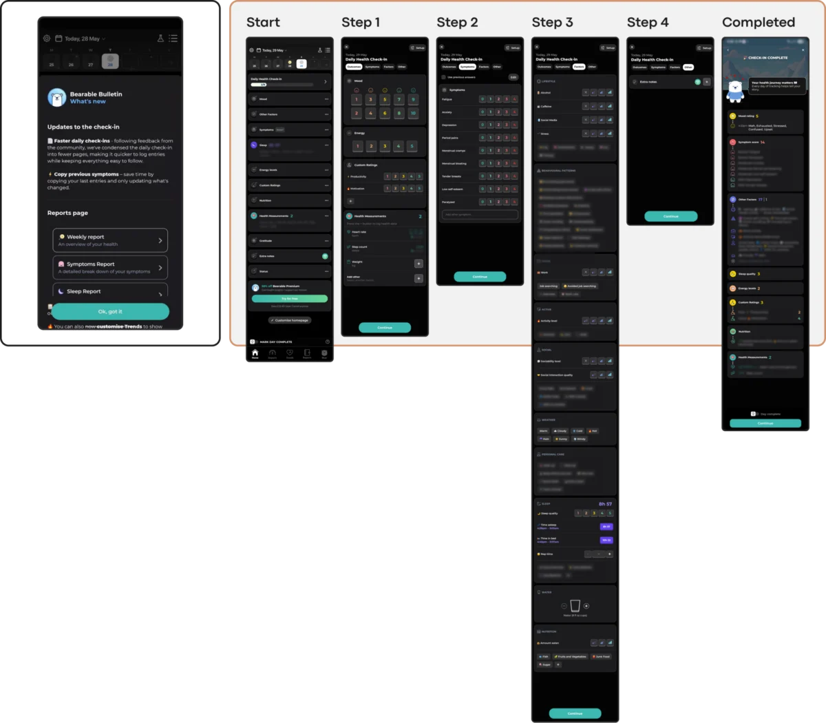
Industry leaders and therapeutic app developers are responding by shifting toward state-aware design. Rather than forcing all users down a single, rigid path, modern applications like Bear Room and Teeni are pioneering dual-pathway architectures:

- Low-Friction Voice Input: Allowing overwhelmed users to speak their thoughts rather than type or tap through complex menus.
- The "Hot Flow" to "Cold Flow" Transition: Providing immediate, unstructured venting spaces for acute emotional relief before gently transitioning users into reflective, structured therapeutic resources.
- Forgiving Retention Mechanics: Designing three-day rolling streaks that do not punish missed days, reframing the app’s presence as a supportive refuge rather than a demanding taskmaster.
Implications for the Future of mHealth Design
The implications of these findings extend far beyond individual app reviews. They represent a philosophical shift for the entire digital product design community.

Designing for mental health requires stepping away from the ego-driven pursuit of Dribbble-ready aesthetic perfection and embracing a radically contextual evaluation framework. Before deploying any new visual or interaction pattern, product teams must ask five foundational questions:

- Does this pattern lower the cognitive cost of using the app when the user can least afford it?
- Does the visual and emotional tone align with a low-capacity user state, offering solace rather than saturation?
- Does the information architecture maintain stability and predictability to support routine use?
- Does the design actively comply with accessibility standards (WCAG 2.2), ensuring no user is silently excluded?
- Are our engagement mechanics designed to support healing, or do they rely on coercion, guilt, and artificial urgency?
Ultimately, sustainable retention in mental health technology is not earned by capturing attention through noise, novelty, and manipulation. It is earned by becoming a consistently respectful, reliable, and quiet helper that users can trust during their moments of deepest vulnerability. In this space, the ultimate triumph of design is not that the interface is noticed—but that the support is deeply felt.
 Iffa Jayyana
 Azzam Bilal Chamdy
 Nila Kartika Wati
