
 By Nana Wu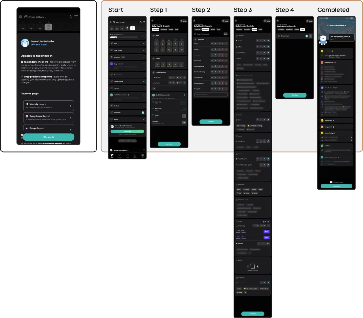
By Kat Homan
In the modern digital landscape, user interface (UI) design trends move at a breakneck speed. Designers are constantly incentivized to adopt the latest visual aesthetics—ranging from neo-brutalism and glassmorphism to hyper-gamified engagement loops—to capture attention and signal cutting-edge innovation.

However, when these trends are blindly transplanted into the realm of mental health and mobile health (mHealth) applications, they collide disastrously with human vulnerability. According to extensive clinical and digital health data, mental health apps face a severe, ongoing retention crisis: roughly 95% of users who open an app on day one abandon it by day 30, with a median retention rate of a dismal 3.3%. Even industry giants lose approximately 50% of their user base within the first ten days.

This massive drop-off highlights a vital truth: in digital therapeutics and emotional wellbeing tools, interface design is not merely aesthetic—it is a critical clinical tool. When design choices prioritize novelty over the psychological state of an already distressed user, they add cognitive strain, erode trust, and actively drive users away.

Main Facts: The Crisis of Engagement in mHealth
The core conflict in mental health UX design lies in a fundamental divergence of purpose. Standard UI trends are optimized to capture attention, maximize screen time, and signal corporate innovation. In stark contrast, mental health applications must be engineered to offer refuge, reduce cognitive load, and build deep trust.

When apps ignore this distinction, they fail users during moments of acute need. People do not open mental health applications out of idle curiosity; they turn to them when they are stressed, anxious, depressed, exhausted, or experiencing a panic attack. In these high-strain states, an unconventional icon, a hidden navigation menu, an aggressive notification, or a flashy, un-skippable animation ceases to be a delightful surprise. Instead, it becomes an overwhelming cognitive hurdle—and a direct catalyst for disengagement.

To combat this, designers must evaluate every visual choice against a single, uncompromising metric: Does this design lower the cost of using the app when the user can least afford to spend mental energy?

Chronology and Industry Evolution: From Utility to Over-Engineering
The Early Days of Digital Wellbeing
When mobile mental health applications first emerged, they largely mirrored traditional clinical tools—offering static psychoeducation, simple PDF worksheets, and basic mood-tracking logs. While clinically sound, these early iterations often lacked engagement mechanisms, leading to low initial adoption.

The Wave of Consumerization and Gamification
As wellness apps matured into commercial products, developers began borrowing aggressive growth and retention tactics from consumer gaming, social media, and fintech apps. Streaks, push notifications, milestone badges, and immersive color palettes became standard.

The Modern Reckoning (Present Day)
Over the last several years, clinical researchers and UX practitioners have begun measuring the fallout of this consumerization. Studies published in journals such as the Journal of Medical Internet Research (JMIR) have documented the catastrophic 30-day drop-off rates. This has sparked a counter-movement: a push toward evidence-based, low-friction, and empathetic design frameworks that prioritize cognitive accessibility over trend-chasing visual noise.

Supporting Data: The Metrics of User Abandonment
The argument against trend-driven mental health UI is firmly backed by quantitative research and public health statistics:

- The 30-Day Drop-Off: Research indicates that up to 95% of first-day users abandon mental health apps by the 30th day, highlighting that initial downloads do not translate into sustained therapeutic habits.
- The Global Mental Health Burden: According to the World Health Organization (WHO), over one billion people globally live with a mental health condition, with depression rates alone rising by 25% over the past decade.
- The Cost of Cognitive Overload: Clinical studies show that individuals dealing with acute anxiety or depression experience lowered executive functioning. Complex, cluttered home screens or abstract, unlabeled navigation icons require micro-decisions that can feel insurmountable to a burned-out user.
- The Need for Subtlety: Research into color psychology within mHealth apps demonstrates that distressed users strongly prefer dark palettes, muted earth tones, and clean, uncluttered aesthetics. Excessively bright, cheerful color schemes frequently trigger an emotional mismatch, feeling dismissive or physically jarring to someone in pain.
Official Responses and Clinical Perspectives
Public health organizations and digital ethics watchdogs are increasingly turning their attention toward the structural mechanics of mobile health tools. While regulatory bodies like the FDA and global health authorities heavily scrutinize the clinical validity of automated mental health algorithms and AI chatbots, the user interface layer has historically been left to commercial discretion.

However, clinical psychologists and UX researchers are sounding the alarm on "The Coercion Paradox." Features like daily streaks and aggressive retention loops—which work well in fitness or language-learning apps—can become toxic in psychological recovery contexts. For a user battling depression, a broken streak is frequently internalized not as a missed feature interaction, but as a personal moral failure, deepening feelings of guilt and isolation.

Progressive mental health apps are responding by replacing punitive streak counters with forgiving, low-pressure architectures. For instance, apps like Bear Room utilize three-day rolling cycles that do not reset upon a missed day, prioritizing emotional safety over compulsive daily usage.

Implications: A Practical Evaluation Framework for Designers
To bridge the gap between aesthetic innovation and genuine therapeutic utility, designers must look past Dribbble-style trends and evaluate their interfaces across five core friction points:

1. Cognitive Friction
- The Risk: Neo-brutalist contrasts, hidden menus, and abstract icons force users to decode the interface.
- The Fix: Provide linear, predictable flows with unmistakable, single-action entry points for acute needs (e.g., a prominent "Quick Relief" or panic-support button).
2. Emotional Mismatch
- The Risk: Overly cheerful animations, bright saturated colors, or sudden pop-up celebration screens clash with a user’s low mood.
- The Fix: Align the visual tone with the user’s emotional reality. Utilize muted palettes, calming dark modes, and soft biomorphic shapes that foster a sense of digital refuge.
3. The Inconsistency Penalty
- The Risk: Novel navigation patterns and experimental gesture-driven UIs force users to relearn the app during every session.
- The Fix: Maintain a stable information architecture (Learn, Track, Manage, Support) so that returning users can navigate automatically on autopilot when under stress.
4. Silent Accessibility Exclusion
- The Risk: Low-contrast minimalist typography and gesture-only controls lock out users with visual, motor, or cognitive impairments.
- The Fix: Strictly adhere to WCAG 2.2 guidelines, ensuring minimum contrast ratios (4.5:1 for body text) and reliable button fallbacks for all gestures.
5. The Coercion Paradox
- The Risk: Punitive streaks and urgency-driven push notifications turn wellbeing support into an exhausting performance chore.
- The Fix: Design for compassionate return rather than addictive engagement. Celebrate micro-steps and remove guilt-inducing metrics.
Conclusion
Trends can win design awards, generate tech-press buzz, and satisfy a portfolio’s desire for visual novelty. But in the fragile ecosystem of mental health technology, the ultimate metric of success is not how long an interface keeps a user staring at a screen.

The true measure of a successful mental health app is whether it functions as a quiet helper—a respectful, low-friction digital sanctuary that users trust enough to return to in their moments of deepest need. When designing for the human mind under stress, the goal is never to make the interface stand out; it is to make the healing support genuinely felt.
 Nana
Nana  Lina Irawan
  Asep Darmawan