
 By rifanmuazin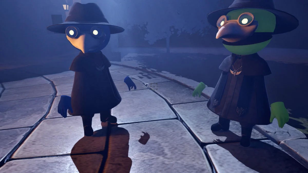
In the fast-paced world of digital marketing and independent game development, the difference between a successful branding campaign and an internet laughingstock often comes down to a few pixels of kerning. This week, the independent Japanese studio Engawa Games learned this lesson the hard way. Their upcoming cooperative horror title, In Us, has vaulted into the spotlight—not for its innovative gameplay or atmospheric terror, but for a typographic blunder so egregious it has become a case study in accidental graphic design failure.
The incident serves as a stark reminder that even with the most sophisticated creative tools, the human eye is subject to profound cognitive blind spots. As the game’s key art circulates across social media platforms like X (formerly Twitter) and Reddit, it has sparked a wider conversation about the necessity of fresh eyes in the design process and the psychological phenomena that allow such obvious errors to slip through the cracks.
The Anatomy of an Unfortunate Oversight
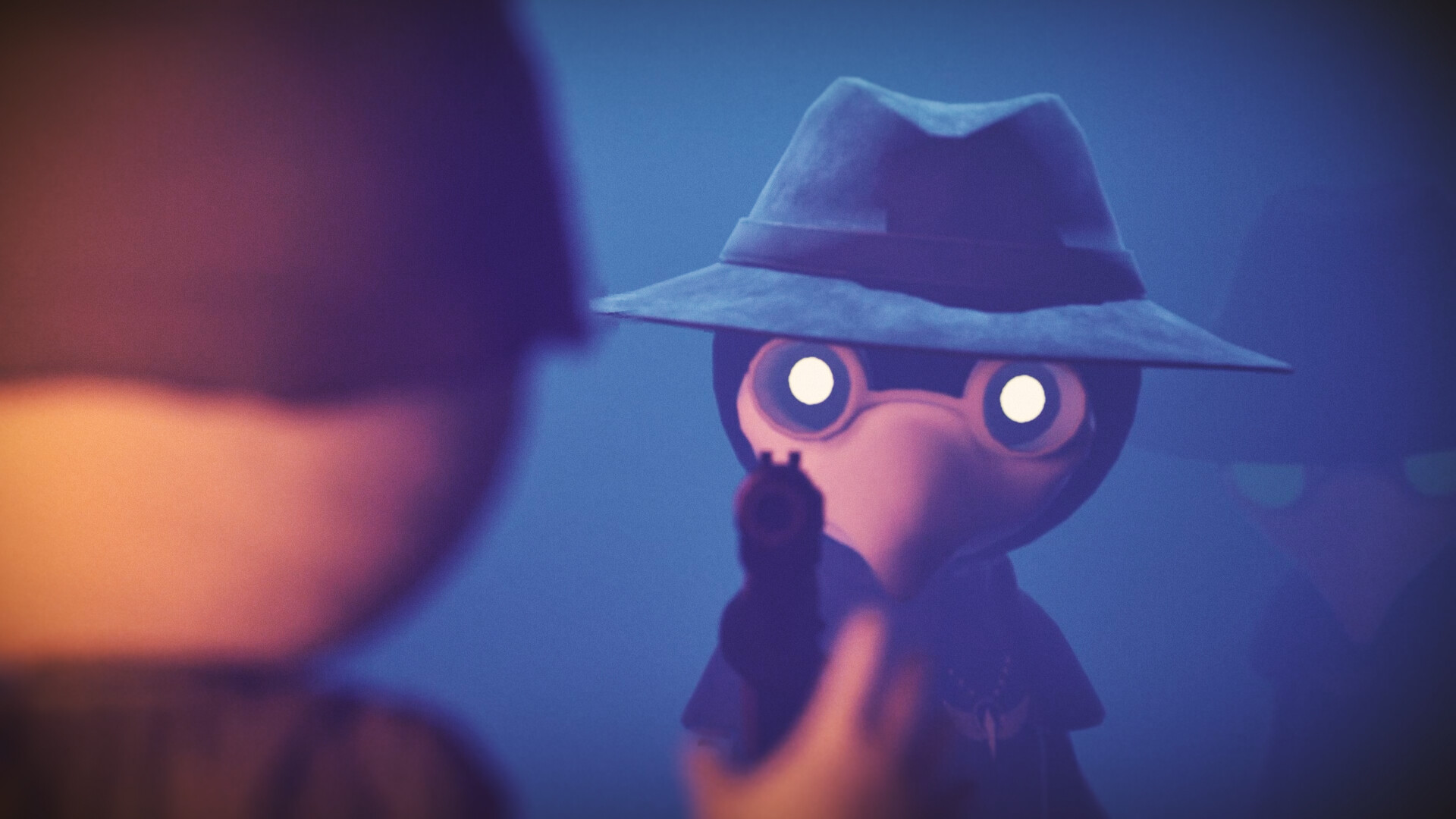
In Us is a multiplayer survival horror game that promises a compelling mix of social deduction and atmospheric tension. Developed by Engawa Games—the team behind the chaotic hit Parking Together!—the game places players in the shoes of bird-masked exorcists tasked with identifying and purging demons disguised as villagers. The core concept is strong, and the initial marketing materials, featuring moody stained-glass aesthetics and gothic, ritualistic imagery, were clearly intended to signal a high-quality, immersive experience.
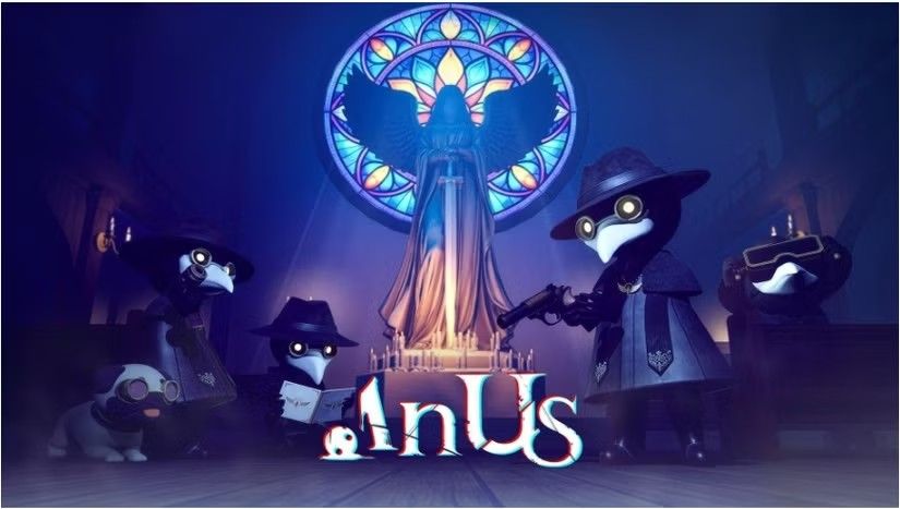
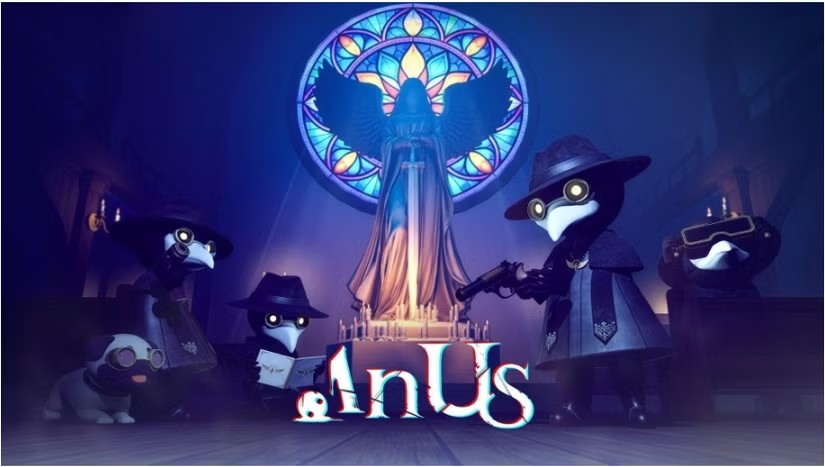
However, the visual identity of the game hit a catastrophic snag in its title treatment. The logo, which features a tightly kerned, stylized font, presents the words "In Us" in a way that, to the average observer, is almost impossible to read as intended. Due to the proximity of the characters and the specific shaping of the letterforms, the title is being widely misread as "Anus."
Once the association is made, it is, in the parlance of the internet, "impossible to unsee." The viral spread of the image was instantaneous. What was meant to be a terrifying, professional logo for a horror game has instead become a source of juvenile, albeit relentless, amusement for thousands of social media users.
A Chronology of the "Anus" Incident
The timeline of this design disaster highlights the speed at which modern digital branding can collapse.
- Pre-Launch Phase: Engawa Games finalized their promotional assets, likely spending weeks iterating on the logo, colors, and overall composition. During this period, the design was viewed by the internal team, potentially including stakeholders, artists, and marketing leads.
- The Reveal: The studio uploaded the game’s store page to Steam, intending to build anticipation for the upcoming release. The key art, which prominently features the problematic logo, served as the primary visual hook for potential players.
- The Initial Spark: Within hours of the store page going live, users on platforms like Reddit and X began to point out the unfortunate linguistic collision. Initial skepticism was high, with many users questioning if the image was a "deepfake" or an AI-generated prank.
- The Viral Peak: As confirmation spread that the image was indeed authentic and currently live on the official Steam store, the story was picked up by gaming news outlets, including DualShockers. The narrative shifted from "Is this real?" to a mockery of the design team’s lack of oversight.
- The Aftermath: At the time of this writing, the image remains on the Steam listing, a permanent digital artifact of an oversight that will likely follow the game’s marketing campaign for the remainder of its lifecycle.
The Science of Seeing: Why Do We Miss the Obvious?
To understand how a team of talented developers could miss such an obvious visual pun, we must look to cognitive psychology. The phenomenon at play is remarkably similar to the famous "Invisible Gorilla" experiment conducted by Christopher Chabris and Daniel Simons.
In that study, researchers asked participants to watch a video of people passing a basketball and count the number of passes made by the team in white. While the participants were laser-focused on the task of counting, they almost entirely failed to notice a person in a gorilla suit walking through the middle of the frame.
This is known as "inattentional blindness." When the brain is deeply focused on a specific, complex task—such as balancing the kerning, color temperature, and emotional weight of a game logo—it stops processing the "big picture" information. The designers of In Us were likely so preoccupied with the aesthetic harmony of the title that their brains stopped reading the letters as a word and began viewing them as geometric shapes.
This is a common affliction for creative professionals. When you spend ten hours a day staring at a single graphic, the design becomes an abstraction. You stop seeing the word "In Us" and start seeing a collection of vertical lines and curves. It is the same reason why authors are notoriously poor at proofreading their own books; their brains "fill in" the words they intended to write rather than the words actually on the page.
Supporting Data: The Cost of Kerning
While In Us is a particularly funny example, it is far from unique. Typographic errors have cost companies millions in branding reboots and public relations damage.
In the world of print journalism, for instance, there is a legendary, if often tragic, history of cover typos. Before the advent of modern digital proofing, magazines would occasionally go to print with glaring errors that were only spotted after thousands of copies had hit newsstands. These errors often occur during the "final polish" stage, where the designer is tweaking a layout that has already been approved by multiple layers of management.
Research into eye-tracking software in advertising has shown that consumers spend less than 1.5 seconds looking at a piece of media before deciding whether to engage with it. In that split second, the brain does not "read" the logo; it absorbs the entire image at once. If the visual cues lean toward an unintended meaning, the consumer will register that meaning instantly, often before the conscious mind has a chance to interpret the text correctly.
The Industry Perspective: A Crisis of Quality Assurance
The broader industry reaction to the In Us logo has been one of sympathetic cringing. While the mockery is loud, many professional designers recognize the scenario all too well. It highlights a potential failure in the "review pipeline."
Typically, a branding project should pass through several sets of eyes:
- The Creator: Too close to the work to see errors.
- The Team Lead: Often shares the same tunnel vision as the creator.
- The Outsider: A person completely unaffiliated with the project who sees it for the first time.
The "Outsider" is the most important role in the creative process. In the case of In Us, it appears this step was either skipped or the feedback was ignored. Many studios, under pressure to meet tight deadlines, often rush the final approval phase, assuming that because the design is "artistically sound," it is "communicatively sound." As this incident proves, those two things are not the same.
Implications for Future Branding
What are the lasting implications for Engawa Games? In the short term, they have gained significant notoriety. While some might argue that "all press is good press," the risk here is that the brand is now associated with a joke rather than the quality of the game itself.
However, there is a silver lining. This incident has forced a conversation about the fragility of visual communication. For other developers and marketing teams, the In Us debacle serves as a cautionary tale:
- The "Thumbnail" Test: Always view your design at the smallest possible size. If it looks wrong as a tiny icon on a smartphone screen, it will be misinterpreted.
- The "Cold Eyes" Policy: Never launch a creative asset without showing it to someone who has never seen it before. If they don’t immediately tell you what it is, ask them what they think it says.
- The Linguistic Check: In a global market, be aware of how letter shapes interact. A simple font change or a shift in letter spacing can completely alter the message.
Conclusion: The Grace of God
The mockery directed at Engawa Games is, in many ways, a ritual of the internet. It is a way for users to bond over a shared, ridiculous discovery. But as the article’s author rightly notes, it is a "there but for the grace of God go I" situation.
Every designer, writer, and developer has likely had a moment where they narrowly avoided a similar catastrophe. We have all sent that email with the typo in the subject line, or published that report with the wrong chart. The In Us logo is simply the latest reminder that in the creative world, the smallest detail is often the most dangerous.
For now, the game remains on Steam, the logo remains unchanged, and the internet continues to laugh. But perhaps, in the future, the team at Engawa Games—and indeed, studios everywhere—will take that extra half-second to look at their work with fresh eyes, ensuring that their next big reveal is remembered for its brilliance, not its anatomy. And, as always, keep an eye out for the gorilla. You never know when it might walk right through your design.
 Pevita Pearce
  Neng Nana
  Suro Senen