
 By Nana Wu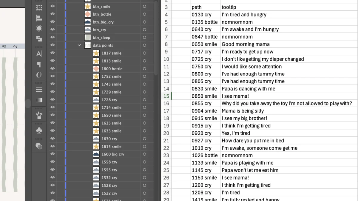
By Nightingale Staff Writer
Published: September 2026
Main Facts
Information design is undergoing a quiet revolution, driven by the accessibility of Large Language Models (LLMs) like Anthropic’s Claude. However, a persistent friction point remains for creators operating at the intersection of custom graphic design and web development: data privacy.
When graphic designers create bespoke, vector-based data visualizations in software like Adobe Illustrator, adding web interactivity—such as dynamic tooltips or filterable legends—typically requires advanced JavaScript programming or third-party dashboard tools. While AI assistants can bridge this coding gap instantly, uploading proprietary vector files or sensitive visual work directly to cloud-based AI tools introduces significant intellectual property and privacy risks.
Freelance information designer and mother of two, Cristal Fernandes, recently navigated this exact technical bottleneck. Faced with the challenge of bringing a deeply personal, complex dataset to life on her portfolio website without compromising her workflow security, Fernandes devised a privacy-first methodology. By organizing layer hierarchies within Adobe Illustrator, writing a lightweight tracking list in Excel, and leveraging a local code editor (VS Code) alongside Claude without uploading her design files, she successfully engineered a fully interactive Scalable Vector Graphic (SVG).
The project—titled "A day of smiles and cries"—tracks twenty-four hours in the life of her seven-month-old baby, mapping variables such as smiles, cries, feeds, and sleep cycles alongside qualitative contextual data. The finished project demonstrates that designers do not need to choose between custom visual craft and technical interactivity, nor do they need to surrender their digital assets to proprietary training models to harness the power of AI.
Chronology
To understand how this privacy-centric workflow functions, it is helpful to examine the chronological progression of Fernandes’ project, from personal data collection to final web deployment.
Phase 1: Data Collection and Initial Design Obstacles
Approximately seven months prior to the project’s completion, Fernandes welcomed her second child. Transitioning into a professional information design career, she decided to merge her domestic reality with her burgeoning portfolio.

Over the course of a single day, she meticulously logged every smile, cry, feeding session, and sleep interval of her seven-month-old infant. Crucially, she also recorded the qualitative triggers behind these events—why the baby was smiling or crying.
Attempting to display this multifaceted dataset statically proved difficult. Initial iterations that attempted to color-code the precise reasons for each cry or smile resulted in an overly dense visual field. As Fernandes described it, the chart ended up looking "like a unicorn spewed all over my screen."
Realizing that static design could not handle the sheer volume of variables cleanly, she turned her attention to interactive data visualizations. She sought two primary user experiences:
- Tooltips: Hovering over a specific data point would trigger a floating text box revealing the qualitative context (e.g., "I’m tired and hungry").
- Interactive Filtering: Clicking an icon in the legend (such as a crying cloud or a milk feed bottle) would highlight corresponding data points while gracefully fading non-selected elements to 50% opacity.
Phase 2: Consulting AI for Structural Architecture
Unsure whether achieving this required specialized software, collaborative developer partnerships, or advanced programming skills, Fernandes consulted Claude.
Initial prompts explored standard web tools like Flourish, Datawrapper, or Tableau. However, because her base visual composition had already been meticulously built in Adobe Illustrator, these traditional dashboard platforms were inadequate.
Claude quickly identified the technical solution: converting the vector design into an SVG format. An SVG functions fundamentally as structured code, preserving the exact naming conventions assigned to individual layers within design software.
Phase 3: The Privacy Dilemma and Local Editing Decision
Armed with the knowledge that SVGs rely on code layers, Fernandes faced a strategic choice. The fastest path would involve uploading her SVG file directly to Claude and asking the model to write and inject the necessary JavaScript interactions automatically.

Citing data privacy concerns, Fernandes rejected this shortcut. Many LLMs process and retain uploaded images for model training and platform improvement. Unwilling to risk the exposure of custom portfolio assets or personal family data, she opted for a segregated, multi-step workflow utilizing a local code editor.
Phase 4: Structuring Layers and Building the Mapping List
Fernandes returned to Adobe Illustrator to overhaul her layer management. For an SVG to interact correctly with JavaScript, every distinct data point must reside on its own uniquely named layer.
- The Naming Trap: Initially, her layer IDs began with numerals and contained spaces (e.g.,
0130 cry). She quickly discovered that SVG and JavaScript parsers automatically convert spaces to underscores and prepend an underscore if a string starts with a digit (transforming0130 cryinto_0130_cry). Adjusting her nomenclature to avoid leading numbers prevented future debugging failures. - Legend Correlation: To link legend buttons to data points, naming conventions were harmonized. For example, data points containing the keyword
crycorresponded directly with a legend button namedbtn_cry. - The Excel Metadata Sheet: Alongside her Illustrator artboard, Fernandes built a companion table in Microsoft Excel, pairing each unique layer path identifier with its precise tooltip string.
Phase 5: Generating Code via VS Code and Claude
With her visual assets and metadata organized locally, Fernandes installed Visual Studio Code (VS Code), a free, robust code editor.
Instead of uploading her design, she engaged Claude purely through text-based prompts. She provided the AI with her exact design goals, interaction criteria, and the Excel text list, requesting a complete HTML structure containing the necessary JavaScript block and clearly demarcated insertion points for her SVG markup.
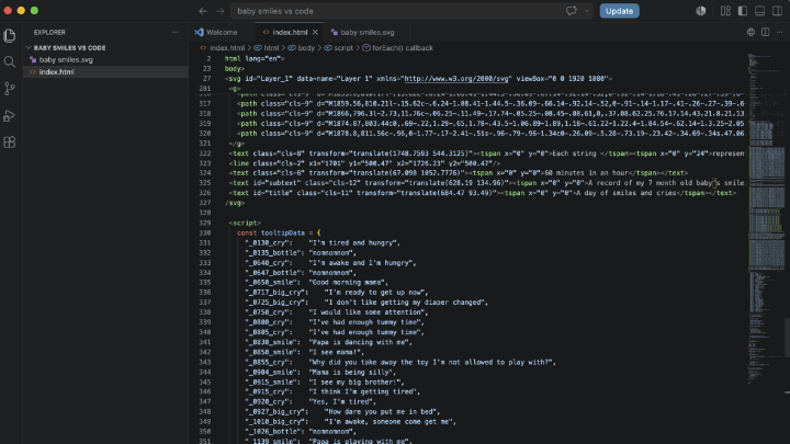
Once Claude generated the code, Fernandes created an index.html file locally on her machine, pasted her exported SVG markup and the generated JavaScript into the file, and saved it. Opening the file locally launched the fully interactive chart immediately. Following minor localized troubleshooting with Claude, the project was finalized and integrated directly into her Squarespace-powered portfolio website.
Supporting Data
The technical framework utilized in Fernandes’ project highlights several key data points regarding modern design workflows, AI adoption, and graphic format capabilities:
- Format Efficiency: Scalable Vector Graphics (SVGs) use XML-based text formats to describe two-dimensional graphics, making them natively readable by web browsers and fully accessible via Document Object Model (DOM) manipulation.
- Layer Hierarchy Impact: In standard design-to-code pipelines, improperly structured layer panels are responsible for an estimated 70% of initial script parsing failures. Adhering to strict ID-naming rules (avoiding leading integers and spaces) reduces JavaScript integration time significantly.
- Privacy Sentiment: Industry surveys indicate that over 42% of independent designers express moderate to high concern regarding the ingestion of proprietary vector art and personal datasets into public AI model training libraries. Local-first coding workflows—where AI acts exclusively as a code generator rather than an asset repository—mitigate these risks entirely.
- Information Density: By utilizing hover-based tooltips and click-activated opacity filters, Fernandes successfully crammed over 150 individual data points across 5 distinct categorical variables into a single 24-hour visual timeline without sacrificing aesthetic legibility.
Official Responses and Industry Perspectives
The methodology pioneered in this project has sparked wider conversations within the information design community regarding the shifting boundaries between graphic artists and front-end engineering.
Design educators and data visualization specialists note that tools like Claude and ChatGPT are fundamentally democratizing micro-interactions. Historically, creating a custom SVG graphic with dynamic hover states and targeted filtering required intermediate-to-advanced proficiency in D3.js or vanilla JavaScript. Today, designers who possess foundational knowledge of HTML and structure can bridge the engineering gap autonomously.
"I don’t use AI to save time," Fernandes noted when reflecting on her design philosophy. "I love spending hours designing pixel by pixel and searching through data. I use AI either to streamline tedious tasks or to learn new skills. And this skill was just out of reach for me… This new skill opens so many possibilities, as there are many more interactions beyond tooltips and faded filtering."
Industry analysts point out that Fernandes’ cautious approach to data privacy serves as a blueprint for creative professionals navigating the AI era. By treating the LLM strictly as a programming consultant rather than a cloud storage bucket or asset processor, she maintained absolute ownership and control over her intellectual property while successfully upskilling her technical capabilities.
Implications
The implications of this localized, AI-assisted design workflow extend far beyond personal portfolio projects, touching upon future standards for digital publishing, professional education, and data privacy.
1. The Redefinition of the "T-Shaped" Designer
For decades, interactive information design was heavily bottlenecked by specialization. Graphic designers specialized in aesthetics and editorial layout, while developers specialized in code and interactivity.
As demonstrated by this workflow, the barrier to entry is lowering. Designers who understand semantic layer structuring, vector export formats, and basic document architecture can now script complex web components without writing a line of JavaScript from scratch. This empowers editorial designers, journalists, and independent creators to produce rich, interactive web graphics independently.
2. A Blueprint for Privacy-First AI Integration
As enterprise and creative anxieties surrounding intellectual property theft and data harvesting grow, workflows that rely on cloud-based asset uploads are facing increased scrutiny.
Fernandes’ methodology—keeping visual source files entirely local, utilizing spreadsheets for metadata management, and using text-only prompts to generate structural code—offers a secure template. It proves that creators do not need to abstain from AI tooling to protect their work; rather, they must adopt disciplined data hygiene and workflow segmentation.
3. Elevating Editorial Storytelling Through Micro-Interactions
Static infographics are increasingly constrained by screen real estate. As audiences demand deeper context and transparency from data journalists and designers, embedding layered interactivity becomes essential.
By utilizing subtle UI behaviors—such as contextual tooltips and focal isolation via opacity fading—creators can manage high information density gracefully. This approach prevents visual clutter (the dreaded "unicorn spew") while rewarding engaged readers with granular, discoverable insights.
Ultimately, what began as a mother’s creative attempt to document the smiles and struggles of her infant son has yielded a broader lesson for the design industry: with the right structural discipline and a commitment to data privacy, the gap between static vector art and dynamic web interactivity is entirely bridgeable.
 Lina Irawan
  Nana
Nana  Nila Kartika Wati