
 By Raul Delapena Setiawan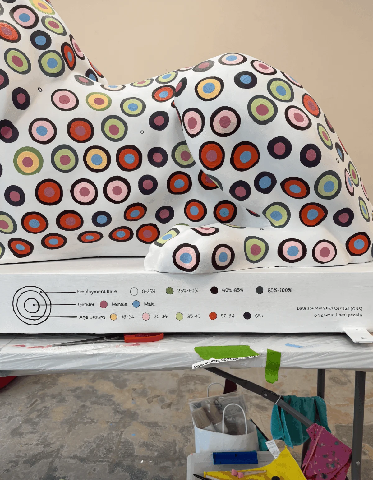
Main Facts
As part of the sweeping "Portsmouth 100" celebrations, the southern English coastal city launched the public art trail known as "Pride of Portsmouth" on July 13, 2026. The exhibition features 45 monumental, fiberglass-molded lion sculptures positioned across the urban landscape. Measuring roughly 100 cm in height, 175 cm in length, and 60 cm in width, each piece serves as a unique canvas designed by a carefully shortlisted artist sponsored by local businesses and organizations.
Among these striking installations is a unique fusion of statistics and fine art crafted by data artist and researcher Or Misgav. Sponsored by the commercial campus Lakeside North Harbour, Misgav’s contribution breaks away from conventional artistic mediums. Instead of paint-by-intuition, the artist transformed raw demographic data from the Office for National Statistics (ONS) 2021 census into a complex, hand-painted data visualization mapped directly onto a 1,500-circle grid draped over the lion’s physical contours.
Strip away the numbers, and the sculpture functions as an unlabelled, pure visual language. The left flank of the lion encapsulates health status, religion, and age groups, while the right side visualizes employment rates categorized by age and gender. Through this ambitious project, Misgav has redefined data art, translating digital design tools into a physical, deeply human enterprise.
Chronology: From Digital Scroll to Physical Reality
The Spark of Inspiration
The journey began during a routine evening of idle phone scrolling when Misgav encountered an advertisement for the "Pride of Portsmouth" trail. The mind quickly shifted from passive consumption to data mode. For a data advocate, the trail presented an irresistible question: Could a three-dimensional fiberglass lion serve as an effective canvas for data art? Could this initiative become a data visualization "love letter" to Portsmouth?

Sifting Through the ONS Datasets
Every compelling narrative demands a solid foundation. Misgav spent countless hours combing through ONS datasets, ultimately settling on the pre-made tables from the 2021 census—the most comprehensive demographic snapshot available. Confronted with rich variables spanning ethnicity, family history, religion, health, and employment, the challenge was narrowing down the narrative without reducing a complex urban population to a single, flat storyline.
The Design Phase and Corporate Collaboration
Working inside digital design software like Figma, Misgav began mapping variables. Just as the color palette was being finalized, project sponsor Lakeside North Harbour requested that their primary brand color be integrated to anchor the lion’s visual identity. Misgav seized the opportunity for a poetic alignment: dedicating the sponsor’s signature hue to signify "Good Health Status," mirroring the data-backed reality that the vast majority of Portsmouth residents thrive in robust health.

The Projection Impasse
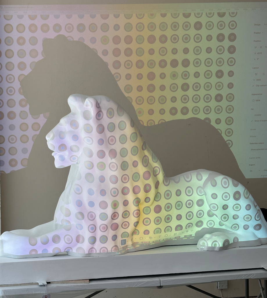
Translating a two-dimensional grid onto a three-dimensional object proved to be the project’s most harrowing hurdle. Initial attempts to use a digital projector to cast the design grid onto the sculpture failed. The projector’s vertical angle distorted margins and row spacing, while the projected pattern appeared completely flat, ignoring the lion’s muscular, organic contours. Countless dots marked with a washable pen resulted in a cluttered, muddy visual mess, forcing a total rethink.
The Transit Breakthrough
A moment of clarity struck during a rush-hour ride on a double-decker bus. Observing the organic yet structured spacing of cars in traffic, Misgav realized the design needed a "brick-wall" honeycomb pattern rather than a rigid digital layout. With the help of flexible paper and a ruler acting as a template that hugged the lion’s curves, Misgav and her husband manually plotted the centers for all 1,500 individual circles.

The Exhausting Execution
Over four brutal weeks of relentless daily work—balancing a demanding PhD workload, family commitments, and scheduling sacrifices—every single spot was hand-painted. Because Misgav adhered strictly to Alberto Cairo’s pillars of truthful data visualization, every drop of paint had to be calculated. Working in a communal studio filled with chatty artists, Misgav was forced to count every circle out loud to ensure zero data points were misplaced. Finally, after weeks of sleep-deprived anxiety, stained fingers, and intricate color layering, the lion was complete.
Supporting Data: What the Lion Tells Us About Portsmouth
The visual narrative emblazoned across the fiberglass lion is not merely decorative; it is grounded in rigorous empirical evidence drawn directly from the Office for National Statistics.

- Employment Landscape: The right side of the sculpture maps employment rates by age and gender. The visualization highlights an encouraging reality: the vast majority of Portsmouth residents maintain high employment rates, reflecting a resilient local economy.
- Religious Demographics: The left side encodes religion alongside age and health. The data reveals a striking demographic pattern for the city. The vast majority of Portsmouth residents record "no religion," followed by Christianity as the largest organized religious group, and Islam as the second largest. Other religious categories fell below the standardized factor threshold, combining for fewer than 15 spots total.
- Health Status: Embodying the Lakeside North Harbour brand color, the "Good Health Status" nodes visually dominate the sculpture, celebrating the statistical majority of residents experiencing positive health outcomes.
- The Grid Scale: The completed artwork relies on a meticulous layout of precisely 1,500 distinct circles, arranged in an optimized honeycomb matrix designed to honor the sculpture’s physical curves rather than forcing a sterile, flat digital frame onto a 3D body.
Official Responses and Stakeholder Perspectives
The integration of corporate sponsorship with academic data art created a unique synergy for the "Pride of Portsmouth" initiative.
Lakeside North Harbour, the commercial campus acting as Misgav’s corporate sponsor, embraced the unorthodox concept from its inception. By weaving their brand color into the data representation of "Good Health Status," the partnership moved beyond simple logo placement, embedding corporate identity directly into the demographic fabric of the city.

The project management team behind "Pride of Portsmouth" provided crucial logistical and moral support as artists navigated the physical demands of public art production. For Misgav, the project evolved far beyond an individual artistic endeavor into a collective triumph. Assistance poured in from family members, supportive children, and fellow studio artists who helped cushion the intense physical and mental toll of the four-week production window.
Implications: The Intersection of Data and Public Art
Or Misgav’s lion leaves a lasting mark on both the Portsmouth 100 celebrations and the broader philosophy of data visualization.

The Death of Digital Perfection
The project challenged Misgav’s reliance on the digital safety nets of design software. While tools like CTRL+Z and automated grid-snapping foster perfectionism on screen, translating data into the physical world requires embracing the messy, tactile reality of manual labor. Changing a hue on a screen takes a single click; in the physical studio, it demanded multiple coats of thick paint over hardened fiberglass.
Shifting Cognitive Loads in Public Spaces
By stripping away numerical labels and leaving pure, unadorned visual geometry, the sculpture functions as an interactive puzzle for the public. It invites casual passersby and art enthusiasts alike to play "data detective." While the cognitive load of decoding a complex demographic dataset from a painted statue is undeniably high, it democratizes information. It removes statistics from sterile government spreadsheets and embeds them in the public square.

A Blueprint for Future Intersections
Reflecting on the grueling four-week process, Misgav affirms that despite the exhaustion, sleep deprivation, and relentless circle-counting, the answer to whether to do it all over again is an unequivocal "Yes." The project proves that data visualization need not be confined to backlit screens or academic journals. When sculpted onto a roaring lion, data transforms from cold numbers into a vibrant, living love letter to the city of Portsmouth.
 Layla Zulfa
  Muslim
  Ali Ikhwan