
 By Laily UPN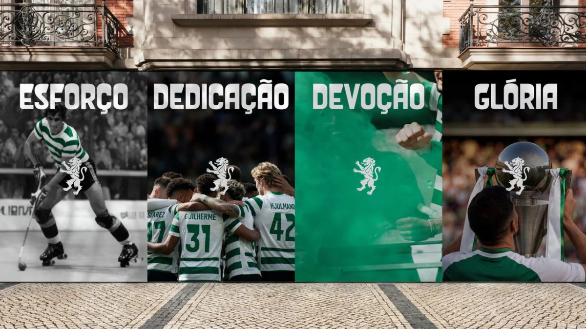
Lisbon, Portugal – Sporting Clube de Portugal (SCP), one of Europe’s most storied football institutions, has unveiled a meticulously crafted brand evolution, a strategic move designed to honor its illustrious 120-year legacy while forging a path towards future global relevance. This comprehensive rebrand, executed in collaboration with global branding agency JKR, is far more than a mere aesthetic update; it is a profound reimagining of the club’s core identity, deeply rooted in its "Code" and the unwavering spirit of its passionate fanbase. The new identity, characterized by its sleek design, distinctive symbolism, and powerful narrative, marks a significant milestone in SCP’s journey, ensuring its iconic heritage resonates with both loyal supporters and new generations worldwide.
The unveiling of this refreshed visual language comes as Sporting CP prepares to celebrate its momentous 120th anniversary, a testament to its enduring presence in Portuguese and international football. The club’s new crest, a masterclass in subtle meaning and artistic execution, seamlessly blends traditional elements with contemporary design principles. It stands as a vibrant expression of the club’s values, a dynamic emblem that is both instantly recognizable and imbued with layers of profound significance, promising to elevate the SCP brand beyond the confines of the pitch and into the broader cultural landscape.
The Main Facts: A New Era for Sporting Clube de Portugal
Sporting Clube de Portugal, founded in 1906, stands as a pillar of Portuguese sporting culture, celebrated for its rich history, numerous accolades, and a proud tradition of developing world-class talent. As the club approaches its 120th anniversary in 2026, it recognized the opportune moment to solidify its brand identity, ensuring it remains as robust and forward-thinking as its sporting ambitions. The newly introduced brand evolution is a proactive step to unify its diverse facets – from its professional football teams to its extensive youth academy and various other sports – under a cohesive, modern, yet deeply traditional banner.
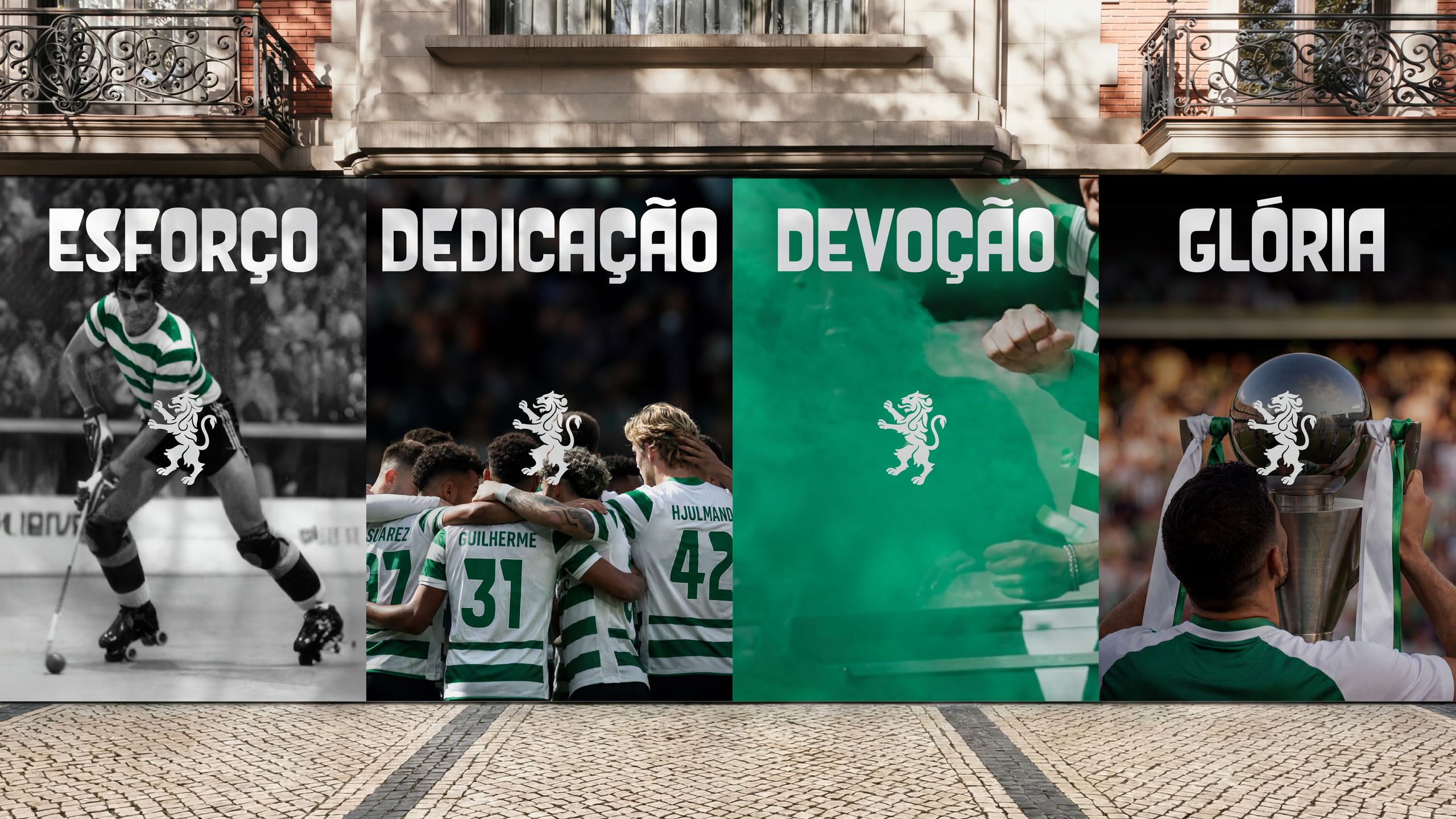
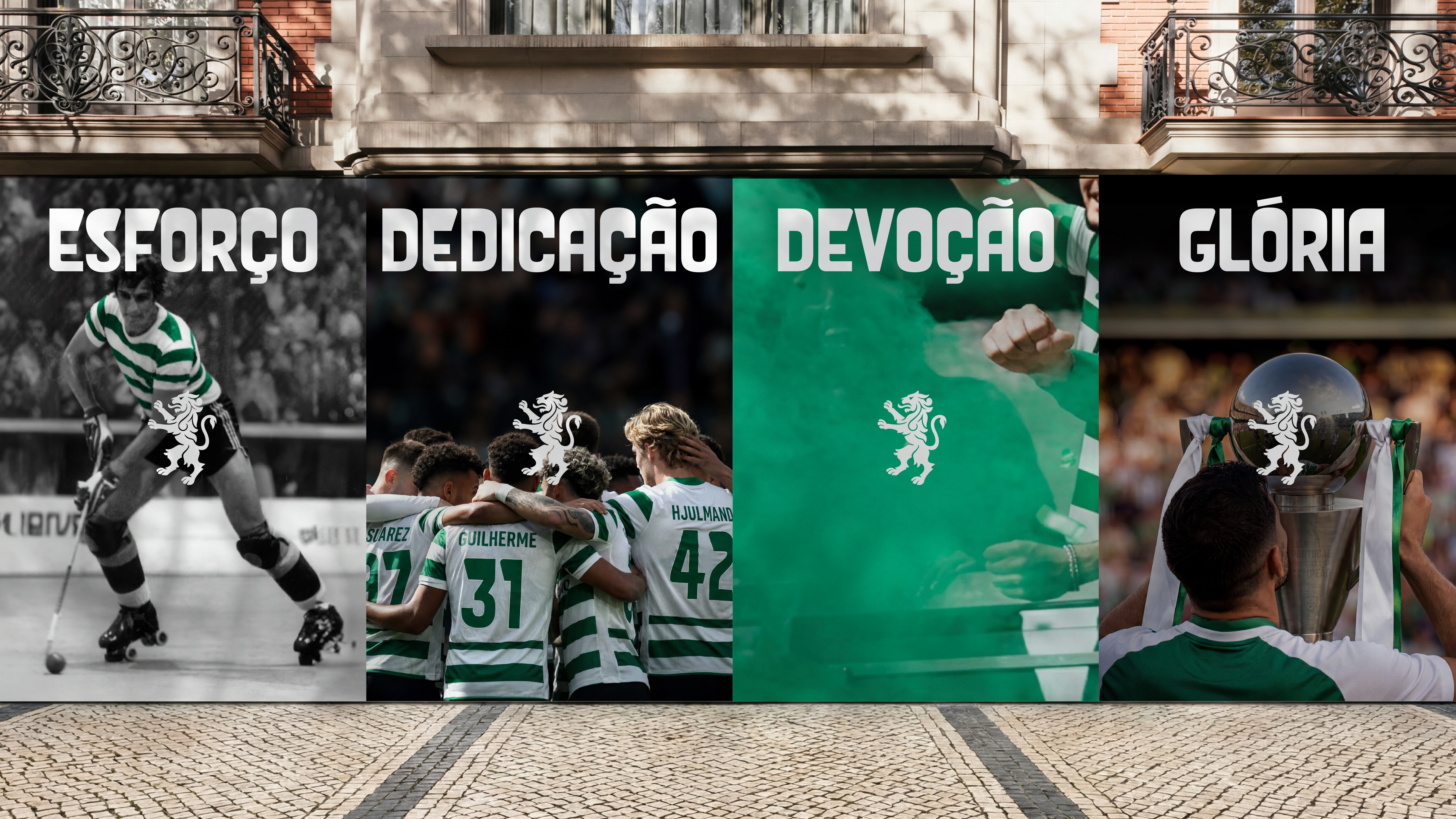
The core of this evolution lies in a refined crest and a comprehensive visual system developed by JKR. The agency’s mandate was clear: to create an identity that not only pays homage to SCP’s revered past but also possesses the versatility and dynamism required for a leading 21st-century sports brand. The result is an identity centered on five emblematic symbols – the Porta 10-A, the Stripes, the Shield, the Crown, and the Lion – each thoughtfully integrated into the new crest and extended across all brand touchpoints. This holistic approach ensures that every visual element communicates the club’s essence, fostering a stronger connection with its vast global community.
The redesign is characterized by a sophisticated interplay of clean lines, powerful symbolism, and a refreshed typographic system, featuring the bespoke "Sporting Sans" font. This careful balance ensures that the brand retains its distinctive character while embracing a modern aesthetic that is adaptable across digital platforms, merchandise, stadium branding, and media communications. The objective was not to erase history but to distill it, presenting SCP’s enduring spirit in a format that is both timeless and contemporary, ready to inspire for another 120 years.
A Legacy Unfurled: The Chronology of an Evolution
The journey towards Sporting CP’s brand evolution is a narrative woven with threads of deep heritage, strategic foresight, and collaborative innovation. Understanding the chronological progression of this significant undertaking provides insight into the meticulous planning and thoughtful execution that underpinned the project.
Roots and Evolution: Sporting CP’s Emblematic Journey
Sporting Clube de Portugal’s identity has evolved organically over its century-plus existence, mirroring societal shifts and the club’s own growth. Founded by José Alvalade and other visionaries, the club’s early emblems were simple yet potent, often featuring variations of the lion, a symbol of strength and nobility, along with the distinctive green and white stripes. The original article specifically references the "1945 emblem" as a significant source of inspiration for the current redesign, suggesting a period where the club’s visual language began to crystallize into a more recognizable form. This particular emblem likely represented a foundational moment, embodying principles and aesthetics that have since become synonymous with SCP. Over the decades, subsequent crests have refined these elements, each iteration adding a layer to the club’s visual narrative, always striving to balance tradition with contemporary appeal. The decision to reference and evolve from such a pivotal historical design underscores a commitment to continuity rather than a radical departure, respecting the visual memory of generations of fans.
The Mandate for Modernity: Partnering with JKR
Recognizing the approaching 120th anniversary as a pivotal moment, Sporting CP initiated a search for a branding partner capable of translating its profound history and ambitious future into a compelling visual identity. Global branding agency JKR, renowned for its expertise in crafting impactful and enduring brand systems, was ultimately selected for this monumental task. The club’s mandate to JKR was multifaceted: to respect and integrate SCP’s rich heritage, to capture the passionate spirit of its fans, to articulate the club’s unique "Code" – an unwritten constitution of values and principles – and to develop a brand system that would be agile, distinctive, and relevant across all modern media platforms. This was not a call for a complete overhaul but rather a sophisticated evolution, a refining of existing iconography to enhance clarity, impact, and global resonance. JKR’s challenge was to synthesize SCP’s complex identity into a cohesive and powerful visual language that could transcend geographical and cultural boundaries.
From Concept to Crest: The Design Process
The collaboration between Sporting CP and JKR was characterized by a deep dive into the club’s archives, its cultural significance, and its aspirations. The design process was iterative and collaborative, moving from extensive research and strategic workshops to conceptualization, refinement, and final execution. A key aspect of this process was the deconstruction of SCP’s existing visual assets and the identification of its most potent symbols. JKR designers meticulously analyzed historical crests, architectural details of Estádio José Alvalade, and the broader Portuguese visual language to unearth elements that could be reinterpreted for a modern context. The "Code" of the club served as the guiding star, ensuring that every design choice was imbued with authentic meaning and purpose. The team worked to harmonize the five core symbols – Porta 10-A, Stripes, Shield, Crown, and Lion – into a singular, impactful crest. This involved countless sketches, digital renderings, and discussions, all aimed at achieving a design that felt both fresh and deeply familiar, embodying the club’s past, present, and future in every stroke.
Deconstructing the Design: Supporting Data and Symbolism
The new brand identity of Sporting Clube de Portugal is a masterclass in symbolic storytelling, meticulously crafted to represent the club’s multifaceted heritage and future ambitions. Each element of the refreshed visual language is imbued with specific meaning, contributing to a cohesive and powerful narrative.
The Five Pillars of Identity: A Deep Dive into the Code
At the heart of the rebrand lies the club’s enigmatic "Code," a set of guiding principles and values that define Sporting CP. The new identity visually translates this code through five core symbols:
-
Porta 10-A: The Gateway to Glory
The Porta 10-A (Gate 10-A) holds a revered place in the hearts of Sporting CP fans, representing the historic entrance through which players traditionally emerge onto the hallowed turf of Estádio José Alvalade. More than just a physical gate, it symbolizes the passage from the ordinary to the extraordinary, the threshold where anticipation meets glory. In the new brand, the architectural lines and patterns inspired by Porta 10-A are subtly woven throughout the identity, forming elegant background textures and graphical elements. This inclusion grounds the brand in the physical space of the club’s home, evoking a sense of belonging, tradition, and the sacred ritual of match day, connecting fans directly to the pulse of the stadium and the team’s journey. -
The Stripes: A Dynamic Canvas of Green and White
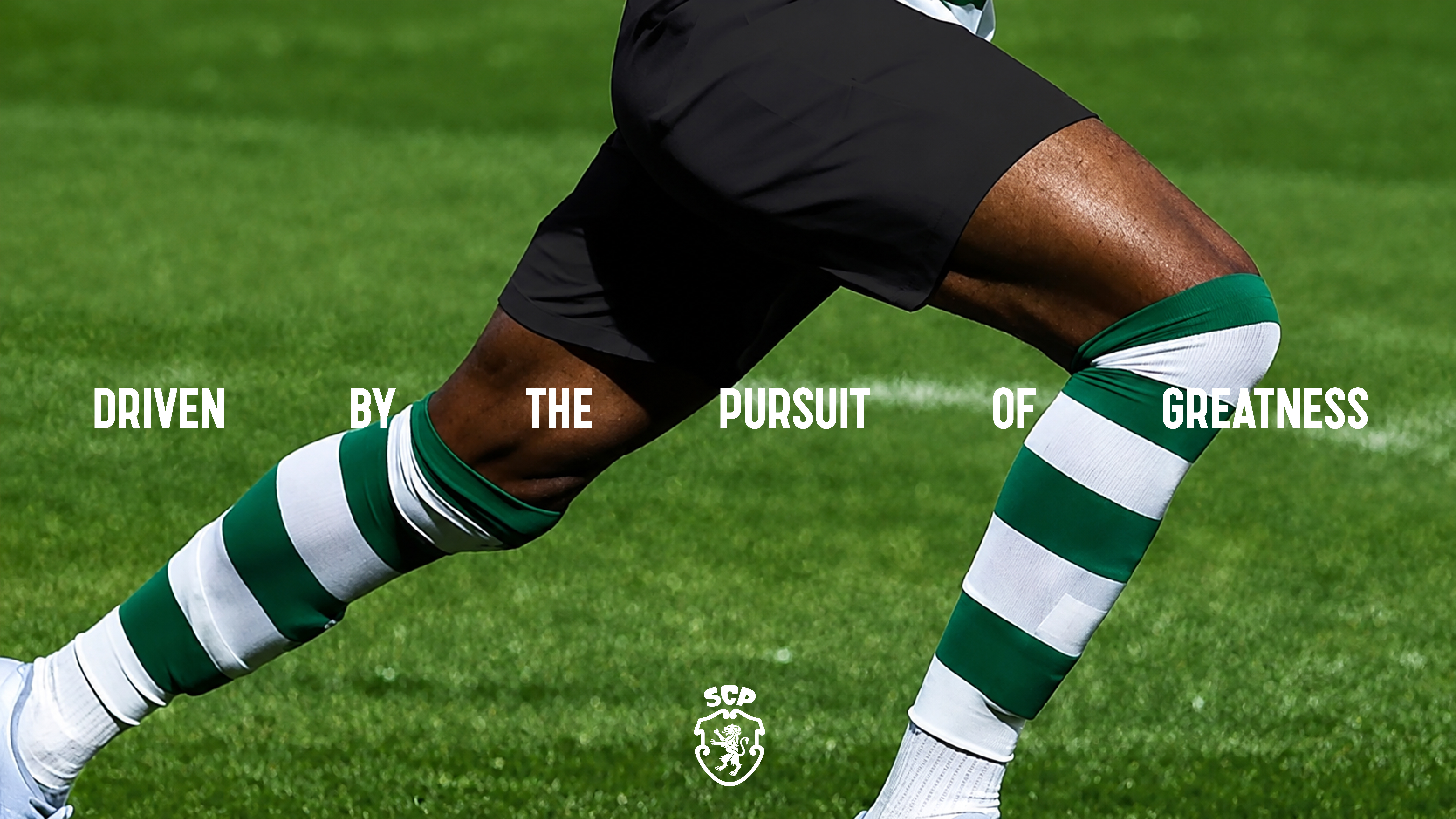
The iconic green and white stripes of Sporting CP are instantly recognizable, representing the club’s colors and its vibrant energy. In the rebrand, these stripes transcend their traditional application on jerseys to become a dynamic, adaptable element of the visual system. Beyond simple color blocks, the stripes are interpreted with motion and fluidity, symbolizing the forward momentum of the club, the rhythmic movement of players on the field, and the collective heartbeat of the supporters. This dynamic interpretation allows the stripes to be used in various animated and digital contexts, bringing a sense of energy and modernity to the brand while retaining its foundational color palette. -
The Shield: Embodying Heritage and Portuguese Pride
The shield shape itself is a classic emblem of sports clubs, signifying protection, strength, and historical lineage. Sporting CP’s new shield draws heavily from the club’s rich heritage, specifically inspired by the 1945 emblem, and integrates elements from the broader Portuguese visual language. Its form is robust yet refined, suggesting both a steadfast defense of tradition and an outward-looking ambition. The shield serves as the foundational structure for the entire crest, anchoring the other symbols within its protective embrace. Its elegant contours and balanced proportions communicate a sense of enduring pride and a deep connection to the club’s roots within the national identity of Portugal. -
The Crown: Royal Acronym and Aspirations
Perched atop the shield, the crown is perhaps one of the most ingenious elements of the new design. It cleverly forms a stylized representation of the club’s acronym, "SCP," integrating these letters into its regal structure. This dual symbolism is powerful: the crown itself denotes excellence, achievement, and a certain regal stature, reflecting Sporting CP’s history of success and its aspirations for future glory. Simultaneously, its subtle incorporation of the acronym ensures that the club’s identity is clearly articulated, making it instantly recognizable even to those unfamiliar with the traditional crown motif. This element speaks to the club’s ambition to be recognized as a leading force, both domestically and internationally.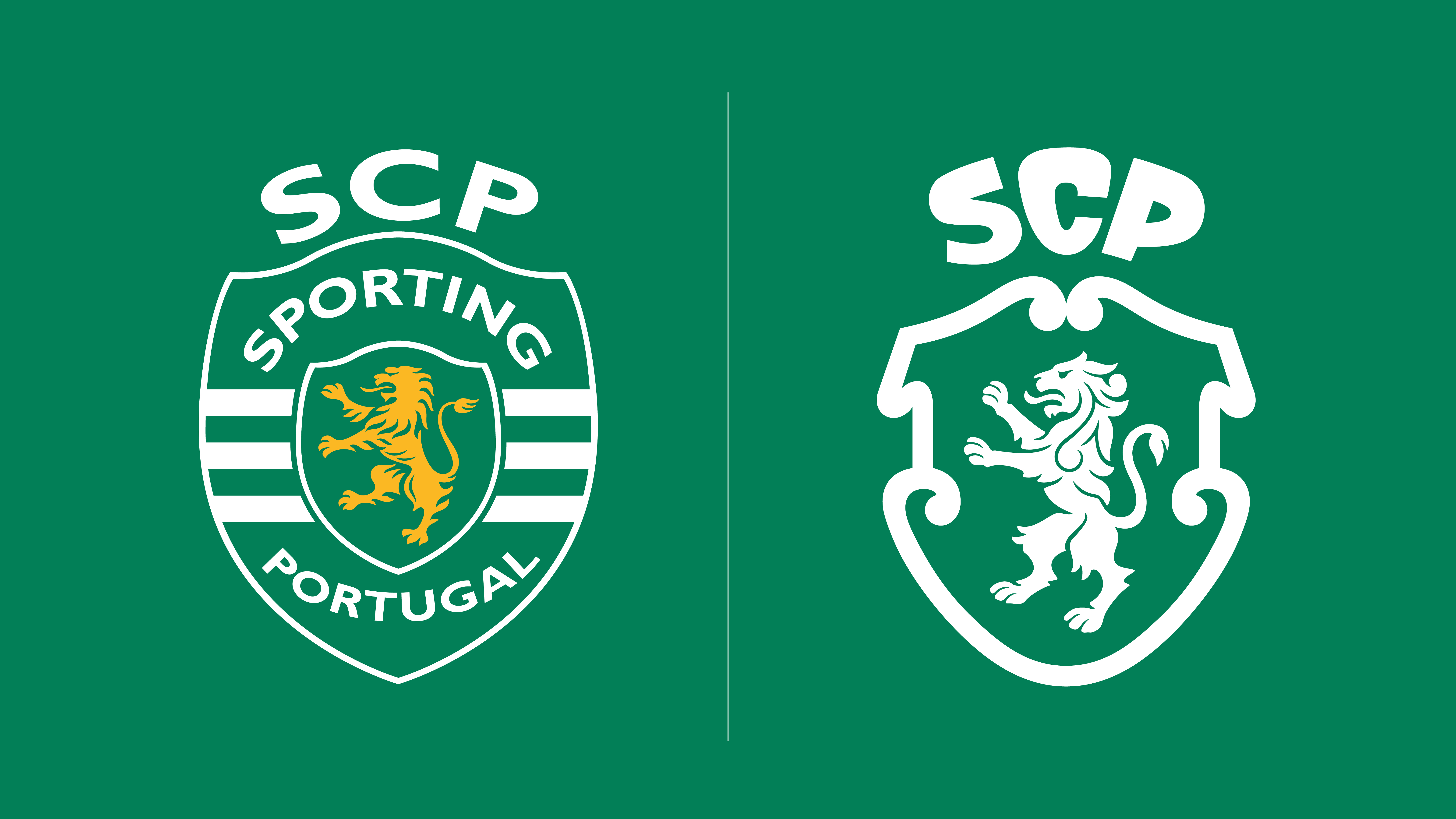
-
The Lion: The Roar of the Fans
The lion has been a prominent feature on Sporting CP’s crests for decades, symbolizing courage, strength, leadership, and the indomitable spirit of the club. In this evolution, the lion is specifically reinterpreted to represent the club’s passionate and loyal fans – "the heart of the brand." Drawing from the legacy of previous crests, the new lion is rendered with a contemporary edge, powerful yet sleek, embodying the collective roar and unwavering support that echoes from the stands. Its position within the crest signifies the fans as the guardians of the club’s legacy and its driving force, a constant source of inspiration and motivation for the players. This symbol bridges the past with the present, acknowledging the foundational role of the supporters throughout SCP’s history.
Sporting Sans: A Typography of Tomorrow
Complementing the refreshed crest is "Sporting Sans," a bespoke contemporary new font developed specifically for the brand. The choice of a sans-serif typeface reflects a commitment to modernity, legibility, and versatility. Sporting Sans is clean, strong, and adaptable, designed to perform effectively across all media, from large-scale stadium graphics to small digital interfaces. Its distinctive character subtly echoes the angularity and precision found within the crest, creating a harmonious visual language that reinforces consistency across all brand communications. This thoughtful typographic choice ensures that the club’s written messages carry the same gravitas and contemporary appeal as its visual identity.
Beyond the Static: Dynamic Motion Graphics
The brand evolution extends beyond static imagery, embracing the imperative of dynamic visual communication in the digital age. Inspired by the green and white stripes, the brand’s dynamic motion design brings a vibrant, energetic quality to SCP’s presence on screens. This element allows the brand to move and breathe, reflecting the dynamism of football itself. Whether in broadcast graphics, social media content, or digital advertising, the motion design adds a layer of engagement, creating a distinctive and memorable experience. It ensures that Sporting CP’s identity is not just seen but felt, conveying speed, precision, and the relentless pursuit of excellence inherent in the club’s ethos.
Voices of Vision: Official Responses and Design Philosophy
The strategic unveiling of Sporting CP’s new brand identity has been met with significant anticipation, generating robust discussions among stakeholders, from club leadership to the vast global fanbase. The design philosophy underpinning this evolution is best articulated by those who spearheaded its creation.
Sean Thomas, Global Executive Creative Director at JKR, offered a concise yet profound insight into the agency’s approach: “This was not a case of starting from scratch. It was about staying faithful to the club’s legacy and true to its loyal fans, while attracting and remaining relevant to the next generation and wider culture. Our job was to build a brand system that carries the spirit of Sporting CP forward without limits, a visual language as distinctive and ambitious as the club itself.” This statement underscores the delicate balance JKR sought to achieve: honoring the past without being confined by it, and embracing the future without losing the club’s soul. The phrase "without limits" hints at a brand system designed for expansion and adaptability, capable of supporting SCP’s growth across various platforms, ventures, and international markets.
While official statements from Sporting CP leadership regarding the rebrand are anticipated to reinforce this message, the strategic intent is clear. A spokesperson for the club, speaking on background, emphasized the importance of this evolution in solidifying SCP’s position as a modern, forward-thinking institution. "Our 120th anniversary is a moment for reflection and renewal," the spokesperson stated. "This new identity is a testament to our enduring values, our commitment to our fans, and our ambition to compete at the highest levels. It’s a visual promise that while we respect our history, we are constantly striving for excellence and innovation in every facet of our club." Such sentiments highlight the brand’s strategic importance, not merely as an aesthetic update but as a declaration of intent for the club’s future trajectory.
The initial reception from the fanbase, while still unfolding, is expected to be largely positive, especially given the meticulous integration of historical elements and fan-centric symbolism. The emphasis on the "Lion" representing the fans and the "Porta 10-A" connecting to the stadium’s sacred spaces are deliberate choices to foster a deeper sense of ownership and pride among supporters. While any rebrand of an iconic institution inevitably draws scrutiny, the careful balance between evolution and reverence for tradition is likely to resonate strongly, reaffirming the emotional bond between the club and its loyal community.
The Roar Ahead: Implications for Sporting CP’s Future
The unveiling of Sporting Clube de Portugal’s evolved brand identity carries significant implications across various dimensions, promising to shape the club’s trajectory in the coming years and beyond. This strategic move is poised to have a ripple effect on fan engagement, commercial endeavors, global recognition, and even its on-field aspirations.
Strengthening Identity and Fan Connection
At its core, the rebrand aims to fortify the club’s identity and deepen the connection with its passionate fanbase. By meticulously weaving in symbols like the Porta 10-A and explicitly stating that the Lion represents the fans, the new identity fosters an enhanced sense of belonging and collective pride. For long-standing supporters, it’s a respectful nod to their heritage, recognizing the elements they cherish. For younger generations and new fans, it presents a sleek, modern, and engaging visual language that is accessible and inspiring. This stronger, more cohesive identity can translate into increased fan loyalty, greater participation in club activities, and a more unified voice for the Sporting CP community, transcending geographical boundaries. The emotional resonance of a well-executed brand can be a powerful force in consolidating a club’s societal impact.
Commercial and Global Reach
A modernized and distinctive brand identity is a potent asset in the competitive landscape of global sports. Commercially, the refreshed brand will undoubtedly enhance Sporting CP’s appeal to sponsors and partners, offering a contemporary and versatile platform for collaboration. The clean, adaptable design elements, coupled with the bespoke "Sporting Sans" font and dynamic motion graphics, provide a rich toolkit for merchandise, advertising campaigns, and digital content, potentially driving increased revenue streams. Globally, a sophisticated and recognizable brand helps Sporting CP stand out in crowded international markets, attracting new followers, expanding its digital footprint, and facilitating greater international brand recognition and engagement, crucial for a club with aspirations beyond national borders.

A Statement of Ambition
The decision to undertake such a significant brand evolution ahead of its 120th anniversary is also a powerful statement of Sporting CP’s ambition. It signals a club that is not content to rest on its laurels but is actively investing in its future, both on and off the pitch. A strong, modern brand projects an image of professionalism, innovation, and a forward-looking mindset, which can indirectly influence player recruitment, staff morale, and overall institutional confidence. It communicates a desire to compete at the highest levels, reflecting the club’s commitment to excellence in all its endeavors. The brand becomes an outward manifestation of the club’s internal drive and strategic vision, inspiring confidence among all stakeholders.
Setting a Benchmark in Sports Branding
Finally, Sporting CP’s collaboration with JKR on this sophisticated rebrand could set a new benchmark in sports branding. The thoughtful integration of deep heritage with modern design principles, the emphasis on symbolic storytelling, and the creation of a versatile visual system demonstrate a meticulous approach that many other clubs might seek to emulate. It proves that brand evolution doesn’t necessitate abandoning history but rather enriching it through contemporary interpretation. By successfully navigating the complexities of honoring a storied past while embracing a dynamic future, Sporting CP’s new identity serves as an exemplar for how traditional institutions can remain relevant and inspiring in an ever-changing global landscape.
Conclusion
Sporting Clube de Portugal’s brand evolution is a masterstroke in balancing tradition with progress. As the club strides confidently towards its 120th anniversary, this meticulously crafted identity, born from a deep understanding of its "Code" and the unwavering loyalty of its fans, stands as a testament to its enduring legacy and ambitious future. Through a harmonious blend of historical reverence and contemporary design, Sporting CP has not merely updated its appearance; it has reaffirmed its soul, ensuring that the roar of the Lion continues to echo powerfully, inspiring generations to come. This strategic rebrand positions SCP not just as a football club, but as a dynamic cultural institution, ready to conquer new horizons while remaining forever true to its iconic green and white heart.
 Evan Lee Salim
  Nana
Nana  Ammar Sabilarrohman