
 By Muslim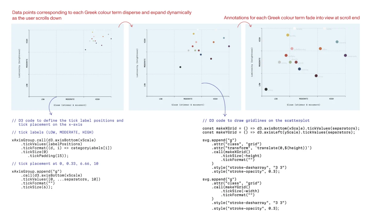
In the early 1420s, Fra Angelico, a Dominican friar whose brushstrokes would come to define the aesthetic of the Early Renaissance, completed his first large-scale masterpiece for the newly consecrated monastery of San Domenico. The San Domenico Altarpiece—a luminous polyptych depicting the Virgin and Child surrounded by a celestial host of angels—became more than a religious icon; it became a defining artifact of an era. For centuries, it presided over the high altar, witnessing the hushed prayers and choral hymns of the Dominican brothers. Yet, beneath the prismatic palette and the serene, haloed countenances lies a narrative of structural struggle—a physical history of wood, humidity, and the necessity of hidden, foundational integrity.
This duality—the celebrated public image and the invisible structural support—serves as a profound metaphor for the modern craft of data visualization. As we move further into an age where information is increasingly complex, the discipline of "building" data has begun to mirror the meticulous conservation of Renaissance art.
A Chronology of Construction and Decay
To view the front of the San Domenico Altarpiece is to witness harmony; to examine its reverse is to confront a chaotic, centuries-long struggle against physics. Over the 17th century, the original panels were recut and forcefully joined by carpenters who favored geometric uniformity over the natural behavior of timber. Beechwood inserts, cut in the shape of "butterflies," were forced into the grain, causing structural discord. As different wood species expanded and contracted under varying humidity, the altarpiece began to warp and crack, threatening the very paint layer that had mesmerized viewers for half a millennium.
The restoration process, undertaken last year, was a monumental task of digital-age craftsmanship. Roberto Buda, a conservator specializing in historic panel paintings, led the stabilization effort. For nine months, Buda and his team engaged in a delicate surgical operation: removing the invasive crossbeams and counter-grain butterfly inserts. They replaced these with custom-fitted, historically accurate poplar wood, meticulously aligned with the original grain. To ensure the work could "breathe," they housed the piece in a new chestnut frame equipped with conical springs.
"It’s a house," Buda remarked to the Financial Times during the process. "If you don’t have a good foundation, it doesn’t hold up. The painting will never look good if the support is not right."
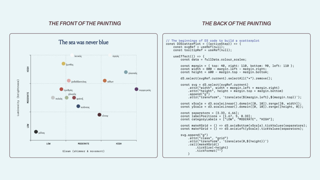
The Pivot: From Neuroscience to Data Carpentry
The resonance of Buda’s philosophy became clear to me in 2025, during a pivotal transition in my own career. As a PhD graduate in experimental neuroscience, my workflow had been a whirlwind of high-velocity technical tasks: hardware prototyping, software development, complex experimental design, and data analysis. In academia, breadth is the currency of survival. Yet, I found myself increasingly drawn to the terminal stage of the pipeline: the act of interpretation and visual storytelling.
I realized that in the rush to publish, academic figures are often treated as afterthoughts—hastily generated plots produced by the default settings of Matplotlib or Excel. I craved greater intention. I wanted to move beyond the "black box" of automated charts and into the workshop of D3.js.
D3, or Data-Driven Documents, is a low-level library that forces the developer to become an architect. Unlike tools that hand you a pre-formed scatterplot, D3 requires you to manually define the coordinate system, calculate scales, and bind data to specific geometric marks. Nothing appears on the screen unless you build it from the raw materials of CSS, HTML, and SVG. It is, in every sense, a workshop filled with raw timber and hand saws.
Supporting Data: The Sensory Dimensions of Color
To master this craft, I joined the Data Visualisation Society’s mentorship program. Under the guidance of my mentor, Sam Bloom, I spent ten weeks exploring the "first principles" of visual construction. Our capstone project involved building an interactive scatterplot that examined the sensory dimensions of color in Homer’s Iliad.
The challenge lay in the fact that Ancient Greek color perception was fundamentally different from our modern, hue-centric taxonomy. For the Greeks, color was an experience of motion, shimmer, and texture. It was a vocabulary of luminosity and material sheen. To visualize this, I had to build a system that reflected these nuances rather than forcing them into modern categories.

The process was slow, steep, and deeply instructional. Every line of code acted as a structural support. If the axis was misaligned or the margin didn’t "breathe," the narrative collapsed. By building the visual from the ground up, I learned that a scatterplot is not just a collection of dots; it is a carefully calibrated environment where the placement of an axis is as critical as the choice of data.
The Logic of Professionalism: Official Perspectives
The importance of this foundational rigor is a core tenet for leading data practitioners. The Financial Times graphics team, for instance, maintains one of the most recognizable visual vocabularies in journalism precisely because they adhere to a strict set of design principles. Their style guides function as a grammar, dictating the exact weight of an axis line and the precise hex codes for color.
Alan Smith, the FT’s Head of Visual and Data Journalism, has often emphasized that a chart should be as readable as a sentence. Similarly, Professor Alberto Cairo of the University of Miami argues that the most critical phase of visualization occurs before the first pixel is placed. In his seminal work, The Art of Insight, Cairo posits that there are no "rules" of visualization, only reason. Every design choice must be a defensible, rational response to the data and the intended audience.
This logic is perhaps best illustrated by the work of the late Hans Rosling. His 2006 TED talk is a masterclass in narrative structure. By using an animated scatterplot to map life expectancy against GDP, Rosling did not just present data; he constructed a stage. The audience understood complex global health trends because Rosling had built a foundation that allowed the narrative to emerge naturally. The animation wasn’t just a gimmick; it was a structural necessity for guiding the viewer through time.
Implications: The Integrity of Design
If we return to the San Domenico Altarpiece, we see the lesson clearly: the surface is inseparable from the support. A data visualization is, at its core, a three-dimensional object of logic. If the underlying structure is weak—if the scales are arbitrary or the axes are misleading—the narrative "paint" will inevitably crack.

Consider the debate surrounding y-axis scaling. While convention suggests starting a y-axis at zero to preserve proportionality, this can sometimes obscure critical variation. As Steven Franconeri, a professor of psychology at Northwestern University, has shown, scaling is a matter of contextual integrity. A temperature chart anchored at zero degrees Fahrenheit might render global warming trends invisible, whereas a scaled axis reveals the truth of the data. The danger of ignoring these structural decisions is not just aesthetic; it is a failure of transparency.
In my own work, I have found that pairing D3 with React provides a modern equivalent to the chestnut frame and conical springs used by Buda. React allows me to manage the "state" of the visualization—describing what the interface should be under various conditions—while D3 handles the mathematical heavy lifting. It is a system designed to "breathe" as the data changes.
Ultimately, this endeavor is not about JavaScript or frameworks. It is about integrity. The most important work a visualization designer performs is the work the reader never sees. When the public views a finished chart, they see the "Virgin and Child"—the clear, resonant story. They do not see the poplar inserts, the carefully calculated margins, or the hours of structural refinement.
But without that invisible labor, the story cannot stand. Whether we are restoring a 15th-century masterpiece or designing a digital scatterplot for the 21st century, the mission remains the same: we are building houses for information. Every axis, every scale, and every line of code must be a piece of timber aligned to the grain. Only then can we ensure that our insights, like the altarpiece, survive the passage of time.
 Lina Irawan
  Nana
Nana  Nila Kartika Wati