
 By Asro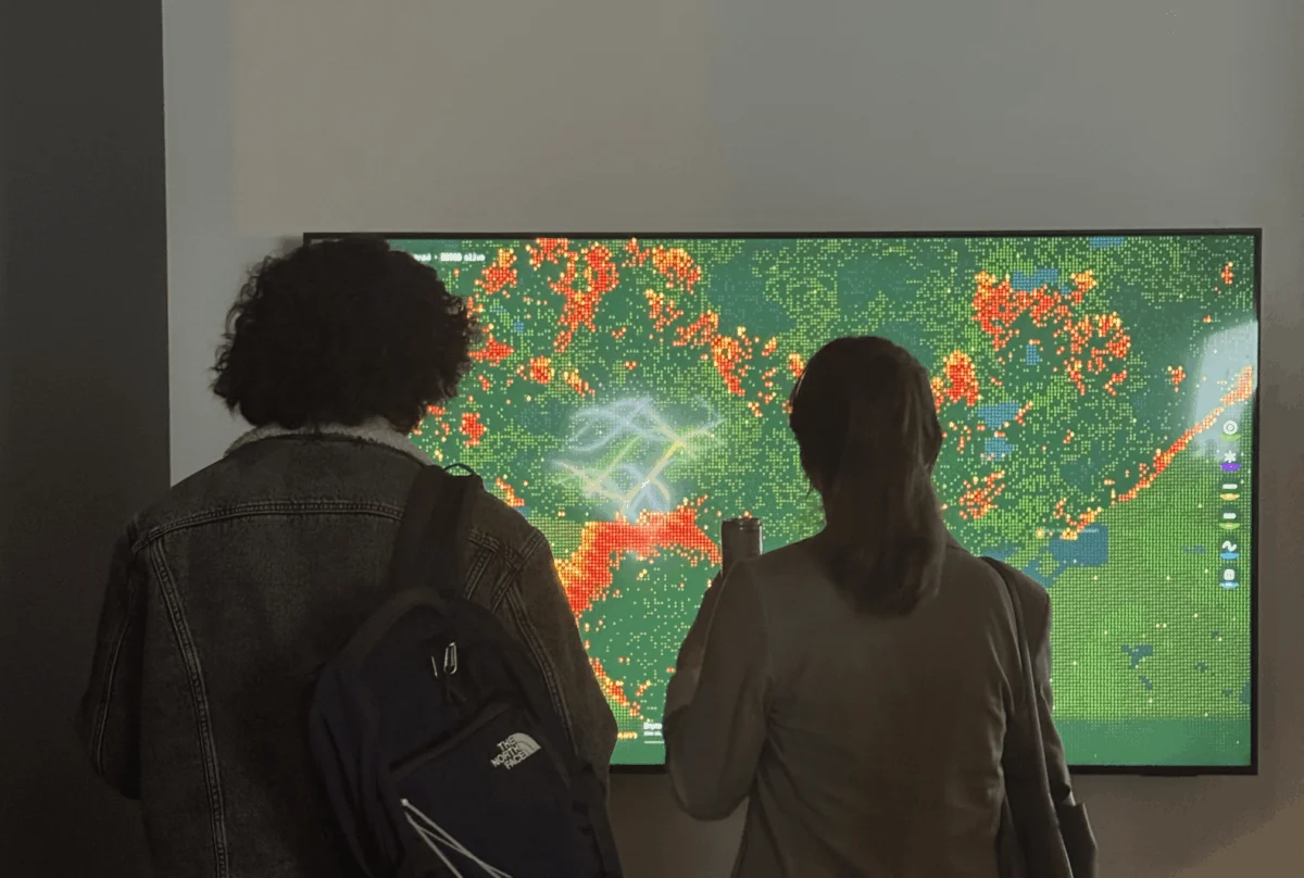
In the high-stakes world of energy infrastructure, data is the currency of survival. For designers like me, tasked with visualizing the complex, shifting landscape of the energy sector, most days are spent translating abstract, alarming trends—soaring demand forecasts and grid expansion curves—into something actionable for stakeholders. Yet, there is a fundamental flaw in the way we communicate these realities. A number in a report remains a sterile figure; a chart in a slide deck is often met with a polite nod and immediate oblivion.
In my work, I have witnessed the "empathy gap" firsthand: the profound, often dangerous space that exists between what the data explicitly states and what a human being actually feels. We are currently facing a climate crisis where our digital appetite—fueled by the voracious energy requirements of AI data centers—is colliding with the physical vulnerability of our natural landscapes. Bridging this gap is not just a design challenge; it is a moral imperative.
The Convergence of Digital Hunger and Physical Risk
Working in San Francisco, one cannot ignore the persistent, haunting presence of wildfire risk. It is a reality etched into the landscape and the economy. However, energy infrastructure and wildland fire risks are not separate problems; they share geography, causality, and a terrifying feedback loop.
As our climate evolves, we are witnessing longer "burn windows" and a frequency of extreme weather events that defy historical precedents. These are not merely natural cycles; they are symptoms of a systemic imbalance. Our digital demand creates a direct, physical burden on a warming planet. As the power grid expands to meet the insatiable appetite of AI, which consumes electricity at a pace rivaling entire nations, we are forced to run more lines through terrain that is becoming increasingly desiccated with each passing season.
I knew these connections. I could cite the statistics on megawatt consumption and fire ignition probabilities. What I could not do, however, was make people feel the stakes of a simple AI prompt. I needed to move beyond the "what" of the data and into the "why" of the human experience.
The Mentorship: From Theory to Spark
My academic background in Information Design and Data Visualization at Northeastern University provided the toolkit to treat data as a design material—something possessing texture, weight, and presence. Yet, academic theory often struggles to translate into visceral public impact.
I arrived at the Data Visualization Society (DVS) mentorship program with a singular, daunting challenge: How do you make someone feel the cost of something invisible?
My mentor, Divya Meghnani, Head of Product at Databricks, proved to be the catalyst for this transformation. Divya did not merely provide technical guidance on building visualizations; he challenged my creative intent. He pushed me to interrogate the narrative behind the numbers. Under his mentorship, the project shifted from a standard data project into a piece of advocacy—a way to force a collision between cold analytics and hot, tangible reality.
The Simulation: Designing "Wired to Burn"
To move away from the safety of static charts, I looked toward the concept of emergent systems. Drawing inspiration from Daniel Shiffman’s The Nature of Code and the evocative, human-centric principles of Data Humanism championed by Giorgia Lupi, I turned to cellular automata—a model where individual, simple rules generate complex, large-scale behavior.
The result was Wired to Burn, an interactive wildfire simulator. In this space, the user is not a passive observer; they are the catalyst. Your cursor is the spark. You, the user, select the terrain—ranging from parched grasslands to dense, vulnerable timber—and establish the environmental conditions for ignition. But once the first click occurs, the "math" takes over.
The simulation operates on a grid where the state of each cell is determined by its neighbors and the variables you have defined. Using the creative coding library p5.js, I engineered a system where fire behaves as a living, breathing entity. It is a real-time calculation of risk that accounts for fuel density and dryness levels—variables that are, in turn, directly influenced by the escalating energy demands of our modern, AI-driven lives.
The Visual Language of Destruction
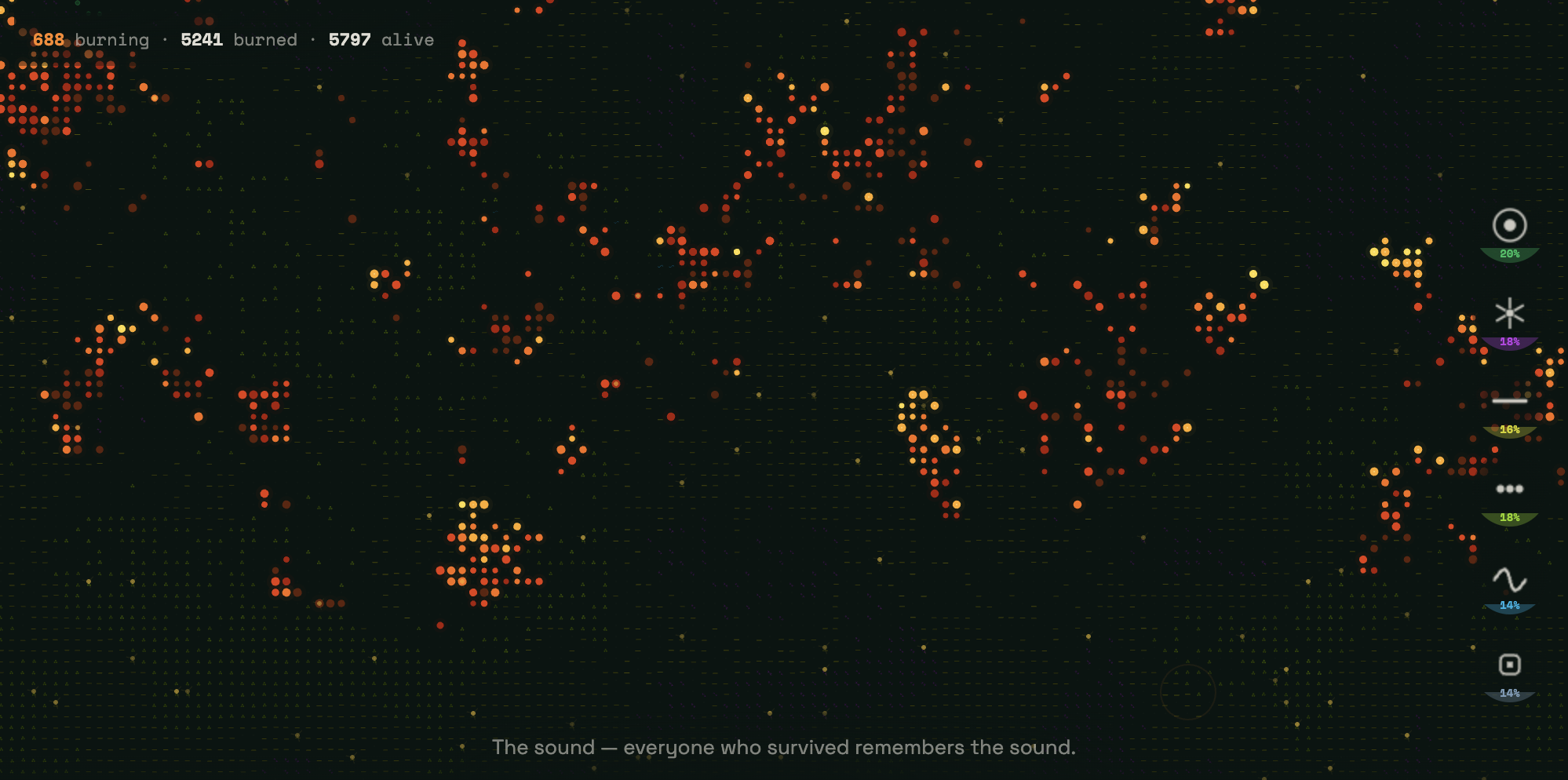
The simulation opens on a near-black canvas, a void waiting for input. Six distinct terrain types populate this space, each rendered as a recurring symbol in vivid neon:

- Emerald green targets for forest;
- Violet starbursts for shrubland;
- Acid yellow dashes for agriculture;
- Lime green dots for grassland;
- Cyan sine waves for wetlands;
- Slate blue squares for developed land.
An amber, ember-like cursor hovers at the center. It is quiet. Nothing has burned yet.
As the fire spreads through the 9,000+ cells, it leaves behind "ash." Embracing Lupi’s philosophy that data should narrate human stories, I resisted the urge to represent burned ground as mere black pixels. Instead, as the fire consumes the landscape, it leaves behind text—narration that explains the hidden infrastructure costs and the human stakes of our digital behavior.
The TIAT Exhibition: Bridging the Empathy Gap
When I presented Wired to Burn at the TIAT exhibition in San Francisco, the theoretical became concrete. I watched strangers approach the screen, their expressions shifting from curiosity to visceral realization.
At first, there was the aesthetic awe of the generative fire—the way the neon symbols flickered and died. But as participants read the text appearing in the wake of the flames, the context shifted. They were no longer just playing with a simulation; they were looking at a mirror of our current climate reality.
One of the most striking moments occurred when visitors stopped to re-read the narration in the ash zones multiple times. It was a validation of the central thesis: when we give data a human pulse, when we make the invisible visible, people stop scrolling and start reflecting. The "empathy gap" began to close, if only for a few minutes, through the power of interactive design.
Implications for the Future of Data Design
As a new voice in the data visualization community, transitioning from student to exhibitor has been a rapid evolution. As I prepare for this year’s Outlier Conference, I find myself ruminating on the theme of "The Final Draft."

To me, this theme is a recognition that no project is ever truly finished. It represents the transformative power of curiosity, the necessity of constraints, and the inevitability of iteration. Wired to Burn is not a final product; it is a live, evolving argument. In the world of climate and energy, the terrain constantly regenerates, the fire starts again, and the data continues to demand that we feel its weight.
The primary implication of this work is a shift in responsibility for data designers. Our role is no longer just to show the numbers or to summarize the trends. Our role is to remain humble in the face of complex, existential systems and to ensure that when we talk about the world, we make the people living in it feel exactly what is at stake.
Conclusion: The Ongoing Work
Data visualization, at its best, is a form of empathy. It is the art of taking the infinite complexity of our world and distilling it into a form that can be felt by the human heart.
As we move forward into an era defined by AI, climate volatility, and the increasing electrification of our lives, the tools we use must be as sophisticated as the problems we face. We must continue to push the boundaries of how we represent these systems, moving away from the safety of the static report and into the dynamic, uncomfortable, and necessary space of interactive storytelling.
The fire is burning. The question is no longer whether we have the data to understand the threat, but whether we have the courage to design for the feeling of that threat. Only then will we move from understanding to action.
About the Author
Pranavi Aourpally is a San Francisco–based creative technologist and data designer exploring the intersection of data, storytelling, and product design. She currently designs for the energy sector while experimenting with design engineering and web-based tools that translate complex information into human-centric experiences. She is particularly interested in how individuals can leverage personal data to better navigate their own lives in a rapidly changing world.
 Lina Irawan
  Nana
Nana  Nila Kartika Wati