
 By Nila Kartika Wati
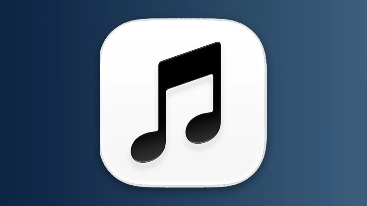
Apple has long been the industry gold standard for branding, often credited with defining the modern aesthetic of the tech world. However, in recent weeks, the Cupertino giant has left the design community—and its massive user base—reeling from a stylistic pivot that feels more like an identity crisis than a bold new vision. Following the release of the iOS 27.2 update, Apple debuted a revised, starkly monochromatic icon for Apple Music. The change has ignited a fierce debate, casting a shadow over what many perceived to be a fresh, "Gen Z-ified" trajectory for the company’s brand image.
The Core Controversy: Minimalism vs. Modernity
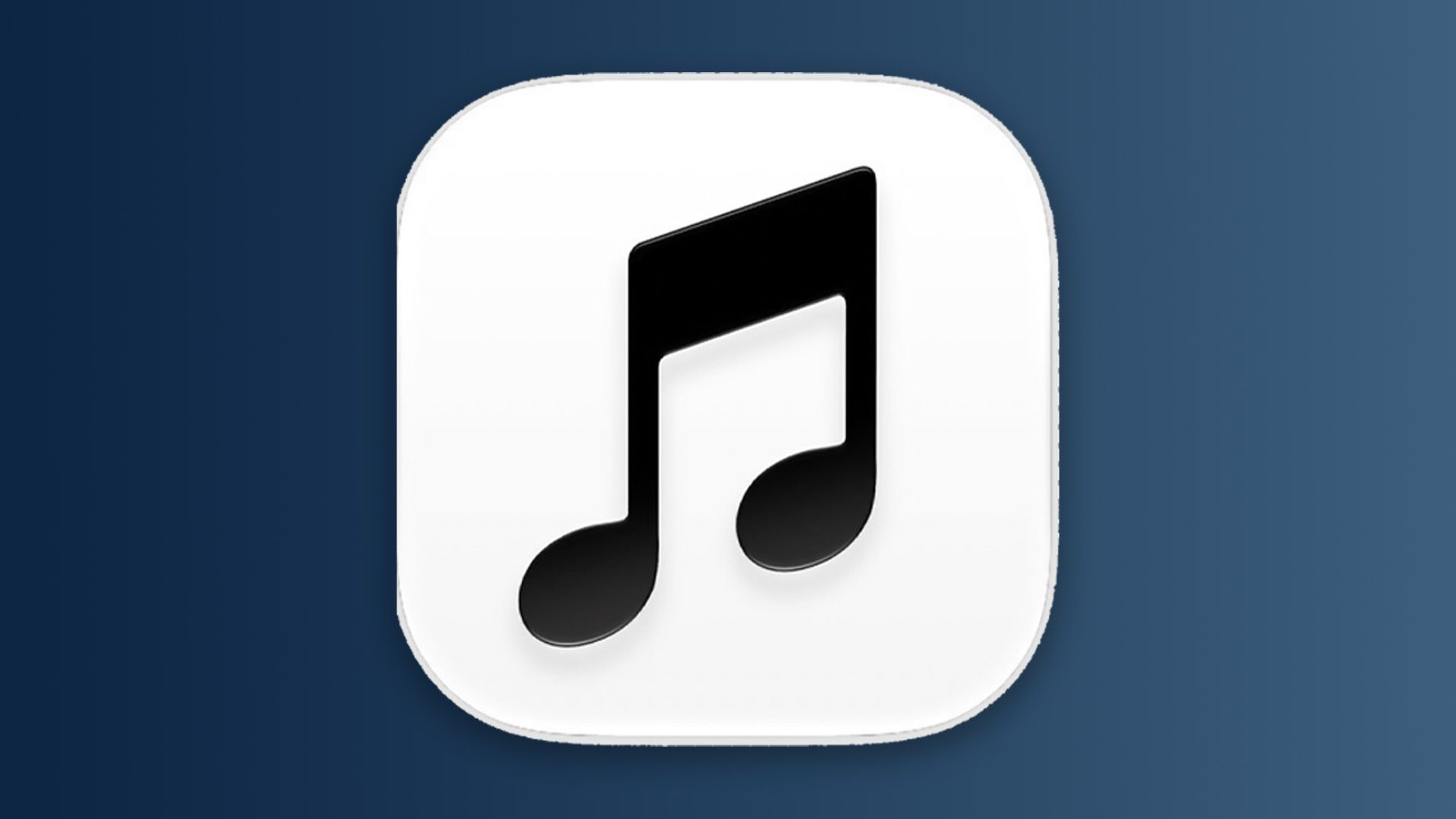
The new Apple Music icon is, by all accounts, a masterclass in stripped-back design. It retains the classic music note silhouette familiar to millions, but it has been rendered entirely in black and white with bolder, more rigid lines. Gone is the vibrant, nuanced gradient that once characterized the service’s branding, replaced by a flat, utilitarian aesthetic that some critics have labeled "characterless."
For many, this transition feels jarring. In the wake of the MacBook Neo’s release—a product that leaned into a more playful, experimental design language—users expected Apple to continue embracing quirkier, more dynamic visual identities. Instead, the move to a monochromatic icon feels like a retreat to the rigid minimalism of the early 2010s, leaving observers to wonder if Apple is truly embracing a new era or merely oscillating between design philosophies.
A Chronology of Apple’s Design Evolution
To understand the weight of this backlash, one must look at the timeline of Apple’s visual history.
- The Skeuomorphic Era (Pre-2013): Apple’s early software design focused on realistic textures—leather stitching, glass textures, and physical button metaphors. It was tactile and human, though it eventually became cluttered.
- The Jony Ive Shift (2013-2019): With the introduction of iOS 7, Apple pivoted sharply toward "Flat Design." This was the dawn of the minimalist era, characterized by thin fonts, translucency, and the removal of ornamental shadows.
- The Nuanced Years (2020-2025): Apple began to reintroduce depth and color gradients. The Apple Music icon thrived here, using vibrant pinks and reds to signal energy and passion.
- The Current Pivot (Late 2026): With the release of iOS 27.2, the brand has returned to a stark, monochrome aesthetic. This move sits in direct contrast to the leaked "Apple Music wordmark" that surfaced earlier this year, which promised a more experimental, stylized approach.
This erratic behavior suggests a company struggling to reconcile its history as a minimalist powerhouse with the modern demands of a younger, trend-driven demographic.
Supporting Data: The Pulse of Public Opinion
The reaction on social media has been swift and unforgiving. On platforms like X (formerly Twitter), the sentiment is overwhelmingly skeptical. One viral post captured the mood perfectly: "Nobody: Absolutely nobody: Apple: rebrands Apple Music."
The data, however, suggests a deeper rift than simple aesthetic preference. Qualitative analysis of user comments reveals three distinct schools of thought:
- The Nostalgia Purists: A minority of users appreciate the "clean" look, arguing that it brings consistency to the iPhone home screen by eliminating visual noise.
- The Identity Crisis Critics: The majority argue that the logo has been "sapped of its soul." By removing color, critics argue that Apple is stripping the service of its emotional connection to the music industry.
- The Strategic Realists: A small but vocal group suggests this is a calculated business move. As one user hypothesized: "They want to turn Apple Music into a neutral platform. By making the icon black and white, they allow the album art and artist photography to provide the color, effectively making the UI a blank canvas for the creators."
Official Responses and Internal Silence
As is typical of Apple, the company has remained tight-lipped regarding the creative strategy behind the new icon. There has been no official press release or design blog post explaining the move, a standard operating procedure that often fuels speculation.
Industry insiders suggest that this "Radio Silence" strategy is deliberate. By allowing the controversy to brew, Apple forces users to interact with the new design, effectively testing engagement metrics in the wild. However, the lack of communication has also left designers in the dark. Without a manifesto or a design brief to ground the change, the public is left to fill the void with their own narratives—most of which, in this case, are negative.
The Implications for Future Branding
What does this mean for the future of Apple’s design language? If the Apple Music icon is the bellwether, we may be seeing the end of the "playful" era hinted at by the MacBook Neo.
1. The "Platformization" of Icons
If Apple continues to adopt a monochrome palette across its ecosystem, it suggests a shift toward treating the OS as a neutral utility rather than a personal expression space. This is a significant departure from the trend of "customizability" that Apple has been pushing with recent iOS updates, such as the ability to tint app icons and customize home screens.
2. Competition with Spotify
The theory that this is a strategic move to compete with Spotify carries weight. Spotify has long utilized a "neutral" green-and-black branding that allows artist imagery to pop. If Apple is attempting to position itself as a "professional" alternative to the more community-focused, colorful, and chaotic Spotify, this logo might be the first step in a broader rebranding of Apple Music as a premium, artist-centric platform.
3. A Potential Correction
Apple is known for its iterative approach. If user sentiment remains consistently negative and impacts engagement metrics (time spent in the app, click-through rates), the company has historically shown a willingness to pivot. We could see a secondary update in the coming months that introduces a subtle accent color, effectively compromising between the current starkness and the previous vibrancy.
Conclusion: A Brand at a Crossroads
The backlash against the new Apple Music logo is about more than just a piece of graphic design; it is a symptom of a deeper anxiety regarding the direction of a brand that defines how millions of people experience the world. Users are protective of Apple because they feel a personal connection to the design choices of the company.
When Apple makes a change that feels like a "regression," it challenges the narrative of constant innovation. Whether this is a strategic move to clear the canvas for a new era of content-driven design, or a simple misstep in a series of ambitious experiments, one thing is clear: the conversation is far from over.
For now, the monochrome icon stands as a testament to the fact that even in the world of high-end technology, the most powerful tool a brand possesses is not its hardware, but the emotional resonance of its symbols. As Apple continues to navigate the competing demands of its minimalist heritage and its future as a creative-led, Gen Z-facing tech giant, it must decide if it wants to be a background utility or a vibrant, living brand. For the moment, the silence—and the black-and-white icon—suggests a company still searching for its own rhythm.
 Reynand Wu
 Nana Muazin
