
 By Laily UPN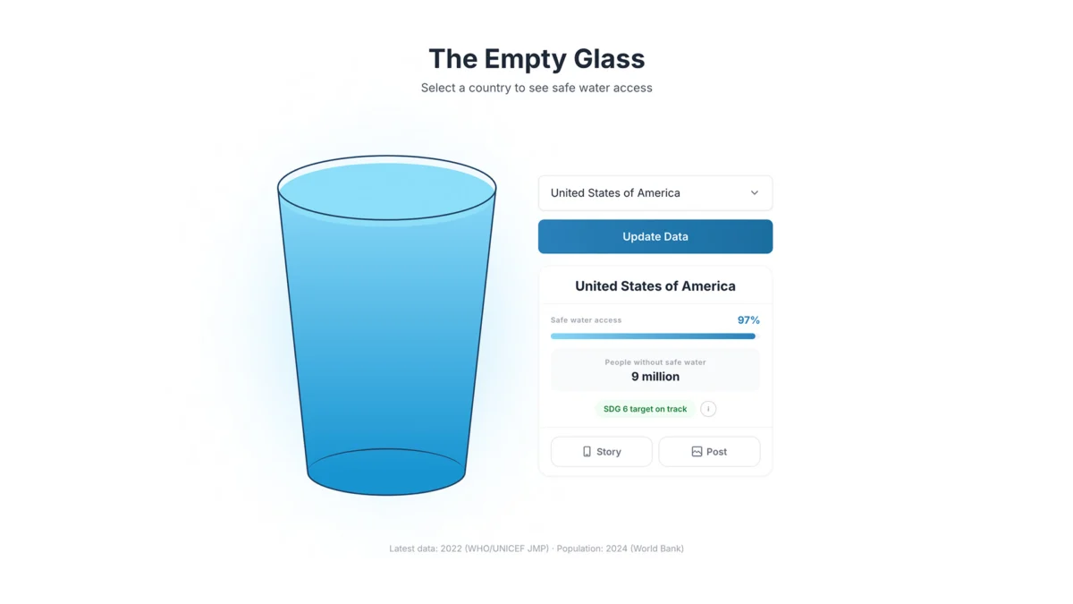
In the realm of modern data journalism, we have become obsessed with the "dashboard effect." We demand high-resolution maps, interactive choropleths, and multi-layered bar charts that pack as much information as possible into a single viewport. Yet, in our pursuit of analytical precision, we have often sacrificed the most critical element of communication: human resonance.
A report stating that a nation has 60% access to safe drinking water is, by all accounts, a triumph of data collection. It is precise, verified by the World Health Organization (WHO) and UNICEF, and scientifically sound. However, as a communication tool, it is remarkably hollow. It fails to convey the visceral reality of thirst, the daily struggle of water insecurity, and the stark, painful divide between the global haves and have-nots.
This disconnect between raw data and human empathy served as the catalyst for "The Empty Glass Project," an experimental data design initiative by Canadian designer and creative strategist Inumimo Idowu. By stripping away the clutter of traditional dashboards, Idowu has created a visual language that prioritizes intuition over raw metrics, proving that when it comes to global crises, simplicity is often the most potent form of storytelling.
The Problem with Precision: Why Charts Often Fail
To understand the necessity of the Empty Glass project, one must first recognize the inherent limitations of standard data visualization. When we look at a map of the world color-coded by water accessibility, our brains tend to process the image as a geographical abstraction. We see shades of blue and red, and we make a quick, cognitive assessment of regional disparities.
However, this is an intellectual exercise, not an emotional one. Traditional visualizations require the viewer to act as an analyst: they must find the legend, map the color to the scale, and mentally convert a percentage into a lived reality. For the vast majority of the public, this process is laborious, and the meaning is quickly lost.
"We often ask, ‘How do we show this data?’" says Idowu. "Instead, I wanted to ask, ‘What does this data feel like in real life?’"
The challenge, as Idowu notes, is not a failure of the data itself, but a failure of the medium. We have mistaken "completeness" for "clarity." By layering in axes, gridlines, and complex legends, we create a barrier to entry. The goal of the Empty Glass Project is to dismantle that barrier, replacing the analytical, cold distance of a chart with the universal, intimate language of a glass of water.
Chronology of a Design Shift
The evolution of the project began with a desire to bridge the gap between development statistics and public awareness.

- Phase I: Data Extraction. Idowu began by aggregating trusted datasets from international NGOs. The challenge here was not finding the information, but curating it. He needed to ensure the data was not just accurate, but representative of the true breadth of the global water crisis.
- Phase II: The Metaphorical Pivot. After weeks of sketching, the team moved away from traditional cartography. The shift occurred when they realized that the most universal human experience regarding water is the act of holding a glass. By scaling this single object, they could bypass the need for abstract numerical scales.
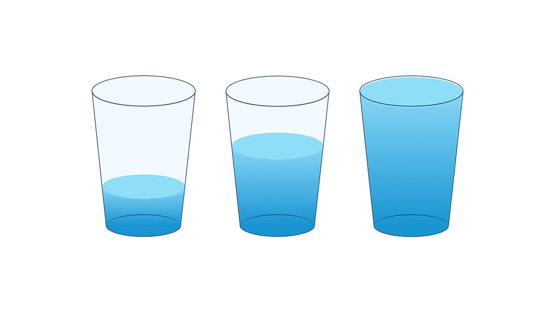
- Phase III: Prototyping Intuition. The interface was built to be radically simple. Users select a country, and the glass fills to the corresponding percentage. There is no background data, no distracting UI elements, and no complex navigation. The focus is entirely on the liquid level within the glass.
- Phase IV: Public Engagement. The launch of the project marked a turning point in how users interacted with the data. Rather than skimming a report, users began to compare their own local realities with those of others, prompting a surge in curiosity about the reasons behind the disparities, rather than just the percentages themselves.
Supporting Data: The Stark Reality of Access
To understand the weight of this project, one must look at the data being visualized. According to the latest reports from the WHO/UNICEF Joint Monitoring Programme for Water Supply, Sanitation and Hygiene (JMP), approximately 2 billion people currently lack access to safely managed drinking water services.
The data reveals deep, systemic inequalities:
- The Rural-Urban Divide: In many regions, the gap between urban access and rural infrastructure remains vast, with rural populations often relying on unimproved water sources.
- The Contamination Crisis: Even where water is "accessible," the quality is frequently compromised. The project highlights that access is not just about proximity; it is about the safety of the resource.
- The Economic Correlation: There is a direct, undeniable link between a nation’s GDP and the stability of its water infrastructure. The Empty Glass Project makes this correlation visible at a glance, as users can click through countries and observe the rapid drop in water levels as they move across economic strata.
These figures are not just numbers on a page; they are determinants of health, education, and gender equality. When water is scarce, it is primarily women and girls who bear the burden of traveling long distances to collect it, directly impacting their ability to participate in the economy or education.
Official Responses and Global Implications
The project has garnered significant attention from the data design community, which has long been grappling with the challenge of "data fatigue."

Design experts have noted that the project is a masterclass in "emotional data visualization." While official bodies like UNICEF have not formally adopted the interface, the methodology has been praised by policy researchers who struggle to make their findings accessible to the public.
"We often spend years collecting data that is then buried in a PDF that nobody reads," noted one researcher. "The Empty Glass Project provides a blueprint for how we can make our findings feel urgent again."
The implications are clear: we are entering a new era of communication where "designing for the human" is becoming just as important as "designing for the data." If we want the public to care about the Sustainable Development Goals (SDGs), we must present them with tools that trigger a visceral, rather than just a logical, response.
Redefining Data Literacy: A Conclusion
The Empty Glass Project is not intended to replace rigorous statistical reporting. The world still needs its choropleth maps, its spreadsheets, and its dense, scholarly reports to guide policy and engineering. However, it serves as a critical entry point.

By removing the friction of data interpretation, the project invites the user into a conversation. It asks, "What does it mean that your glass is full while another is nearly empty?" It shifts the burden of proof from the analyst to the individual, encouraging a sense of global empathy that is often missing from our digital experiences.
In the final analysis, Inumimo Idowu’s work is a reminder that the most sophisticated technology in the world is of little use if it cannot bridge the gap between information and understanding. Sometimes, to explain the most complex problems in human history—such as the global water crisis—the most effective tool is not the most complex one, but the simplest. A glass, after all, is something everyone understands. And an empty one is a reality that, once seen, is impossible to ignore.
 Lina Irawan
  Nana
Nana  Nila Kartika Wati